14. ‘26 Connections’
I was invited alongside 12 other Lettering Arts Trust artists to make a piece of work in response to a poem as part of the 2024 Bloomsbury Festival. The exhibition ‘26 Connections’ is a collaboration between 26, a writers organisation and Barbican Young Poets who were paired together to write poems on the theme of the Bloomsbury Festival, Human.Kind. We were given free reign to respond to the poem in manner we saw fit.
I was drawn to Neil and Alex’s poem, ‘At Dawn’ as they presented the whole compositional process alongside the final version. They settled on a system whereby the first line of one poem ends the other person’s poem. This process of creative collaboration appealed to me and I felt fitted the theme of Human.Kind.
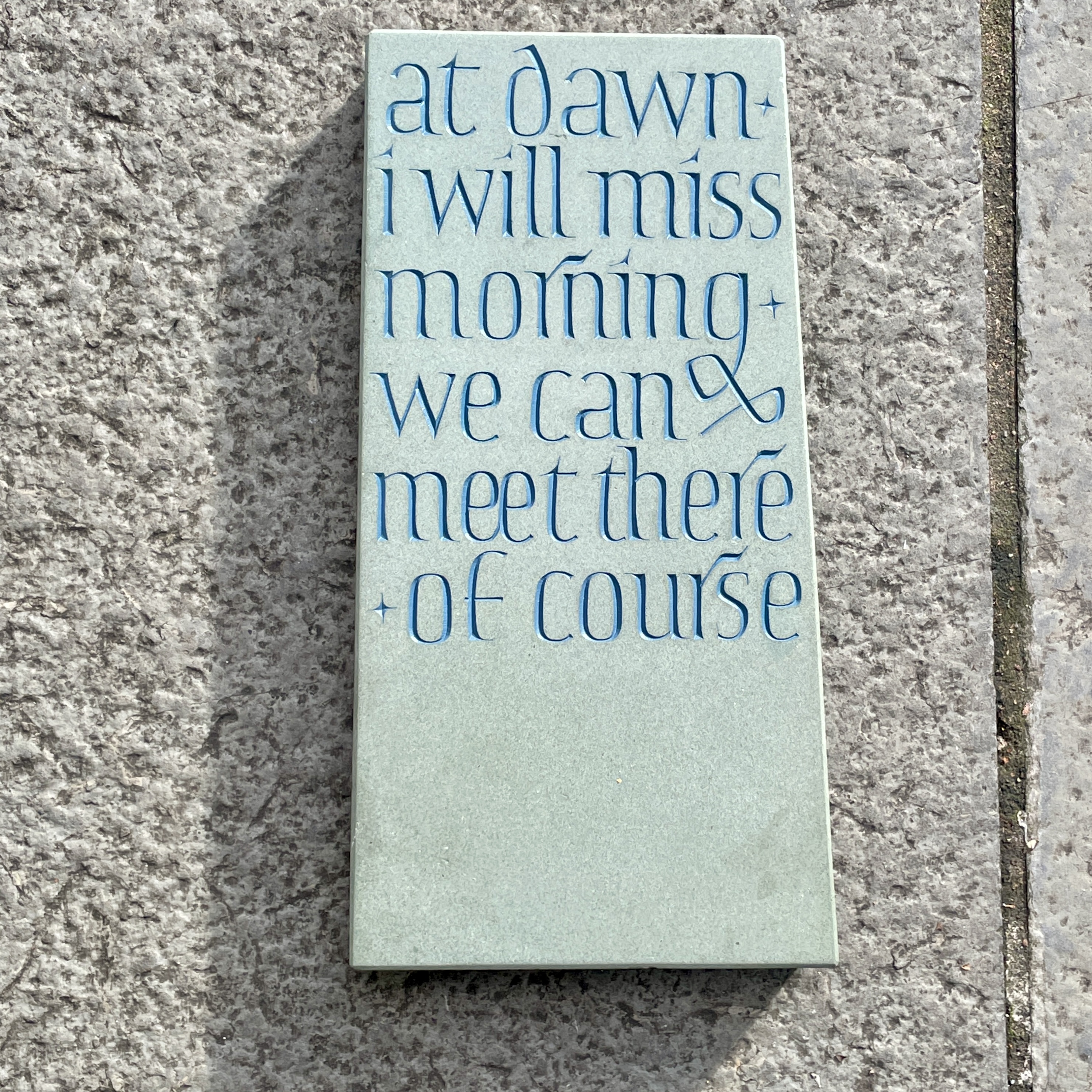
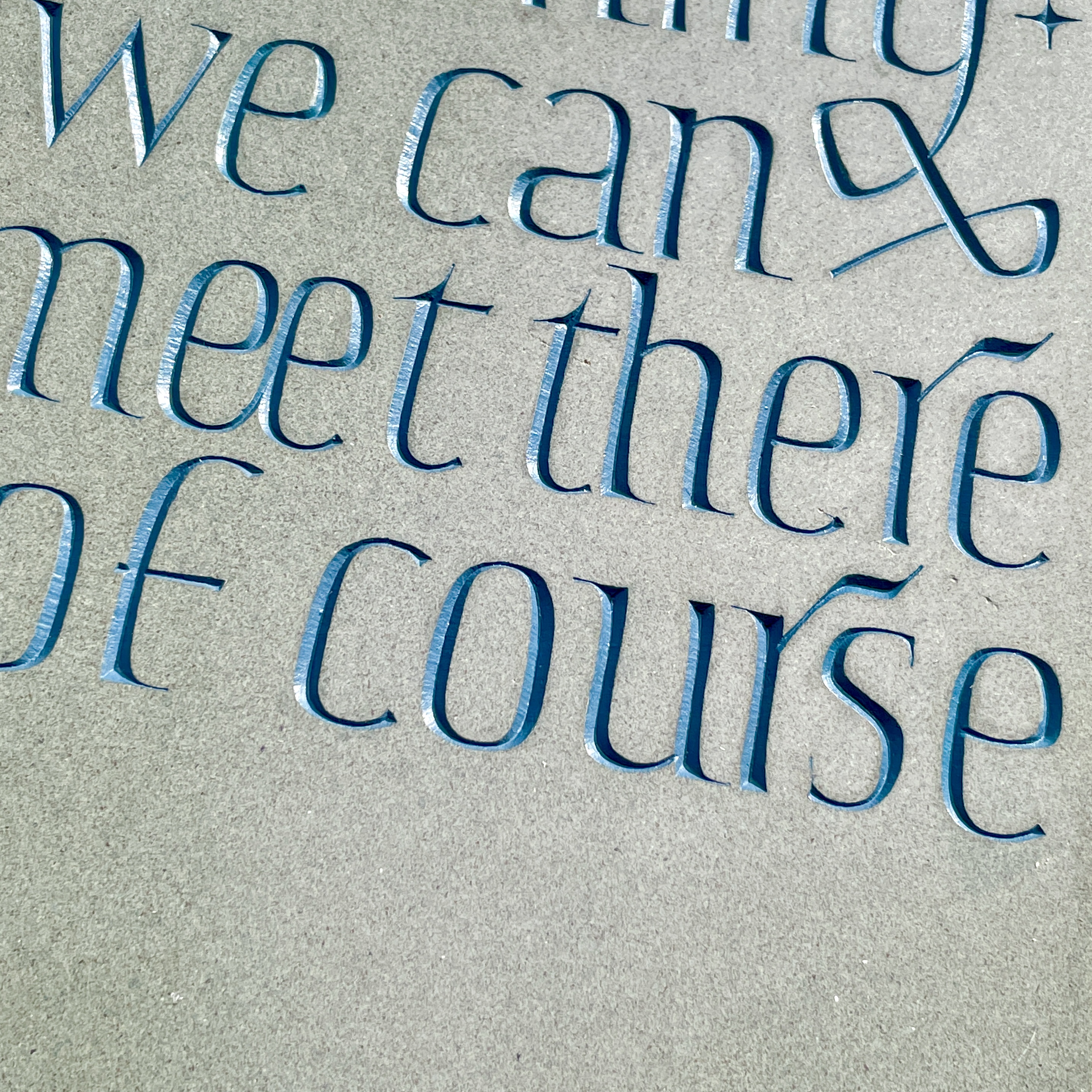
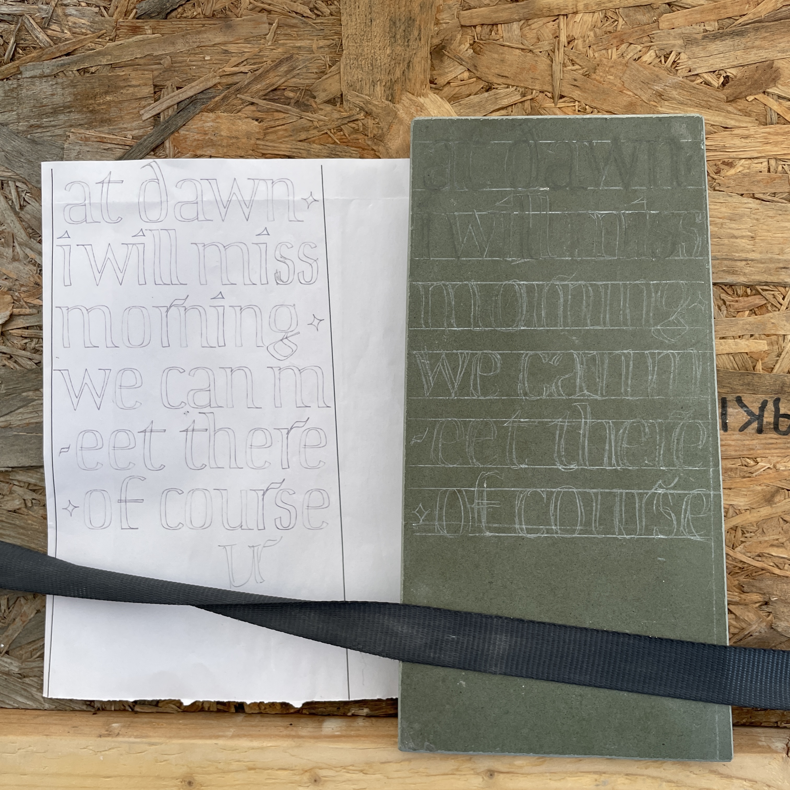
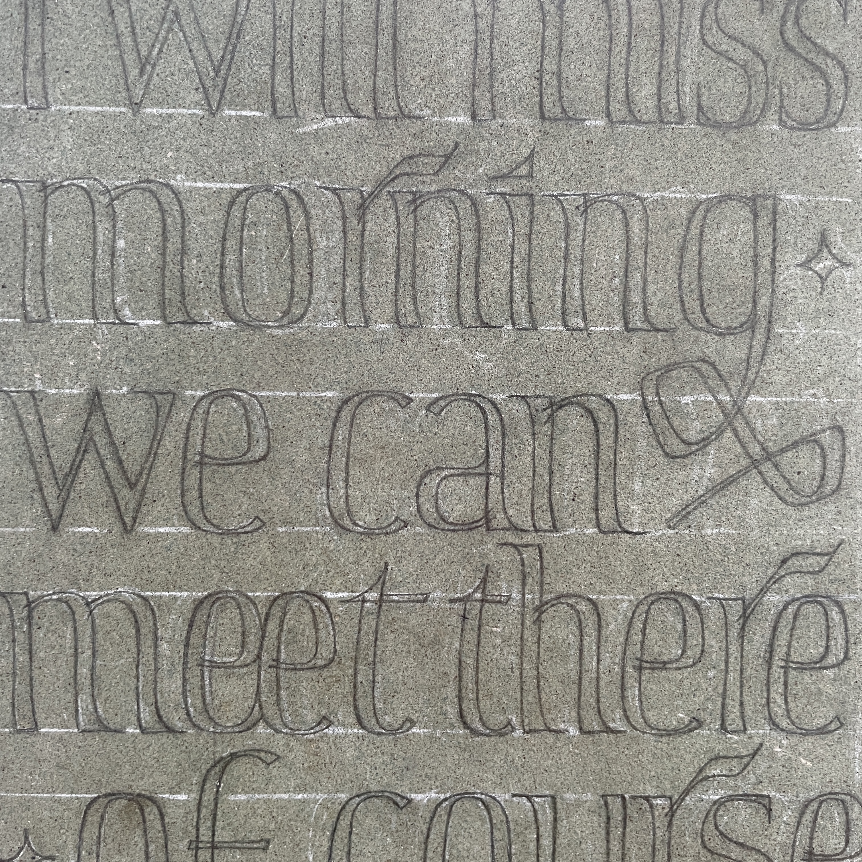
My response to their poem was to distill their process down to just the end lines they used, four lines which in themselves conjure an atmosphere and suggest characters with intentions; ‘at dawn, I will miss morning, we can meet there, of course’. The four lines had been used both to begin and end different iterations of the poem; when I arranged them together it seemed there was a contraction in the meaning that could perhaps be explained by the cyclical inevitability of dawn. The suggestion of meeting ‘at dawn’ felt like an innately human action, the use of the sun and stars as measures of time which humanity can rely on to connect with others over vast distances. This also felt like a fitting sentiment for the theme of this year’s Bloomsbury Festival.
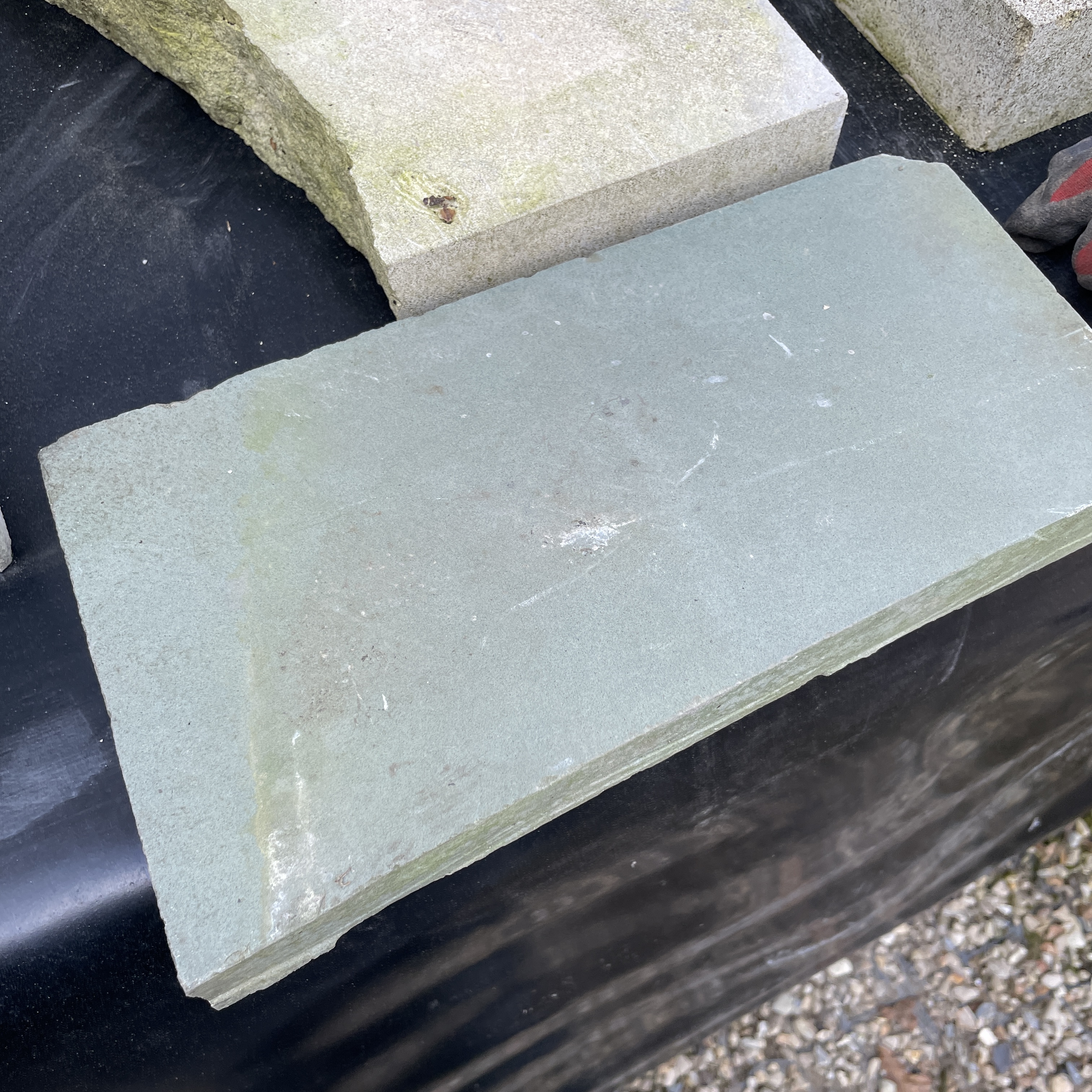
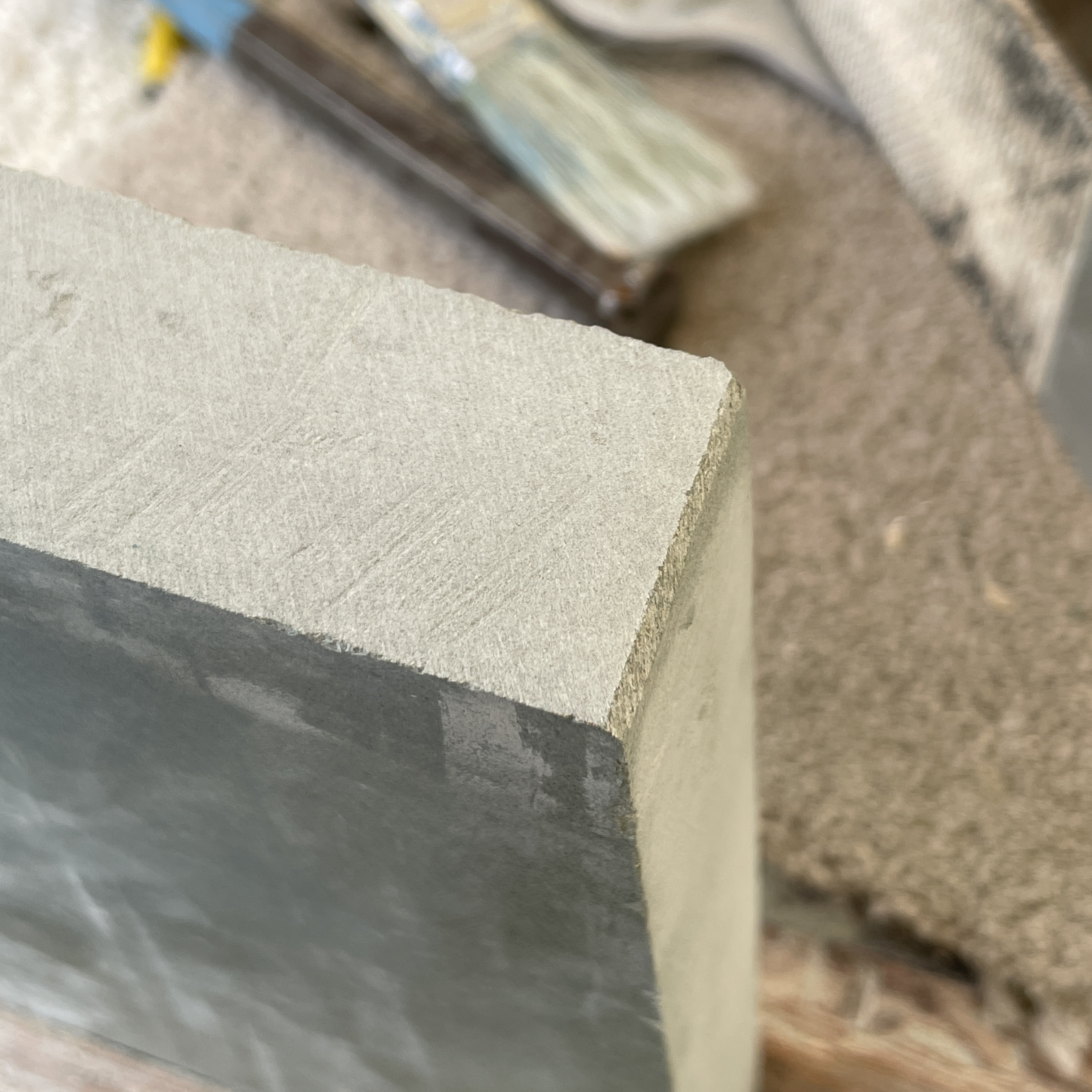
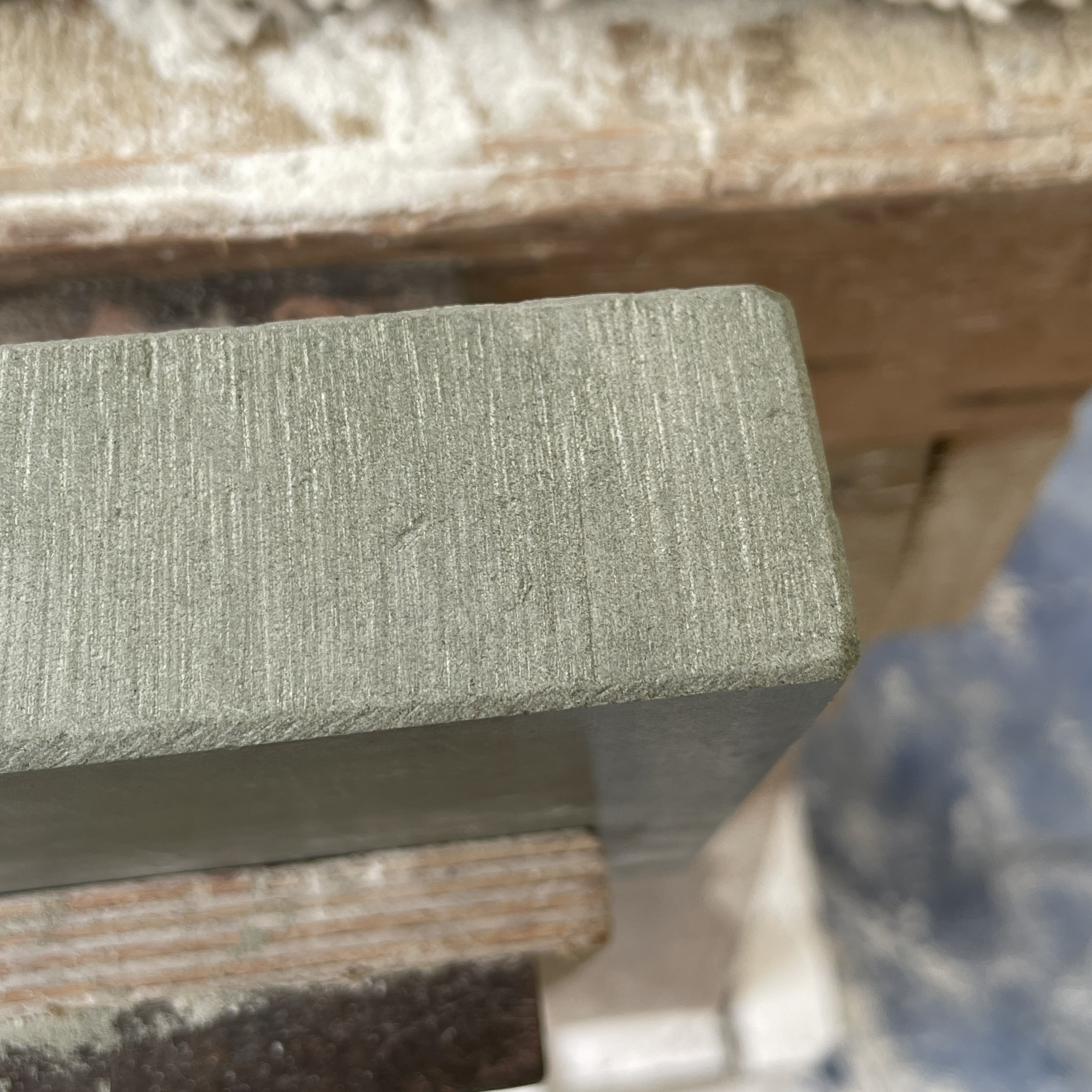
Fig. 1 shows some of my initial sketches for wording and composition for this piece. I was interested in the shapes of road distance markers, as I felt they had pastoral associations, as well as the suggestion of place and distance, both of which are evoked in the poem. Fig. 2 shows the piece of stone I had chosen to work with. The stone is an off-cut piece of green slate, that was given to Charlotte by another carver who in turn got it from another studio. The stone had a polish on the top face but the edges were rough. We cut the stone down to a wedge shape, slightly smaller at the top than the bottom, this ratio went on to inform my choices for the design of the letterforms. Figs. 3-4 show the texture applied to the edges.
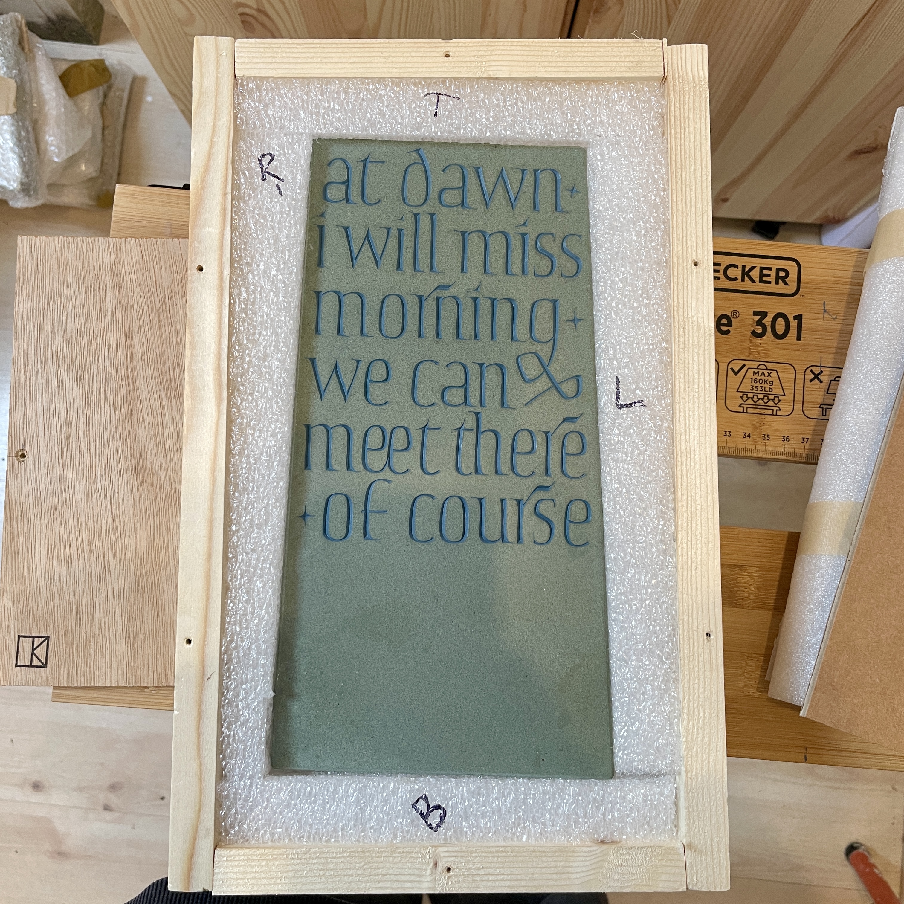
A line in the composition of the poem ‘rhodopsin pigment burying the trees’ particularly resonated with me, with rhodopsin referring to the eye’s ability to see in the dark, specifically to adjust to low light, as I have vivid memories of this sensation. I have tried to invoke something of the colours and tonal quality of seeing a wooded landscape emerge or disappear into a dawn or dusk in the choice of stone and colour of the letters. Figs. 7-9 show the finished stone painted and the box I made to transport it.
