
05. Watercolour
Whilst I was carving my alphabet we decided to work more with the design, by transferring it to a smaller scale and painting it in watercolours. This is a good opportunity to think about how colour can play a part in lettering and also expand my tool skills. I had a done a little bit of watercolour during my art studies but wouldn’t say that I had great skill with a brush. This proved to be the main learning curb and resulted in me simply practising painting straight and curved lines before I attempted the final painting.
We scanned my original drawing and scaled it down to A3 heigh, which I then redrew. This was around the time that I had drawn may alphbet on the stone for the final time, which meant that I have a fuller understanding of the particularties of each letter.
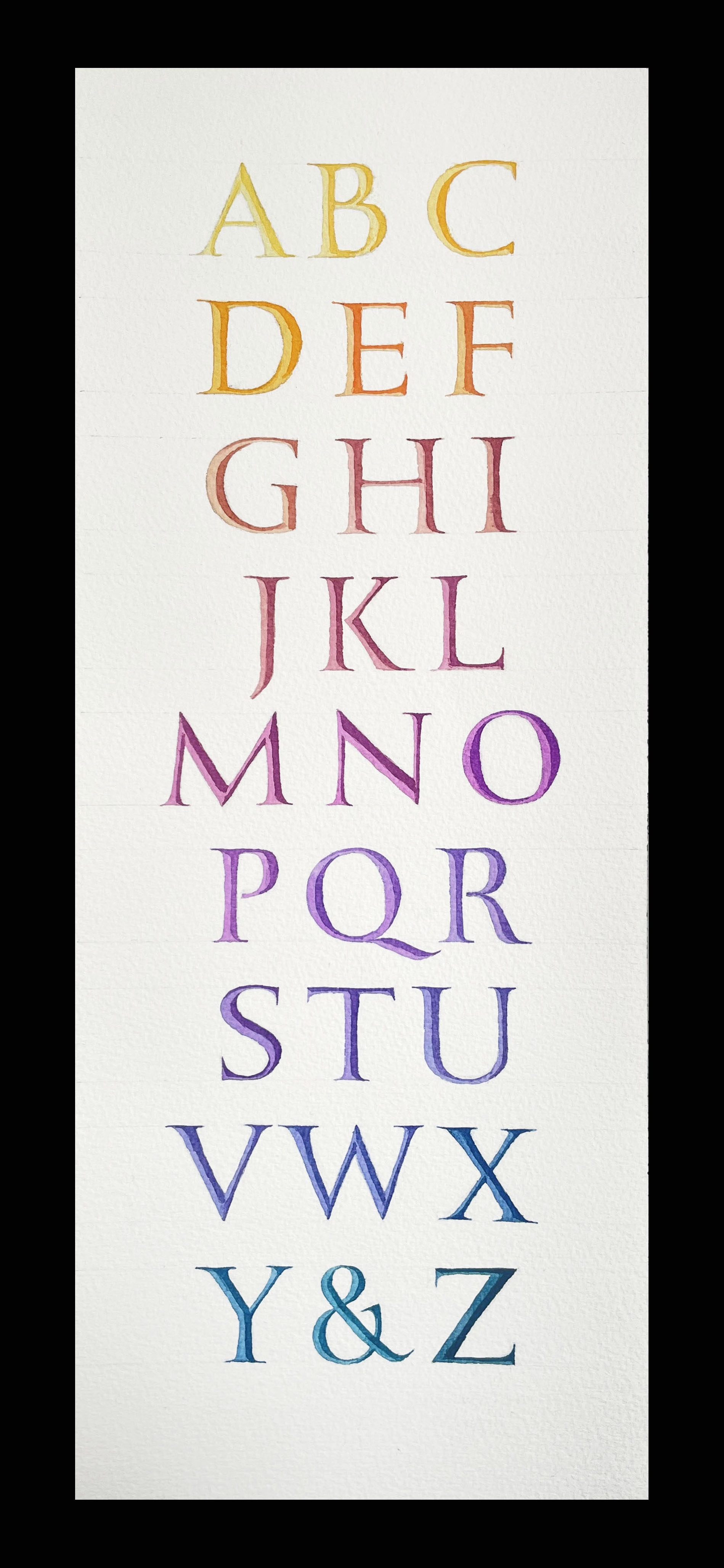
My thoughts on how to use colour for this piece were simply to mirror my carving and paint the letters as if they were carved, with the shadows. I wanted there to be a transition of light to dark across the whole piece, as well as light and shadow in the letters, and have mixed yellow into red, red into blue to achieve a gradation. This was an unusually bight piece of work for me to make, but that seemed necessary due to the formal nature of the composition.
06. ‘torc’ ︎︎︎