

01. Drawing out
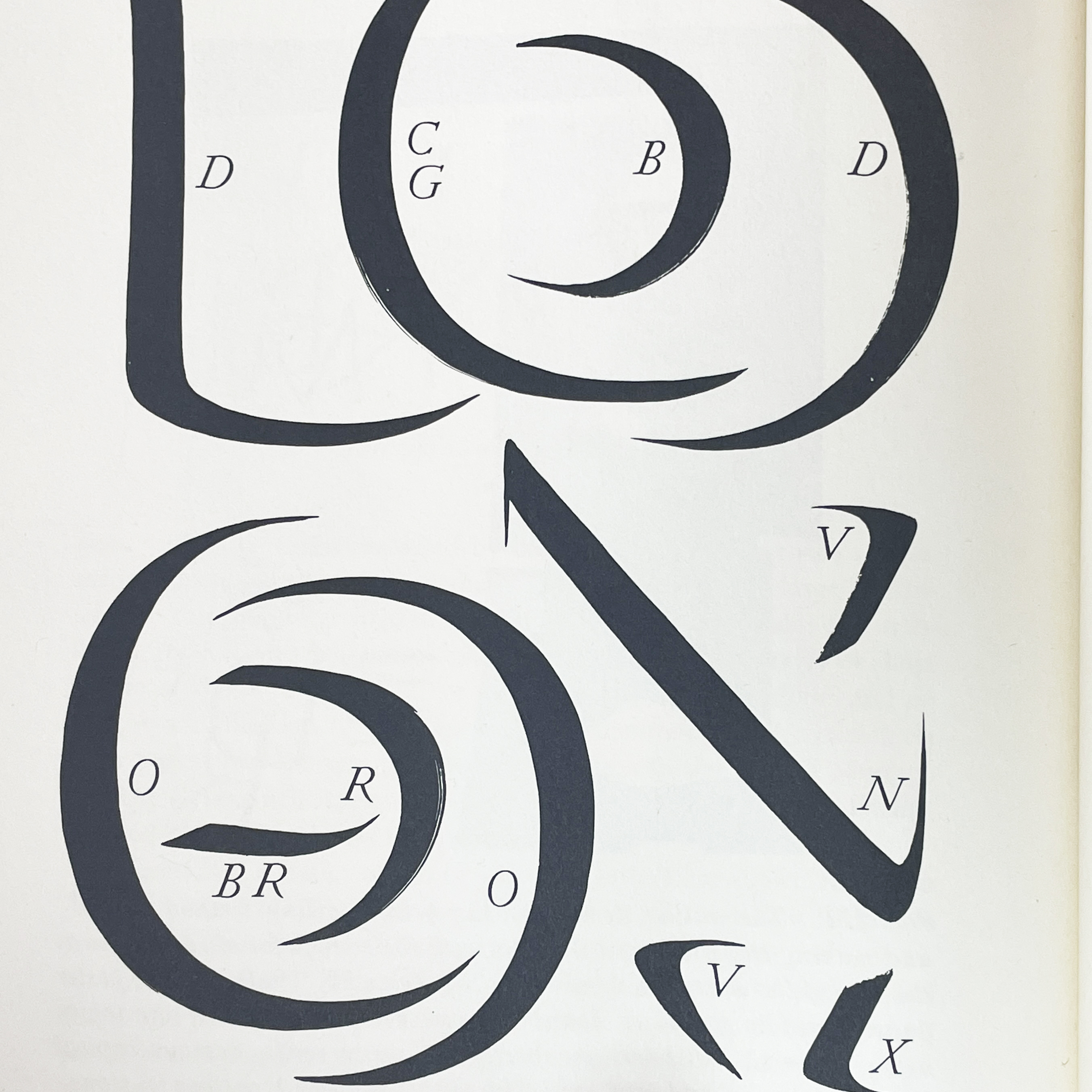
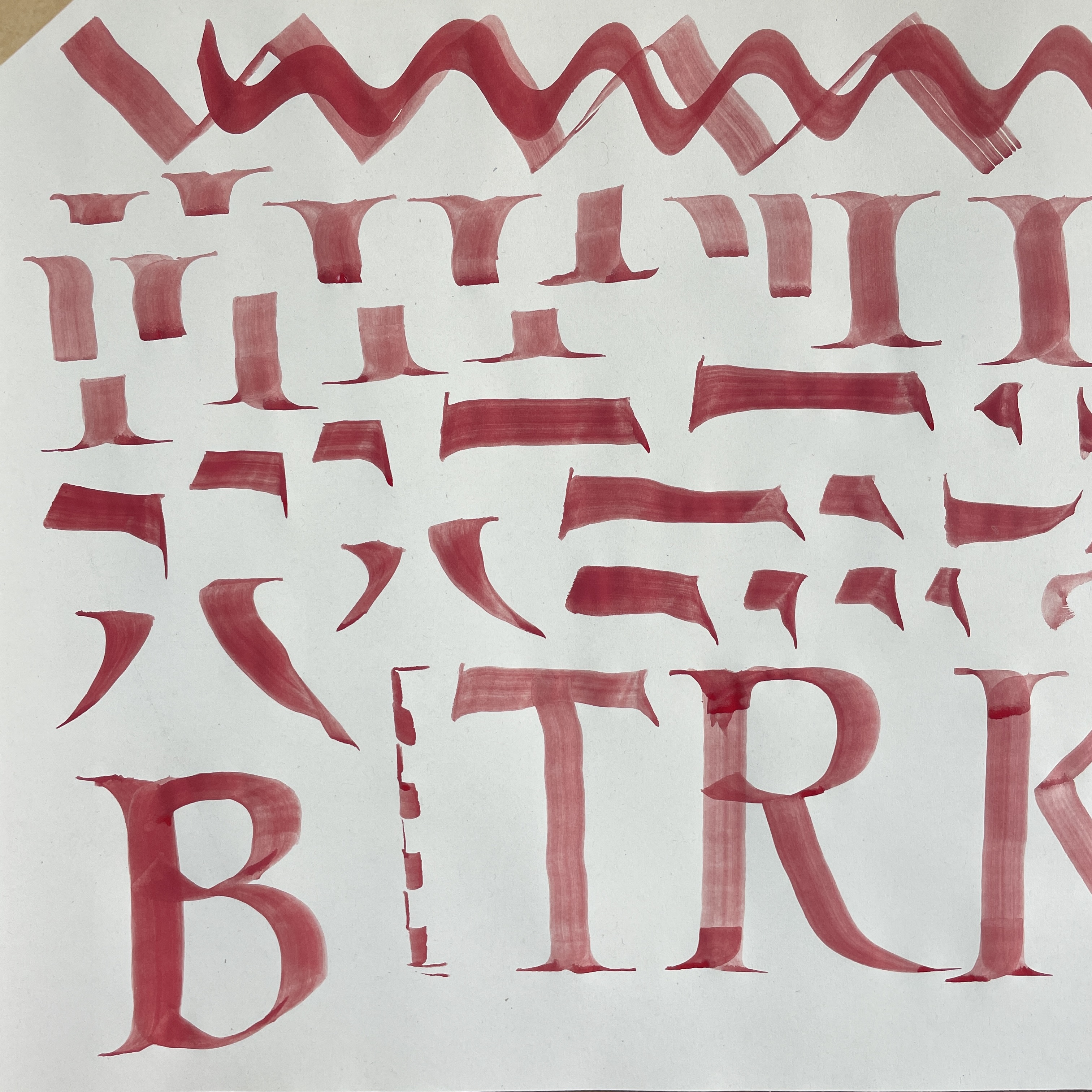
The first piece of work an apprentice often completes is designing and carving their own alphabet. Most often in the Trajan style. ‘Trajan’ being in reference to the Roman emperor Trajan’s triumphal column in Rome, a copy of which can been seen in the Victoria & Albert Museum’s hall of casts. The Trajan alphabet is an uppercase letterform, which we now know derives from the shapes made when drawing with a brush. Fig. c - e show my efforts at this, to create the curves and corners the brush is manipulated and twisted. It is directly from the brush movements that the weights and proportions of the letters derive. Understanding this connection is very useful to keep in mind when I draw my letterforms. Fig. a - b are pages 220 - 221 from Edward M. Catish’s The Origin of the Serif showing the gestures that constitute the letters.


The Trajan letterform is the most commonly used style of lettering for a letter carver as it conveys a solemnity which is appropriate for memorials, but can be personalised in myriad ways for any other type of lettering.
As this is my first exercise I am not looking to any source material to copy a lettering style, but drawing the Trajan alphabet from what I already know. This will help internalise my understand of letterforms.
Fig. 1 - 3 I start by drawing thumbnail sketches of layouts. I gravitate towards a grid that fits all 26 letters of the alphabet plus the ampersand without any gaps. A 3 x 9 grid. To understand how the letter forms of the Trajan alphabet proportionately relate to each other, I draw out the alphabet in a skeleton form. Understanding the relative widths of the letters is an important starting point for achieving a harmonious design.
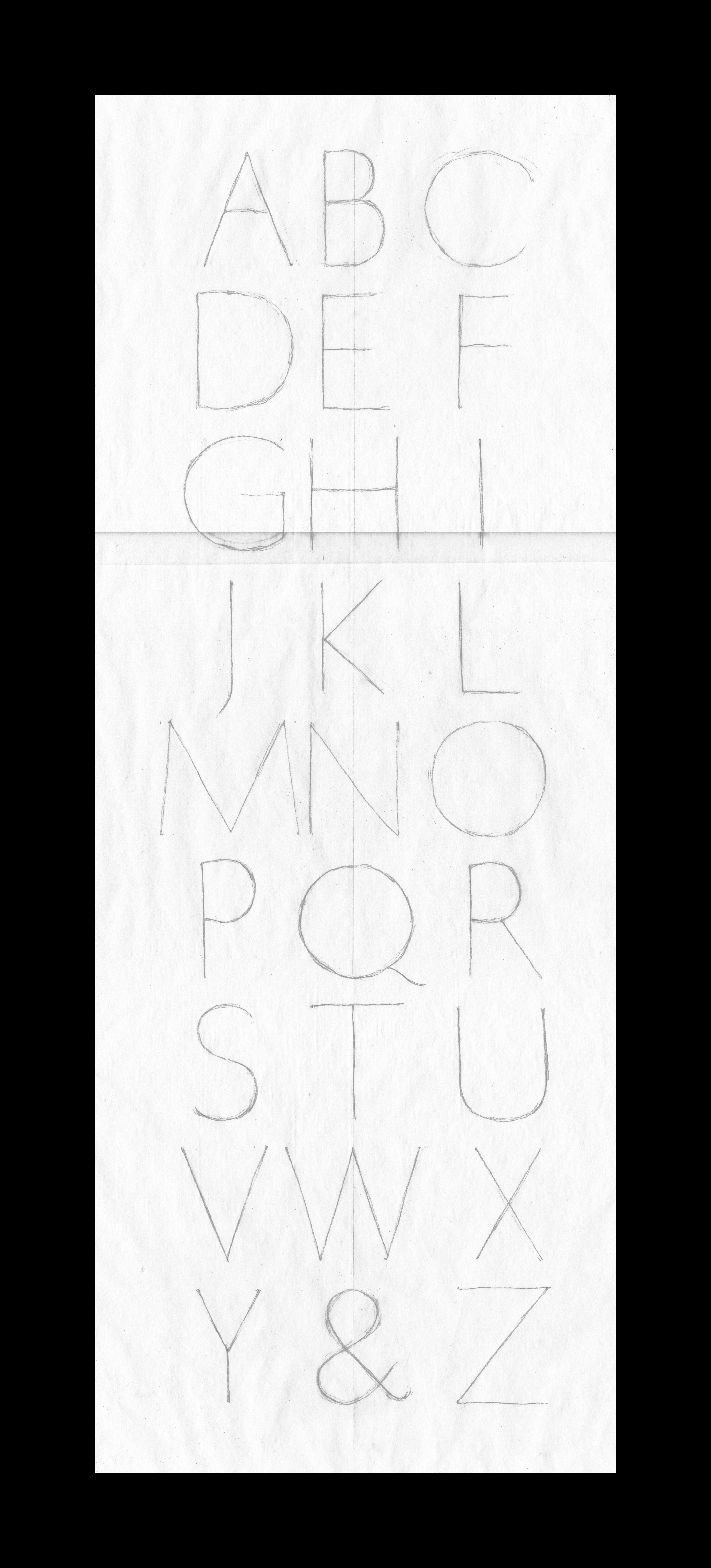
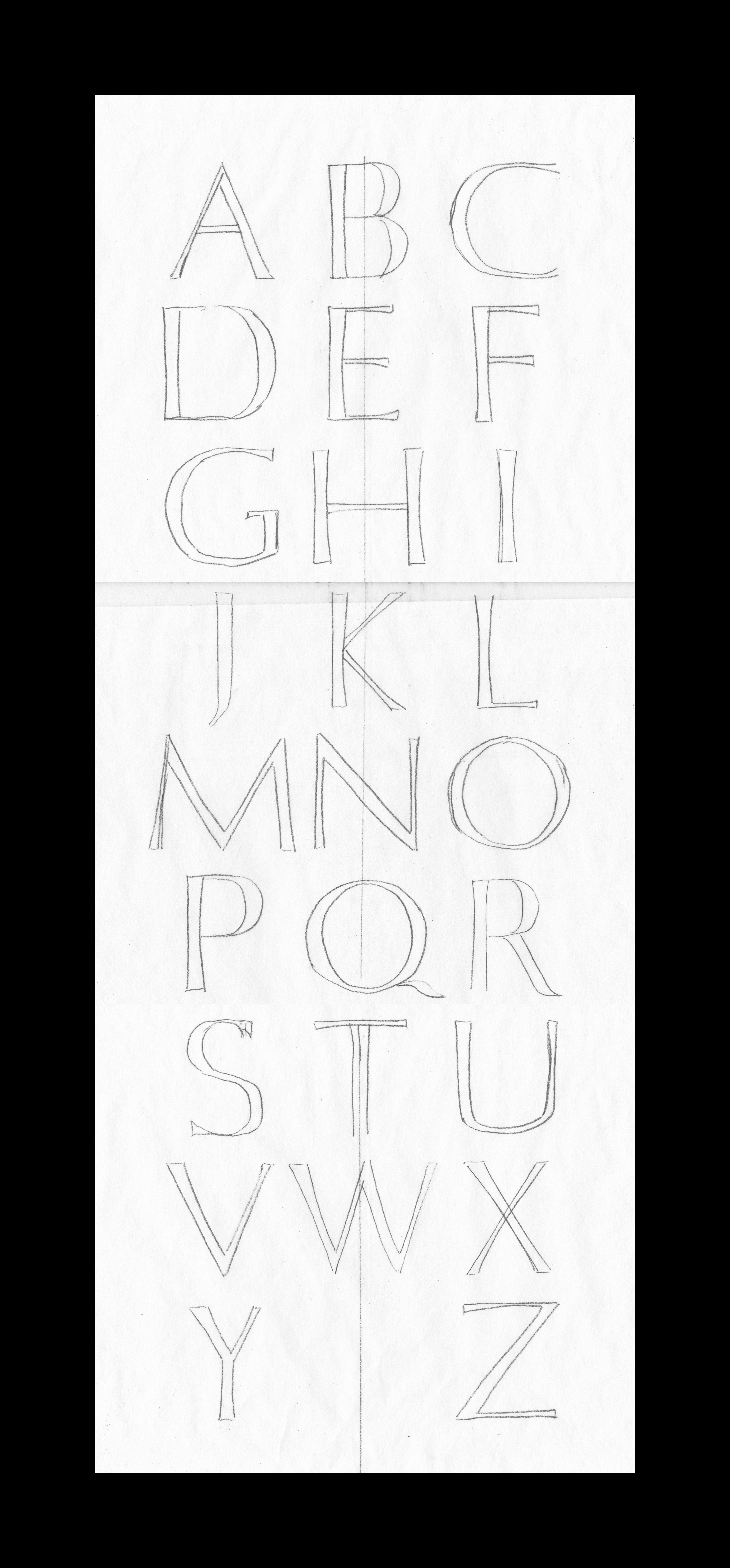
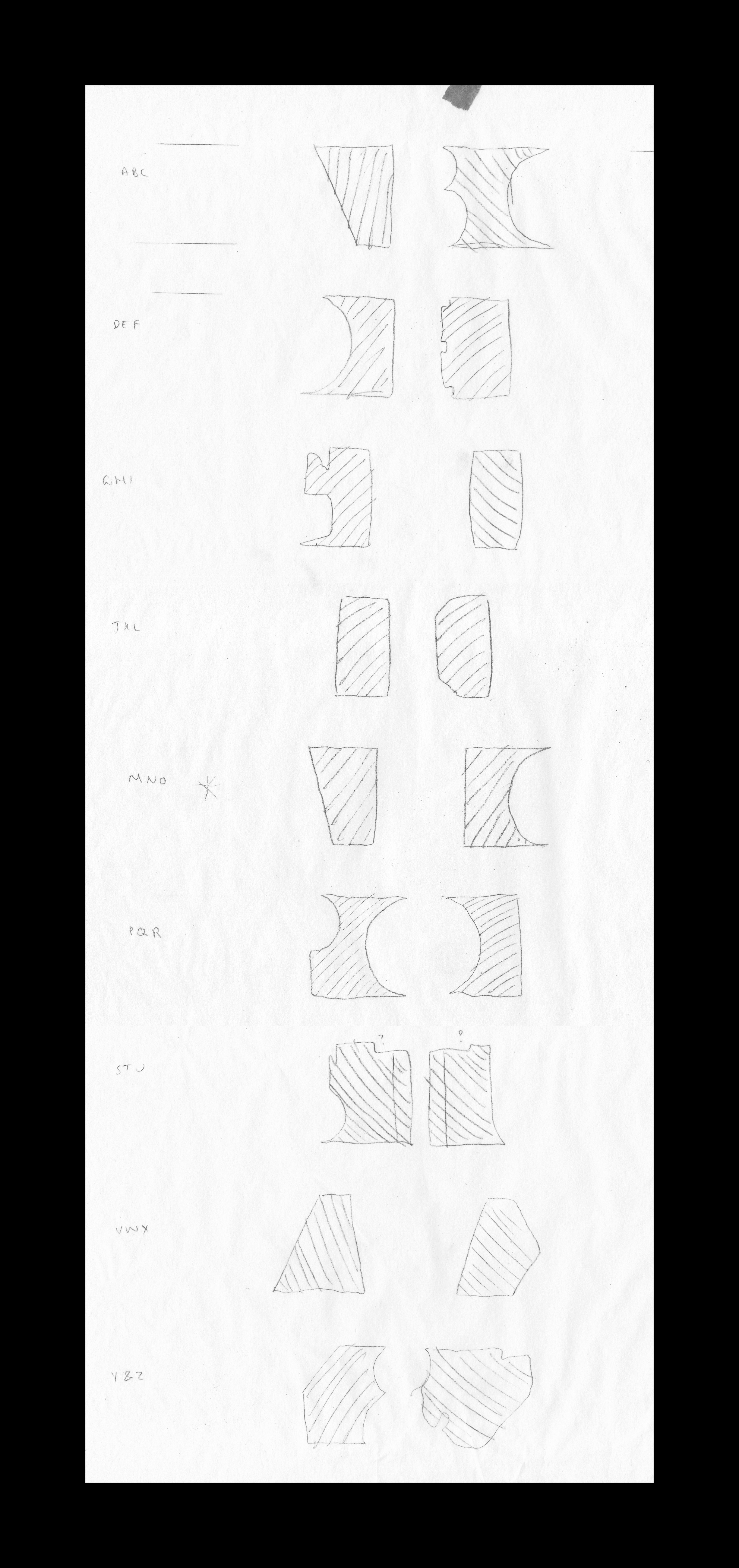
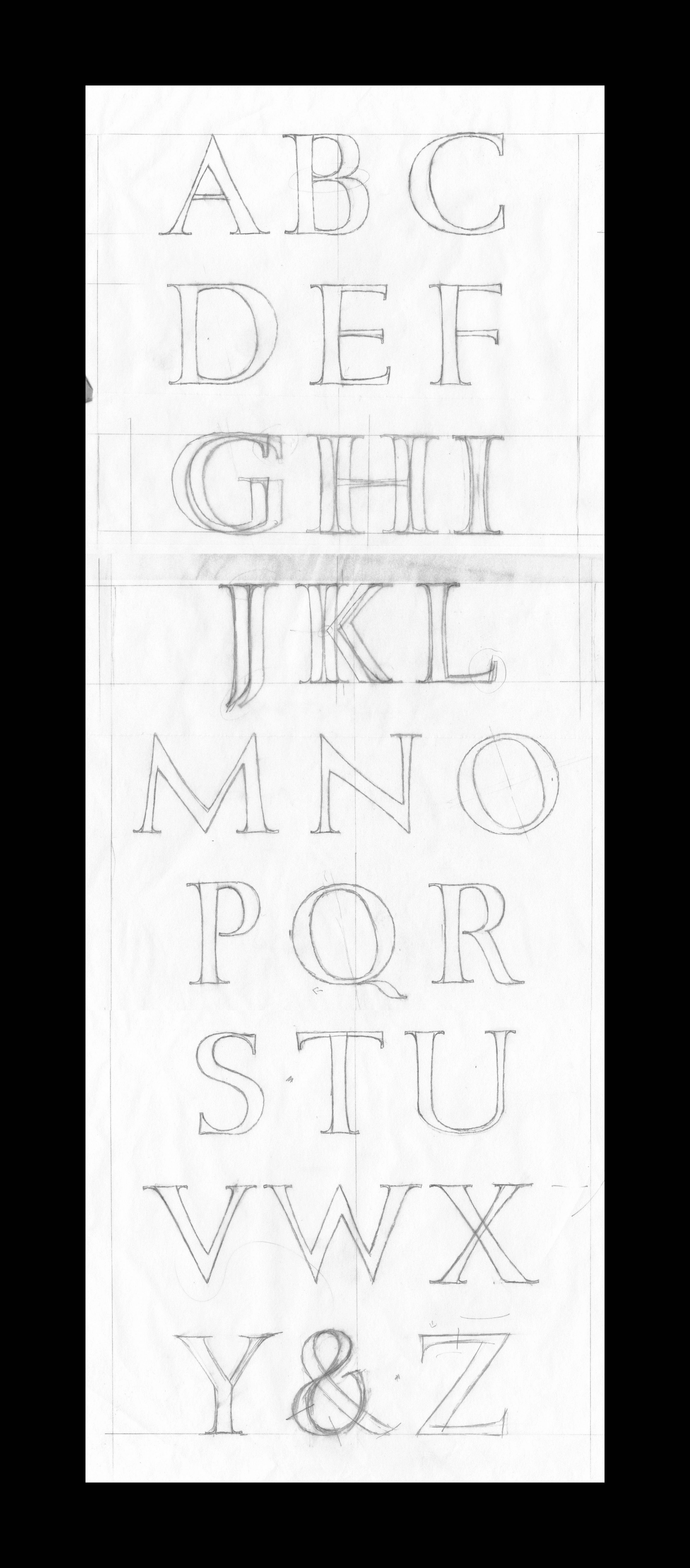
Once I have decided upon the spacing and I’ve made any changes that Charlotte suggested, we go through each letter’s shape and specific characteristics. Throughout this project I am redrawing the letters and gaining a better understand of how they should look. As well as the technical language used to describe a letter.
When I’ve redrawn the ‘final’ alphabet, we start preparing the stone.
02. Preparing the Stone ︎︎︎