09. Italics
Italics are a style of lettering I will use regularly as a letter carver, in this case as with my lowercase piece, I will do a ‘classic’ italic letterform, based mainly on brush lettering. The italic letterform can have slightly different uses to a Trajan capital or uncial. Often used in a more whimsical sense, there can be an informality to it, when used for poetry or verse, but it is also useful for setting apart information, such as a name, from a description.
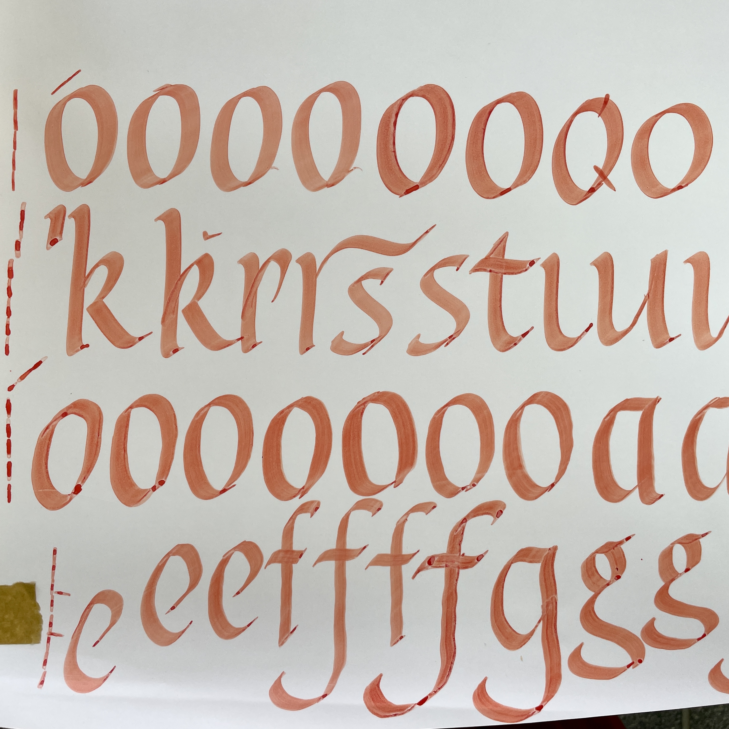
Figs. 1 - 4 As in introduction to the italic letterforms we did some brush lettering. In contrast to lowercase brush lettering where you hold the brush at 30 degrees, for italics, you hold the brush as 45. This contributes to the slanted look of the letters and the placement of weight, giving the letters their characteristic springing look.
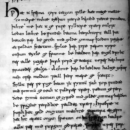
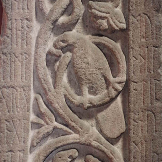
I again returned to the Exeter book for inspiration, and this time decided on a few lines from the poem the ‘The Dream of the Rood’. ‘The Dream of the Rood’ recounts the events of the Crucifixion from the perspective of the cross, the Rood. The text of the poem is found in the Vercelli Book, in the Cathedral of St Andrew in Vercelli Italy Fig. 5. Part of the text also appears carved in runes on the Ruthwell cross Fig. 6. One of the few remaining stones from this period. A cast of which can be seen in the Museum of Classical Archaeology in Cambridge.
I chose two lines from the start of the poem which I felt had a strong visual evocation, despite this being a short extract from the poem. This section also makes reference to the ‘Tree’ the narrator of the poem.
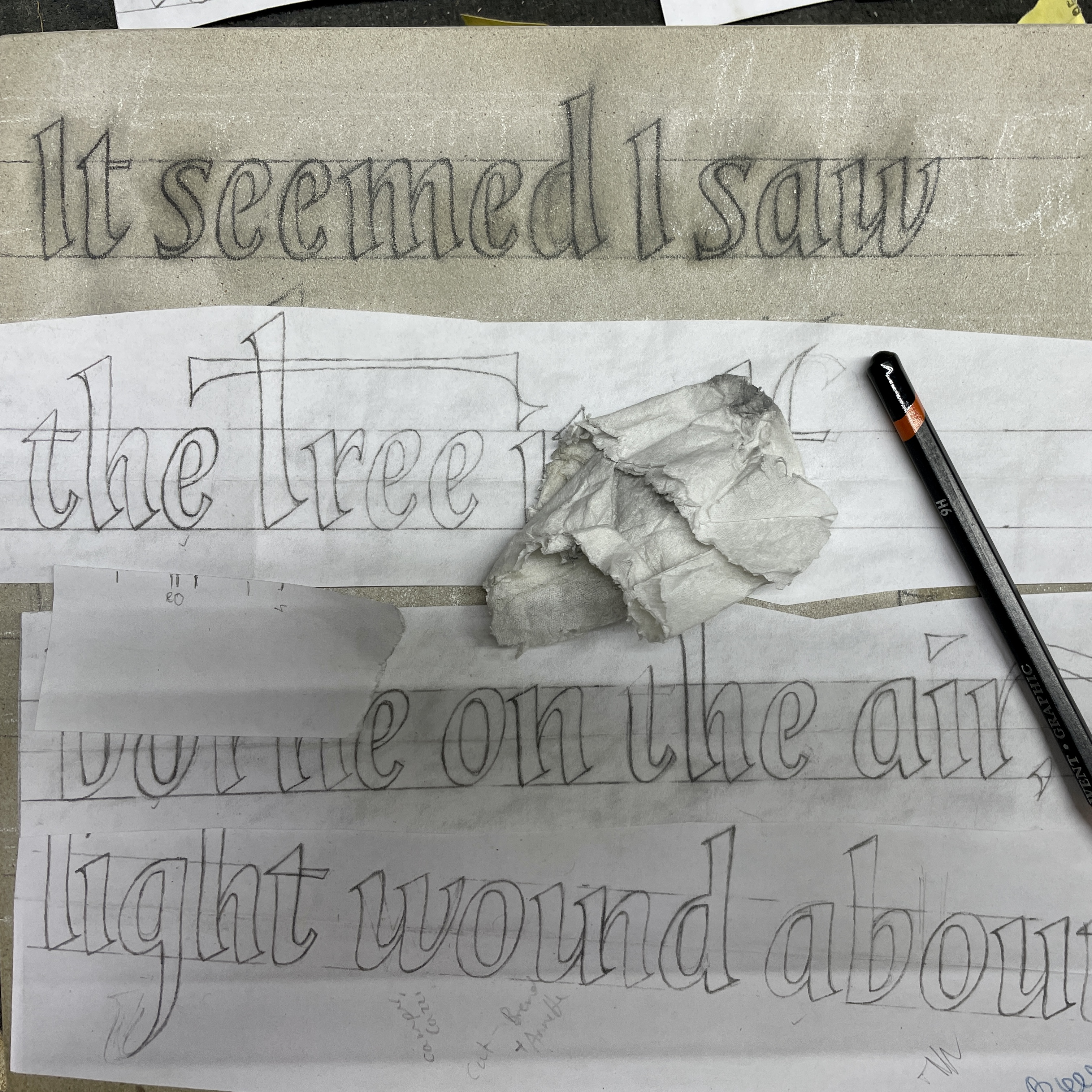
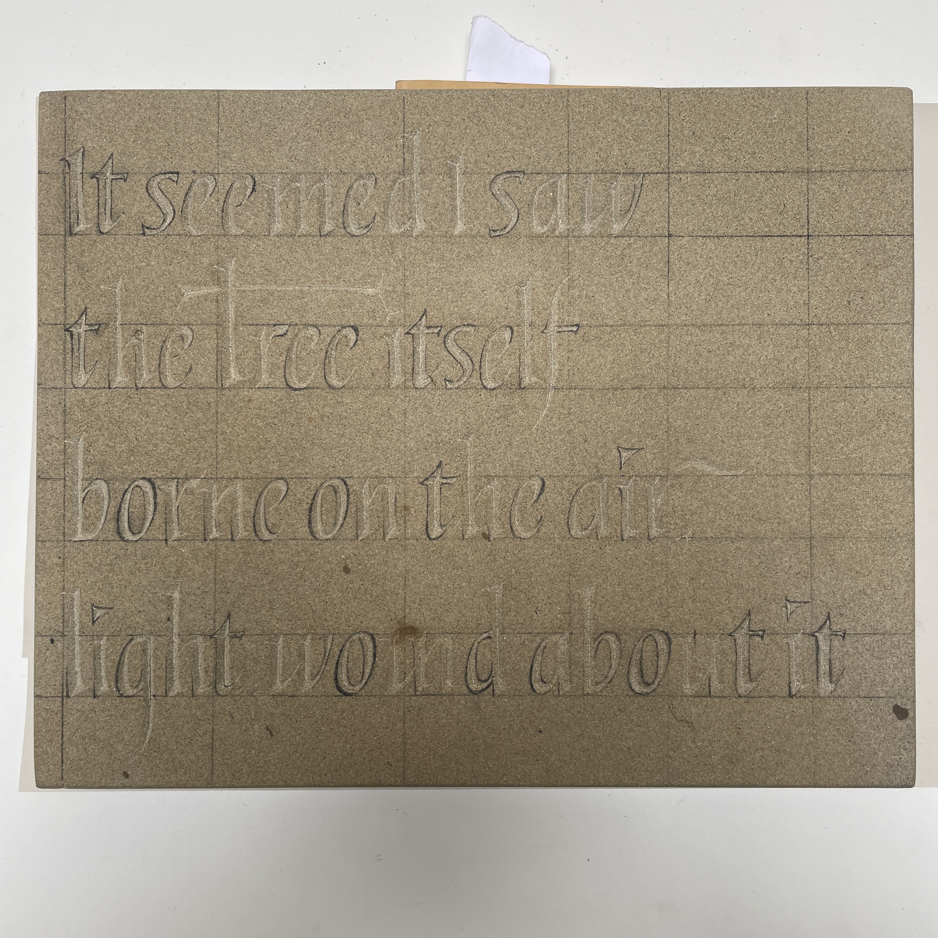
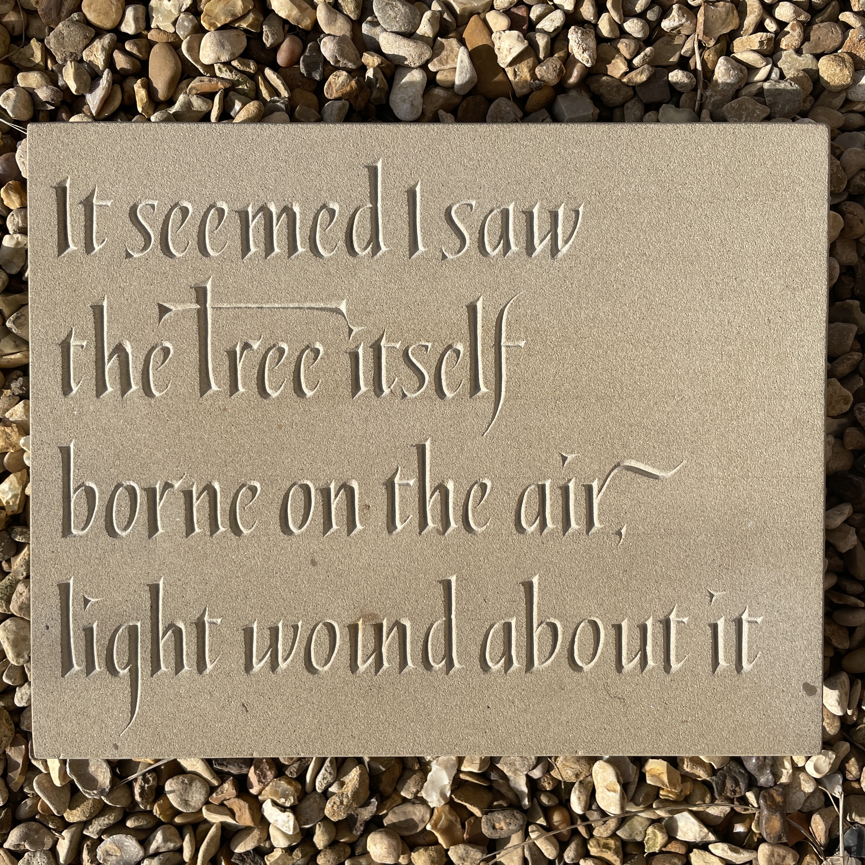
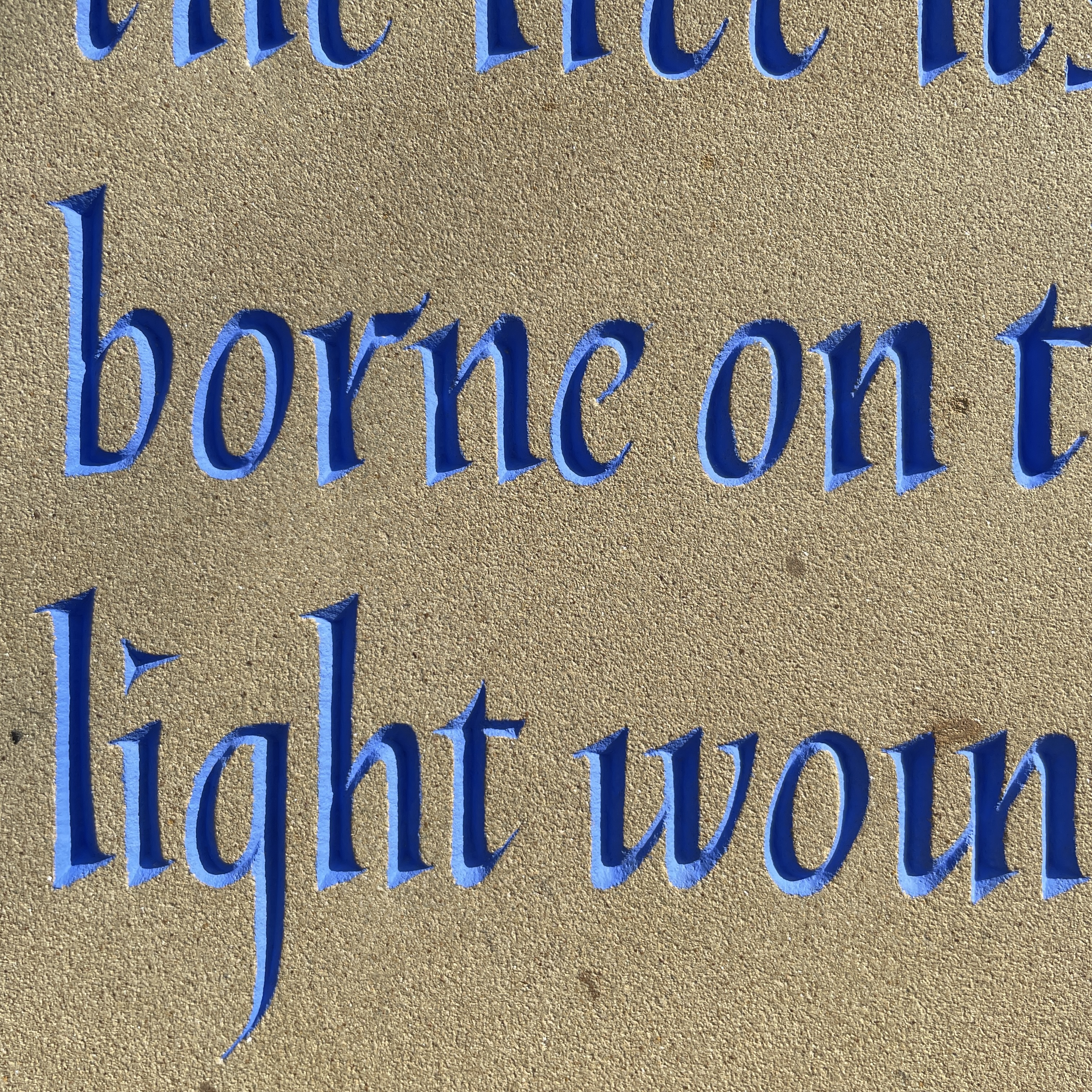
It seemed I saw the Tree itself
borne on the air, light wound about it
Fig. 7 We approached this design from a slightly different method, instead of starting with skeleton forms and sketching the layout on paper, we worked directly onto the stone in chalk and then white pencil to work out the layout. This method cuts out transferring the design to the stone to check that it fits, as you’re working directly with the size of the stone. As this piece of text is from a poem and has its own rhythm and emphasis I felt it was clear that these two lines could be cut into four, to fit on the stone. However this left two long lines and the rest short, so we experimented with different orientations of the stone, in case there was a more balanced way of having the text.
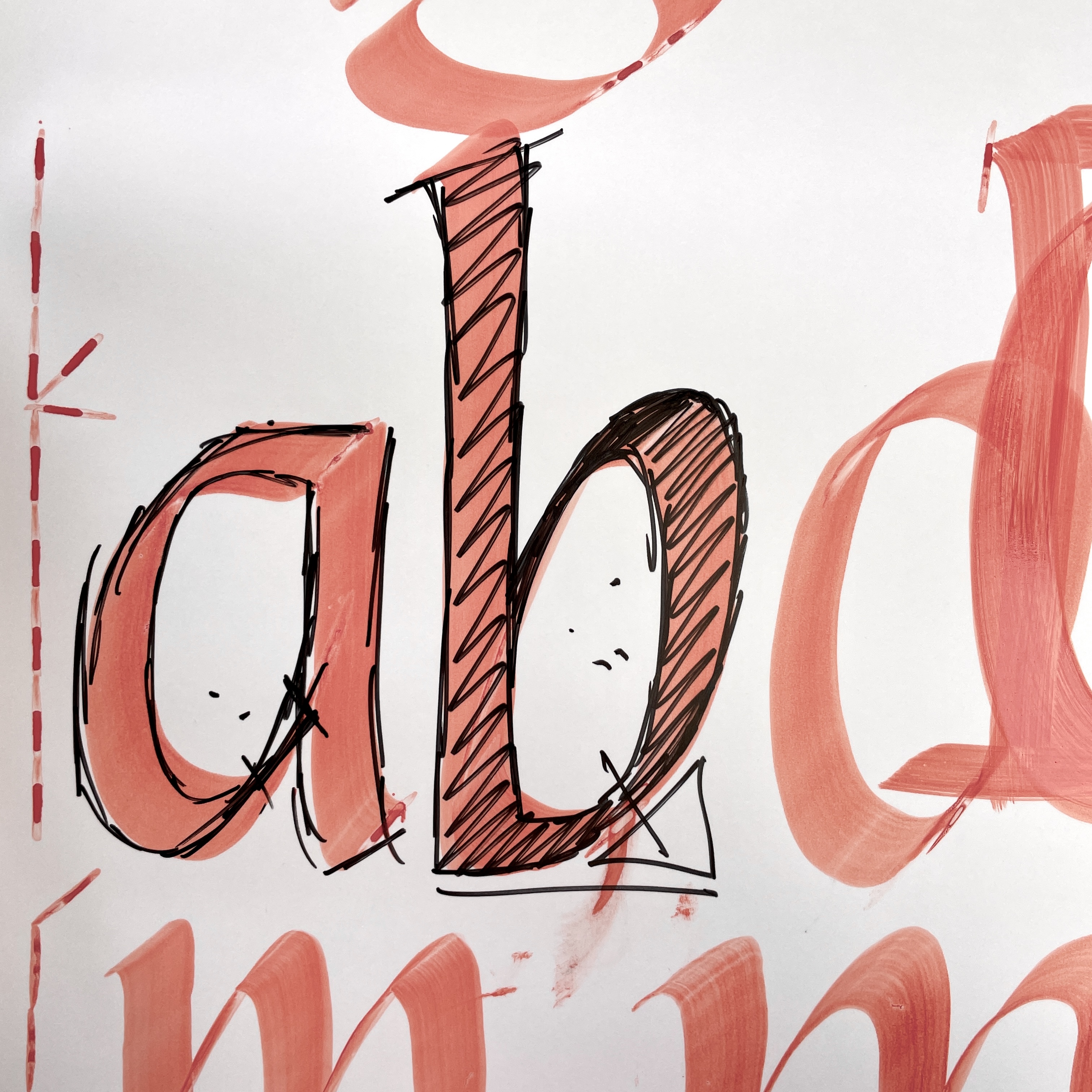
Once the layout was decided, I started to draw the words out with spacing in mind. As there was one line that fitted the whole width of the stone, I drew this line first, as essentially it will determine the spacing for the rest of the text. Whilst I’m drawing the letters I’m paying attention to the negative space inside the letter, the internal shape of the ‘o’, ‘a’, ‘d’, ‘g’, for example should all be roughly the same. The internal shapes of the ‘n’, ‘m’, ‘h’, ‘u, ‘w’ and ’t’, also should be uniform. I’m trying to achieve a coherence across the whole piece, so that nothing stands out. Fig. 10 However, I do want the ‘Tree’ to have a greater presence on the stone, as it is referring to the ‘Tree’ of the crucifix and the narrator of the poem. At first I struggled to get the proportion of the cross bar right, so I went back to drawing the word with a brush and combined a slightly more Trajan capital ‘T’ with the exaggerated cross bar to get the impact I was after. As with all the pieces I’ve made so far in the apprenticeship, by the time I come to draw the letters on the stone I have copied them out a number of times before, this was particularly helpful on this occasion, as the York stone produced quite a smudgy line, which was difficult to get precise, as you can see in Figs. 8 - 10.
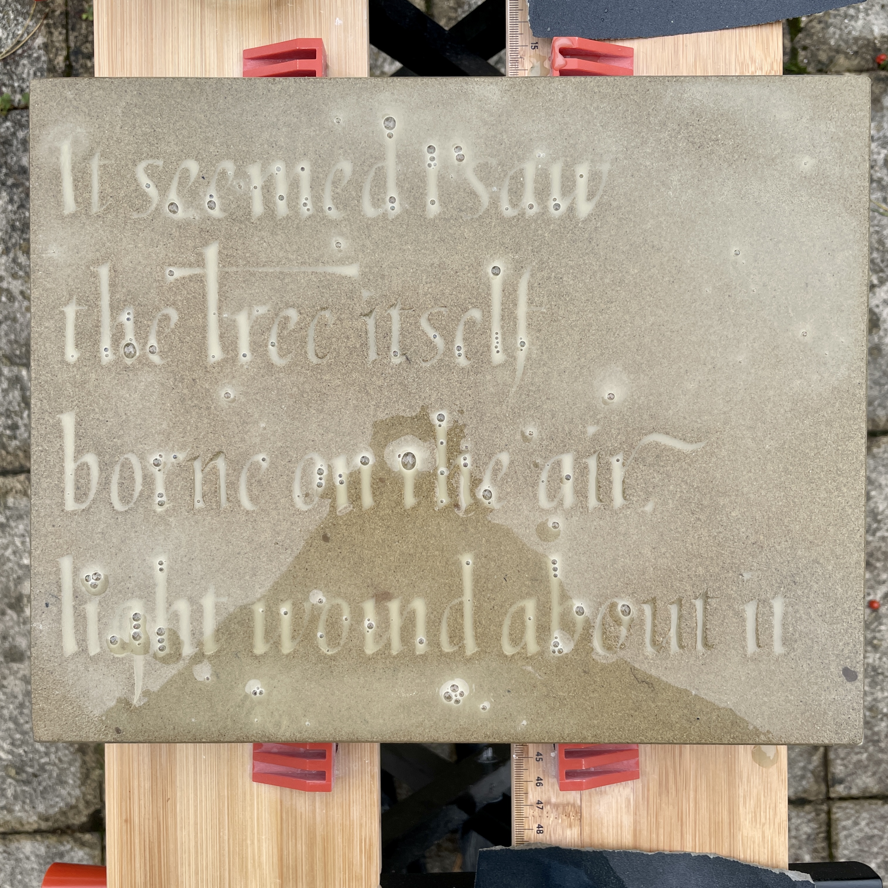
I found carving the York stone quite slow going, mainly due to the need to regularly sharpen my chisels. York stone is a sand stone, which has a dulling effect on the tungsten chisel, almost like carving sand paper. When sharpening I was advised to keep the chisel tip fairly wide, when working on a coarse stone, this helps to remove material when roughing out the letters. I found towards the end of carving that I also wanted a chisel with a finer point to cut a sharp edge on the letters. I was also aware of keeping my letterforms slightly wider than I might in another stone, this was also because of the texture of York stone, being fairly soft, but with a grainy texture.
Because of its light sandy colour, I was aiming for a deeper cut than I might normally, having the letters a little wider made this easier to achieve. The deeper the v-cut the more legible the letters will be in poor lighting, an important consideration if the stone is going to be kept outside. You can see the difference in Fig. 12 where I’ve drawn on alterations in my studio, where the light is from above and casts almost no shadow. Compared to Fig. 13 of the stone on the easel with directional lighting catching the v-cut.
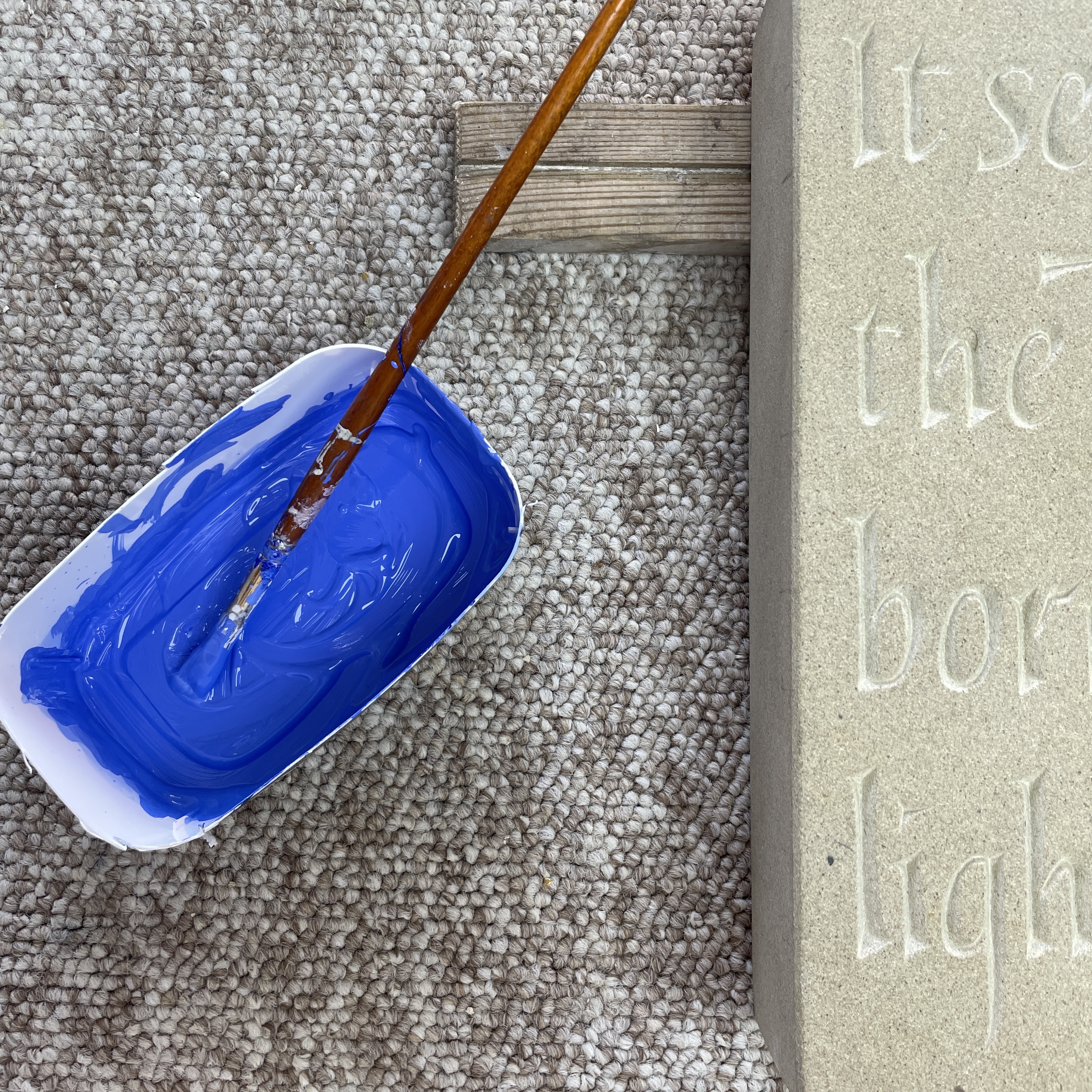
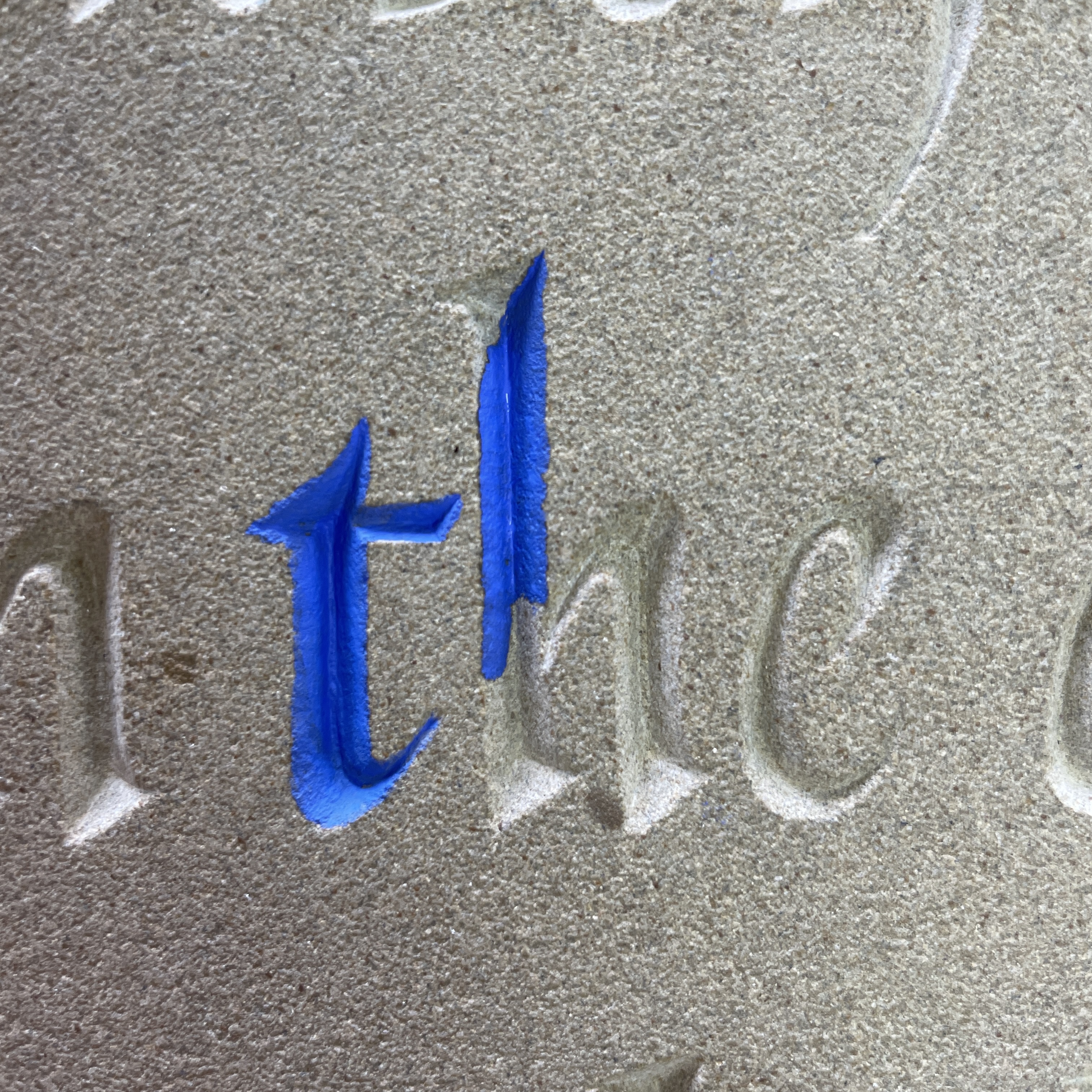
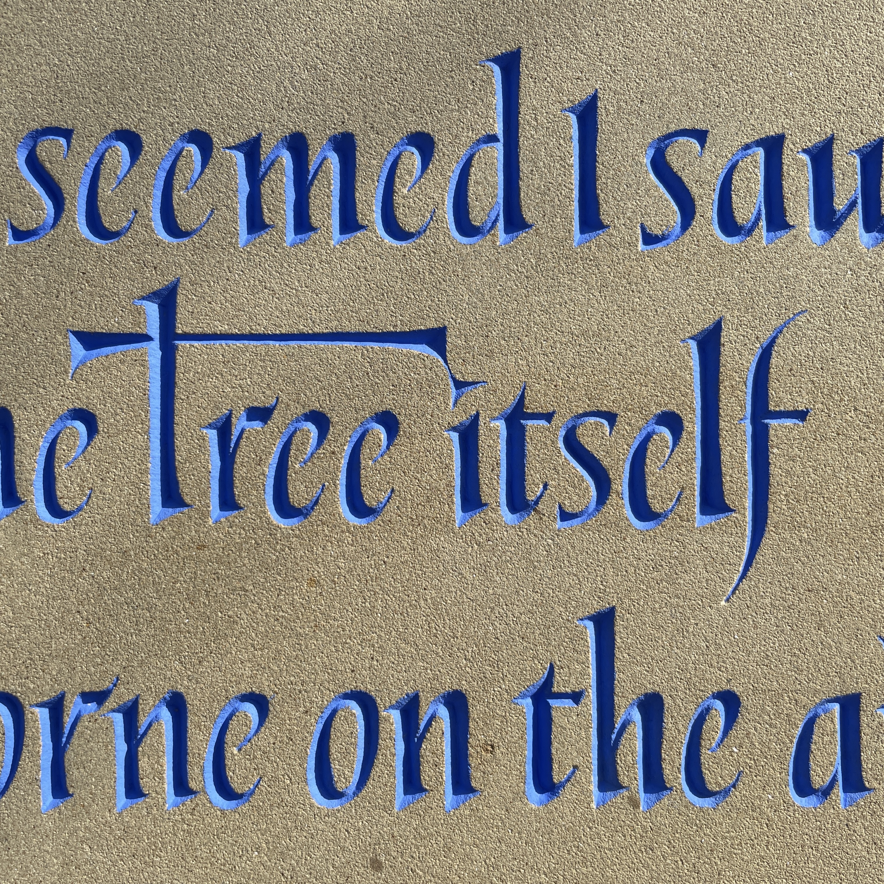
After finishing the carving Charlotte advised me to paint the letters as there was an unfortunate discolouration in the stone above the ‘un’ in the last line, which slightly confused the legibility of the letters Fig. 20. Painting the letters would make them stand out from the stone and lessen the effect of the discolouration. I decided on a bright sky blue and we mixed the colour with a base of sign writers paint, which include chemical dryers and oil paint to get the right colour. As York stone is porous, I needed to be especially careful when painting the letters not to get any paint outside the edge of the letter, as I wouldn’t be able to take it off later. This took me the best part of a day to finish, as you need to work the paint into the stone, to be sure it’s not sticking to any dust. I painted two layers for maximum coverage which allowed me to go over any parts I’d missed. After a final sand over the surface the piece is complete Fig. 22 - 25.
References
The First Poems in English, trans. Michael Alexander, Penguin Classics, London, 2008.
10. Sign writing ︎︎︎ coming soon