

06. ‘torc’
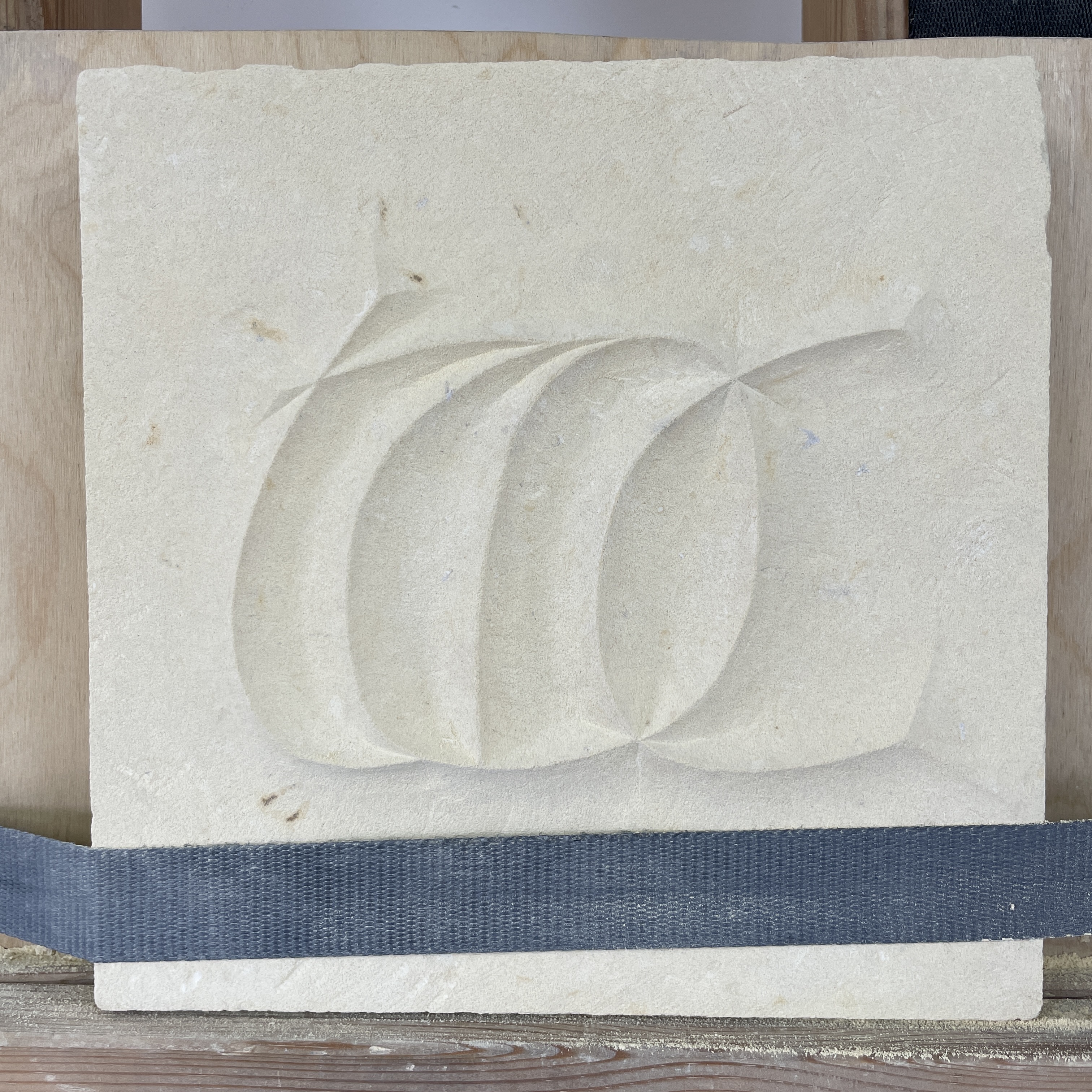
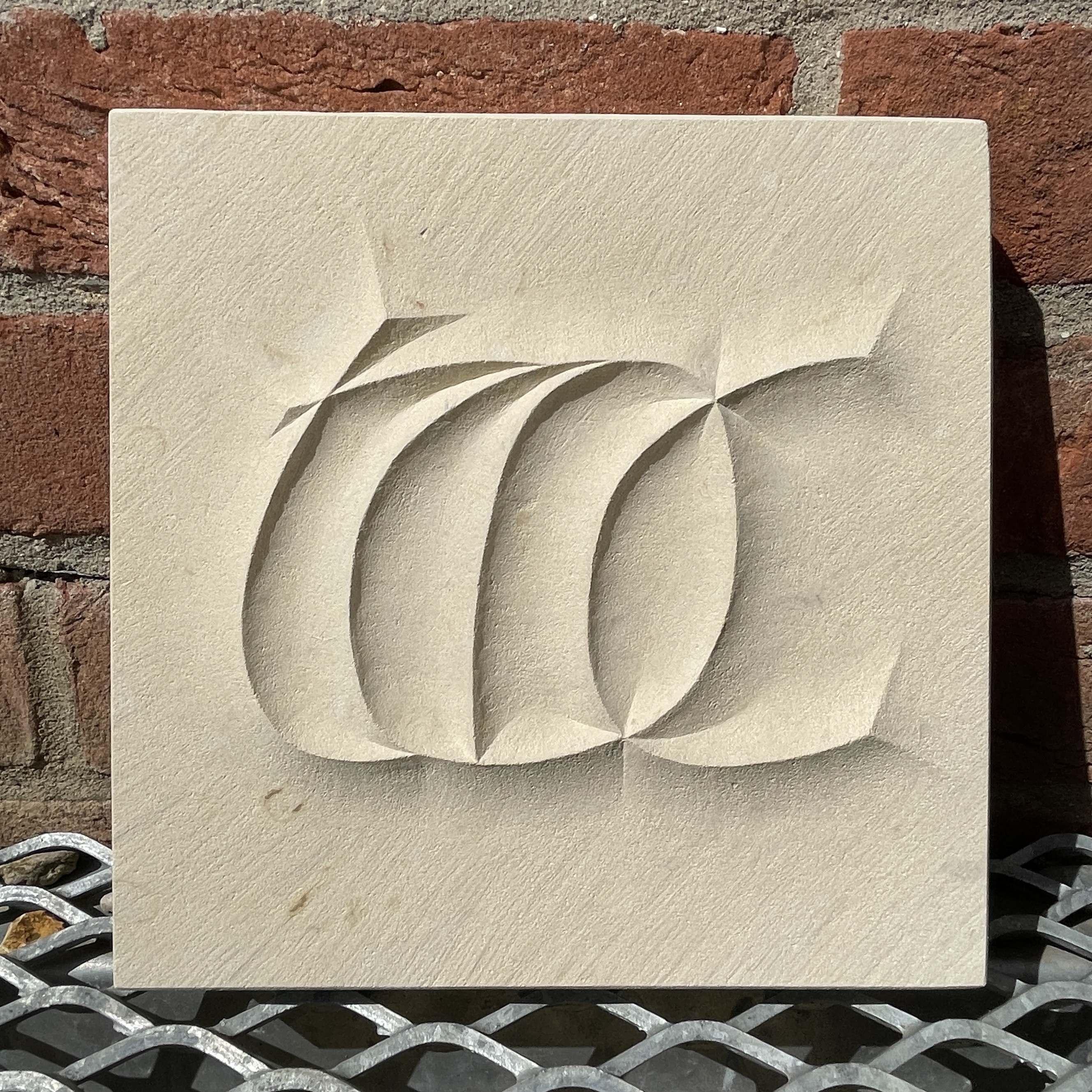
I was kindly invited to submit a piece for an exhibition showcasing the work of recipients of LCAT funding. I only had a month and a half to design and carve the piece so we decided to work on a small scale and Charlotte suggested a soft lime stone. We took this as an opportunity to try carving a more sculptural piece which would have a bit more freedom with regard to style and concept.
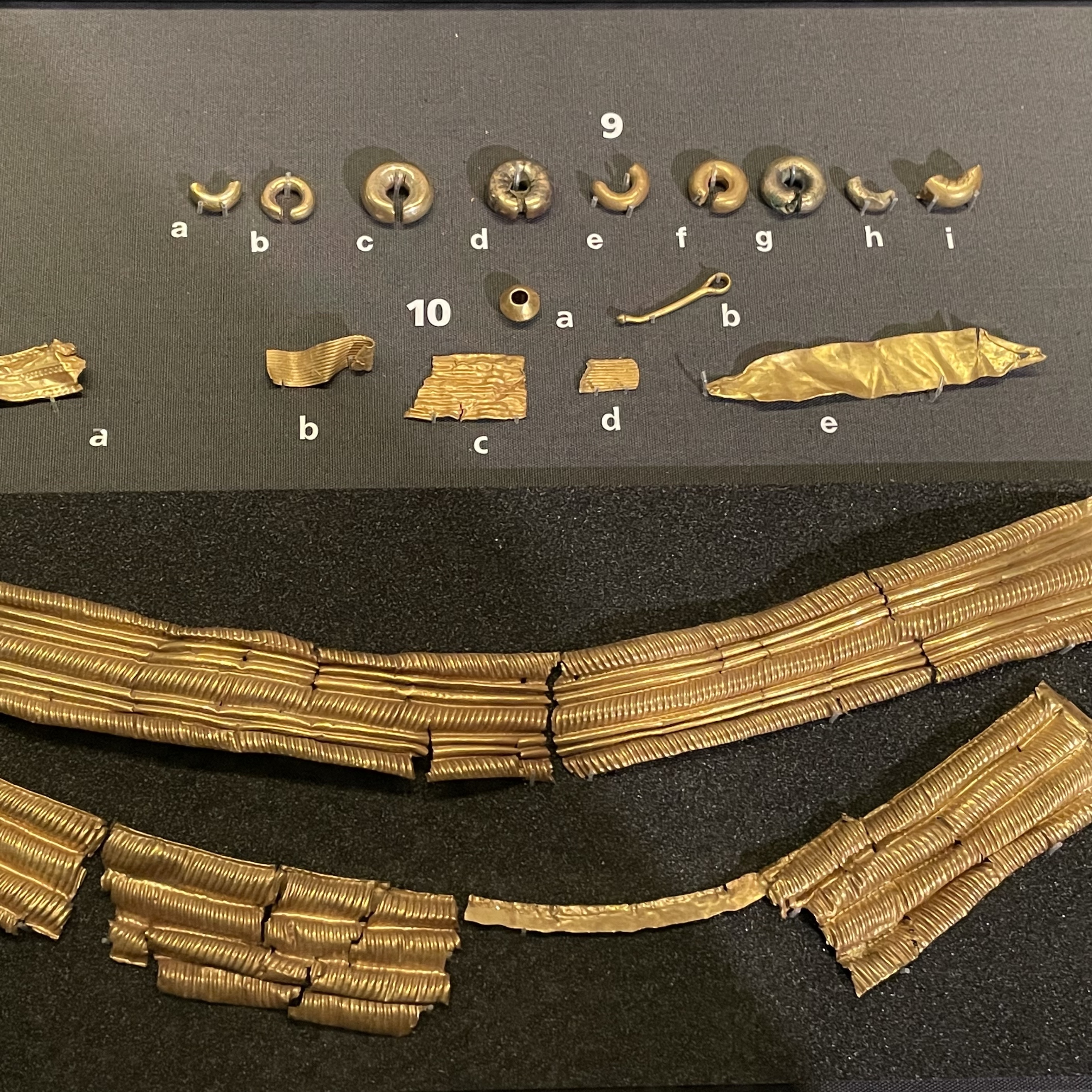
My starting point was sketches I had done on a day drawing around Norwich the previous month. I was particularly drawn to the abstract yet minimal forms of the objects on display in the Norwich Castle Museum from the Iceni period. In particular the twisting form of torcs. Fig. 1-3 The collection holds a wide selection of coins and gold objects from the Iceni period, the majority of which were found in an around Norfolk/Suffolk, as that is the area the Iceni tribe inhabiting around AD 43-61.
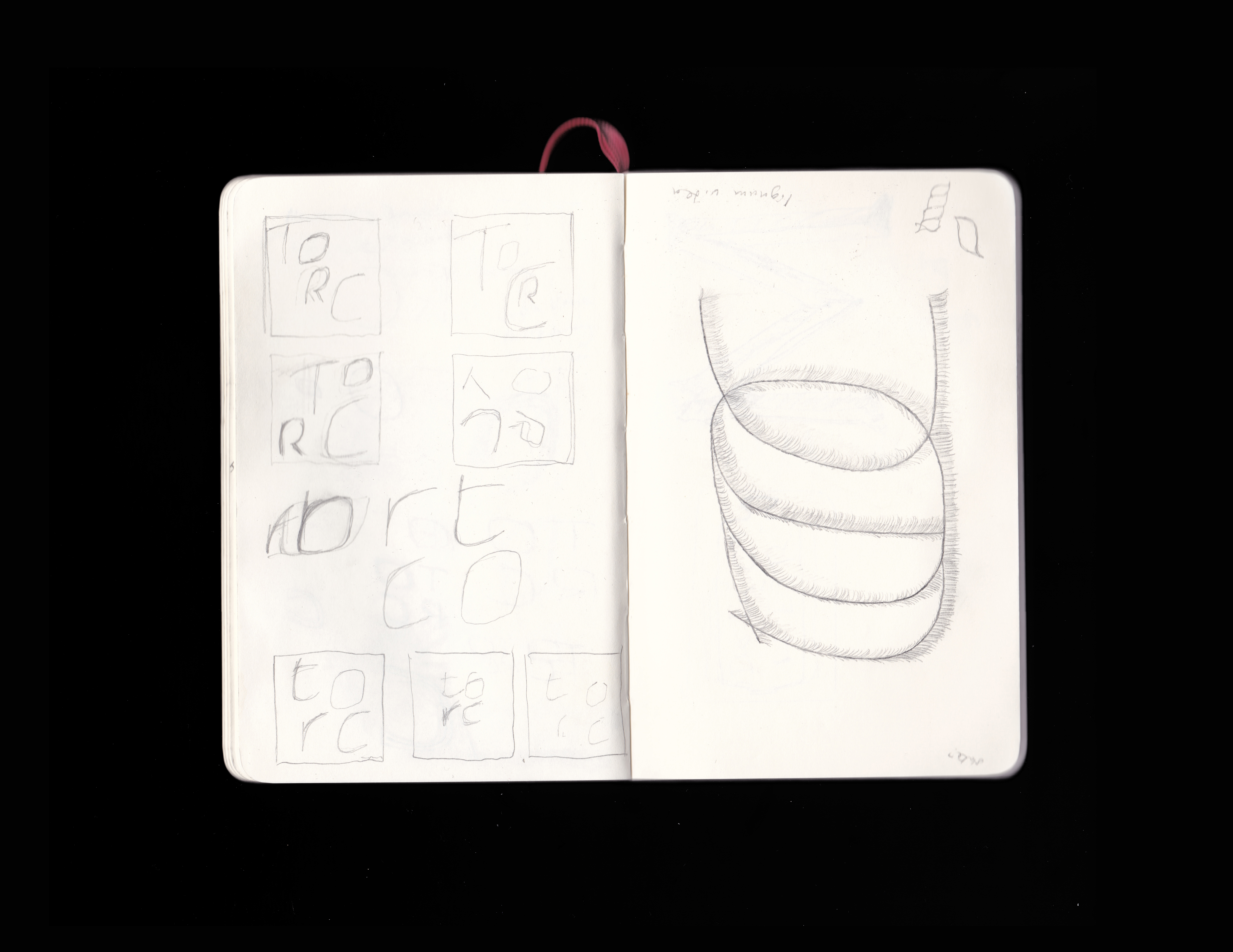
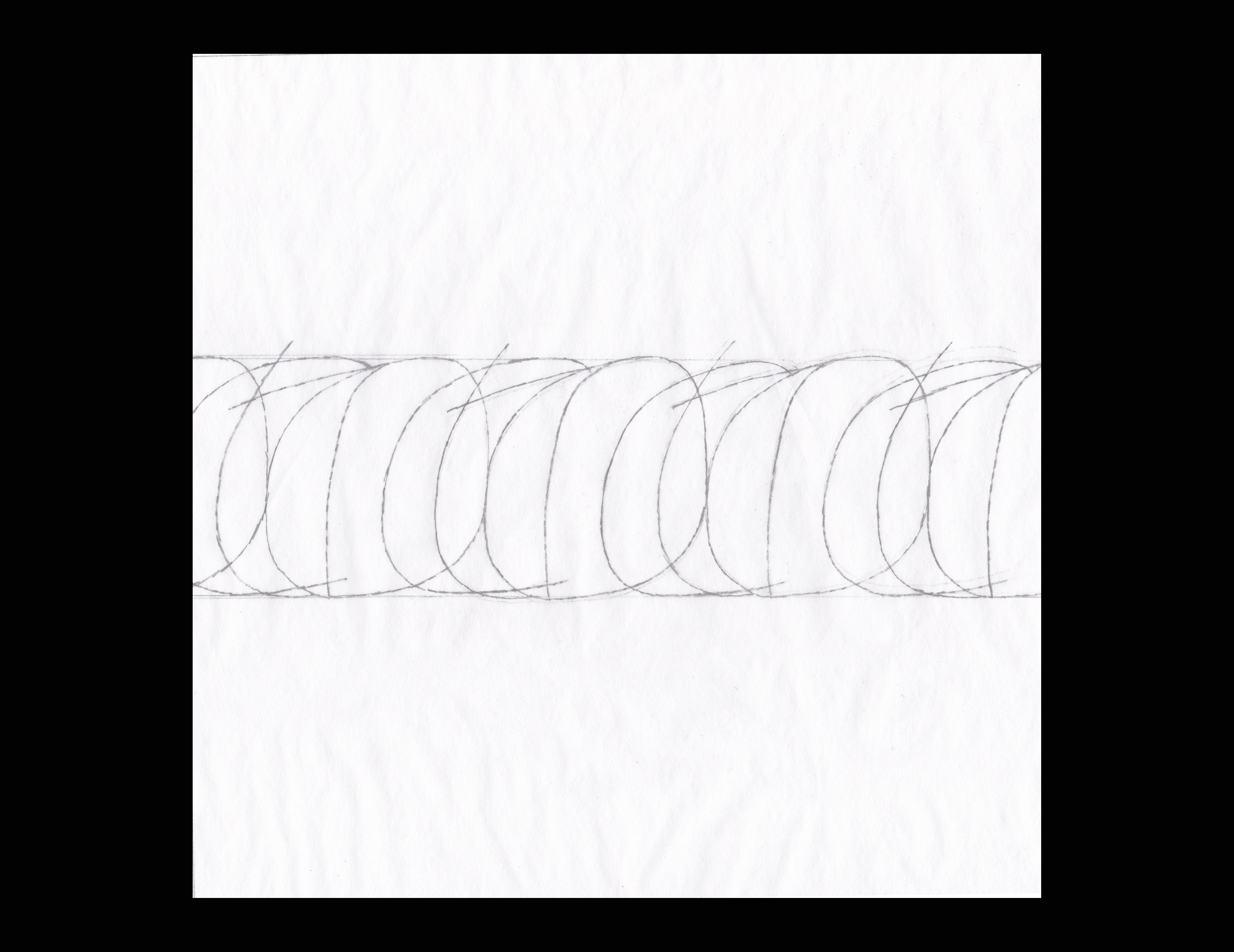

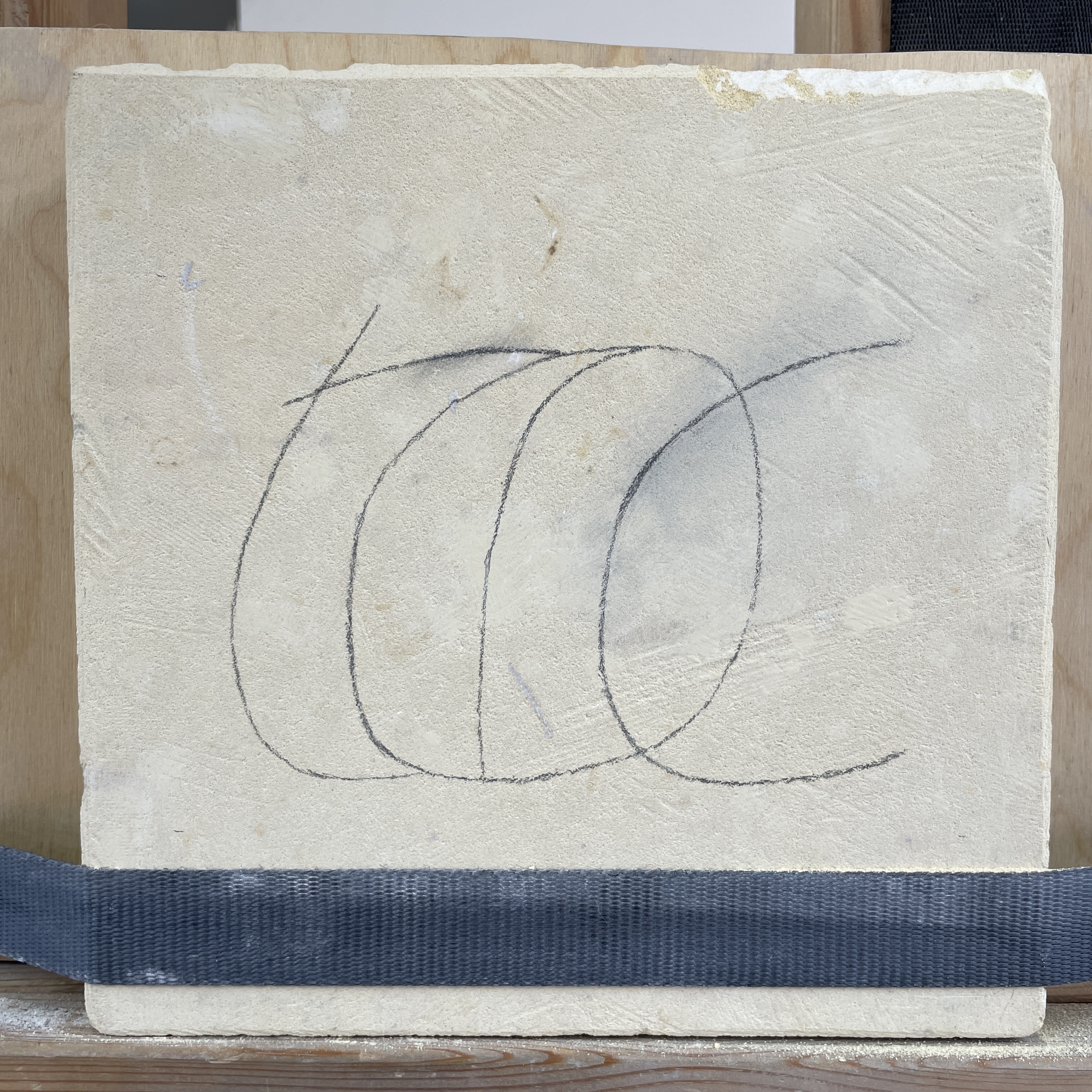
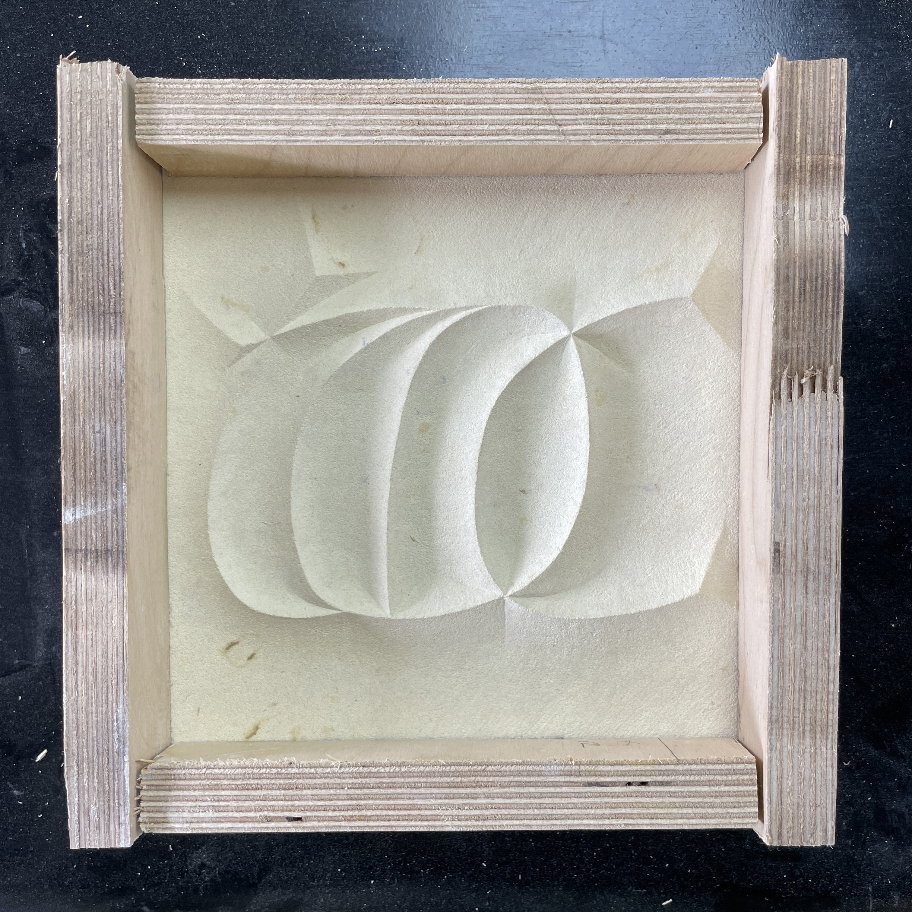
The piece of stone I was working on was square, 200 x 200mm, which proved slightly difficult to work out a composition for a four letter word, which lead me to think about how I wanted the letters to be cut. Whether they would be raised up with straight edges and the surface around them cut away, or morphing into the stone with curved edges. Whilst playing around with composition I began to overlap the letters, due to the curvature of the letterforms they started to suggest the spiralling lines of a torc. This felt like what I was trying to get at, so I took that idea to a logical conclusion and repeated the word again and again. Fig. 5 I liked how this abstracts the word and works purely as a design, but it would have been too fiddly for me to cut in the soft limestone. We decided on the word by itself at a larger scale. Fig. 6
F
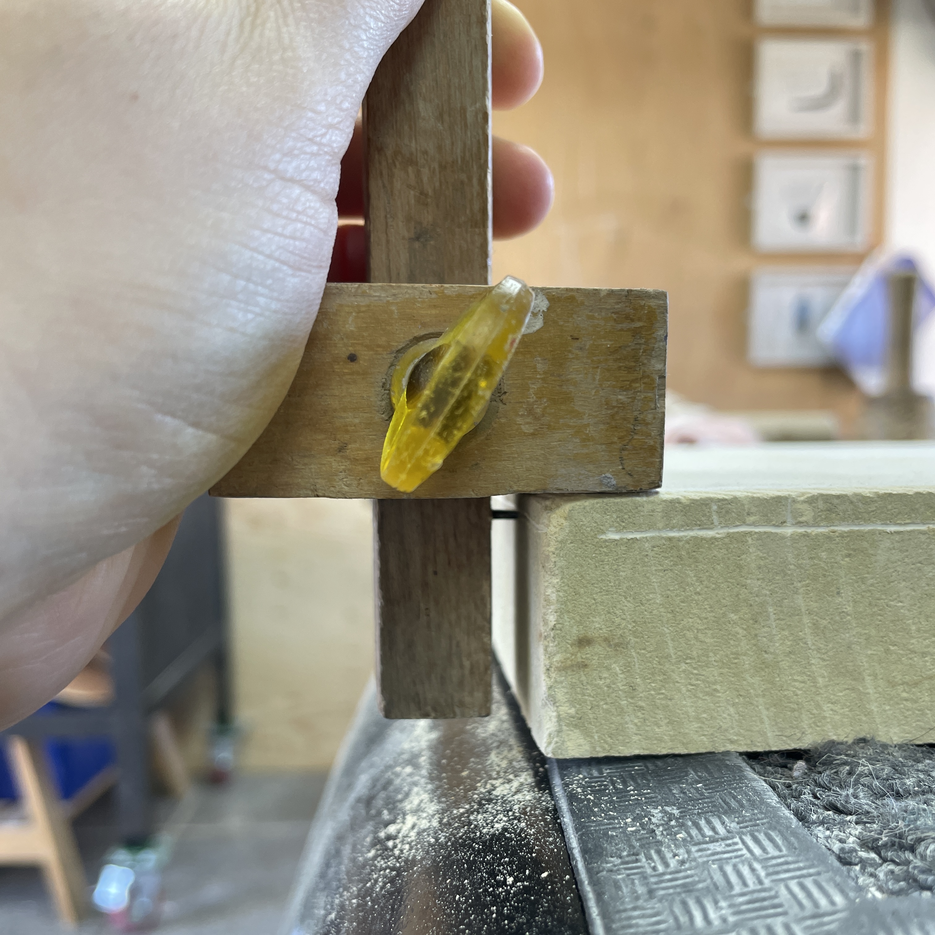
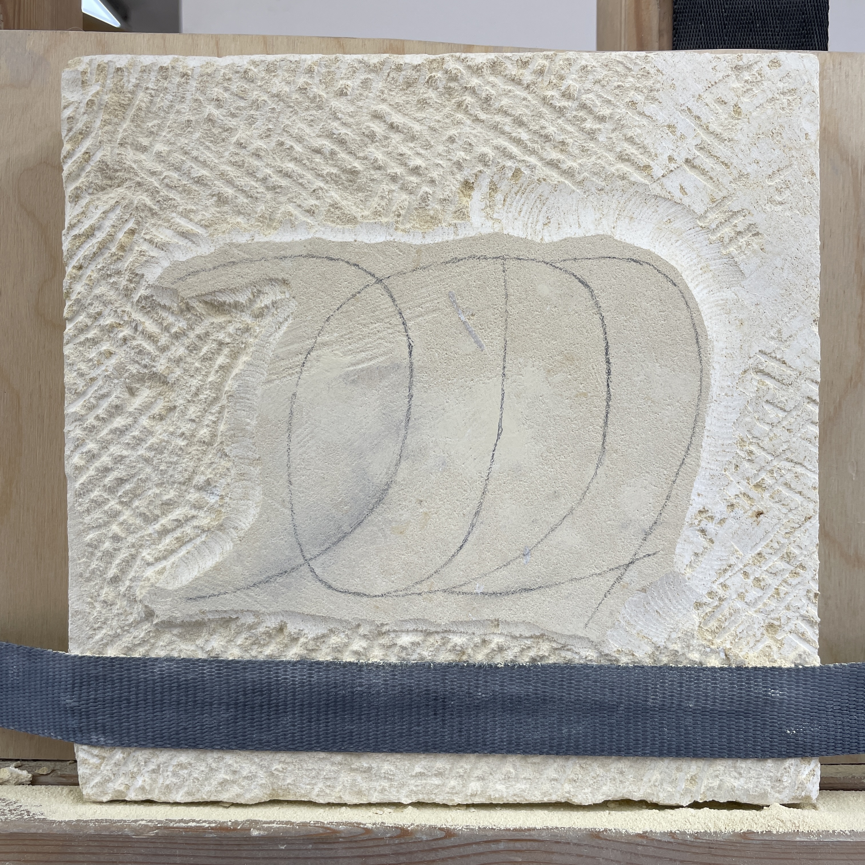
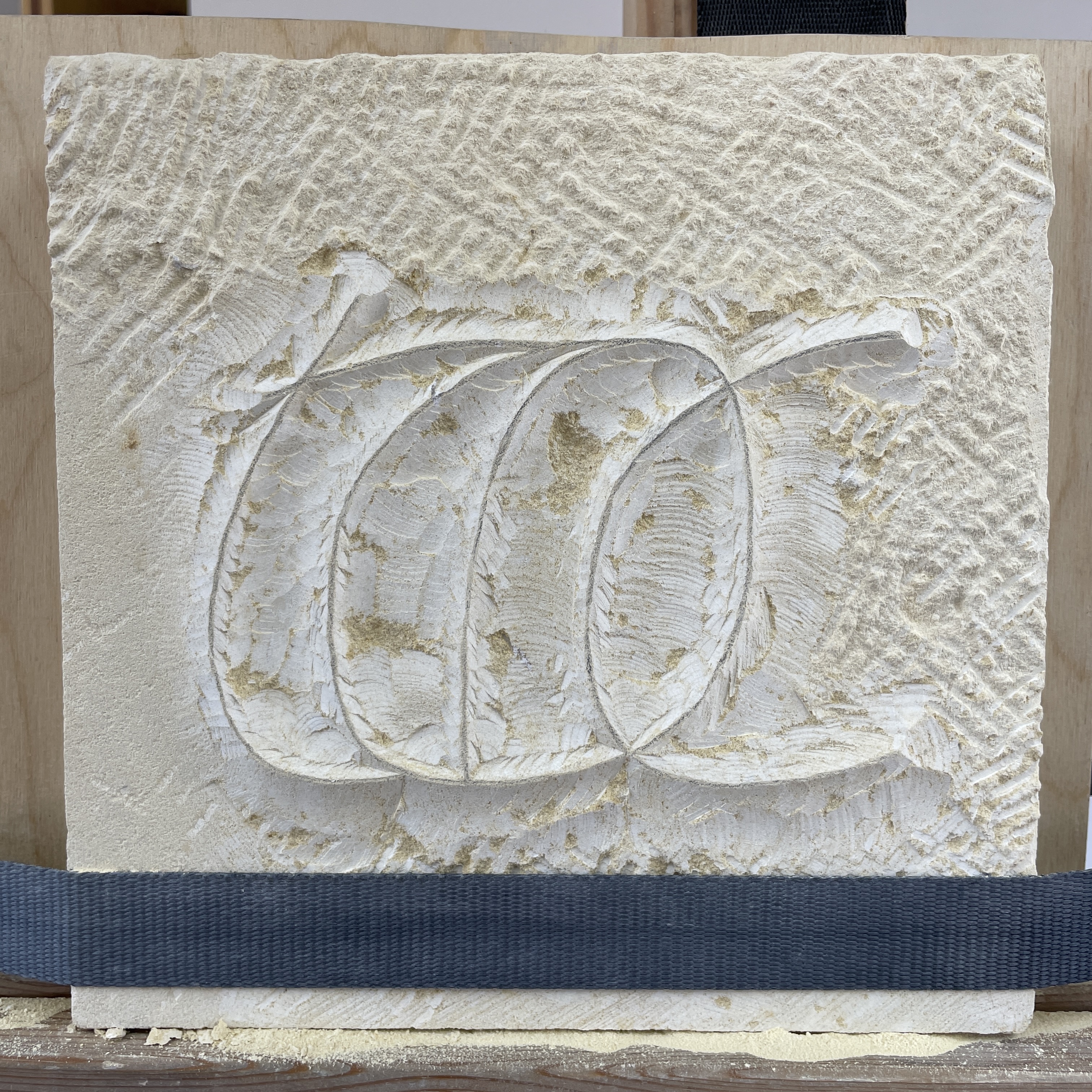
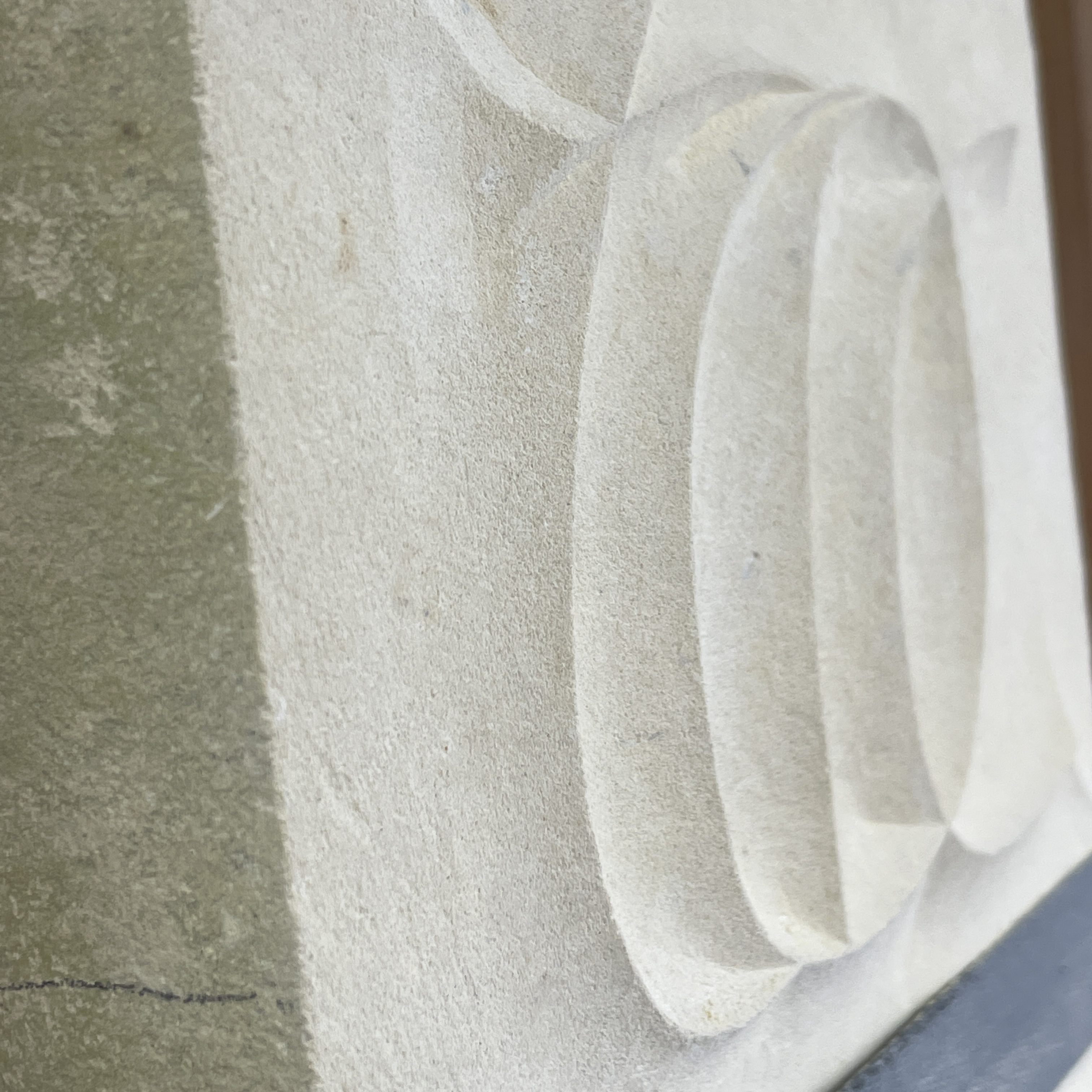
Fig. 7 - 9 To prepare the stone I cut it in half width ways and prepared the surfaces. I drew on the design and we marked the depth I was to cut down to. I then roughed out the background and the insides of the letters. It was important that I cut to the design as close as I could manage. Fig. 10 Using the bull nose chisels I carefully cut away the sloping edges of the insides shapes of the letters. The remainder of my carving was preoccupied with cutting the surround back to an even surface and then smoothing the surface texture as much as I could. Because this stone is so soft almost every mark shows up, so I will put a texture on the background.
07. Lowercase ︎︎︎