Maia Gaffney-Hyde

My Lettering Arts Trust Apprenticeship started on the 10th January 2023, with master carver Charlotte Howarth in West Acre, Norfolk. My apprenticeship will last 2 years, the first 9 months on a part-time basis. I am the 10th LCAT apprentice. 

Lettering Arts Trust Apprentice 2023-24


13. Flourishes


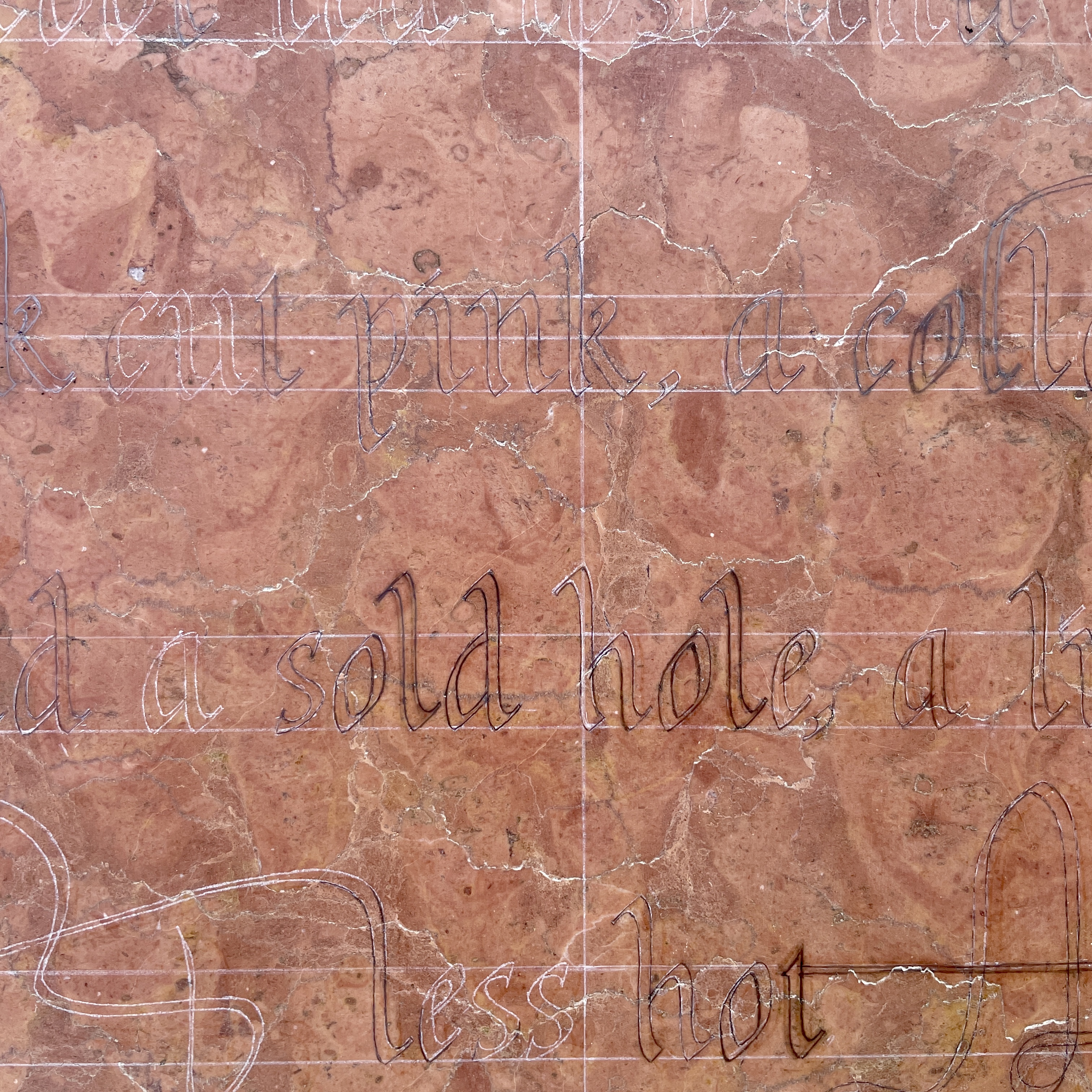
For the next piece I worked on we decided to do a slightly longer body of text, as this would pose a slightly different approach to laying out text. I also wanted to revisit the lowercase calligraphy I had done in an italic style. Charlotte had been given an oval piece of stone, what looked to be a pink marble. I was interested to work on this piece of stone, in part because I hadn’t carved marble before and working within a predefined shape posed a useful constraint.

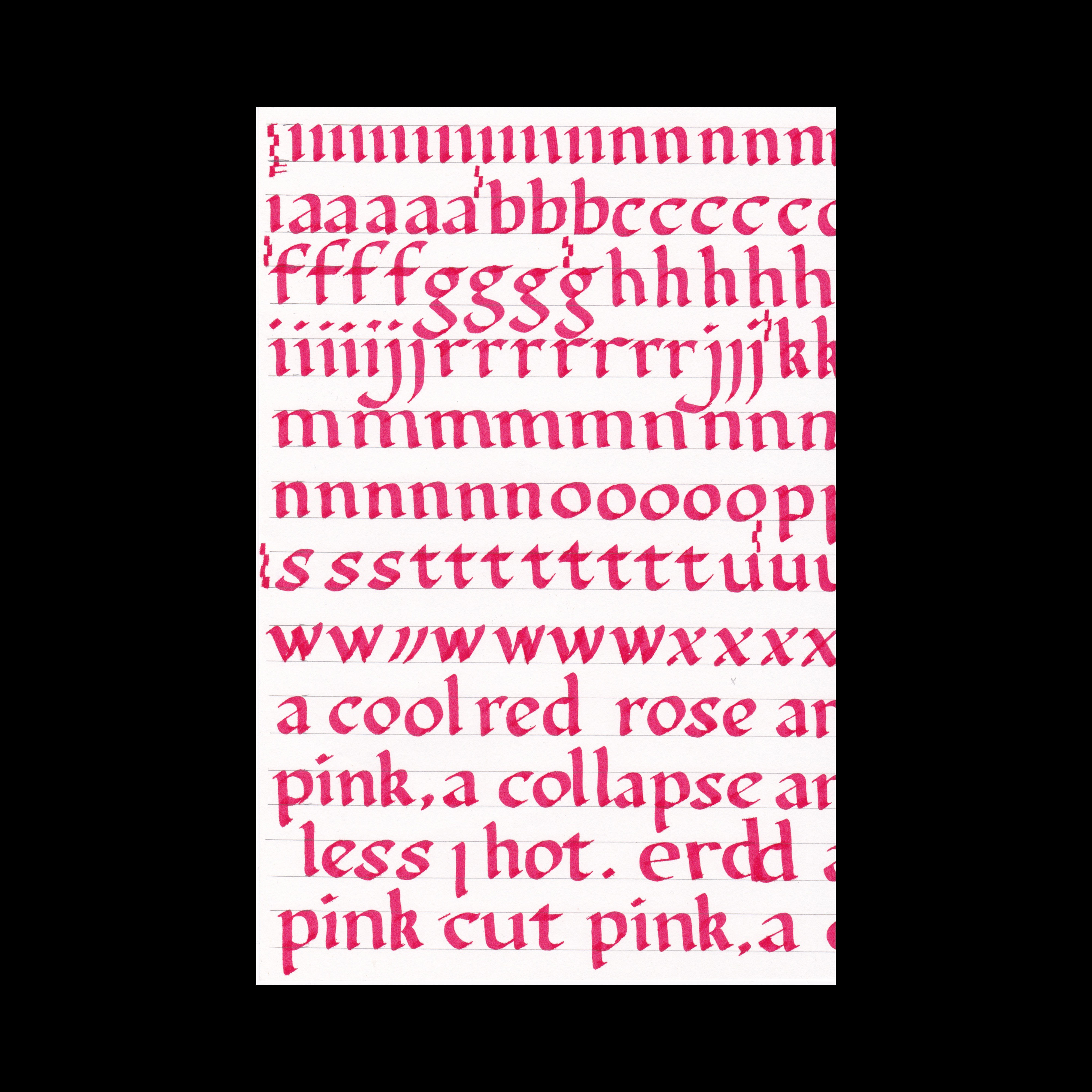
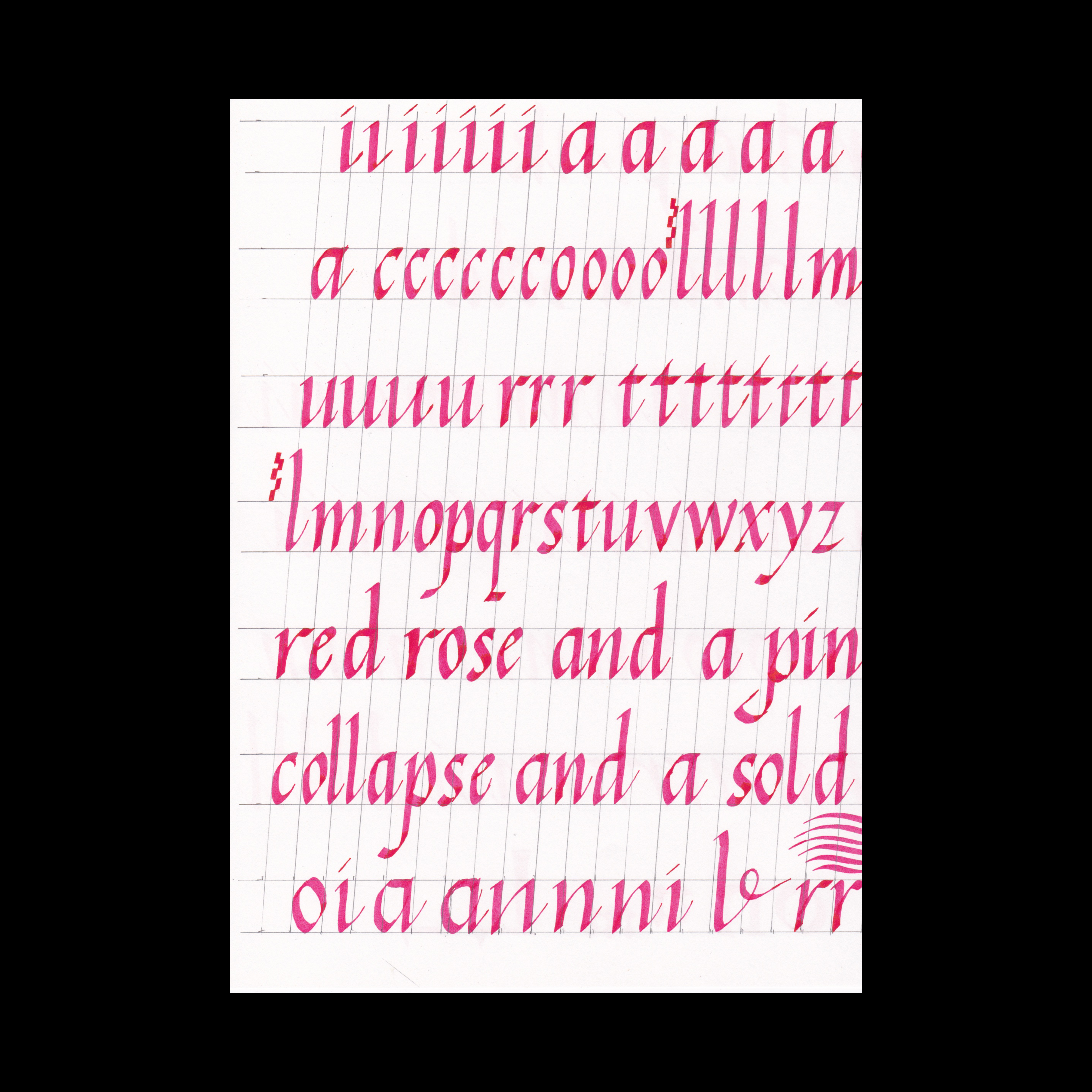
We started by practicing the lower case round hand (foundational hand) lettering with parallel pens, specifically the Pilot parallel pens with ink cartridges, as opposed to dip pens, Fig. 1.

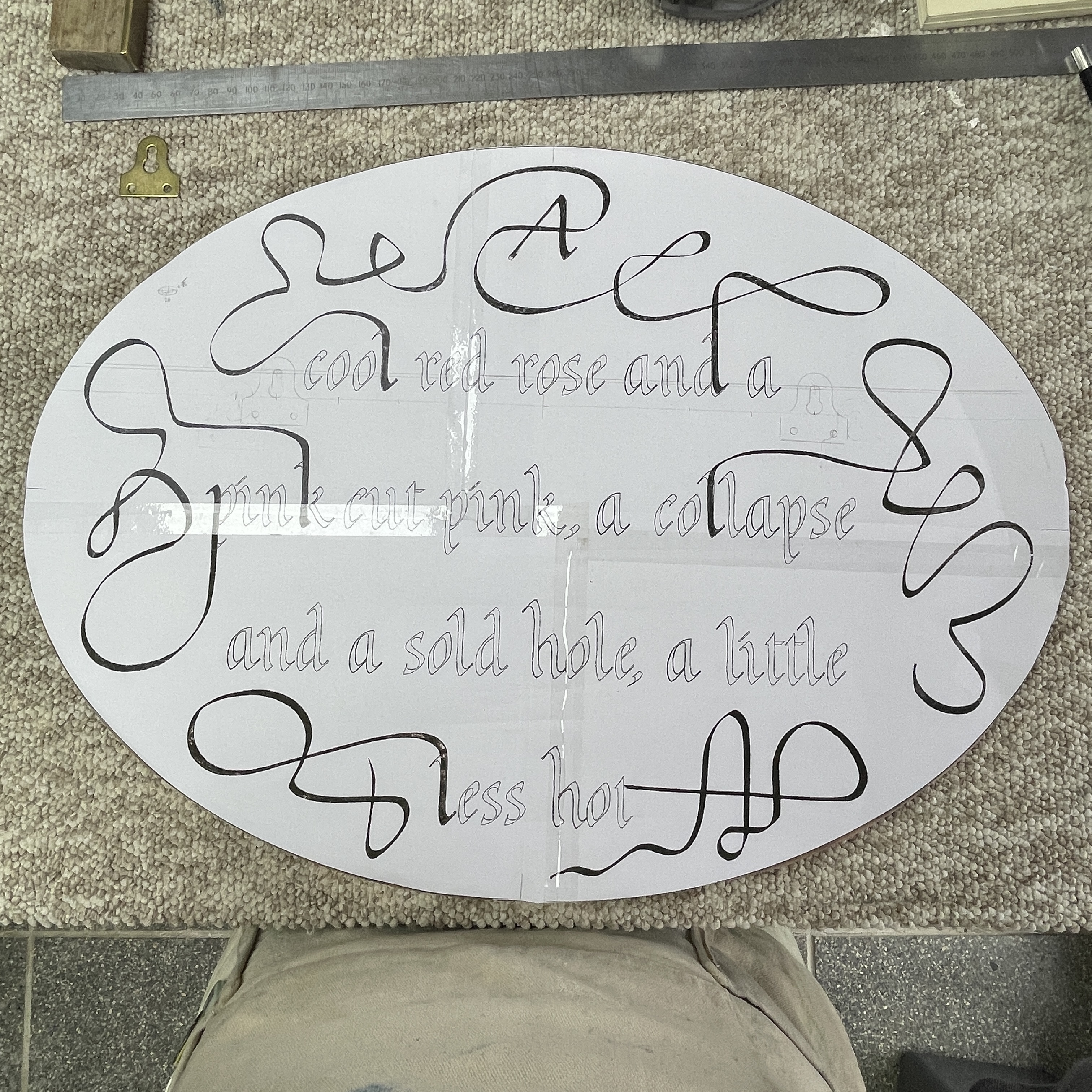
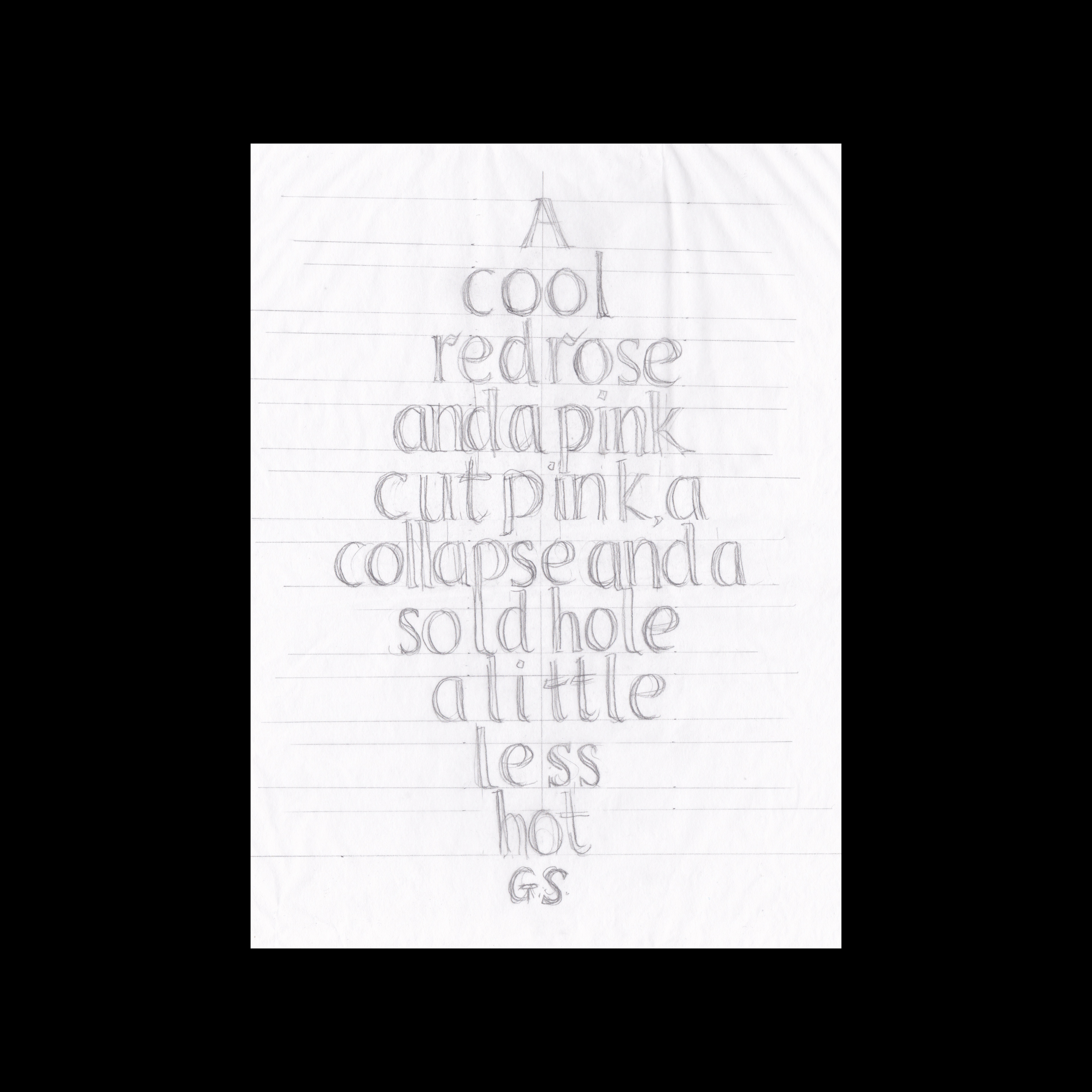
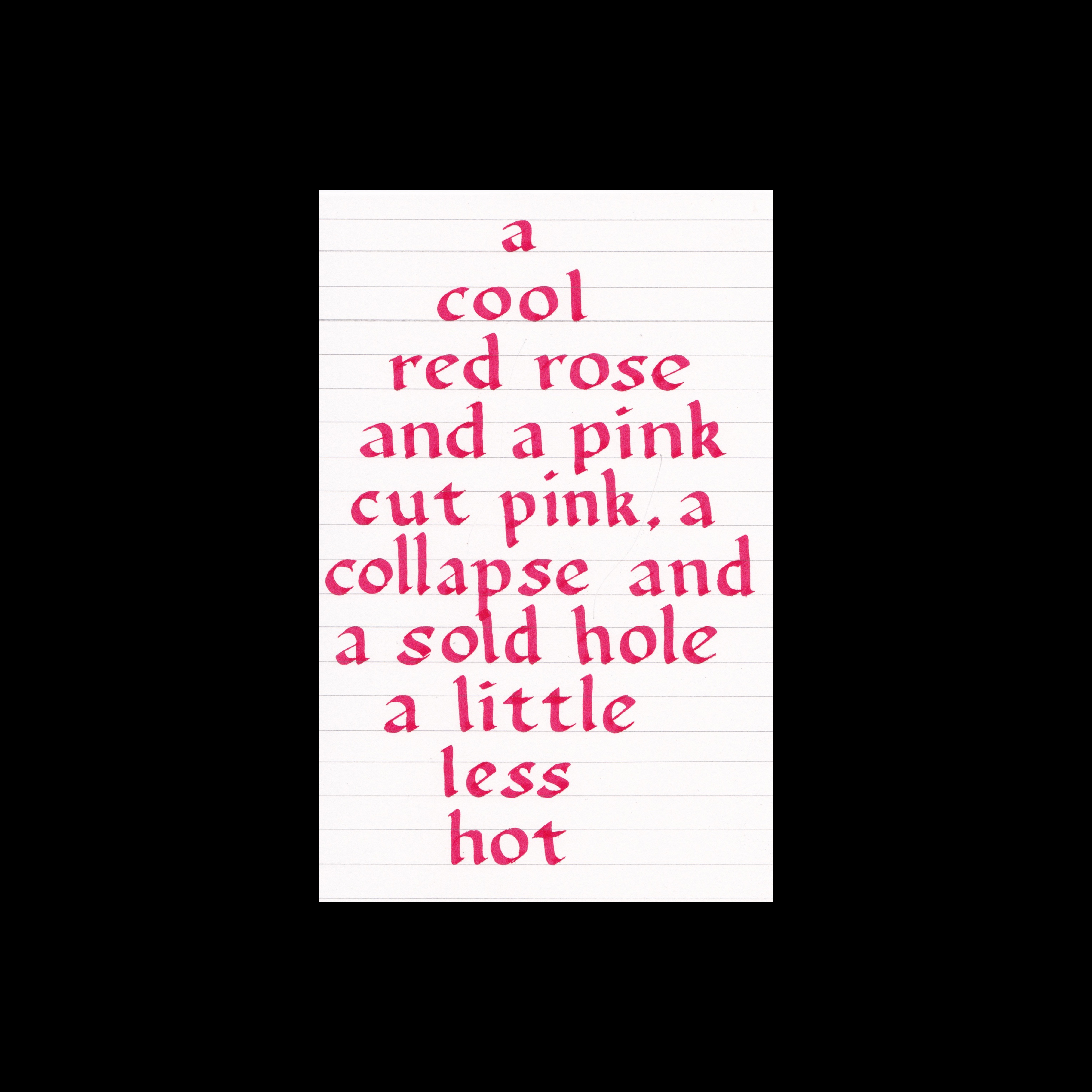
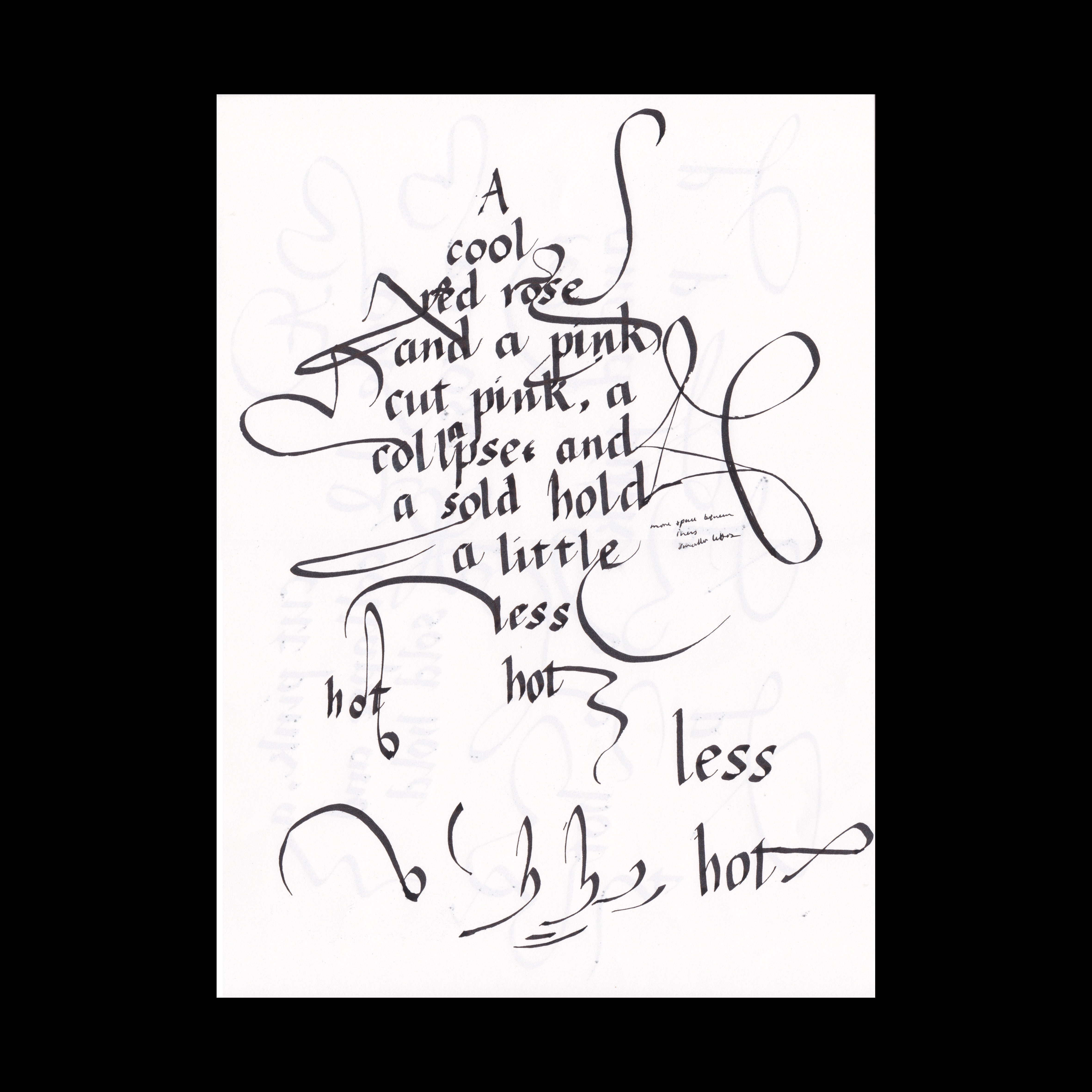
I had selected a four line poem by Gertrude Stein, ‘Red Roses’, not an overly long text, but a good length for the size of stone I had selected. As the stone was oval, I had thought a diamond shape for the text would work, however this left a lot of empty space around the text, Figs. 2-3, so I suggested incorporating flourishes into the design to fill the space.

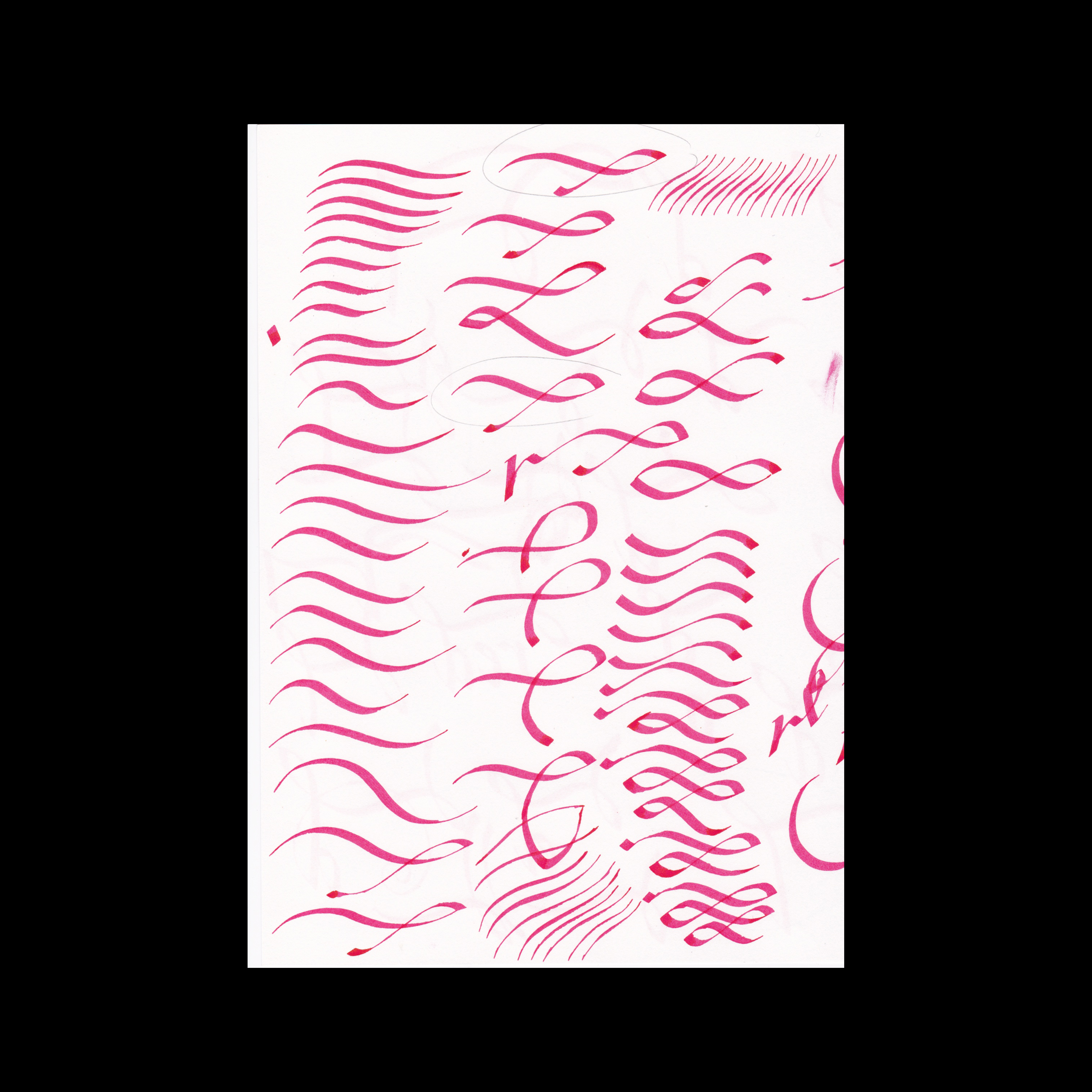
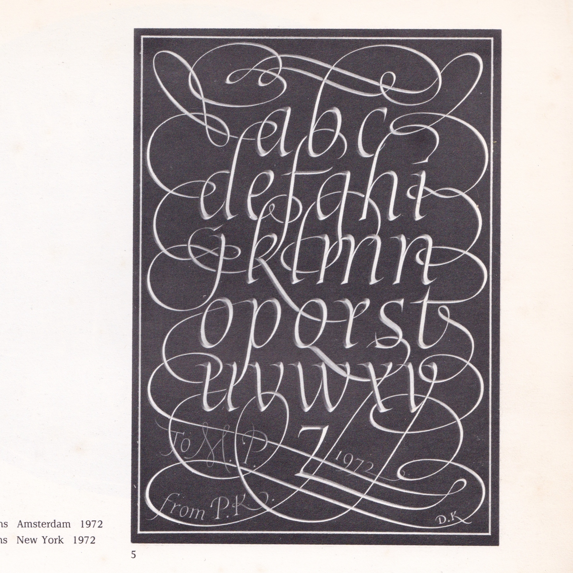
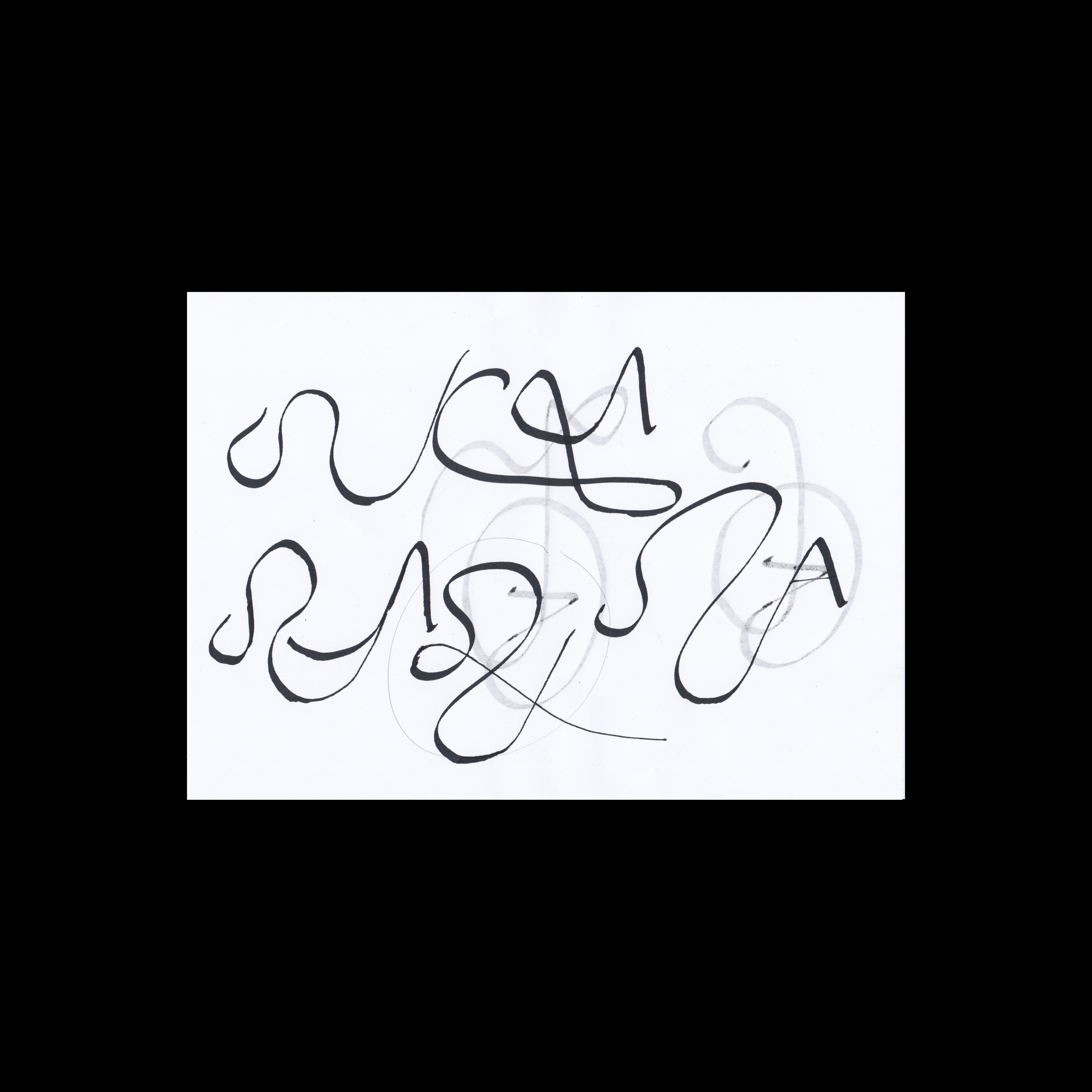
Our starting point for flourishes was to look at David Kindersley’s and Lida Cardozo’s Letters Slate Cut. Charlotte had the original 1981 edition whilst I had a later 1990 edition. The two books have quite a different selection of works between editions, and whilst both have lots of examples of flourishes, the first edition has some very good ones. It became apparent from looking at the flourishes and trying to create them with a parallel pen that I was using the wrong tool, Fig. 4. I switched to a round brush and had more success with the weights and fluidity of movement, Fig. 5. This style of flourish did not entirely fit with the flat-edged pen letters that I had drawn so we looked further back into historic calligraphic examples to find a more appropriate language of flourishes.

Whilst thinking about flourishes made with a flat edged pen, it became apparent that the rounded letter form I had been drawing wasn’t quite right. This lead me to The Encyclopaedia of Calligraphy Techniques by Diana Hardy Wilson and her example of a Humanistic style of lettering.

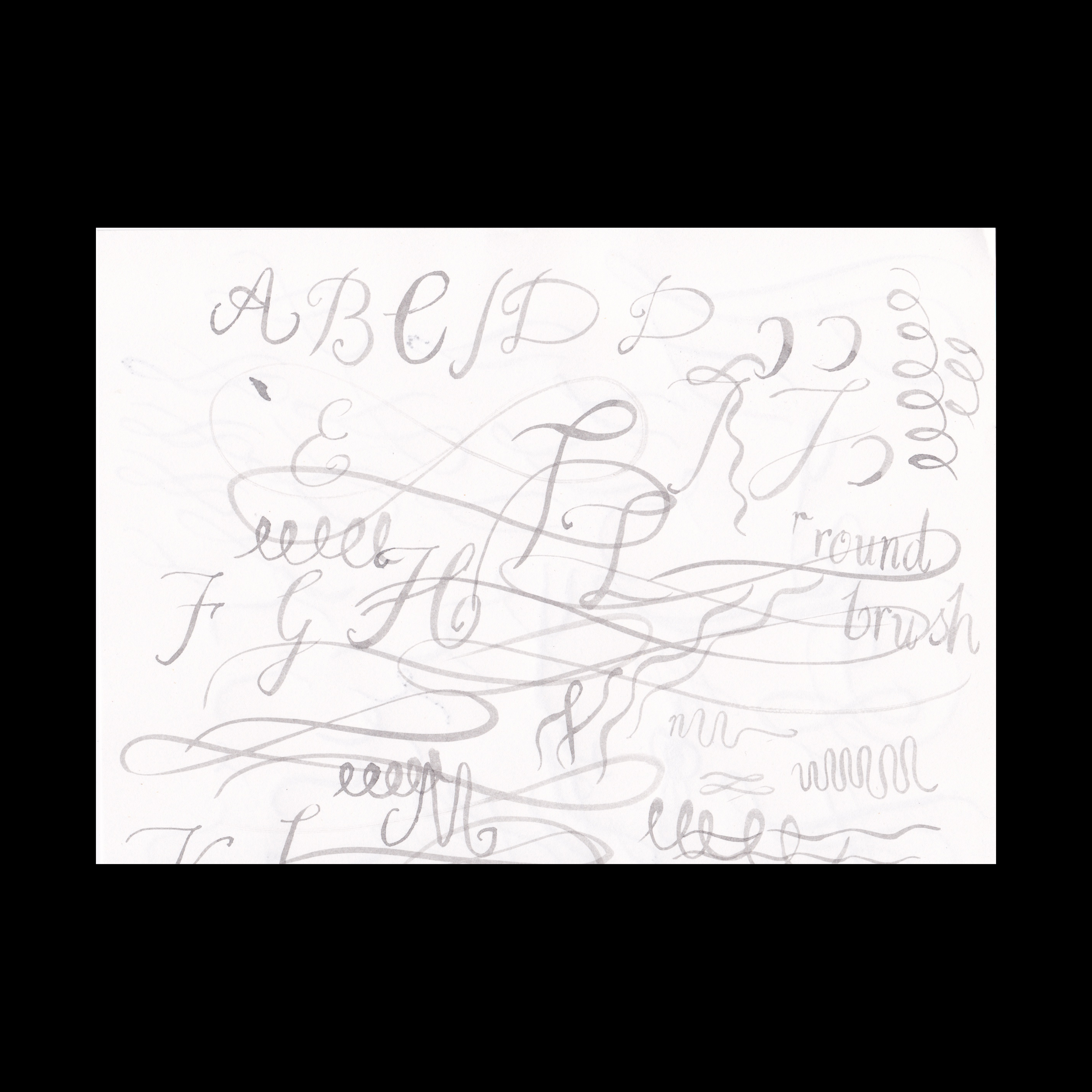
Hardy Wilson describes the Humanistic hand as a move away from Gothic minuscules, but a reference to the Carolingian style of the 8th-10th Centuries, and that this 16th century letter is a precursor of the modern italic letterform. I found the slightly condensed and ‘spiky’ quality of the letters better suited the feel of the text, Fig. 6, so decided to continue with this letterform. The angle of the pen, being held at an 8-10° slant also lended the letters to extending better into flourishes than the round hand at 30-40°.

One piece in-particular that stood out to me from Letters Slate Cut, and which I kept in mind throughout working on this piece, was a lowercase italic alphabet by David Kindersley, Fig. 7. The flourishes go around the edge of the body of text, but also through the letters, crossing lines, navigating around the entire piece, from top to bottom. This piece really highlights how the flourish can be used to get from one point to another but not in a straightforward way. I particularly liked the connection between the ‘d’ and the ‘j’ on the line below, which in turn jumps up though the dot of the ‘j’ to the top of the ‘f’, itself nestled in the ‘b’. The flourishes in this piece are less lines to be followed and more an over all texture that is part of the visual rhythm of the text. This example really shows flourishes at their most complicated yet effortless.

When I came back to Charlotte with my own compositional attempts, Fig. 8, she pointed out that certain letters and parts of letters are more suited to become a flourish, and that the most successful flourishes come out of the natural movement of the pen in the direction of the gesture. This was important to keep in mind as I developed the flourishes for this piece.

Looking through Charlotte’s books on calligraphy The Universal Penman (1980), an exhibition catalogue from the Victoria and Albert Museum, it had a huge range of calligraphic examples and lots of different types of flourishes that were clearly made with a flat edged pen. One piece in particular stood out to me, a page from Giovanni Antonio Tagliente's book The True Art of Excellent Writing or Lo presente libro, a writing manual, Fig. 9. I subsequently found that the full book is available to view and download as a PDF on the Library of Congress website, for anyone interested. This style of flourish directly influenced the ones I designed for my piece.

Due to my vertical layout of the text, I didn’t have a conducive number of letters with ascenders that could flow into flourishes, Fig. 10 shows how the flourishes weren’t really working, so I decided to flip the composition onto the horizontal, which actually worked much better.

The next stage was to move away from the flat edged pen and start drawing the letters with a pencil. Re-drawing and altertering the letterforms slightly would also make them more appropriate for carving.

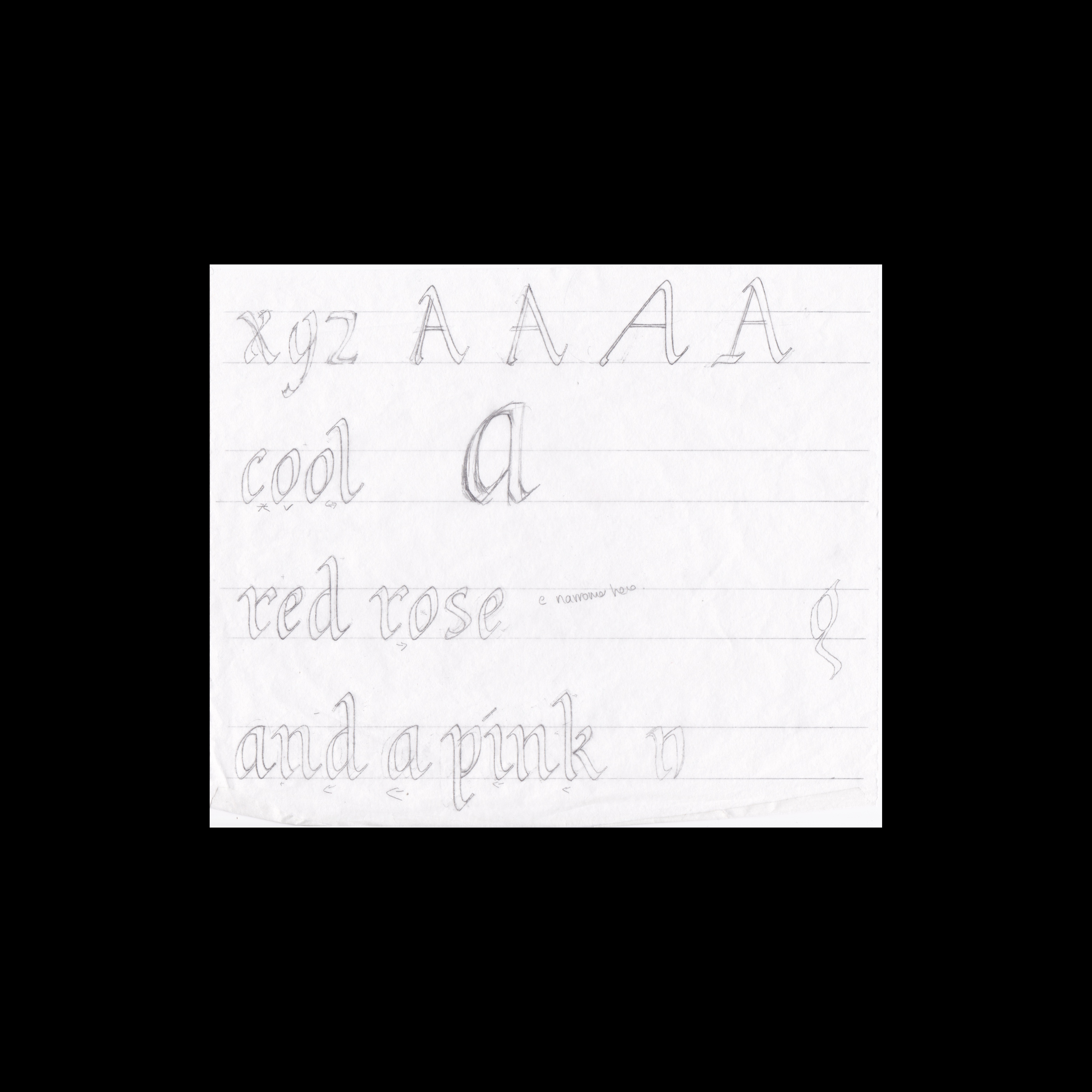
To bring cohesion to the letterforms I needed to make some adjustments to what I had drawn with the pen, the characteristics are derived from the shape and width of the letter ‘o’, Fig. 11. I made mine narrower and slightly squared off, Fig. 12. From this I could then sketch out the letters and begin drawing out the text in their final ‘style’, Fig. 13.

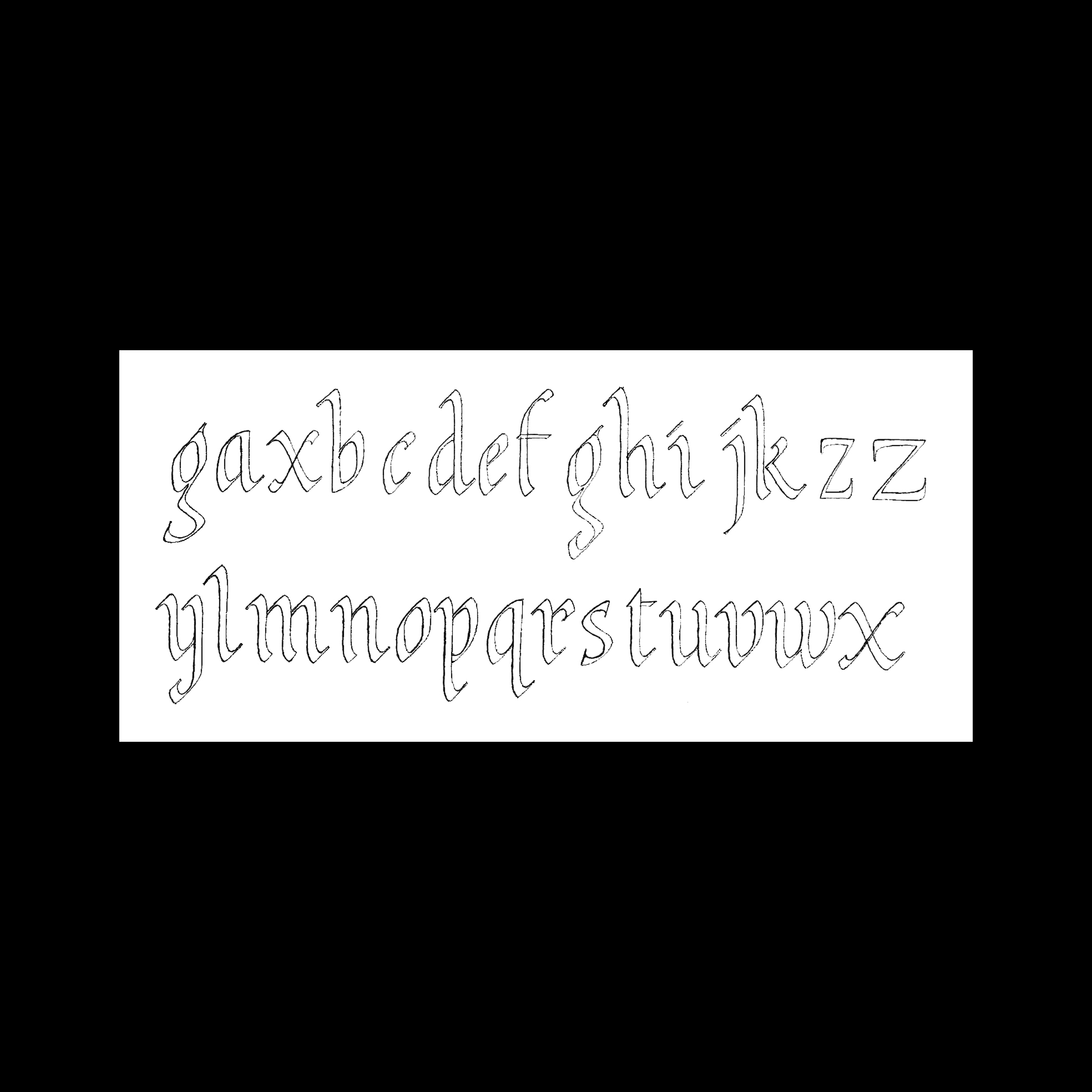
In the process of working out the particulars of the letterforms I had drawn out the whole lowercase alphabet, Fig. 14. This seemed like a good oppertunity to use a piece of software that Charlotte had introducted me to, Fontshelf. An app that allows you to take a hand drawn alphabet and turn it into a typeface. In theory this would allow me to very easily adjust the spacing of the letters and quickly make changes. The app required a very clean and precise drawing of the letters that could be scanned in and cleaned up further on Photoshop and then imported. I actually did two versions, one as outlines and one with solid letters. This did indeed make it much easier to type out the letters and adjust the spacing. From there I had a full size version of the layout that I could incorporate the flourishes into, Fig. 15.

As I drew the flourishes that would fit my composition I gained a better understanding of how the flourishes from the Tagliente example were generated. In trying to achieve the same shapes it became apparent that there was a degree of pen manipulation; twisting, pulling or pushing the pen created quite specific angles and widths of line, and that some lines look better crossed over, and some lines running near each other created a visual tension. Fig. 16 shows some pen drawn flourishes, whilst Fig. 17 shows how I’ve neatened the lines in a way that fits the design.  


At first I saw this piece as a way to showcase different types of flourish, where a single letter has a large ornate flourish. However this lended a fractured look to the composition and it also left spaces where I struggled to accommodate a flourish. This led me to begin joining letters from one line to the next, with a flourish, Fig. 18 shows a half way point in the flourish composition. It became clear that if some parts were joint then perhaps all of them should be. I was also aware that symmetry might help bring the piece together, as with the Kindersley example where there are similar, but not identical shapes, that tie the composition together.

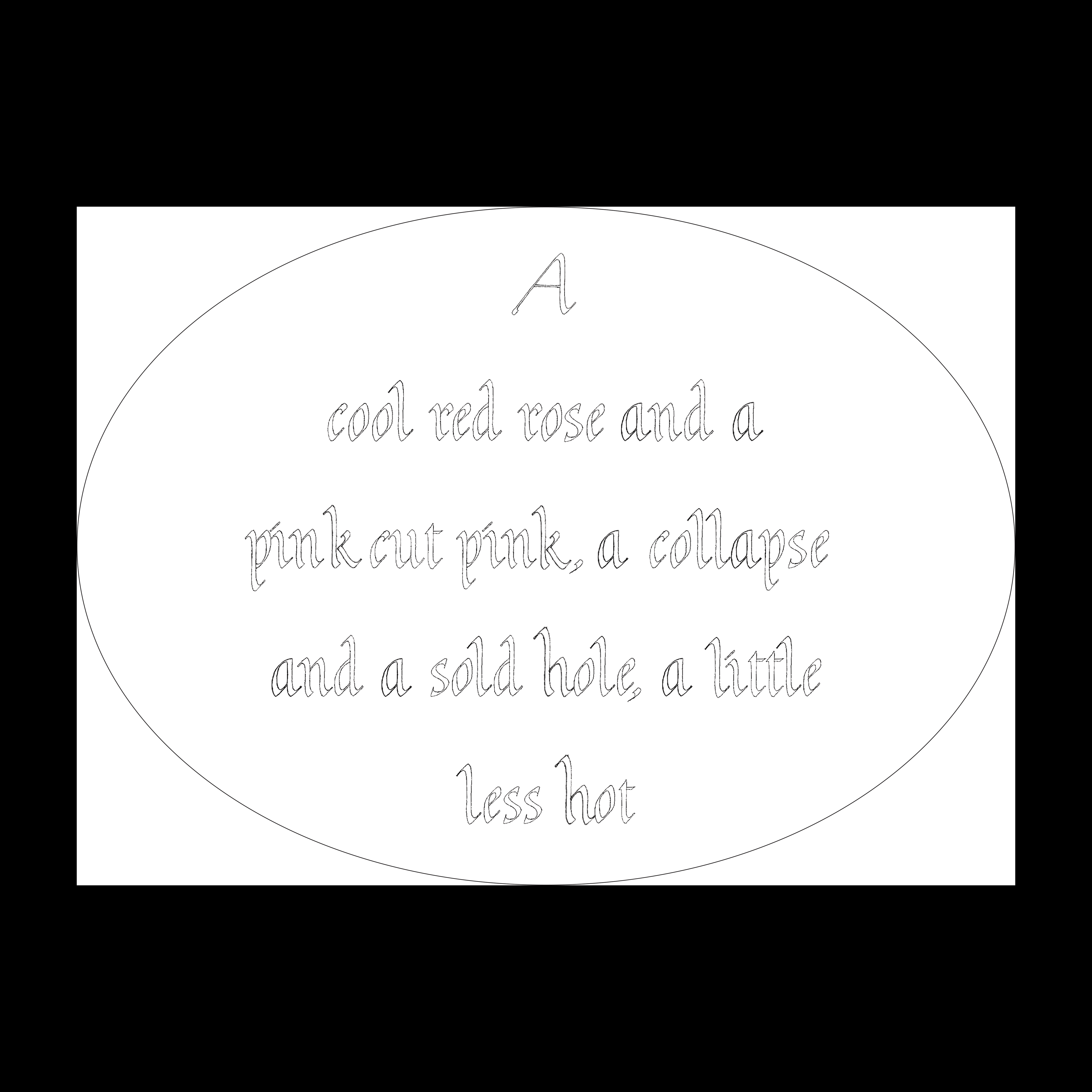
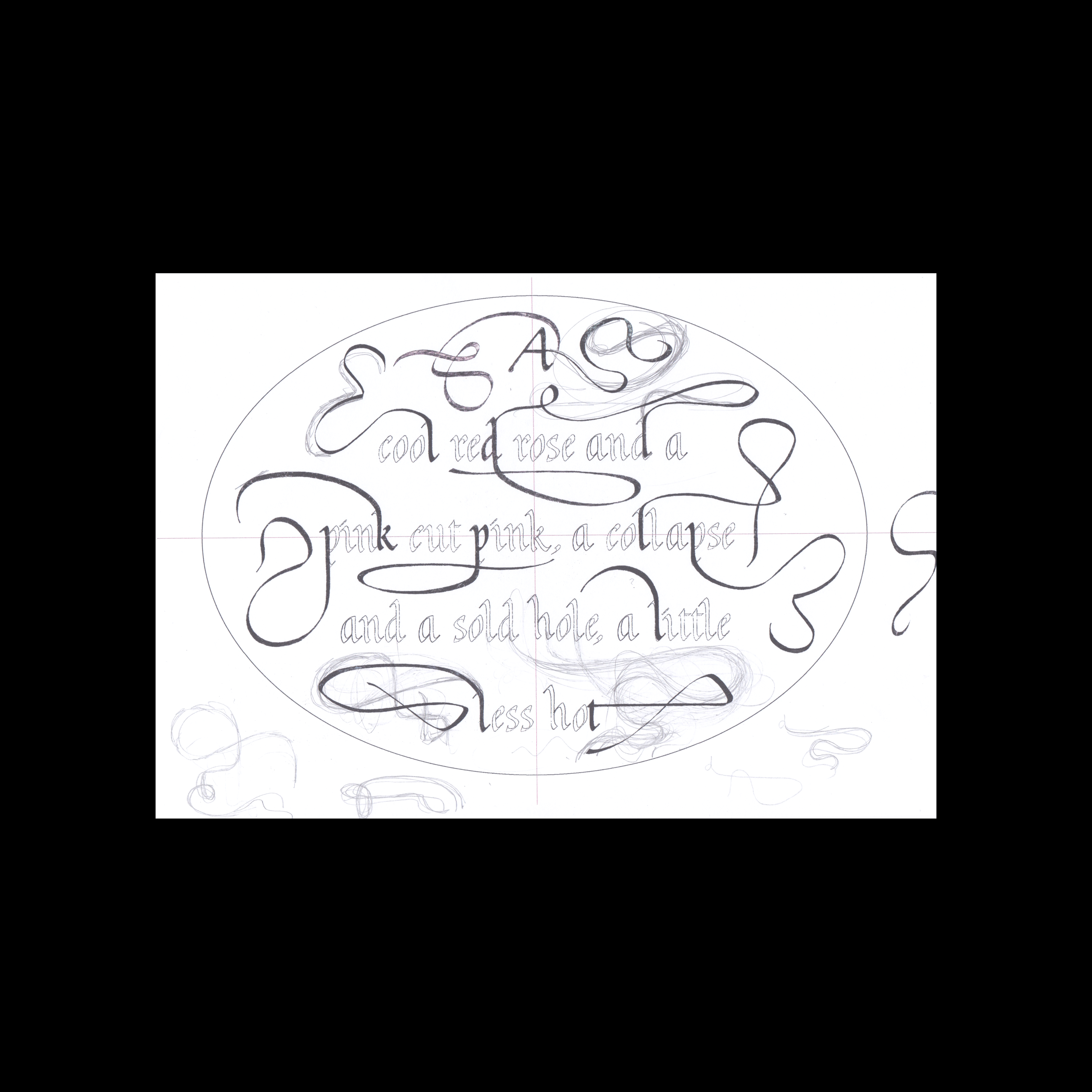
This process of drawing out the letter/flourish, scanning it and cleaning up the drawing was how I continued to amass the flourishes, and add them to the layout. It was really useful to see the whole design at scale and also to print out the design full size and work on flourishes that would precisely fit the design. The final design has essentially five large flourishes joining letters and fitting across the oval, see Fig. 28 below.

Once I had the design finalised, I moved on to shaping the stone. The stone was an oval, but not a symmetrical one and slightly squared. We decided to cut down the edges to create a nicer shape, Fig. 19 shows the design laid over the stone and the edges to be cut away. For this I cut away the stone by hand rather than using electric tools. Although it takes longer this was a good opportunity to put into practise the skills I had learnt over the last year and to familiarise myself with carving this stone. Figs. 20-22 show the process of carving away and polishing the surfaces.

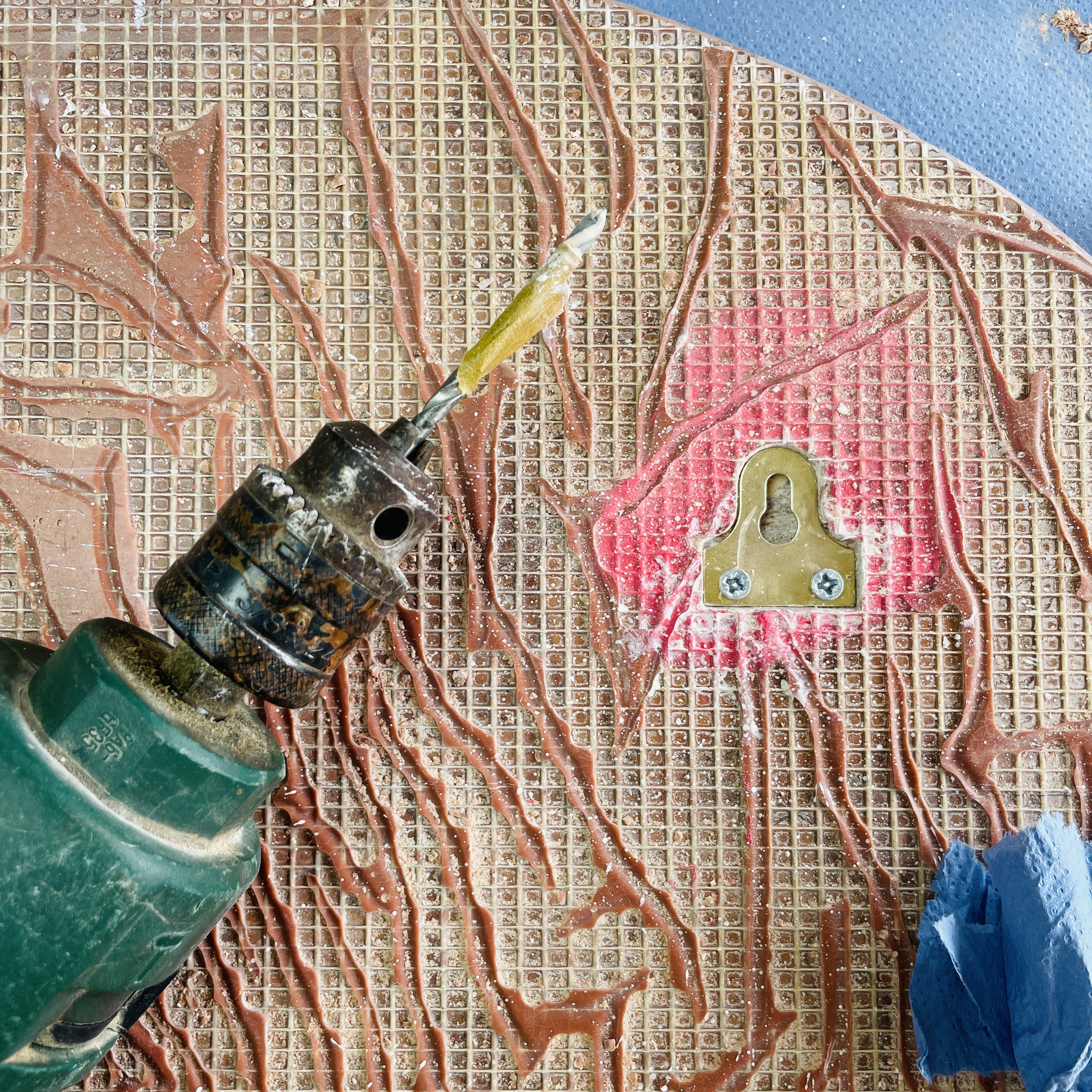
After I transferred the design onto the stone, Fig. 23, for this I did use copy paper, as the design was quite intricate, I then selected the placement of the mirror plates on the back so that they would interfere to the least extent with the design. Fig. 24 shows the placement of the mirror plates around the design. As the stone is fairly thin, 20mm and there are cracks running all over the stone, we didn’t want to run the risk of accidentally chipping a chunk out. I cut the holes for the mirror plates before I started carving the design, Fig. 25.

I then began caving. It quickly became apparent that certain aspects of the design would prove fiddly to carve, specifically the curve at the top and bottom of the uprights into the serif, as can be seen in Fig. 26, the top and bottom of the ‘c’, the curve in the ‘u’ and ‘t’. The carving probably took me a few weeks in total, fitting around other work.

Upon finishing the carving we painted the letters with a mix of sign writers paint and oil paint. I tried to match the colour of the stone dust, but a little lighter so that the letters ‘pop’ out. I ended up doing two layers of paint to be sure that I’d covered all cracks. To remove any paint that was left over the edges of the letters we used a cuttlefish bone, Fig. 27, which is a mild abrasive and leaves a nicely buffed finish. It works well on a stone that can be polished, such as marble. Figs. 28-29 shows the finished piece.

14. Sundials coming soon... ︎︎︎


My Lettering Arts Trust Apprenticeship started on the 10th January 2023, with master carver Charlotte Howarth in West Norfolk. My apprenticeship will last two years, the first year on a part-time basis. I am the 10th LCAT apprentice.


© Maia Gaffney-Hyde MMXXIV