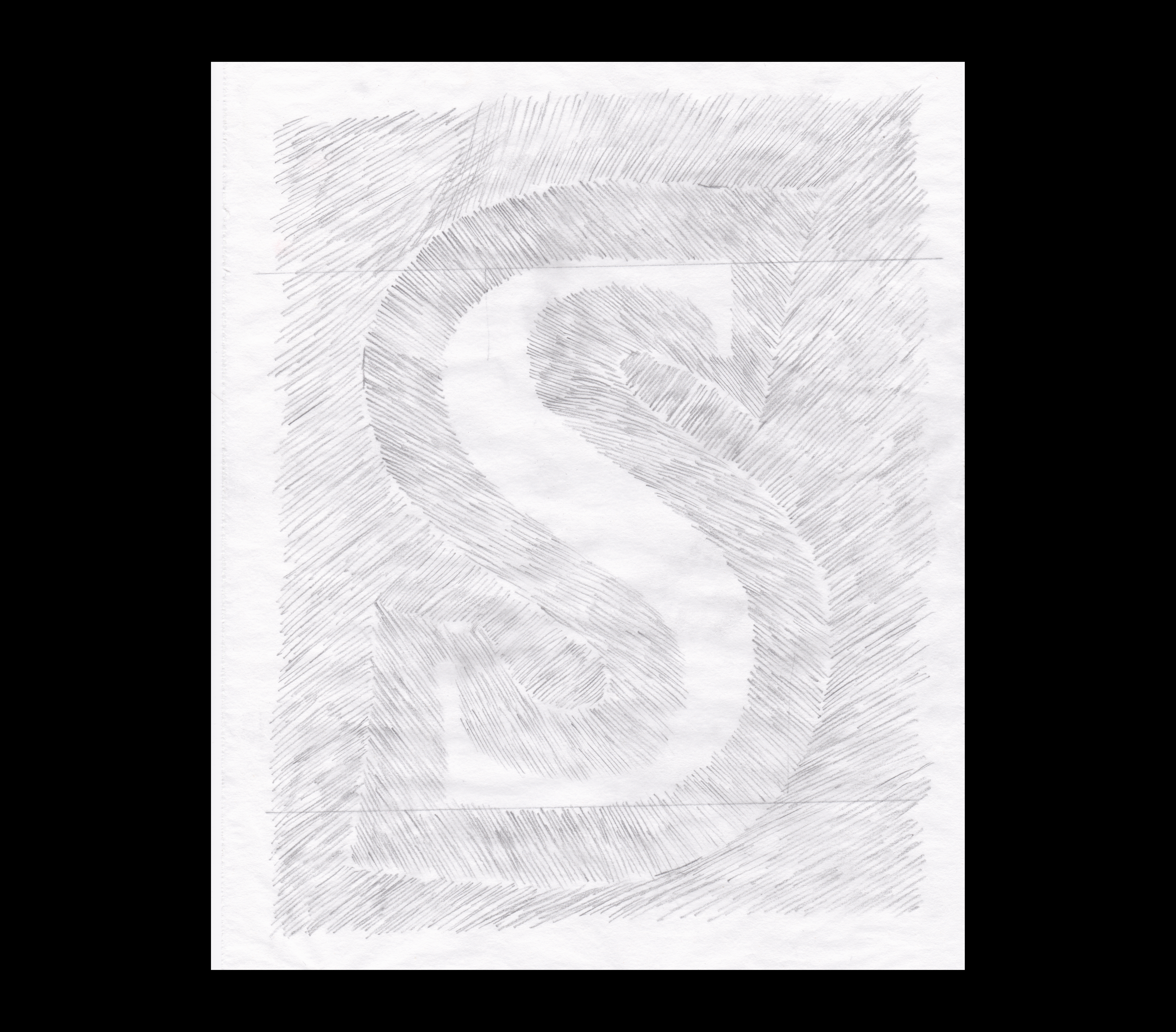
08. ‘S’
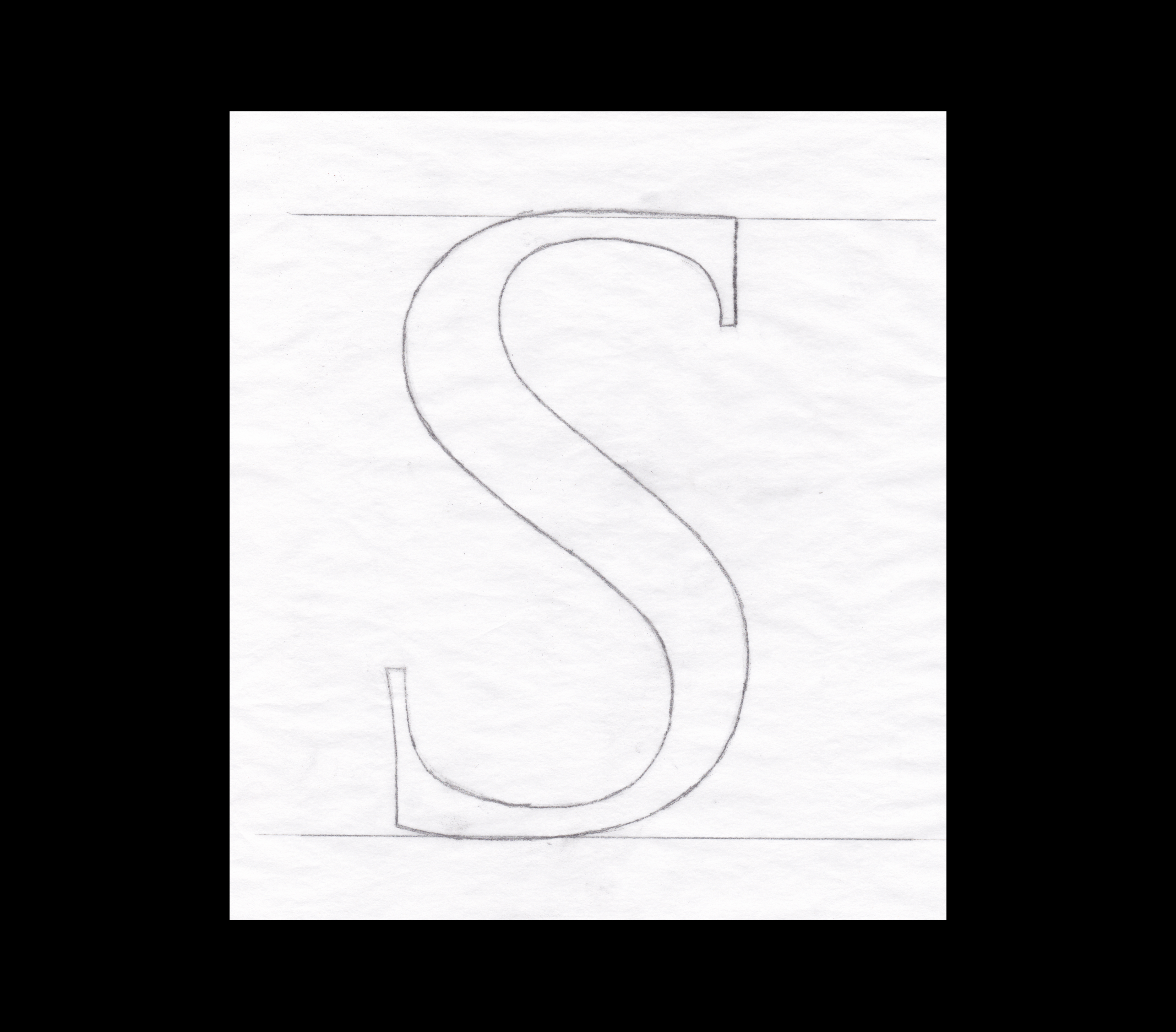
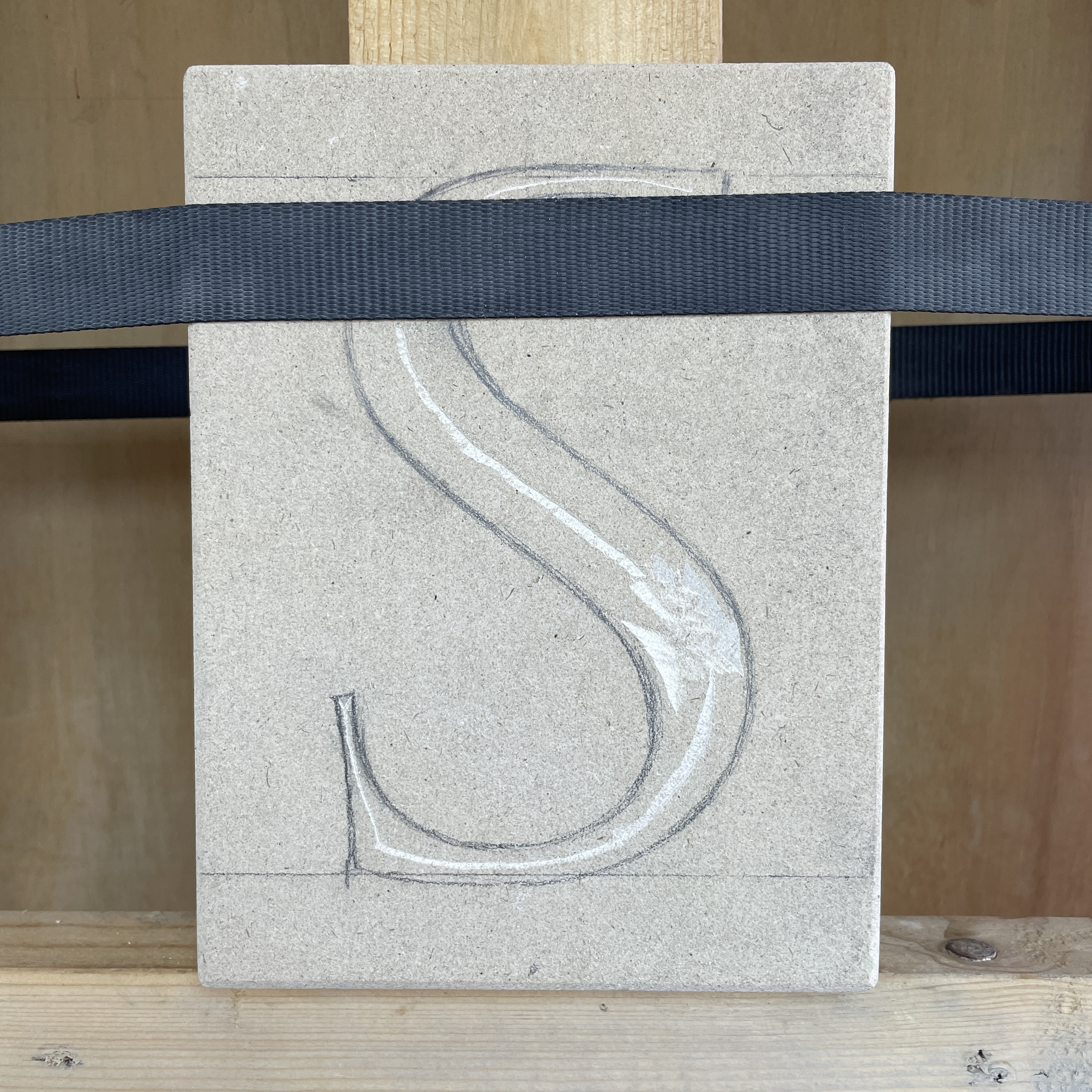
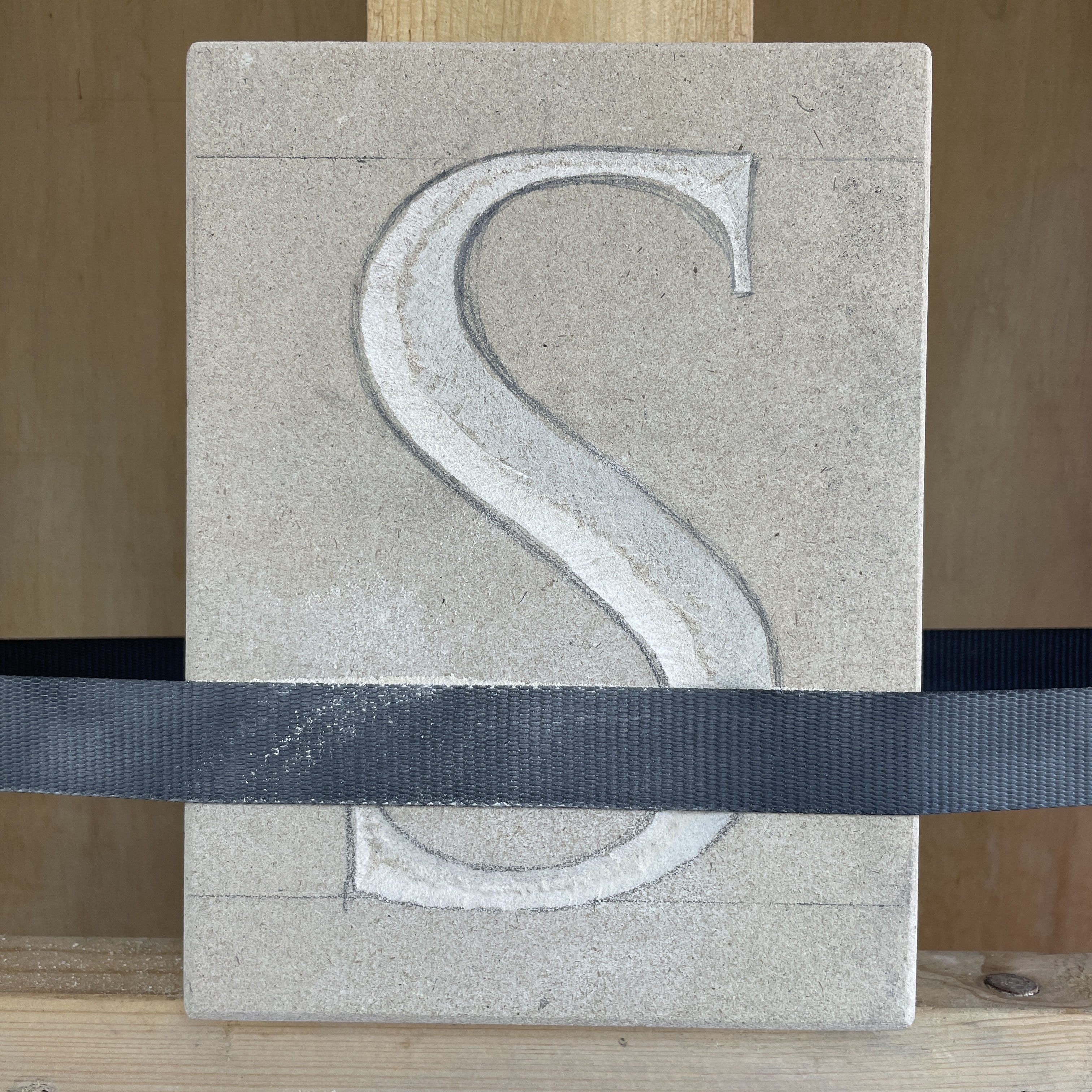
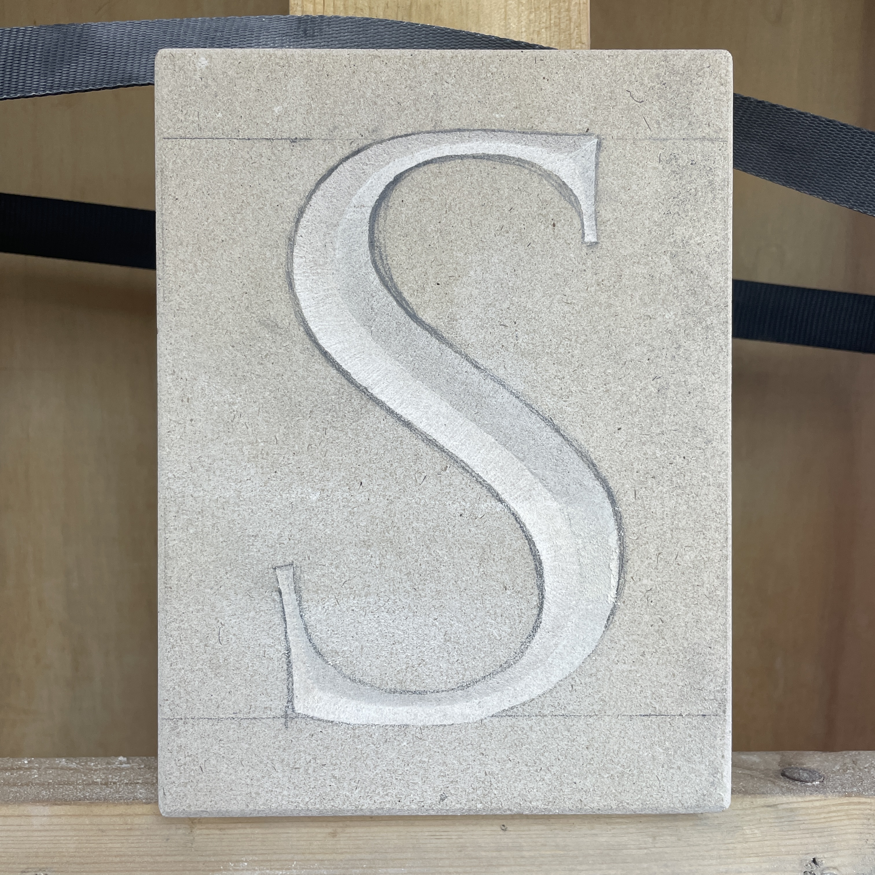
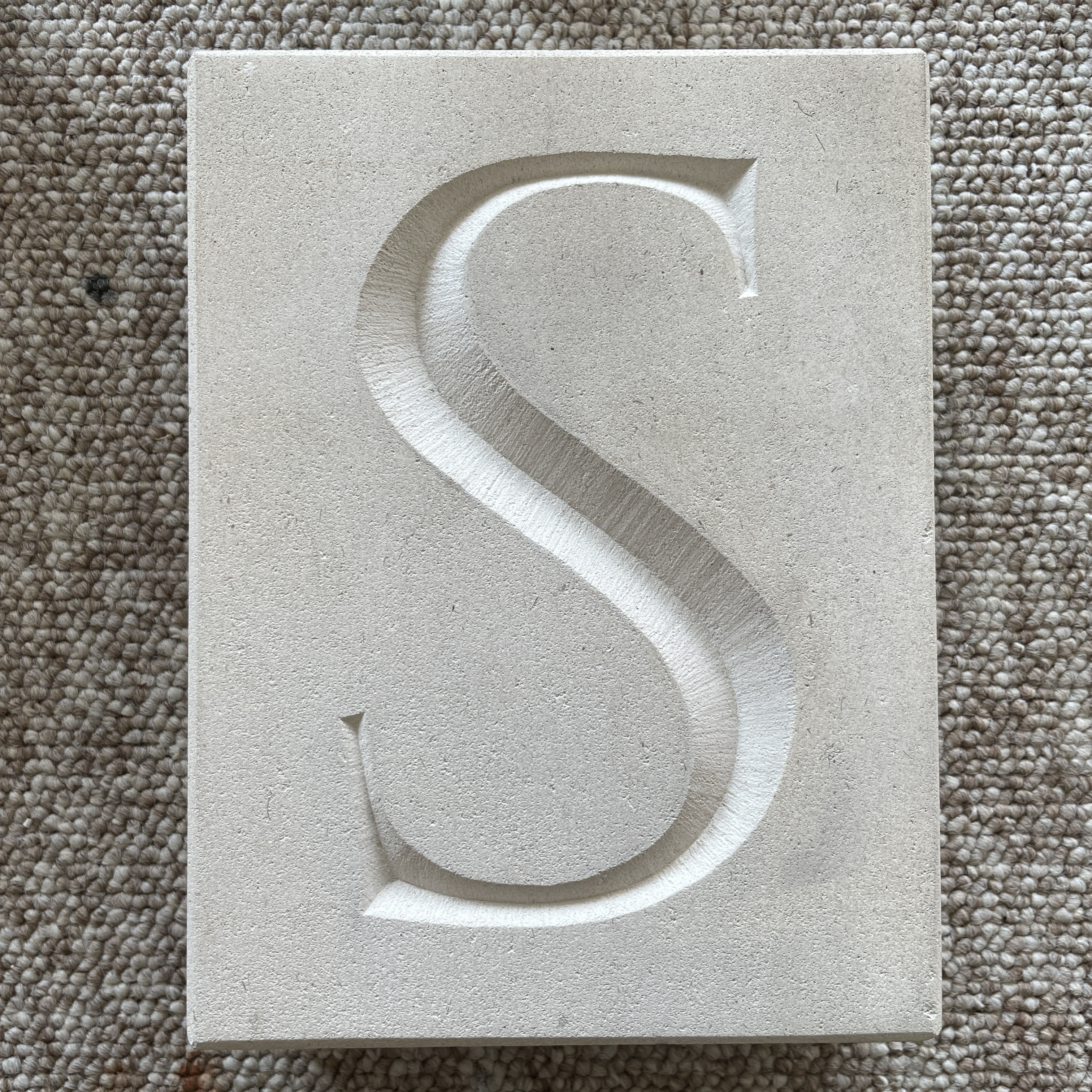
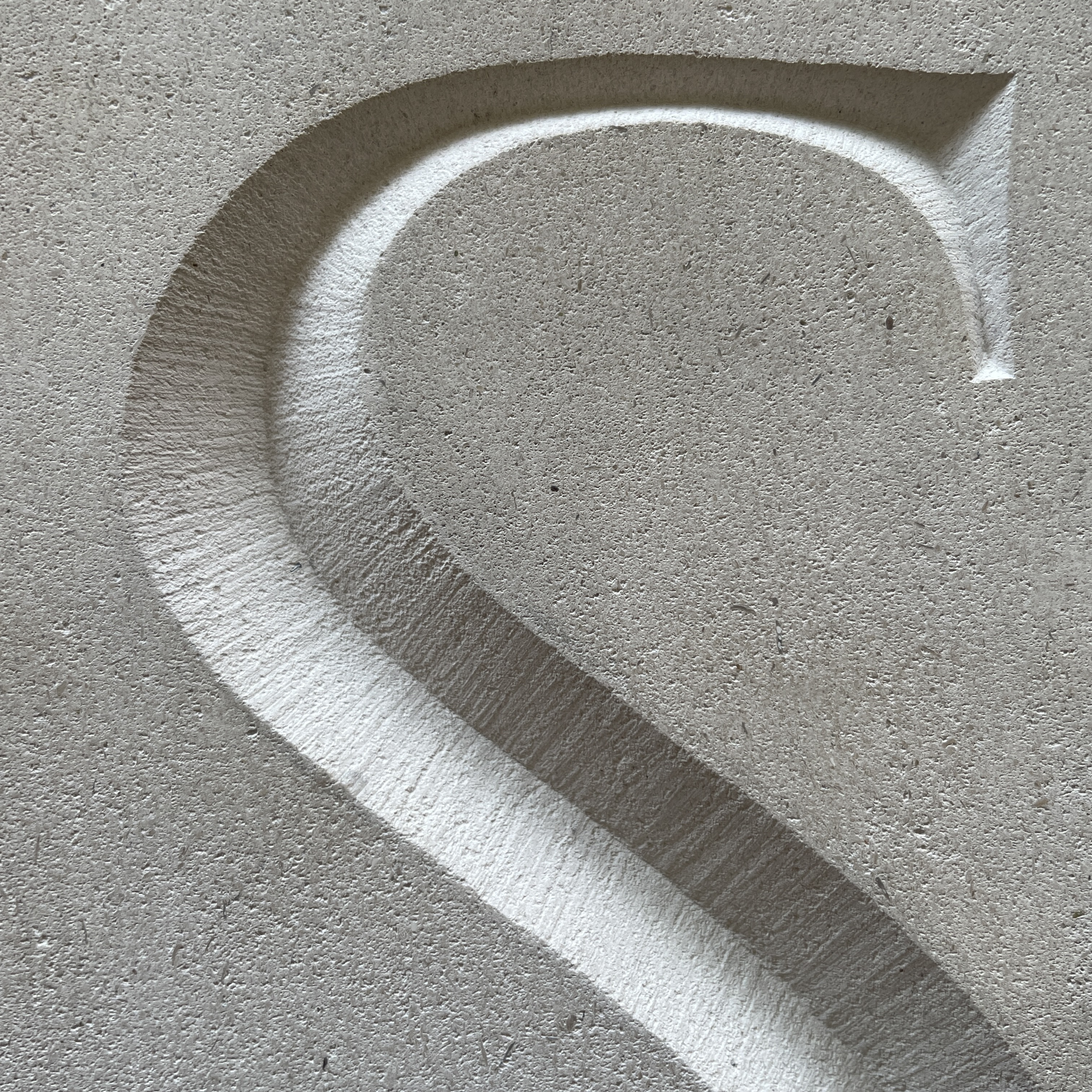
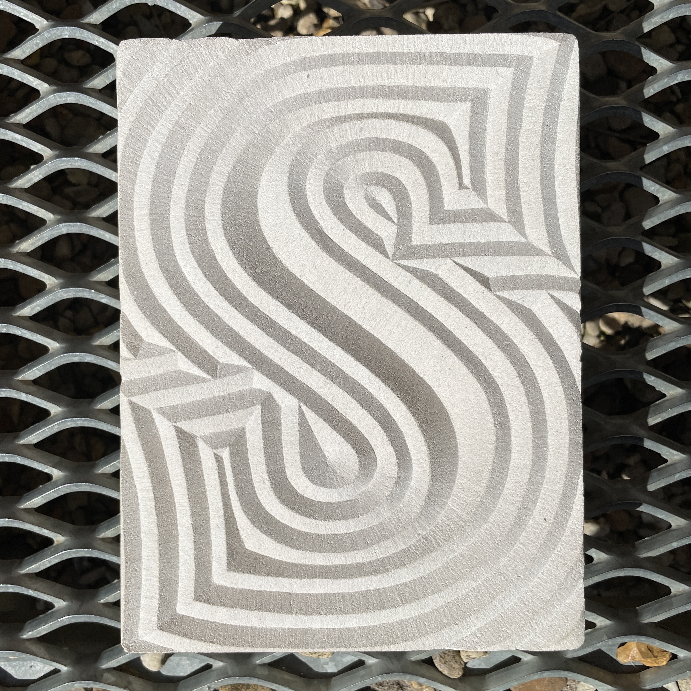
This project offered the oppertunity to practise a combination of skills. Firstly, working at a larger scale, secondly the opportunity to experiment with design in a less traditional, abstract way and thirdly a digital component. Fig. 1 We decided to pick a letter that I found more difficult to draw; being an entirely curved letter ’S’ is more challenging to get balanced. We decided to do that letter at 15cm high. Carving a letter at this scale requires skills in removing larger amounts of stone in an efficient way and is unlike the carving I have done so far.
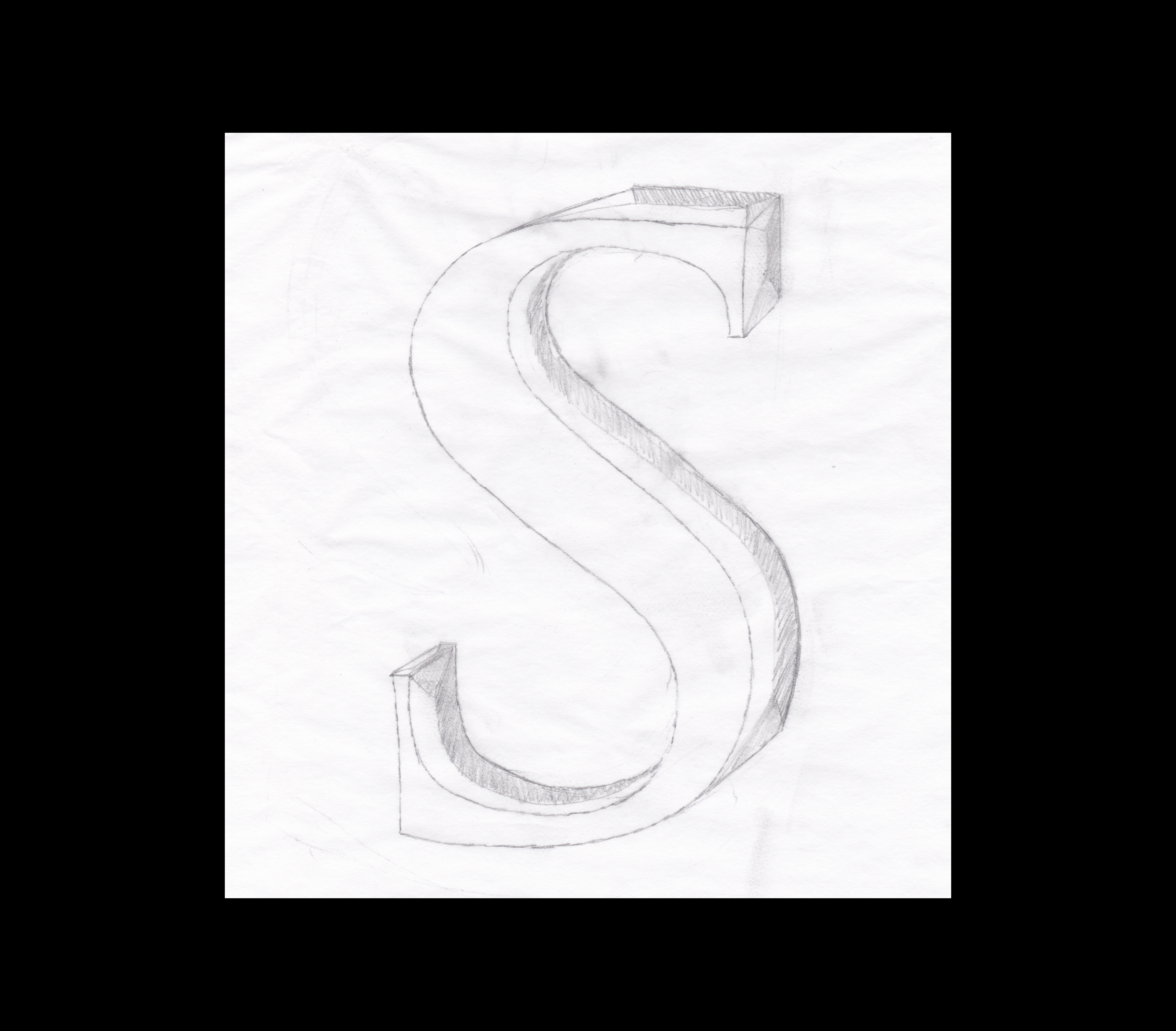
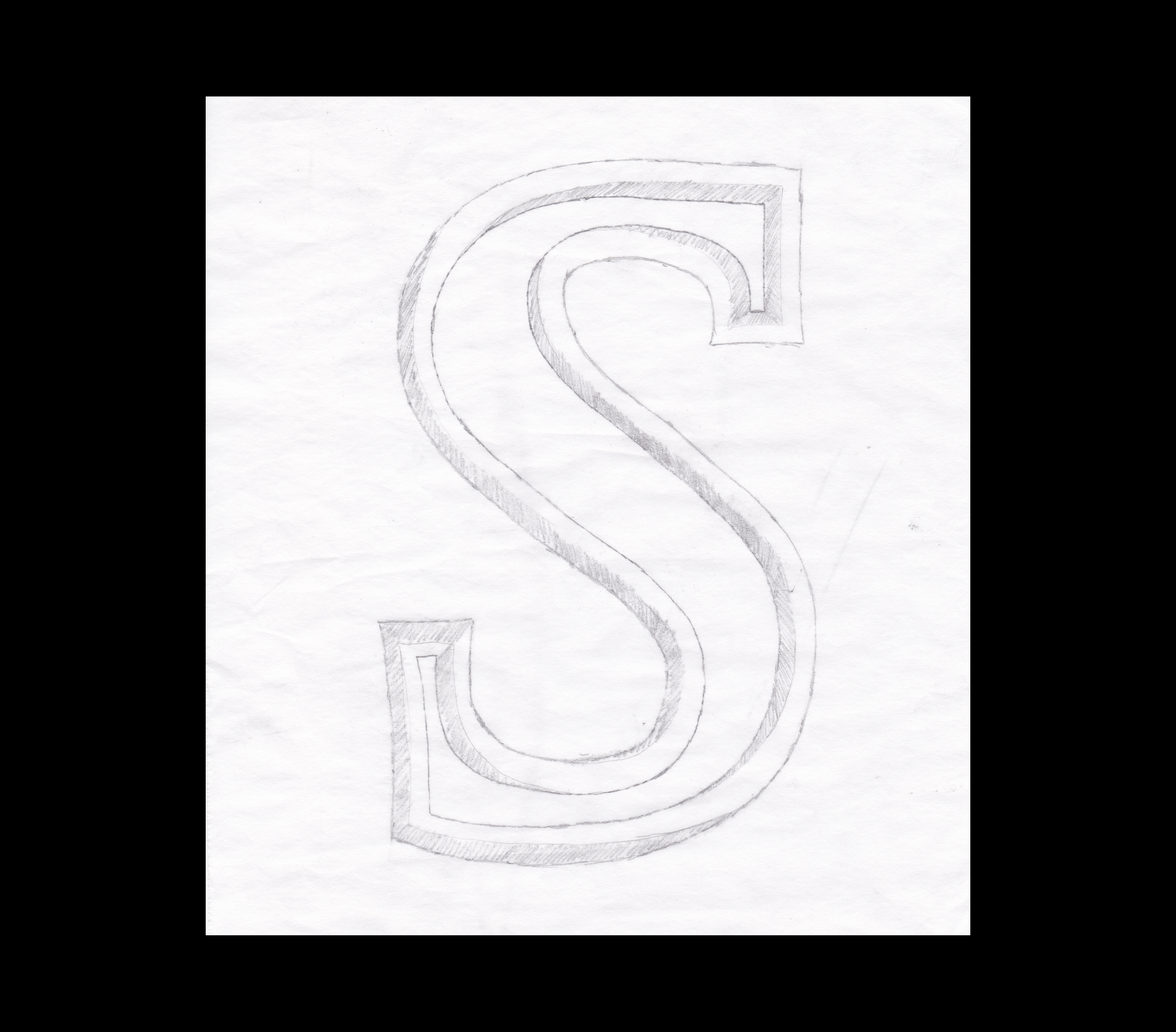
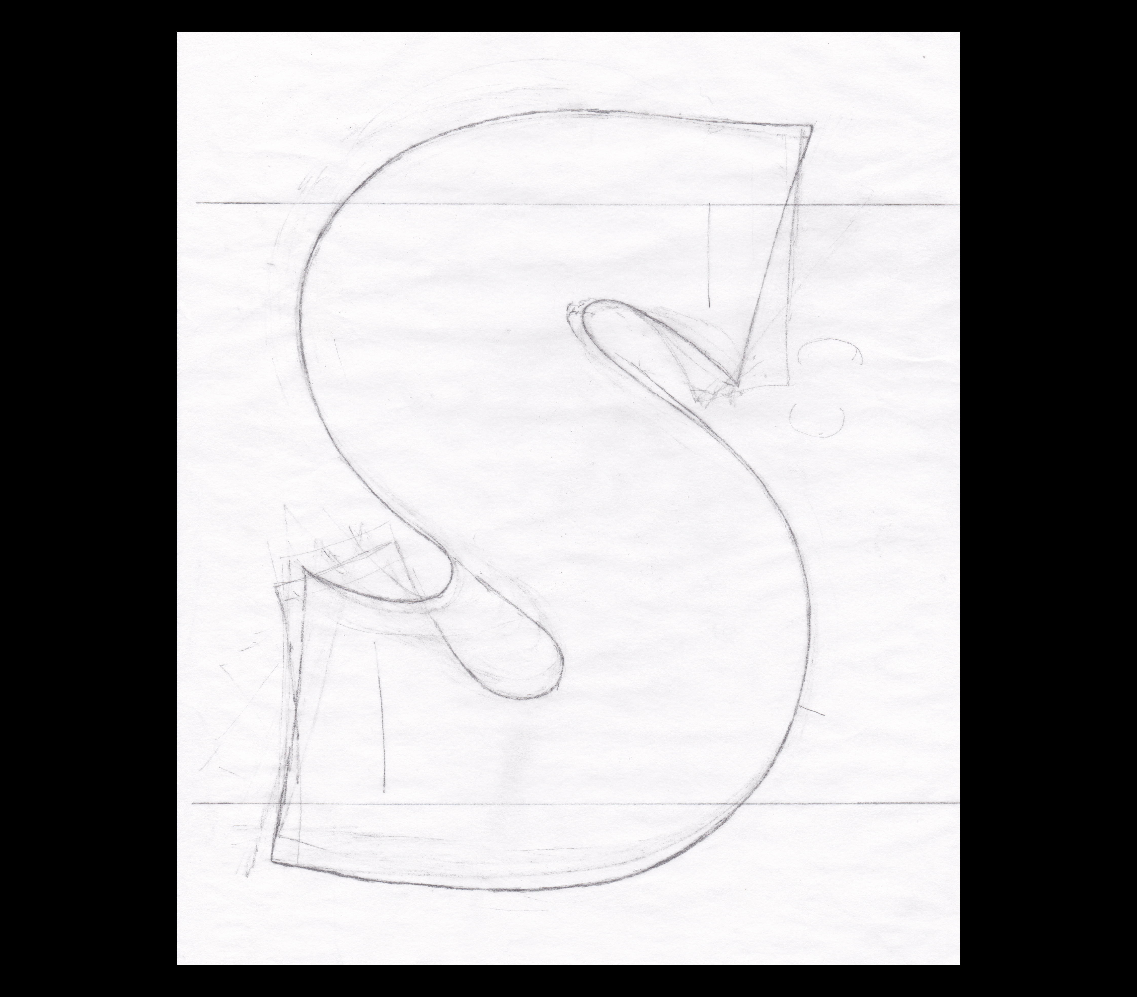
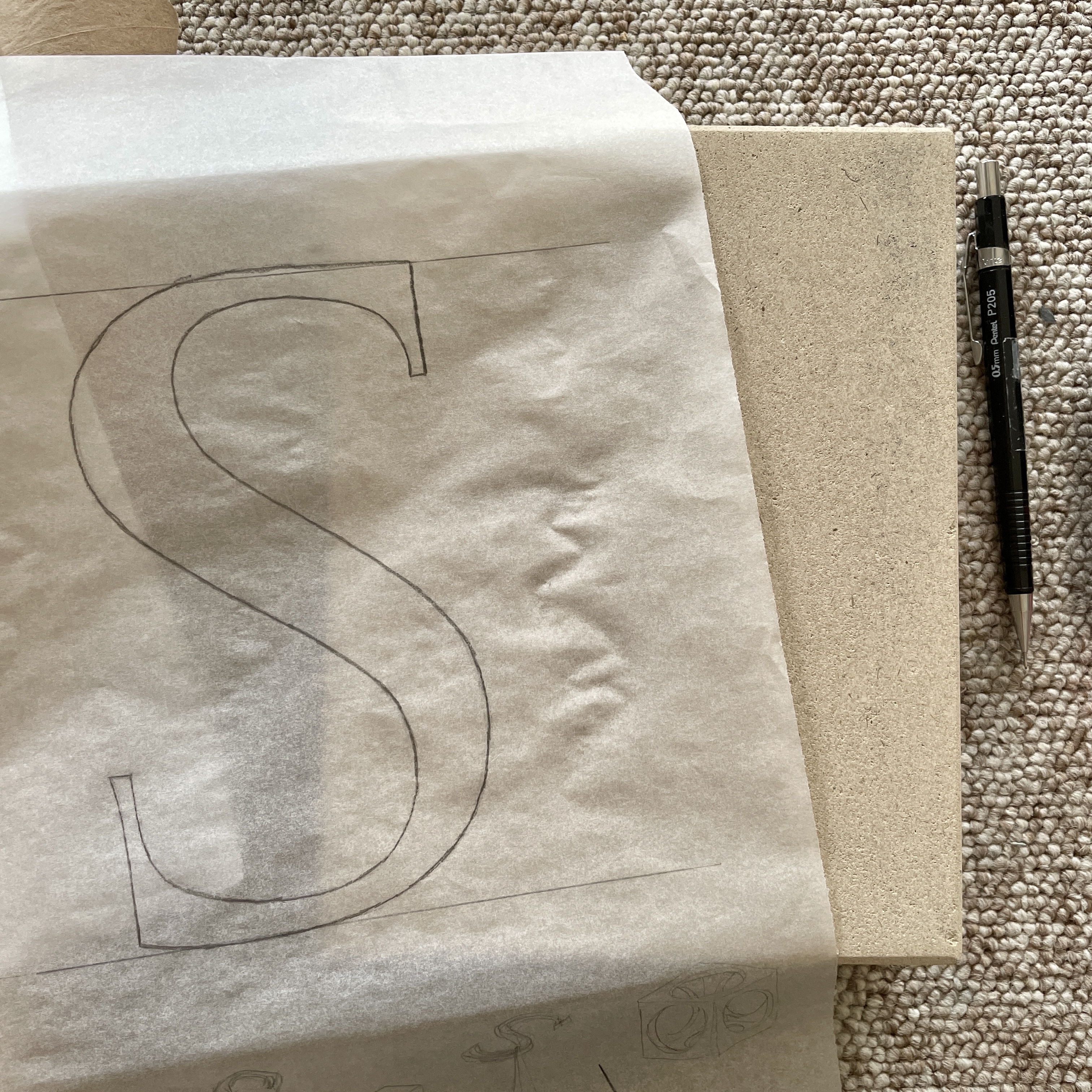
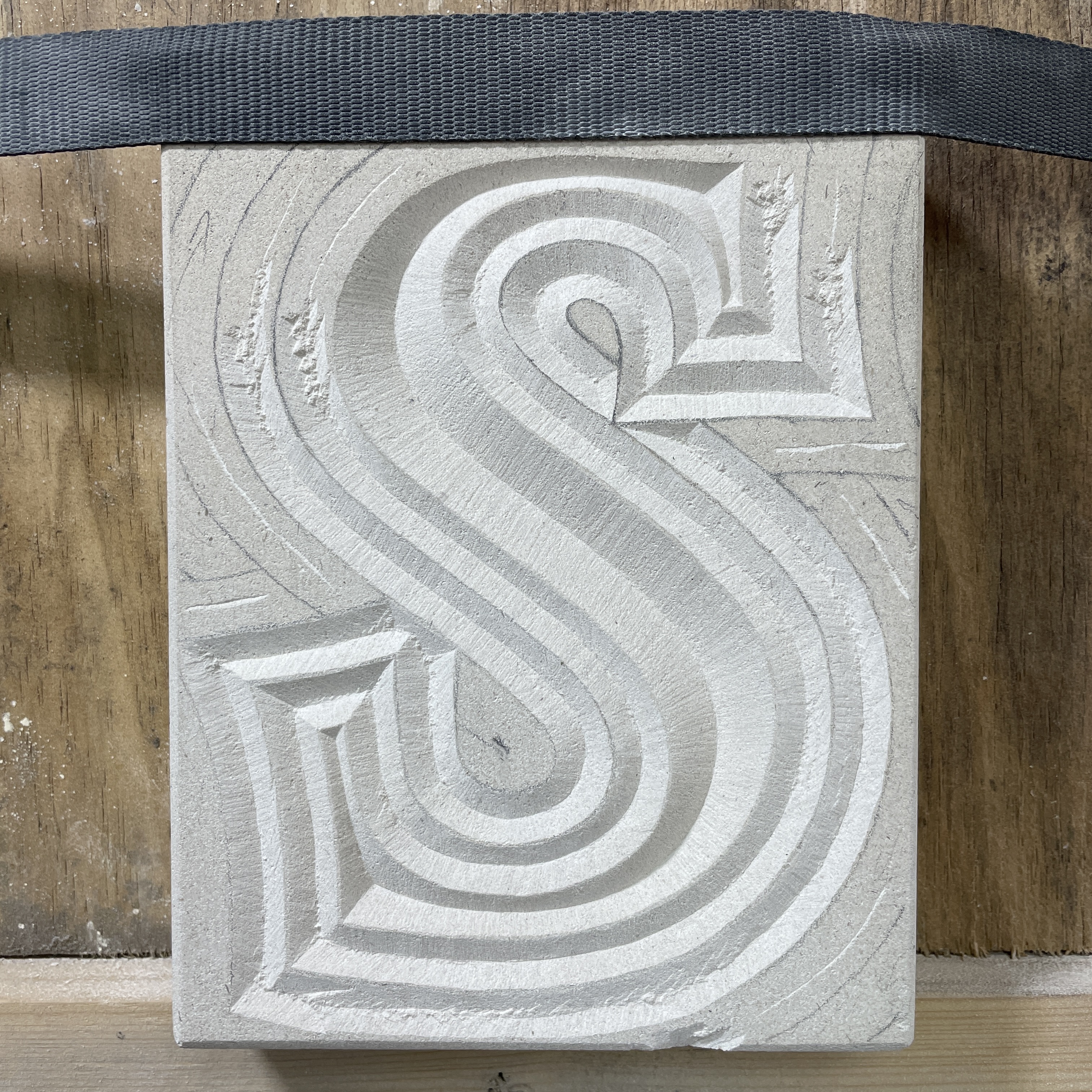
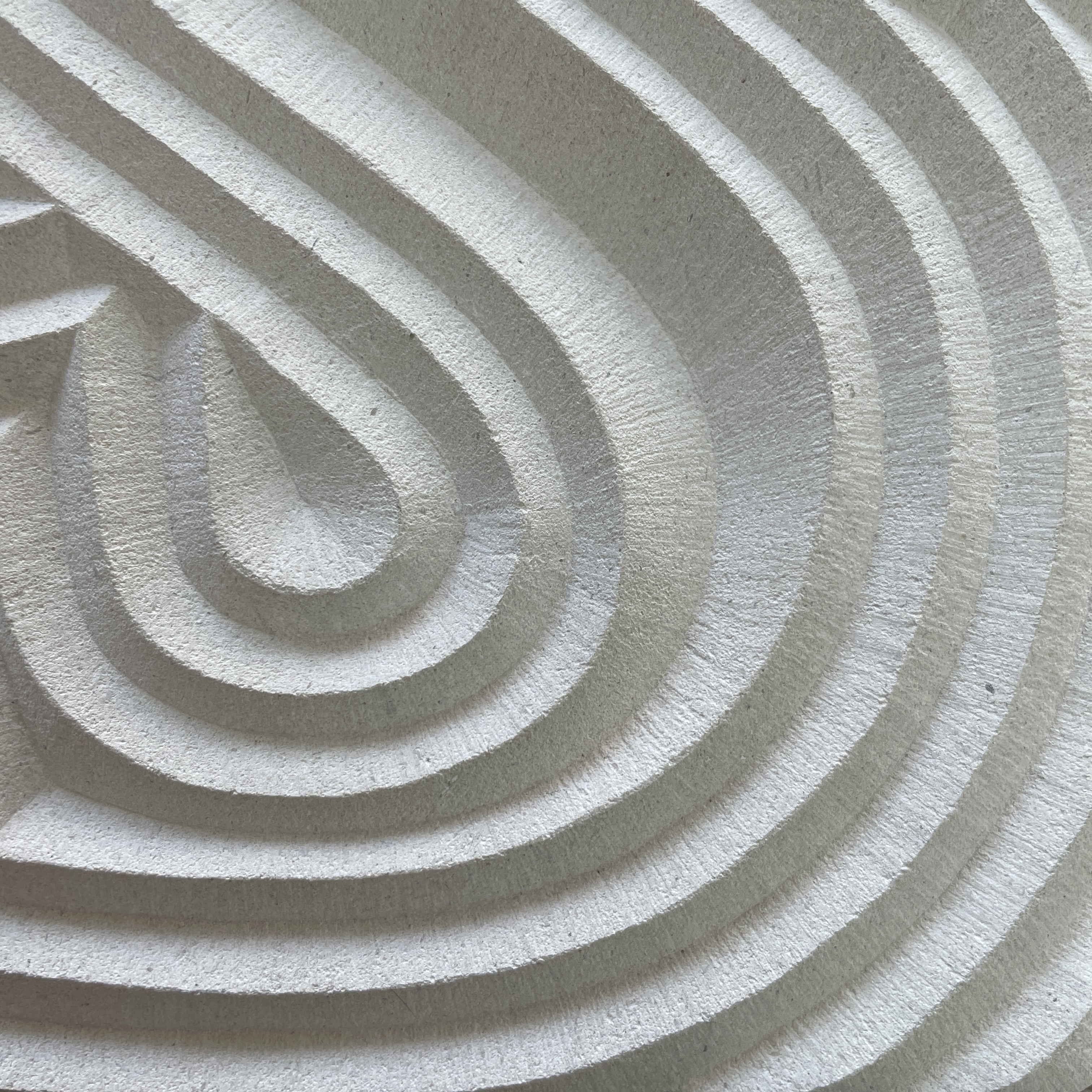
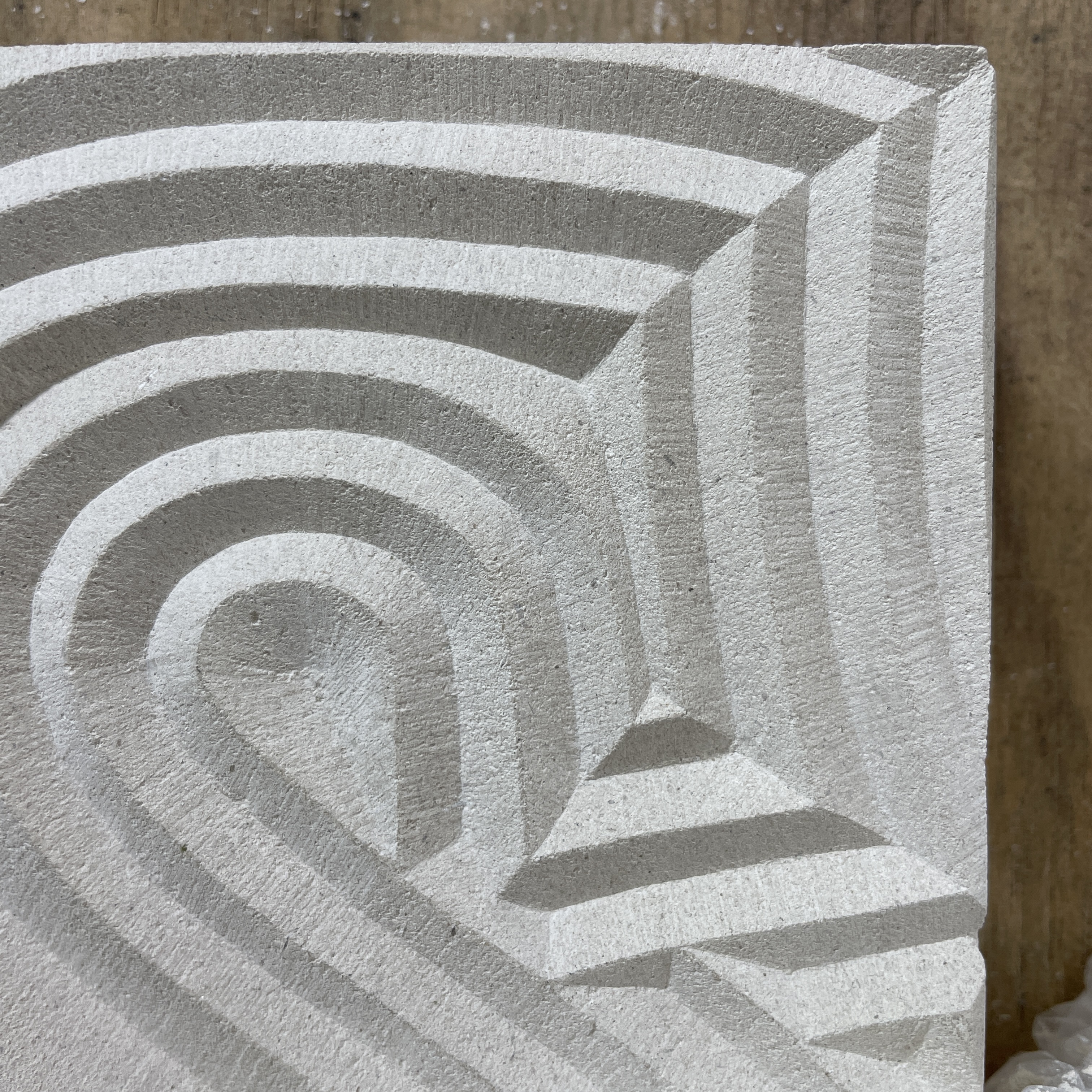
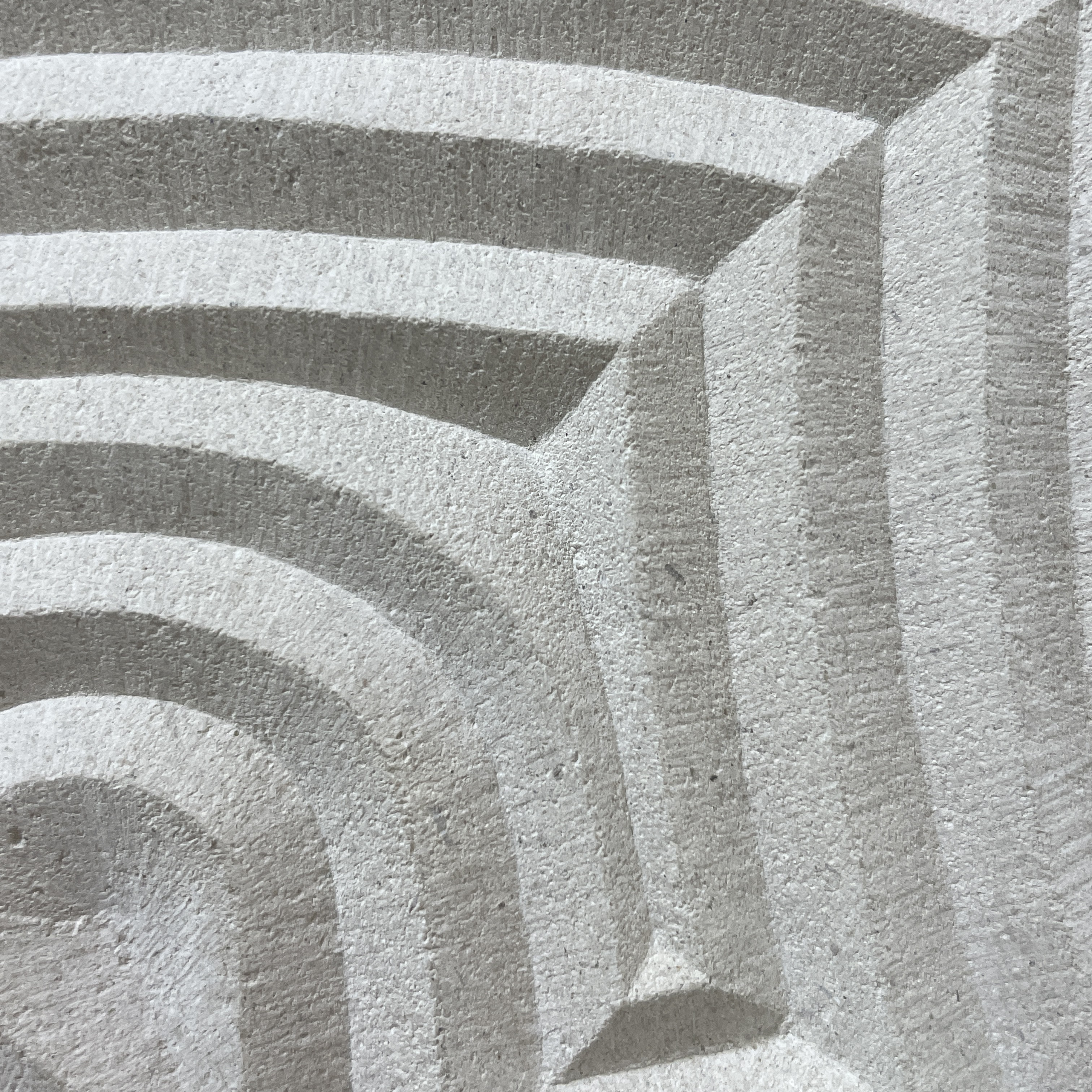
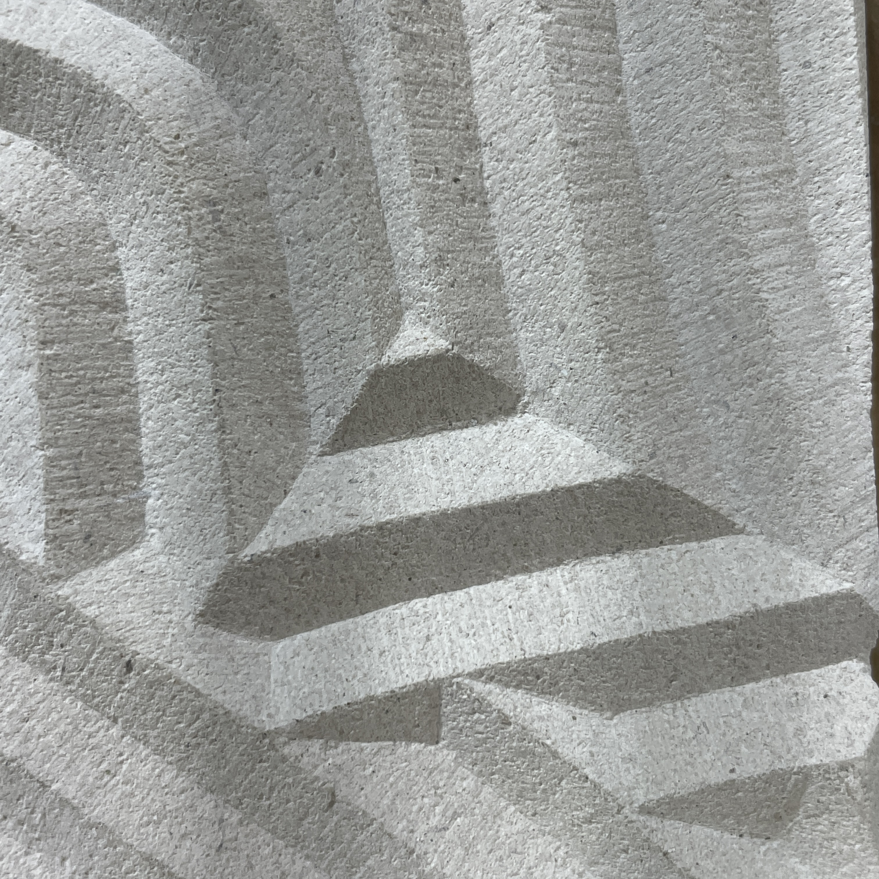
Fig. 2 - 5 I came up with a few designs for the ‘experimental’ aspect of the piece, but decided on concentric ’S’s (a developed Fig. 3), which in theory is a simple design, but in practise the drawing needed to be accurate, whilst also achieving a precise finish would be essential to the success of the piece. As it progressed this piece turned into an exploration of the ‘v-cut’, which is an the essential attribute of cutting letters.
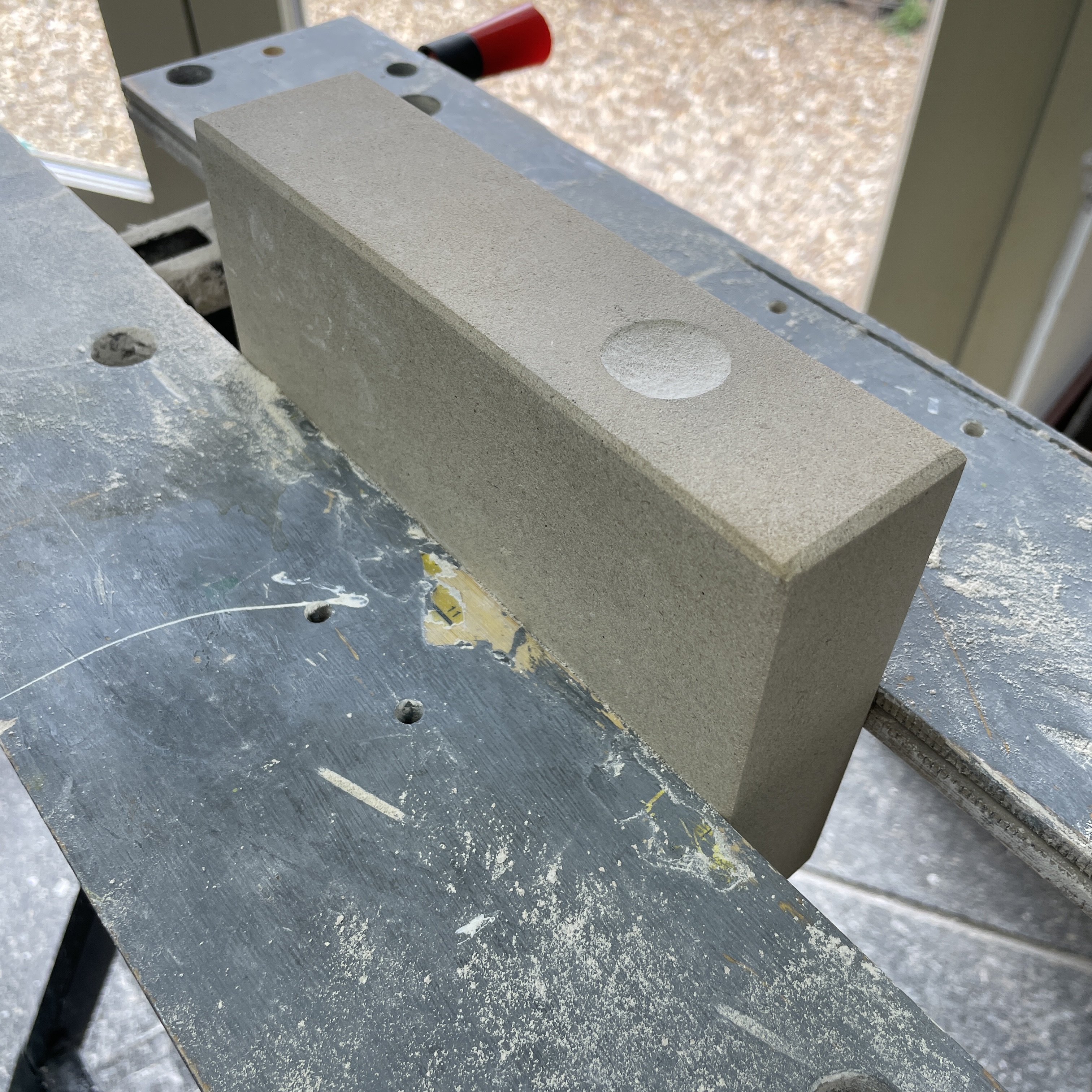
The piece of stone I worked in was Portland, a soft UK stone that is used a lot for headstones. The piece I was working with had jagged edges which we sawed down to size, in the process one of the edges developed a gouge, which was too deep to sand back. I decided to use this as a space to put my signature and cut the gouge out further into a circle, Fig. 7.
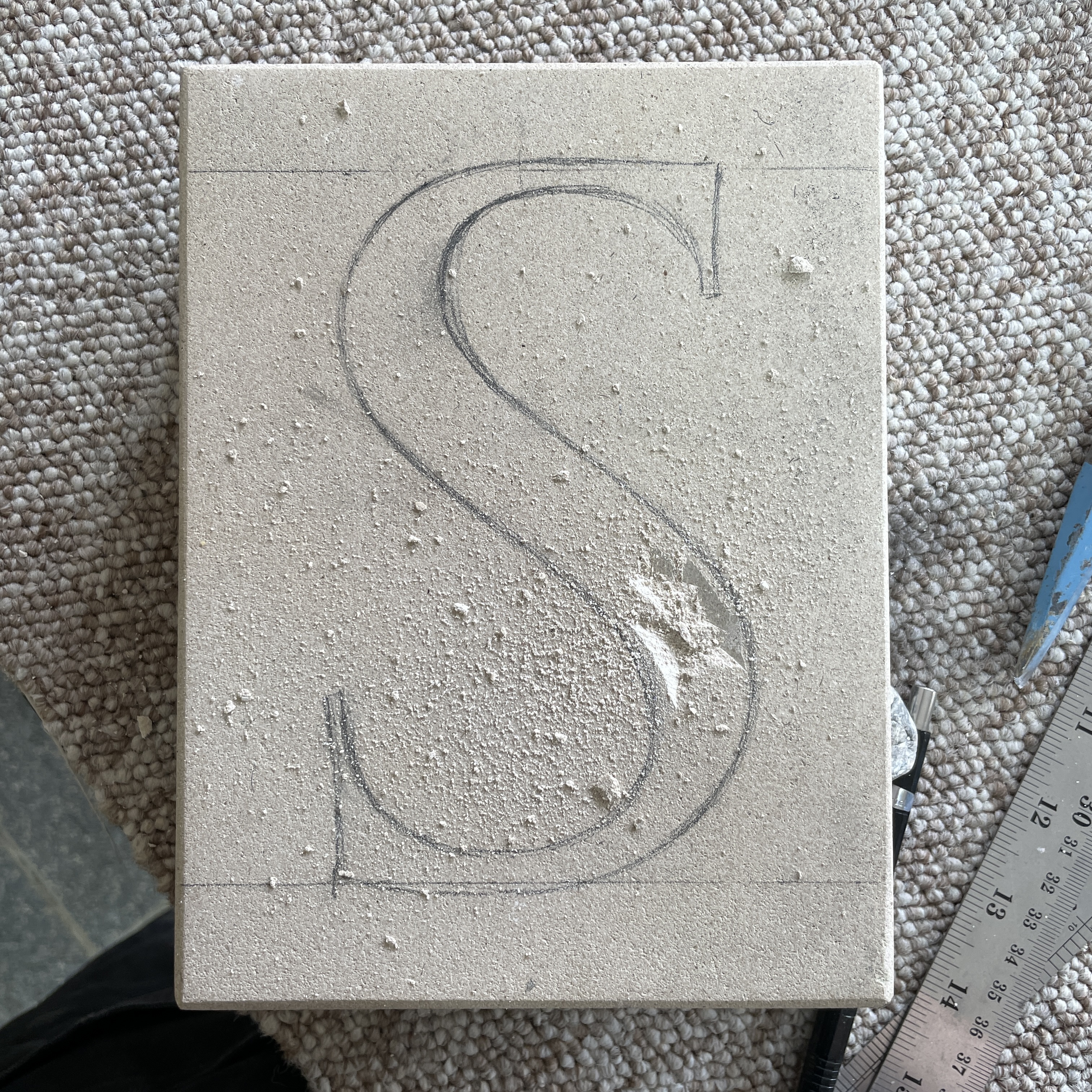
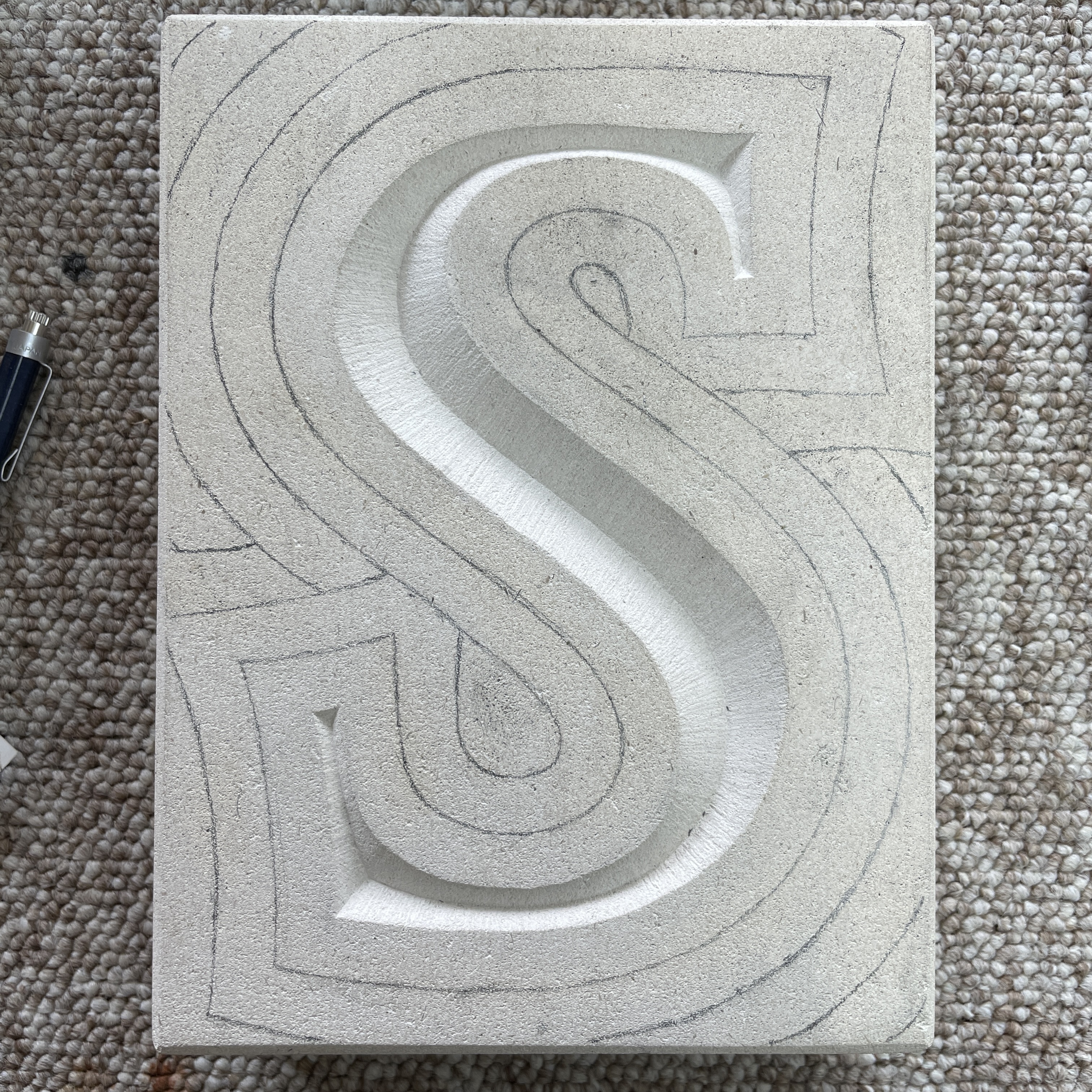
In terms of making my entire design digital I attempted to draw the consecutive lines free hand, but this proved quite difficult, as can be seen in Fig. 22, the lines didn’t match up as they needed to. Instead I used the lines I’d drawn on the stone as guides, which was much more effective, Fig. 23.
To enable the design to be cut in the way that we wanted I needed to make each layer an individual shape, which could be v-cut. As it demonstrated in Fig. 24, each layer having a colour.

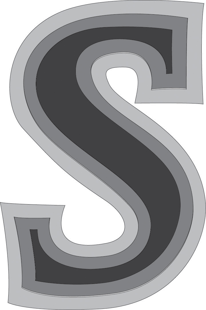
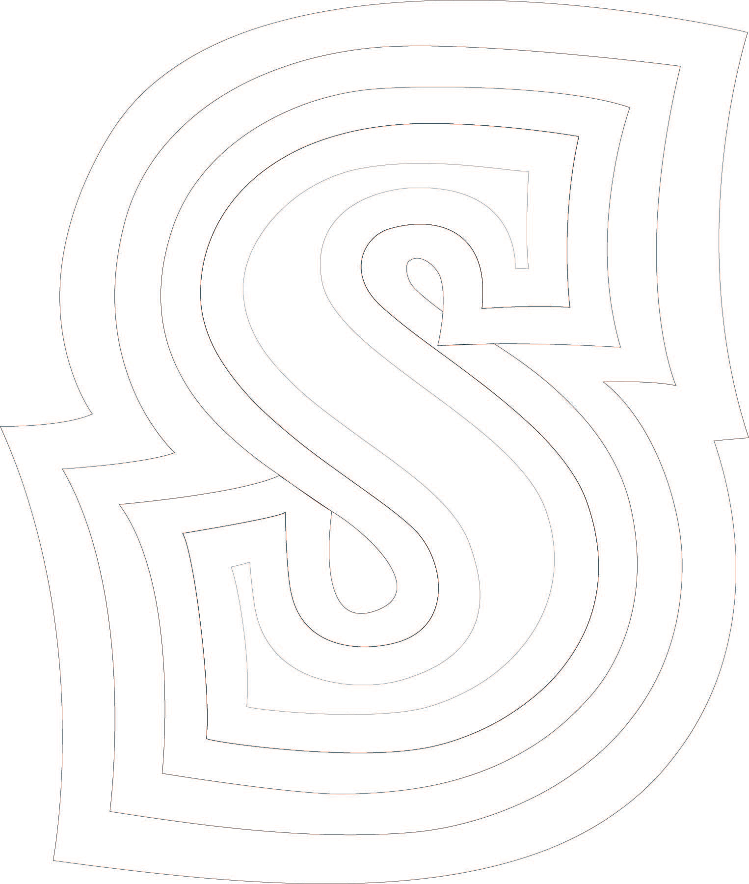
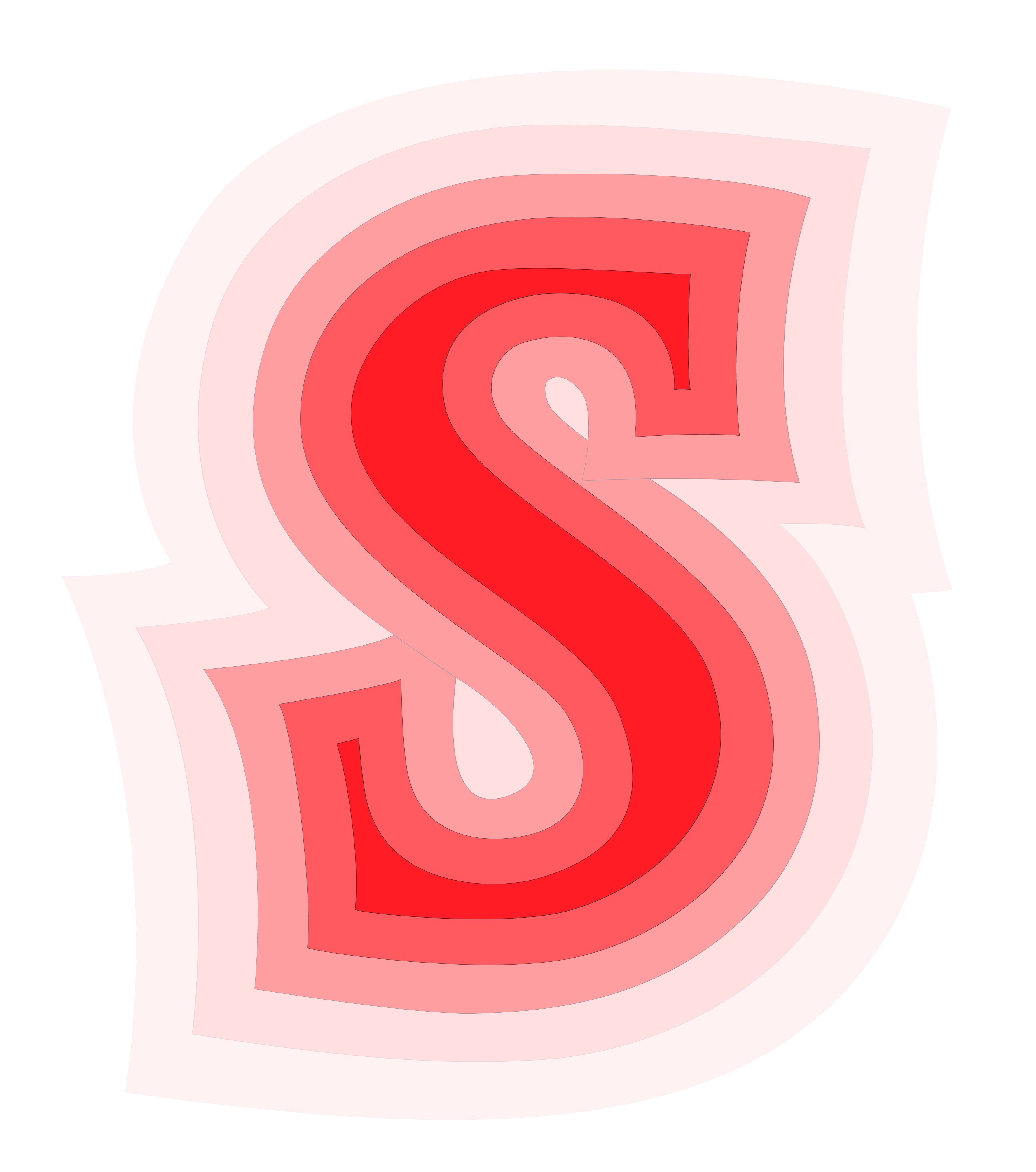
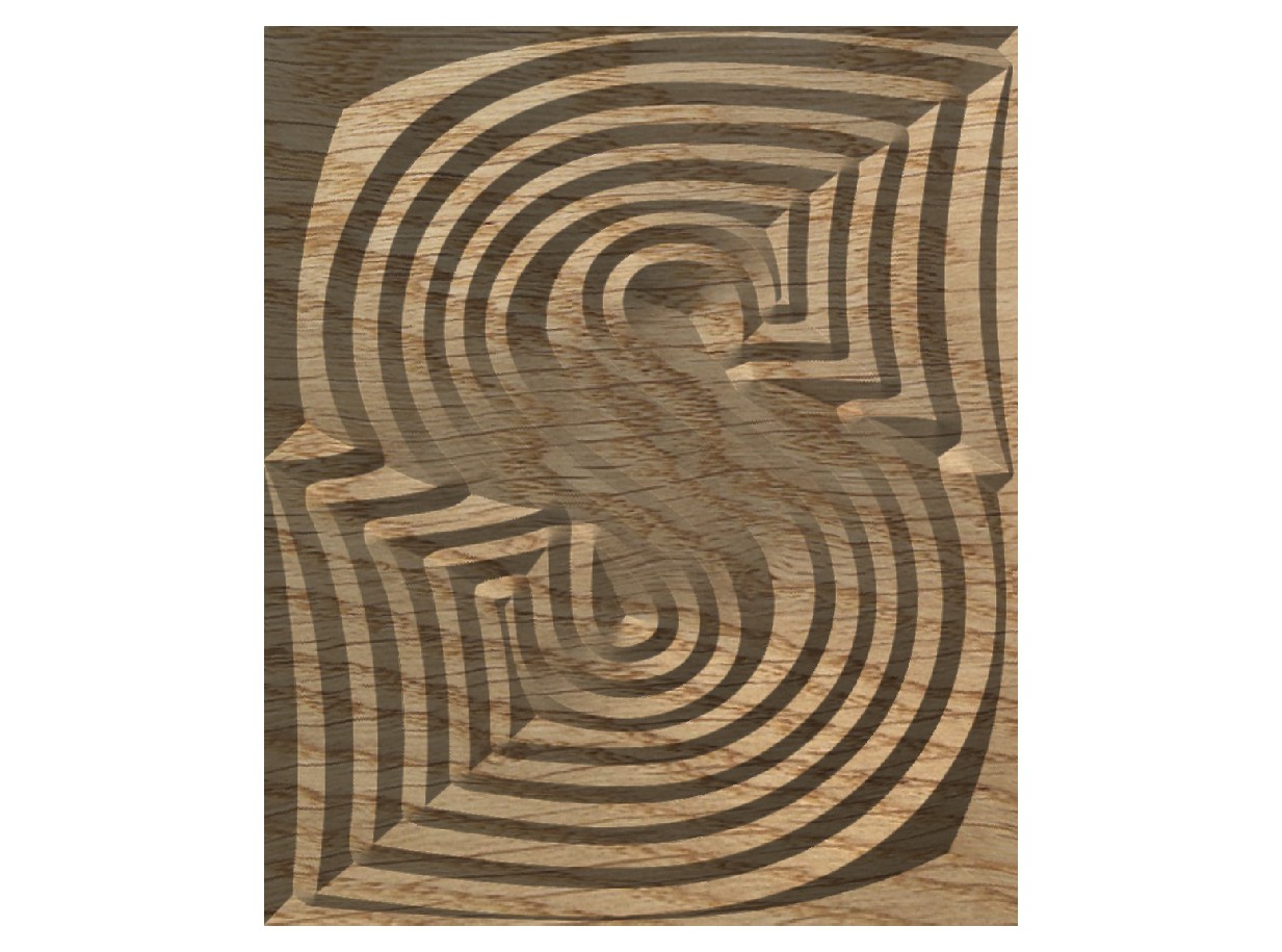
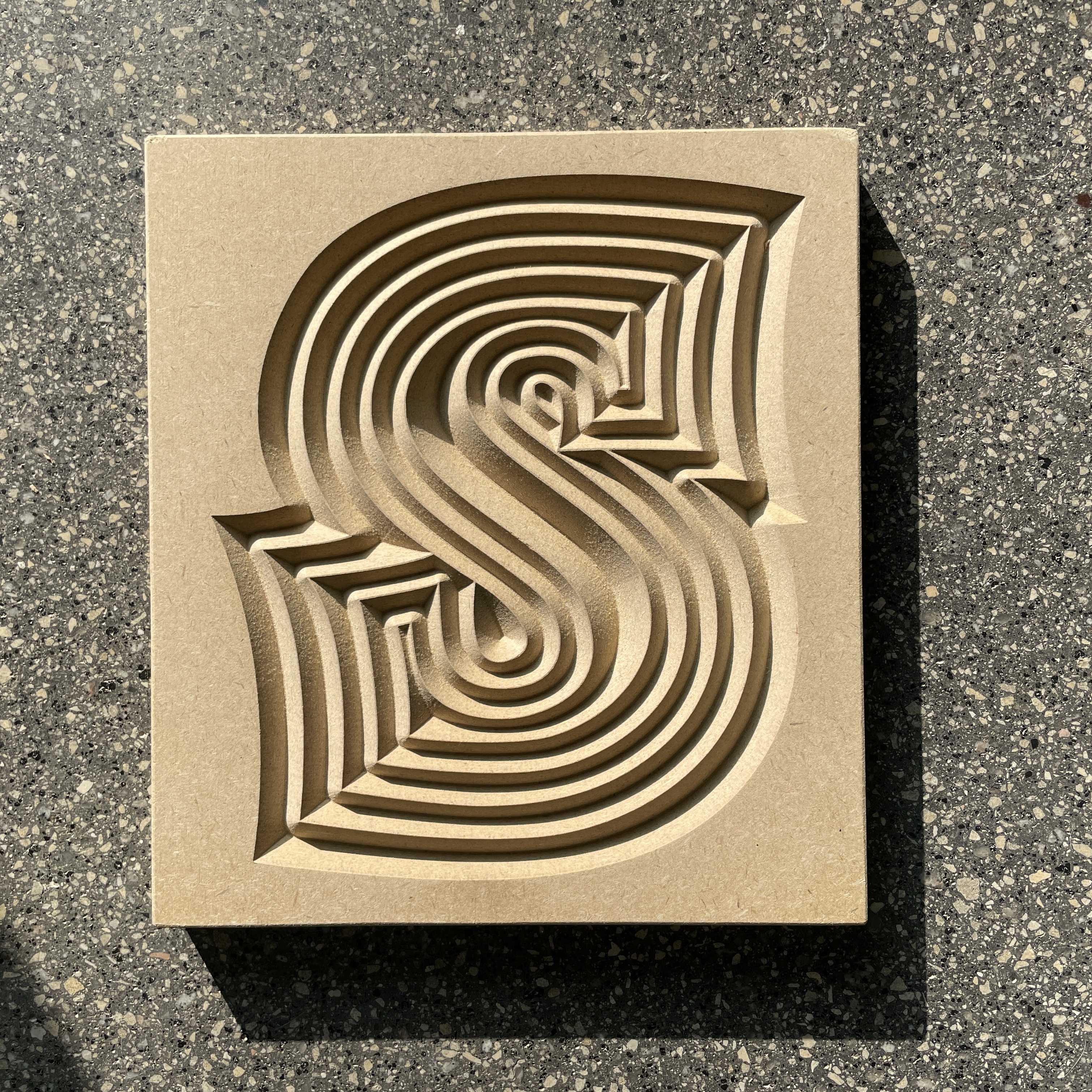
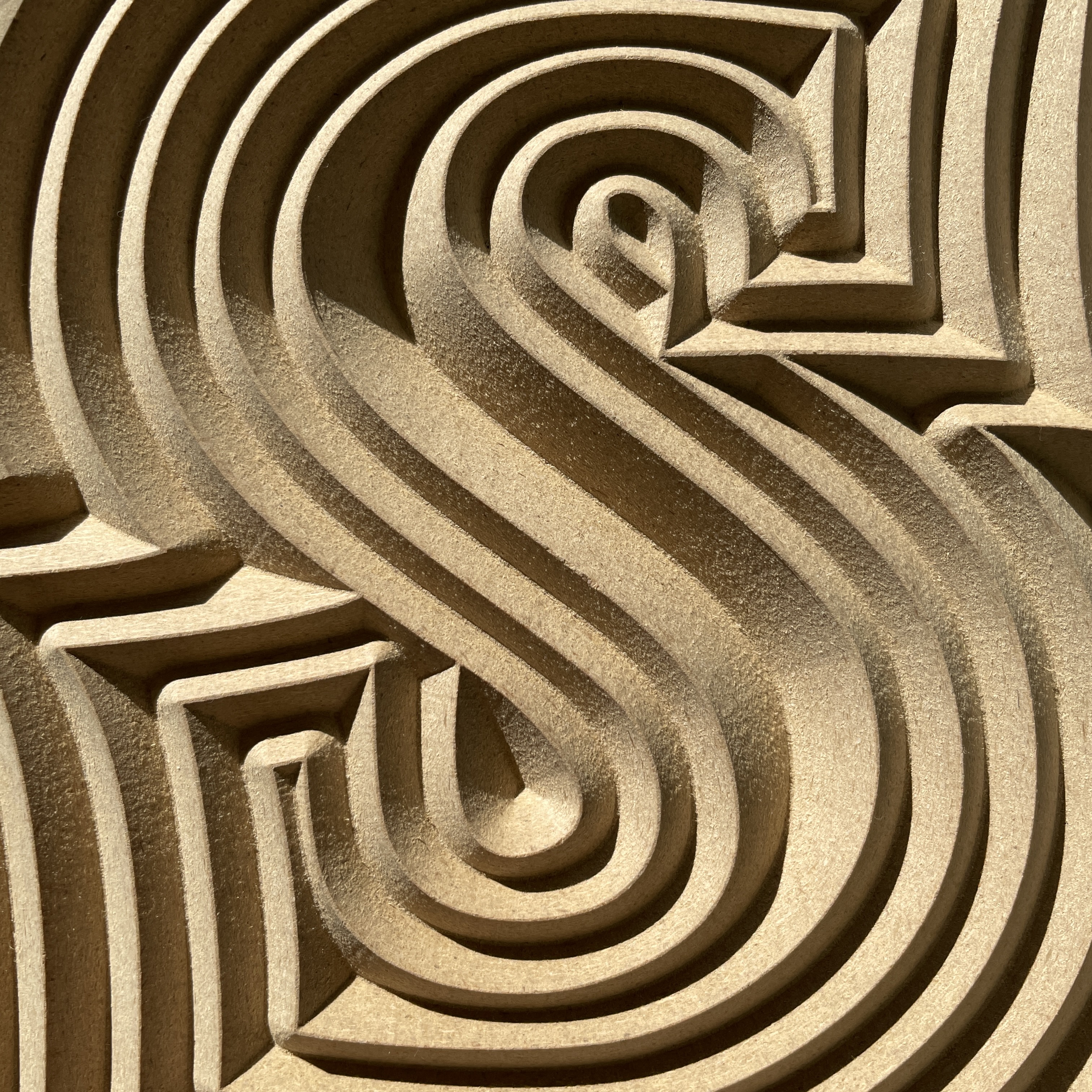
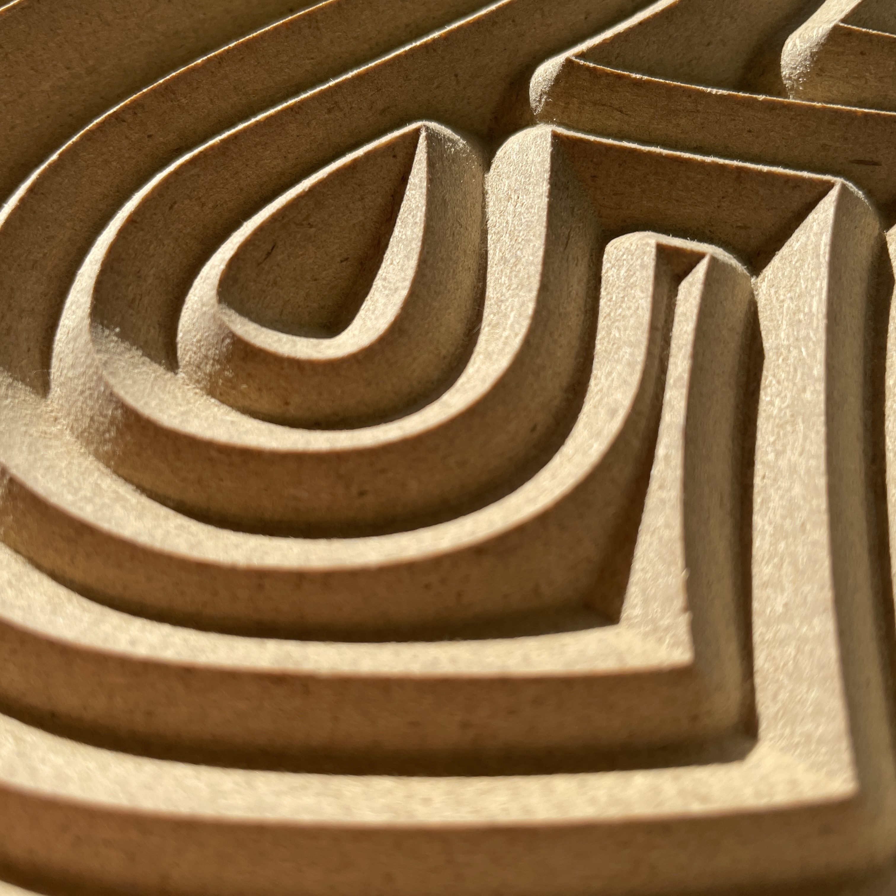
Fig. 23 shows the preposed wood cut. We intend to get this cut ‘as is’ but also to get the reverse cut, so that we can take prints or embosses from it. Figs. 26 - 28 show the finished piece CNC cut in wood.
09. Italics ︎︎︎