01 Trajan Alphabet
02 ‘torc’
03 Lowercase
04 ‘S’
05 Italics
06 Sign Writing
07 Low Relief
08 Nereids
09 Flourishes
10 ‘26 Connections’
11 Woodcarving
02 ‘torc’
I was kindly invited to submit a piece for an exhibition showcasing the work of recipients of LCAT funding to be held at City and Guilds of London Art School. I had a month and a half to design and carve the piece so we decided to work on a small scale and Charlotte suggested a soft lime stone. We took this as an opportunity to try carving a more sculptural piece which would have a bit more freedom with regard to style and concept.
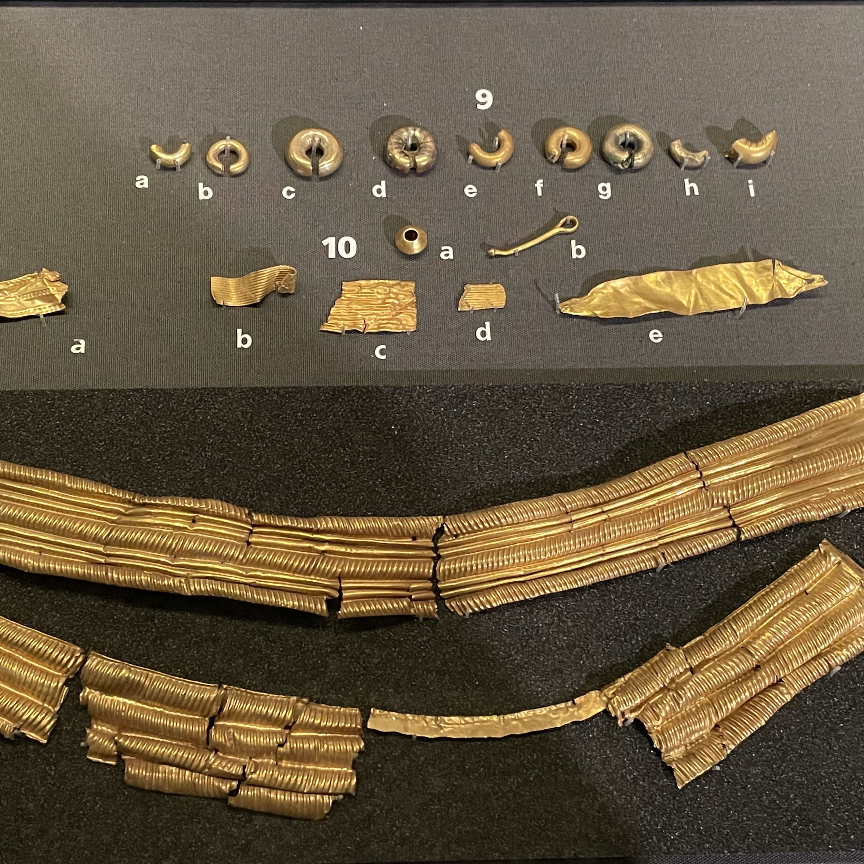
My starting point were sketches I had done on a day drawing around Norwich the previous month. The abstract yet minimal forms of objects from the Iceni period, on display in Norwich Castle Museum, particularly appealed to me, in particular the twisting gold torcs. The collection holds a wide selection of coins and gold objects from the Iceni period, the majority of which were found in and around Norfolk/Suffolk, as that is the area the Iceni tribe inhabited around AD 43-61, figs. 1-3.
![1]()
![2]()
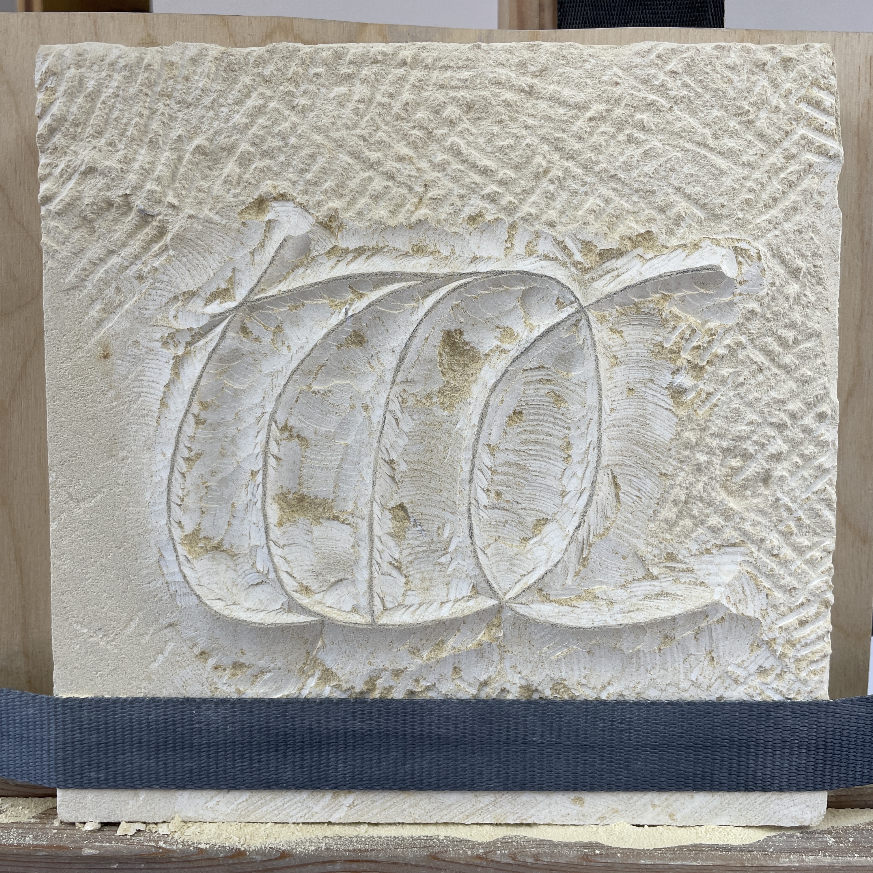
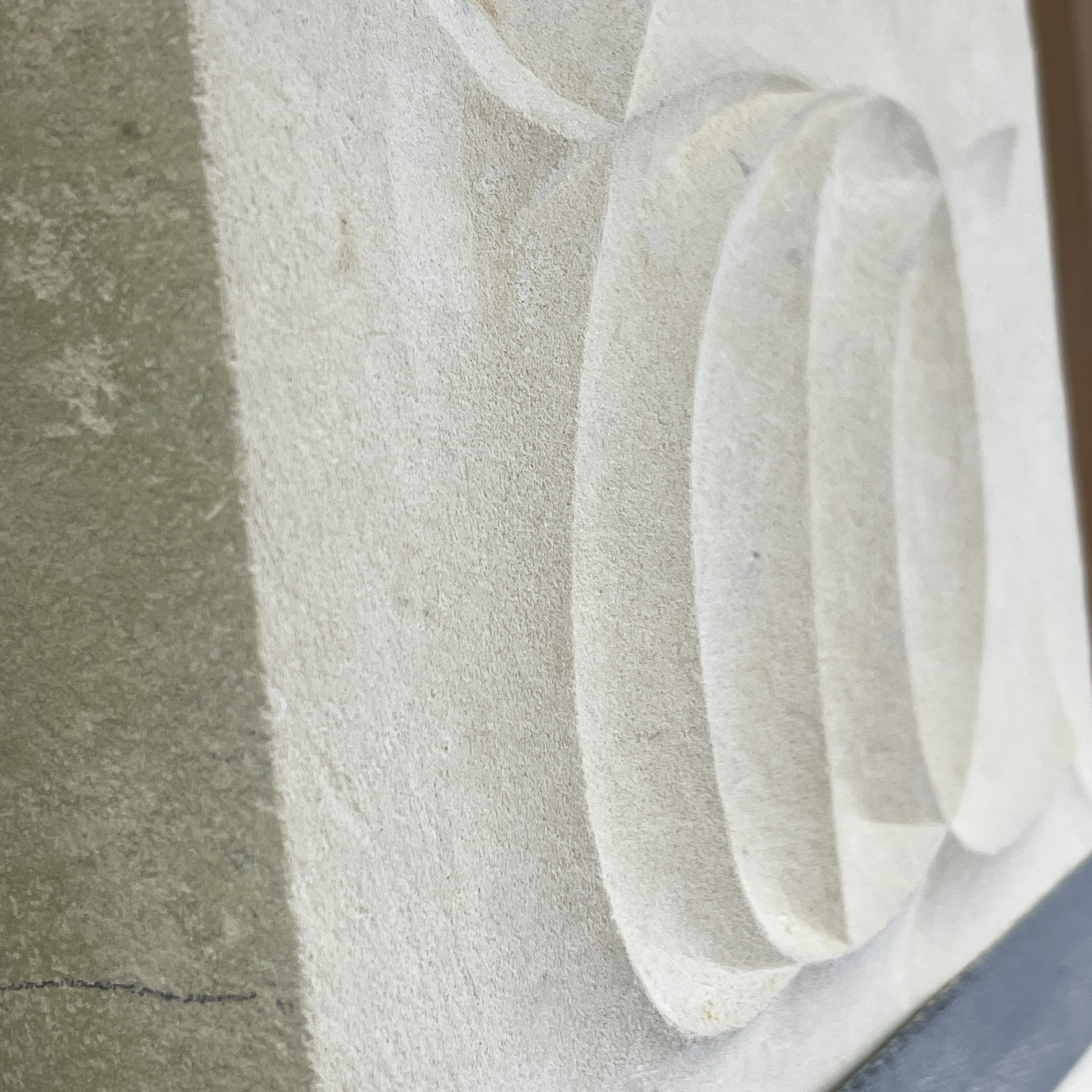
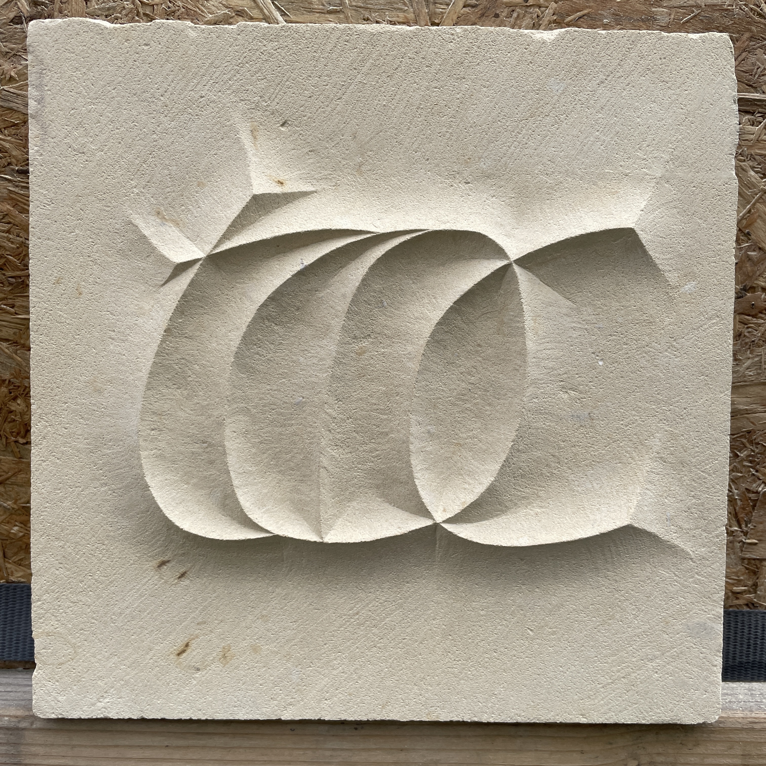
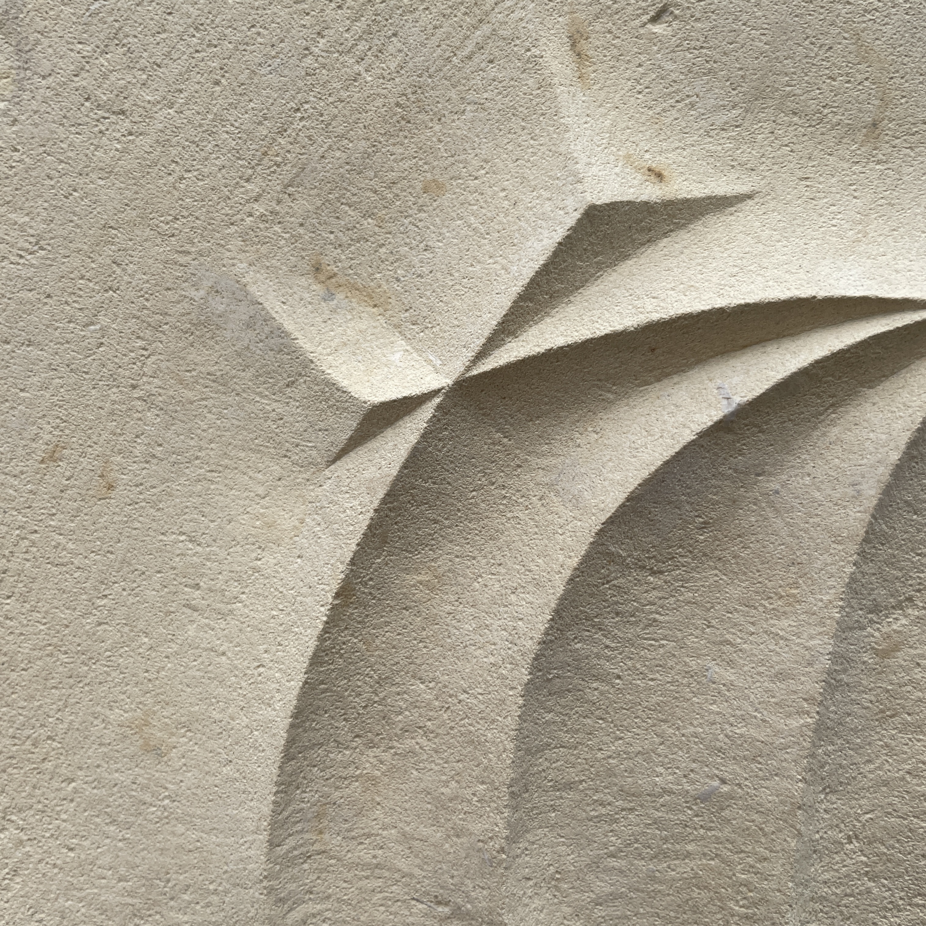
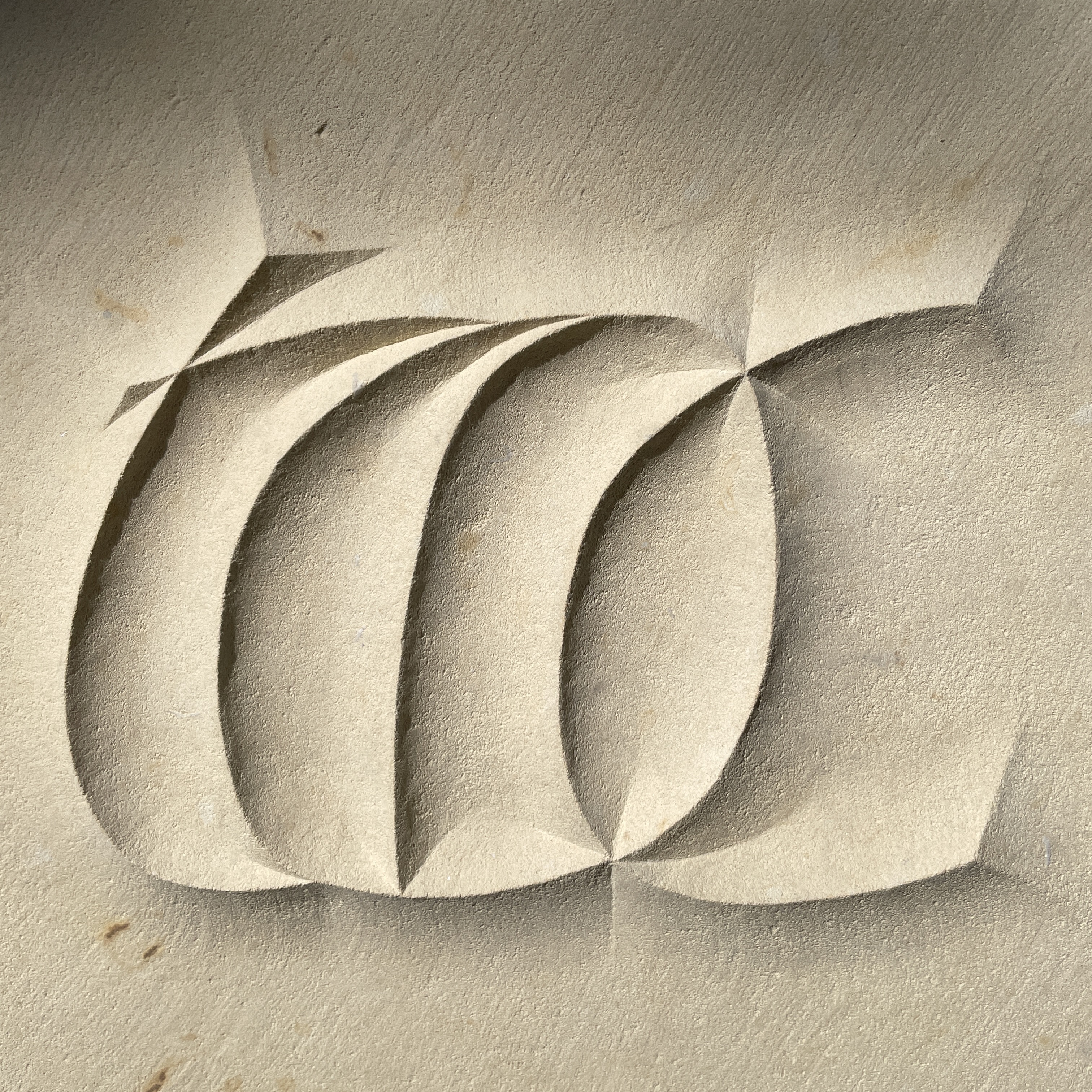
![3]() To take advantage of the softness of the stone we decided to carve the letters in relief rather than incised. The background has been cut away and the finished effect is as if the letters are reaching out of the stone.
To take advantage of the softness of the stone we decided to carve the letters in relief rather than incised. The background has been cut away and the finished effect is as if the letters are reaching out of the stone.
![4]()
![5]()
![6]()
I used the negative space within the twists of a torc as a shape to base my letterforms on, top right of the image in fig. 4. This took a little experimenting but I eventually fixed upon a shape I was happy with and started to draw out an alphabet. This process helped me decide the logic of the letter forms and how they could be adjusted for the word I had chosen to work with. As this is my first ‘3D’ piece I tried to keep it simple and decided to carve the four letter word ‘torc’.
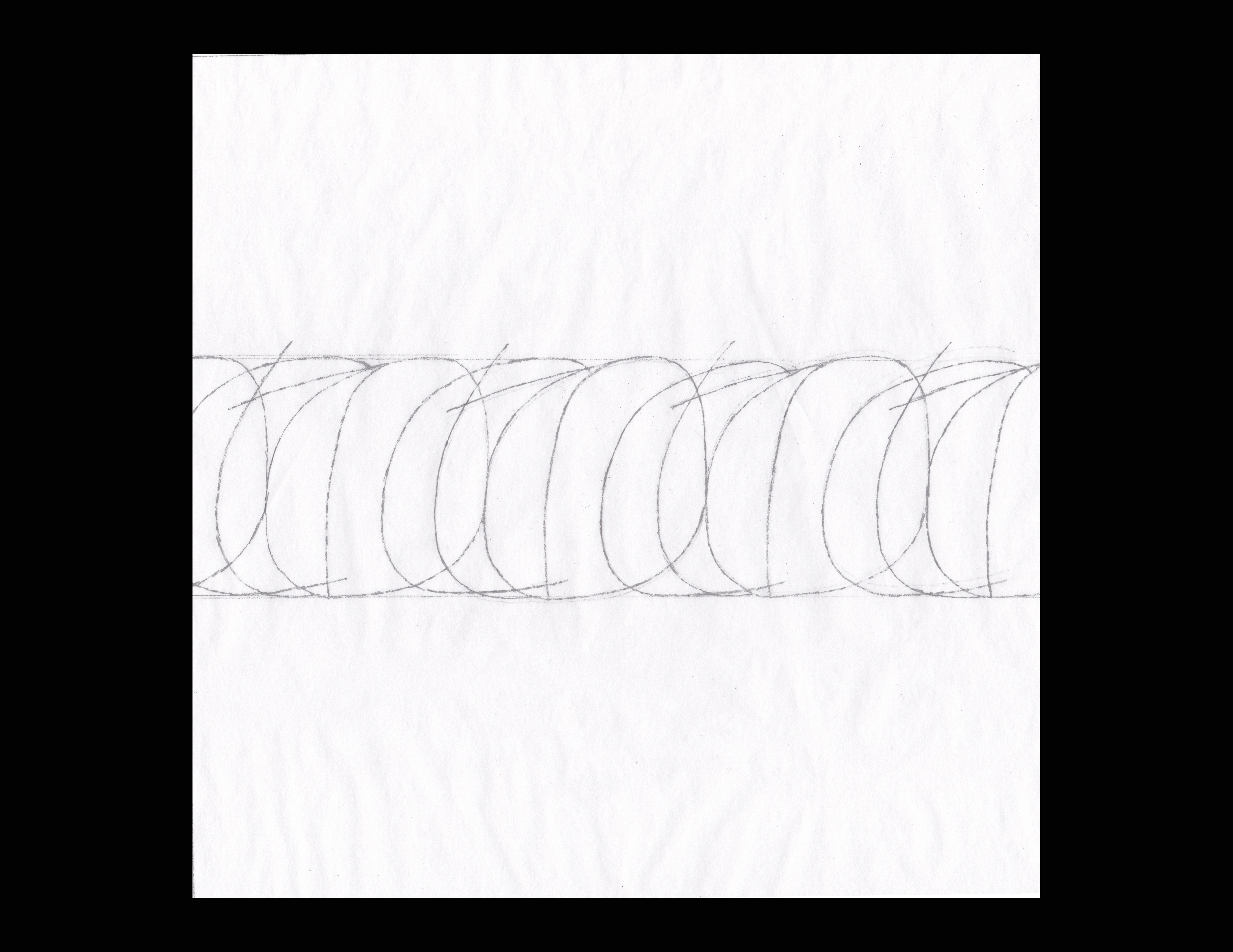
The piece of stone I was working on was square, 200 x 200mm, which proved more of a challenge to work out a composition than expected; splitting the letters into each corner of the square looked too much like a grid, whilst placing the word in the centre of the stone didn't fill the space. Whilst playing around with composition I began to overlap the letters, due to the curvature of the letterforms they started to suggest the spiralling lines of a torc. This felt like what I was trying to get at, so I took that idea to a logical conclusion and repeated the word again and again, as in fig.5. I liked how this abstracts the word and works purely as a design, but it would have been too fiddly for me to cut in the soft limestone. We decided on the word by itself at a larger scale, fig. 6
![7]()
![8]()
![9]()
![10]()
![11]()
![12]()
![13]()
![14]()
![15]()
![16]()
![17]()
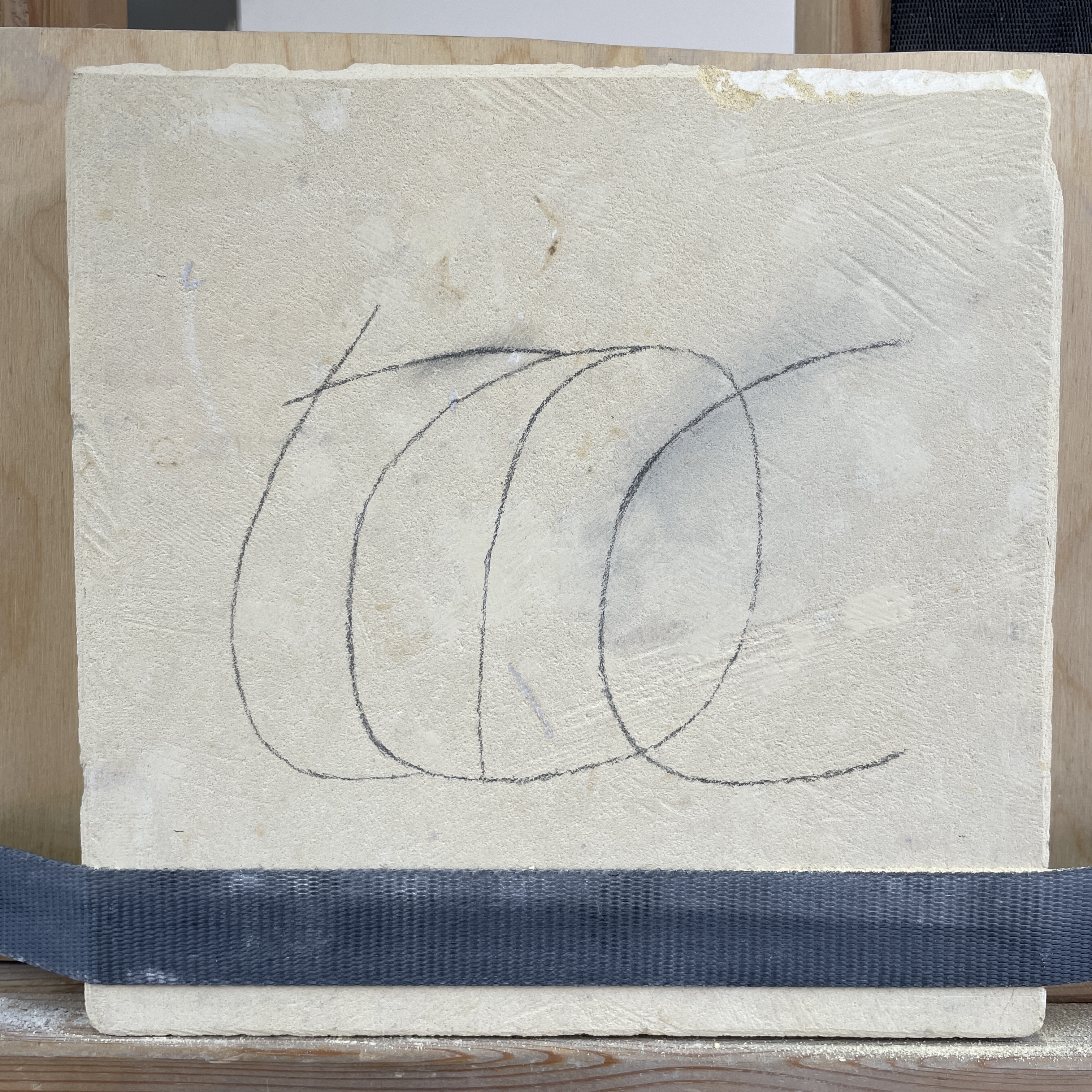
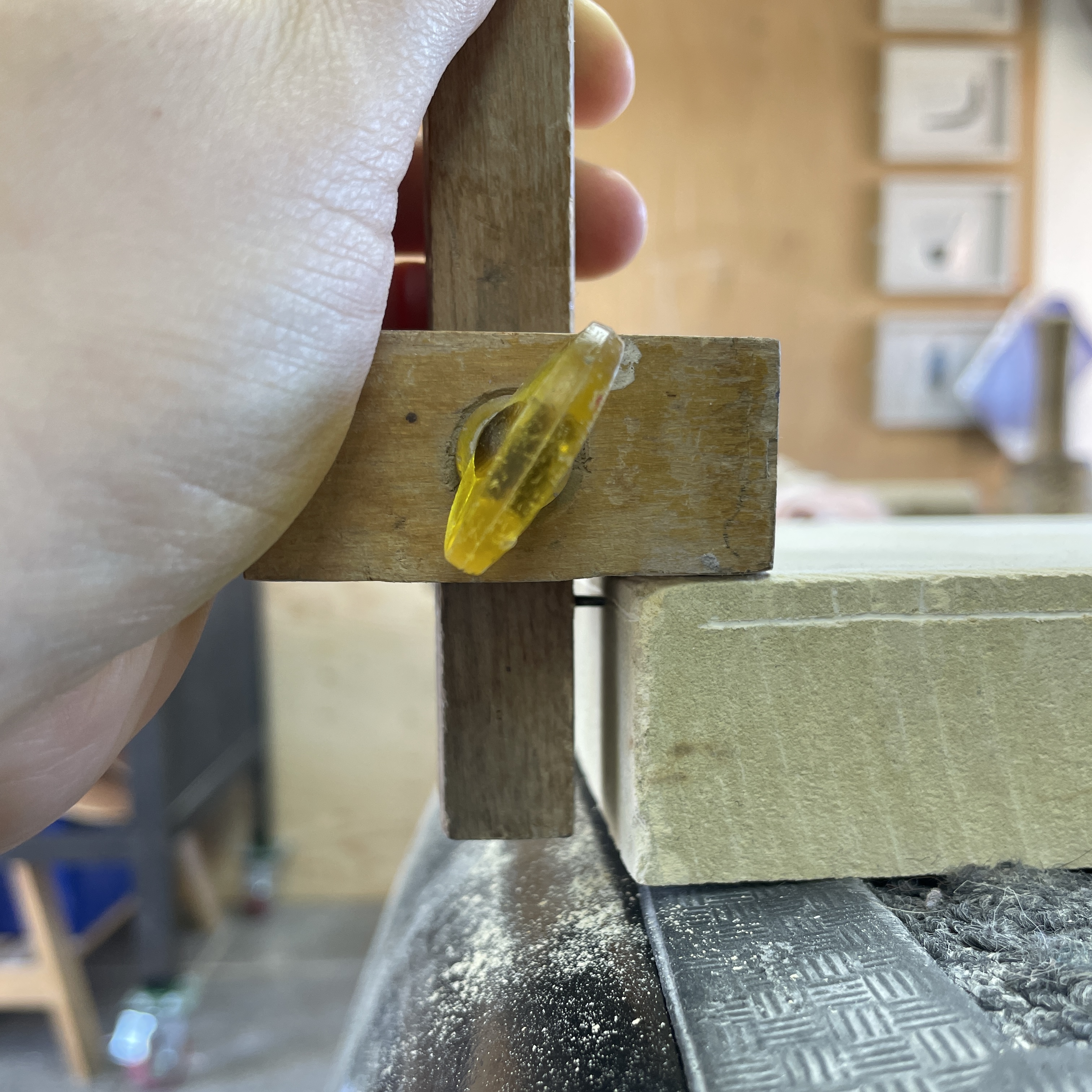
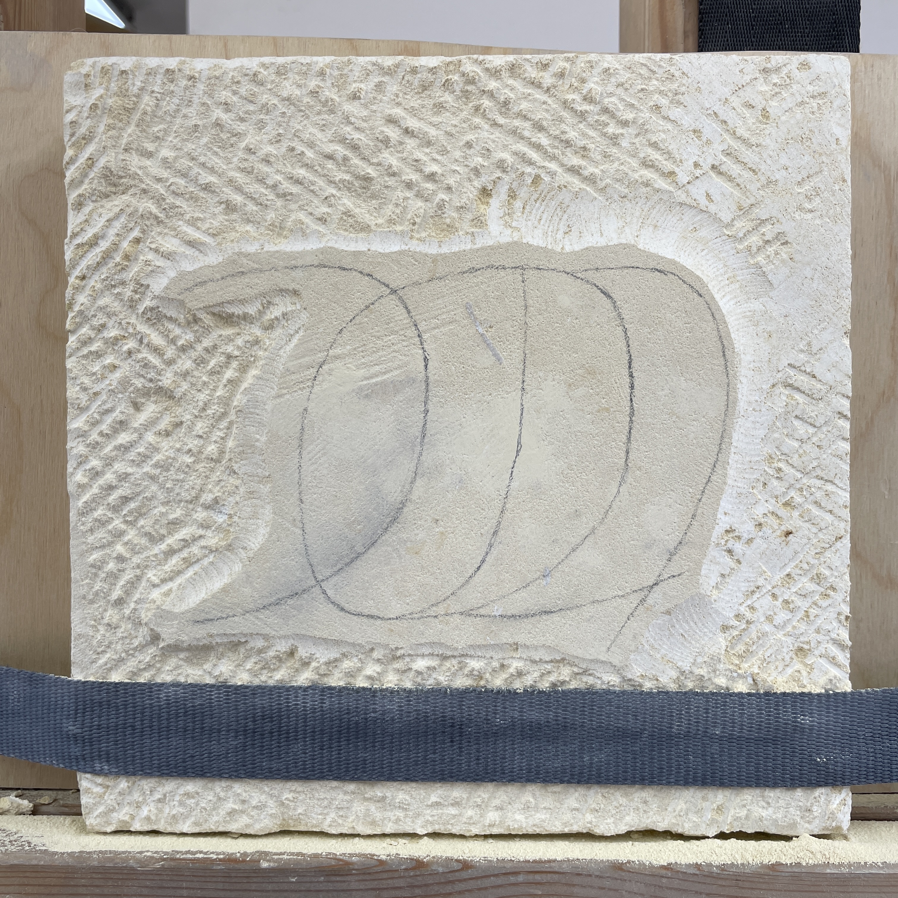
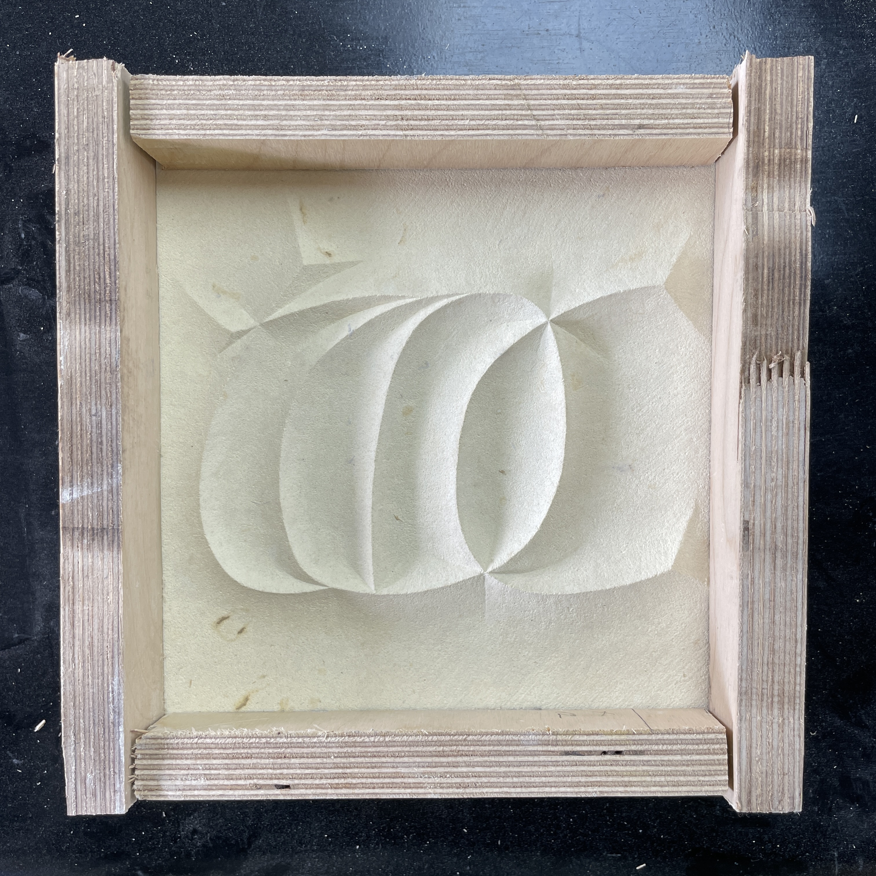
![18]() To prepare the stone I cut it in half width ways and prepared the surfaces, fig. 7-8. I drew on the design and we marked the depth I was to cut down to, figs. 9+10. I then roughed out the background and the insides of the letters, figs. 11-13. It was important that I cut to the design as close as I could manage. Using the bull nose chisels, I carefully cut away the sloping edges of the insides shapes of the letters, as can be seen in figs. 13-14. The remainder of my carving was preoccupied with cutting the surround back to an even surface and then smoothing the surface texture as much as I could. Because this stone is so soft almost every mark shows up, so I put a subtle texture on the background, seen best in figs. 16-17. We made a box for delivery to the exhibition in London, fig. 18. Below is the piece on display at City and Guilds as part of London Craft Week.
To prepare the stone I cut it in half width ways and prepared the surfaces, fig. 7-8. I drew on the design and we marked the depth I was to cut down to, figs. 9+10. I then roughed out the background and the insides of the letters, figs. 11-13. It was important that I cut to the design as close as I could manage. Using the bull nose chisels, I carefully cut away the sloping edges of the insides shapes of the letters, as can be seen in figs. 13-14. The remainder of my carving was preoccupied with cutting the surround back to an even surface and then smoothing the surface texture as much as I could. Because this stone is so soft almost every mark shows up, so I put a subtle texture on the background, seen best in figs. 16-17. We made a box for delivery to the exhibition in London, fig. 18. Below is the piece on display at City and Guilds as part of London Craft Week.
![19]()
![20]()
![21]()
02 ‘torc’
03 Lowercase
04 ‘S’
05 Italics
06 Sign Writing
07 Low Relief
08 Nereids
09 Flourishes
10 ‘26 Connections’
11 Woodcarving
02 ‘torc’
I was kindly invited to submit a piece for an exhibition showcasing the work of recipients of LCAT funding to be held at City and Guilds of London Art School. I had a month and a half to design and carve the piece so we decided to work on a small scale and Charlotte suggested a soft lime stone. We took this as an opportunity to try carving a more sculptural piece which would have a bit more freedom with regard to style and concept.
My starting point were sketches I had done on a day drawing around Norwich the previous month. The abstract yet minimal forms of objects from the Iceni period, on display in Norwich Castle Museum, particularly appealed to me, in particular the twisting gold torcs. The collection holds a wide selection of coins and gold objects from the Iceni period, the majority of which were found in and around Norfolk/Suffolk, as that is the area the Iceni tribe inhabited around AD 43-61, figs. 1-3.


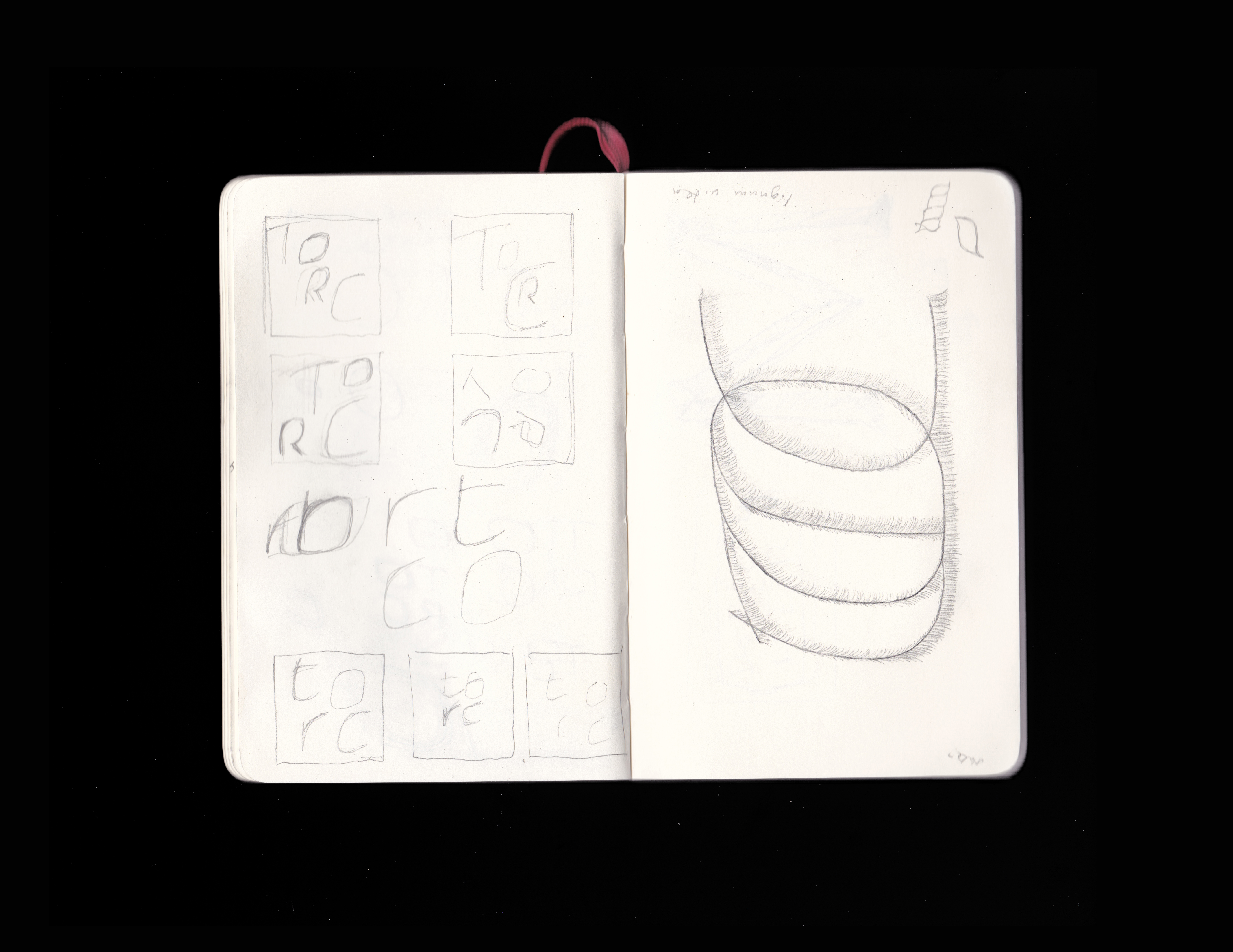

I used the negative space within the twists of a torc as a shape to base my letterforms on, top right of the image in fig. 4. This took a little experimenting but I eventually fixed upon a shape I was happy with and started to draw out an alphabet. This process helped me decide the logic of the letter forms and how they could be adjusted for the word I had chosen to work with. As this is my first ‘3D’ piece I tried to keep it simple and decided to carve the four letter word ‘torc’.
The piece of stone I was working on was square, 200 x 200mm, which proved more of a challenge to work out a composition than expected; splitting the letters into each corner of the square looked too much like a grid, whilst placing the word in the centre of the stone didn't fill the space. Whilst playing around with composition I began to overlap the letters, due to the curvature of the letterforms they started to suggest the spiralling lines of a torc. This felt like what I was trying to get at, so I took that idea to a logical conclusion and repeated the word again and again, as in fig.5. I liked how this abstracts the word and works purely as a design, but it would have been too fiddly for me to cut in the soft limestone. We decided on the word by itself at a larger scale, fig. 6
