01 Trajan Alphabet
02 ‘torc’
03 Lowercase
04 ‘S’
05 Italics
06 Sign Writing
07 Low Relief
08 Nereids
09 Flourishes
10 ‘26 Connections’
11 Woodcarving
01 Trajan
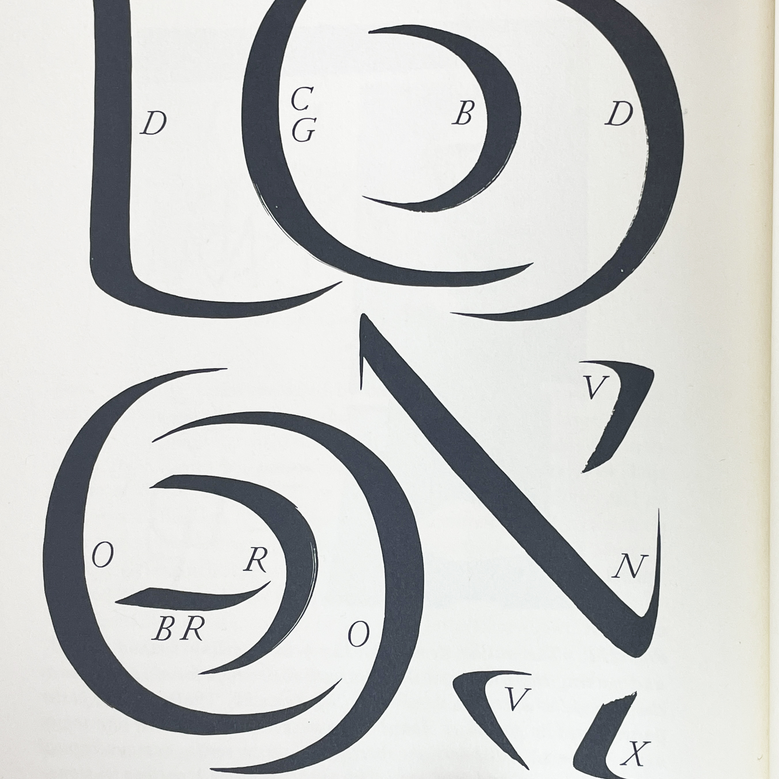
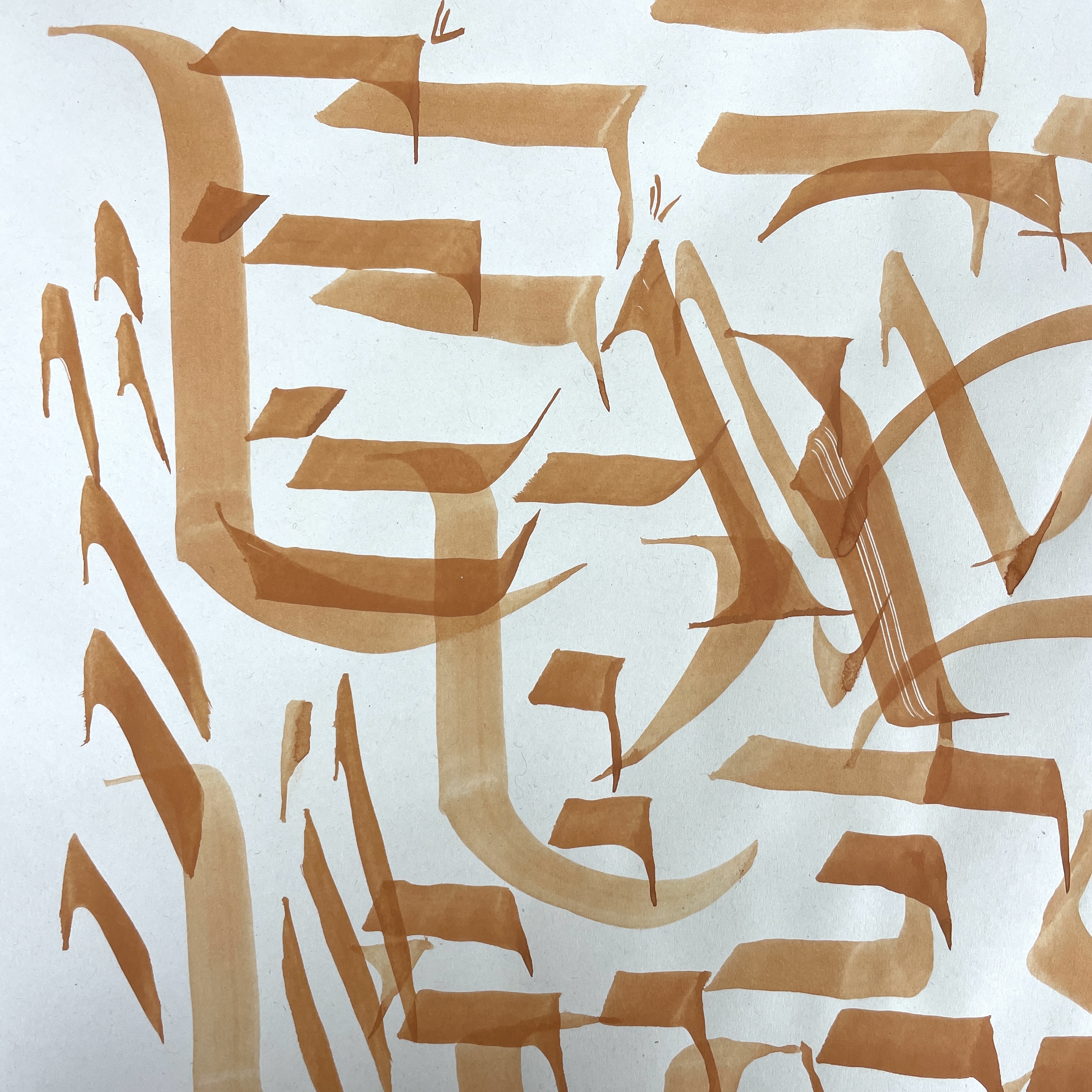
The first piece of work an apprentice often completes is designing and carving their own alphabet. Most often in the Trajan style. ‘Trajan’ being in reference to the Roman emperor Trajan’s triumphal column in Rome, a copy of which can been seen in the Victoria & Albert Museum’s hall of casts. The Trajan alphabet is an uppercase letterform, which we now know derives from the shapes made when drawing with a brush. Fig. c - e show my efforts at this, to create the curves and corners the brush is manipulated and twisted. It is directly from the brush movements that the weights and proportions of the letters derive. Understanding this connection is very useful to keep in mind when I draw my letterforms. Fig. a - b are pages 220 - 221 from Edward M. Catish’s The Origin of the Serif showing the gestures that constitute the letters.
![]()
![]()
The Trajan letterform is the most commonly used style of lettering for a letter carver as it conveys a solemnity which is appropriate for memorials, but can be personalised in myriad ways for any other type of lettering.
As this is my first exercise I am not looking to any source material to copy a lettering style, but drawing the Trajan alphabet from what I already know. This will help internalise my understand of letterforms.
Fig. 1 - 3 I start by drawing thumbnail sketches of layouts. I gravitate towards a grid that fits all 26 letters of the alphabet plus the ampersand without any gaps. A 3 x 9 grid. To understand how the letter forms of the Trajan alphabet proportionately relate to each other, I draw out the alphabet in a skeleton form. Understanding the relative widths of the letters is an important starting point for achieving a harmonious design.
![]()
![]()
![]()
Fig. 4 - 7 I now start drawing my design at full size. We decide to work with the letters at 40mm high, not too big or too small for when I start carving. I first draw the skeleton letters and then start to thicken them up to my current understanding of the Trajan style. Whilst drawing I am measuring the letters against one another, to make sure I am getting the proportions correct. When the letters are closer to how they will look in a finished state I can start adjusting the spacing. I’m checking that each line is centred whilst taking into account the optical edge of each letter and the negative space between them, so that the composition looks balanced. I re-draw, trace, cut up and arrange lines, until I’m happy with the layout.
Once I have decided upon the spacing and I’ve made any changes that Charlotte suggested, we go through each letter’s shape and specific characteristics. Throughout this project I am redrawing the letters and gaining a better understand of how they should look. As well as the technical language used to describe a letter.
When I’ve redrawn the ‘final’ alphabet, we start preparing the stone.
Preparing the Stone
I am using a piece of Moleanos limestone for my first piece, rather than something like slate, as it will be more forgiving to cut. Moleanos is a creamy off-white stone with flecks of shells and fossils.
![]()
![]()
Fig. 1 - 2 First we need to cut the stone from the larger piece to the right width. We score the cutting line onto the stone with a pointed chisel and check with a set square that the line is square at either end. The line needs to be scored on both sides of the stone and on the edges. As I’ve never used an angel grinder before Charlotte cuts the stone, but I have a go at using it on a spare piece of stone, to get a feel for how it cuts. We are both in full PPE, Charlotte in a dust mask with filters, goggles, earplugs and ear defenders. Gloves, overalls and steel toe cap boots.
![]()
![]()
![]()
![]()
![]()
Fig. 3-4 Once the stone is cut there is a rough surface to the edge, Charlotte shows me how to neaten this to flat edge. As we are not cutting a letter but rather removing stone and preparing a surface, we use the size and shape tools that are more commonly use in stone masonry.
First we level the surface, by chopping into the centre, never out to the edge, then I chase the surface which produces the parallel lines you can see in fig. 5. I am aiming for the cutting line to reach from edge to edge, if it doesn’t that’s an indication that the surface isn’t flat. Then we go over it with a file to get a completely flat surface. I use the chisel to check that it is flat, as in fig. 7.
![]()
![]()
![]()
![]()
Next I cut the border. Fig. 8 I have opted for a beveled edge, with a chopped texture. Fig. 9 - 10 Although this is a fairly thin piece of stone, the bevelled edge gives the suggestion of the stone being even thinner and lighter, this is heightened by the angle of the bevel. As before we score the lines I want to cut to, and chop away the stone, then chase over it to get a flatter surface. Fig. 13 To create the chased finished texture I deliberately cut a bit deeper. Once I am happy with how the edges are looking, we can start marking up the stone to draw on the design.
![]()
![]()
![]()
![]()
![]()
Fig. 14-17 We draw on a vertical centre line and the lines for the text, we check that everything is square and that the space at the top and bottom is how we want it. Next I transfer the design onto the stone. There are a few ways to transfer drawn letters onto the stone, but Charlotte opts for drawing them straight onto the stone, again this helps cement the letterforms in my mind. This method also takes into account that the design drawn on paper may need to change slightly when transferred to stone. I use a printed copy of my drawing to help get the spacing correct. I draw the letters fairly roughly, as we’ll go over each one before I start carving.
Carving
Fig. 1 - 5 show the letters in there final stage before carving. I’ve drawn them standing at the easel. This process was very useful as we went through all the details that are particular to each letter form.
![]()
![]()
![]()
![]()
As this is the first time I’ve carved in a couple of years I am roughing out the whole design, working from bottom to top and then we’ll go over and work on finessing the cuts and the detail. To start with Charlotte shows me how to ‘chop’ out the letter and then neaten up by ‘chasing’. As mentioned in blog. 02., chopping involves cutting the stone at an angle, while chasing is generally done perpendicular to the cut surface.
The main thing that I need to learn is how to hold the chisel to get to the different parts of a letter. At first the chisel/dummy coordination feels quite awkward. As I’m right handed I hold the dummy in my right hand and chisel in the left.
![]()
Fig. 6 - 8 As a novice cutter one of the things that become apparent when I start cutting are is that the first few letters I cut are too deep. Generally this isn’t a problem in the end, as letters cut deep will weather better, but this can make them more fiddly to cut, as there is more risk of chopping out delicate edges. As I continue my letters become shallower as I get a bit more control. However, I’ll need to make them all the same depth before I finish.
The main reason that I cut the letters too deep is that I’m trying to keep the middle line of the v-cut centred and straight. This is important to the legibility of the letter as it wears over time.
Fig. a - g show the progress of one letter. Fig. c - d particularly show how the stone is ‘chopped’ out, while Fig. g shows the ‘chased’ surface of the cut.
![]()
![]()
![]()
![]()
![]()
![]()
![]()
Fig. 9 - 11 After I’ve finished cutting the whole alphabet we go through each letter and make notes of what needs to be adjusted. We check that the widths of the letters are even and make the serifs more pronounced.
![]()
![]()
![]()
Once I have made all those changes we go over is one final time to make any last adjustments. I then take the stone off the easel and sand down the surface to remove any pencil marks. I also make a rubbing from the stone as a way to record the finished piece.
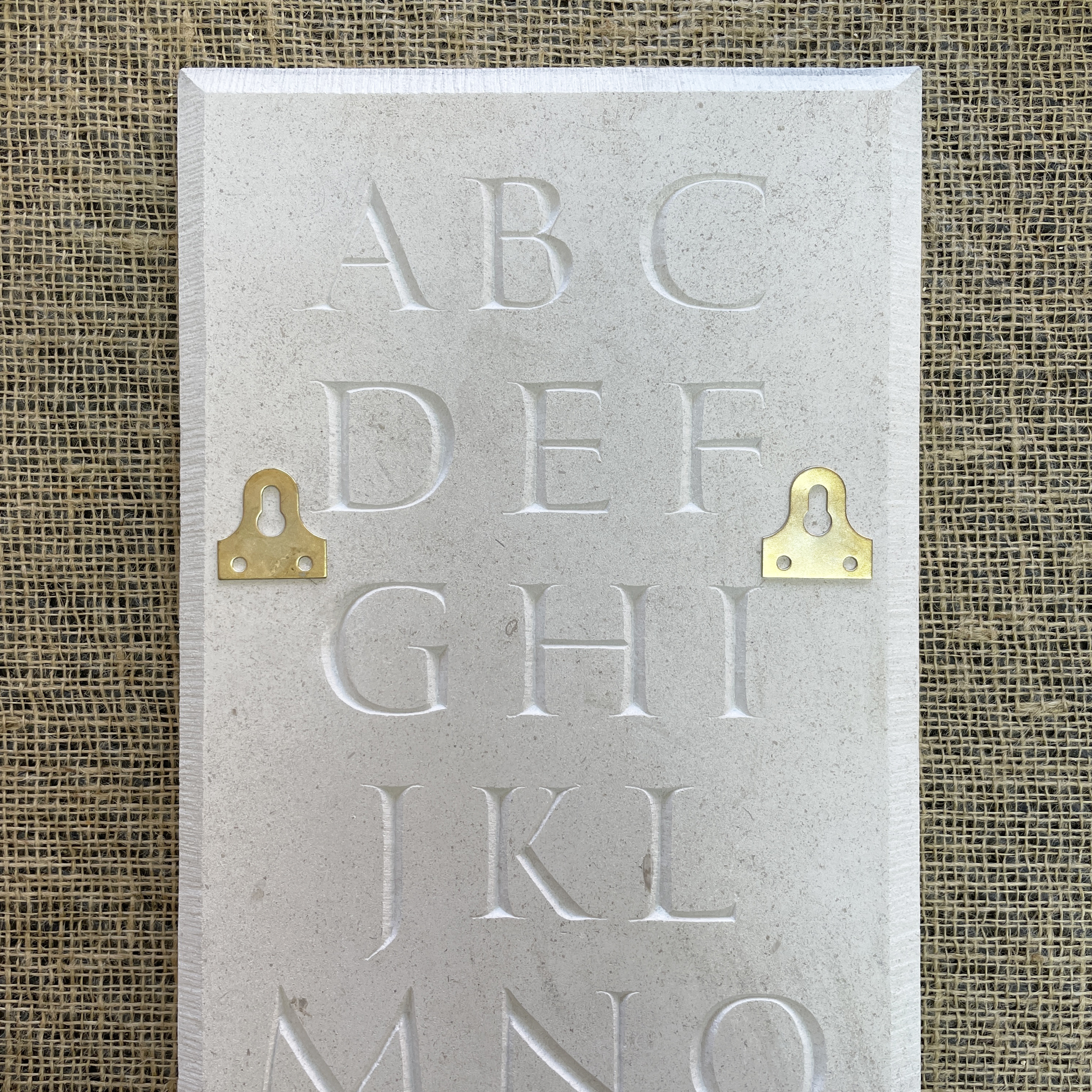
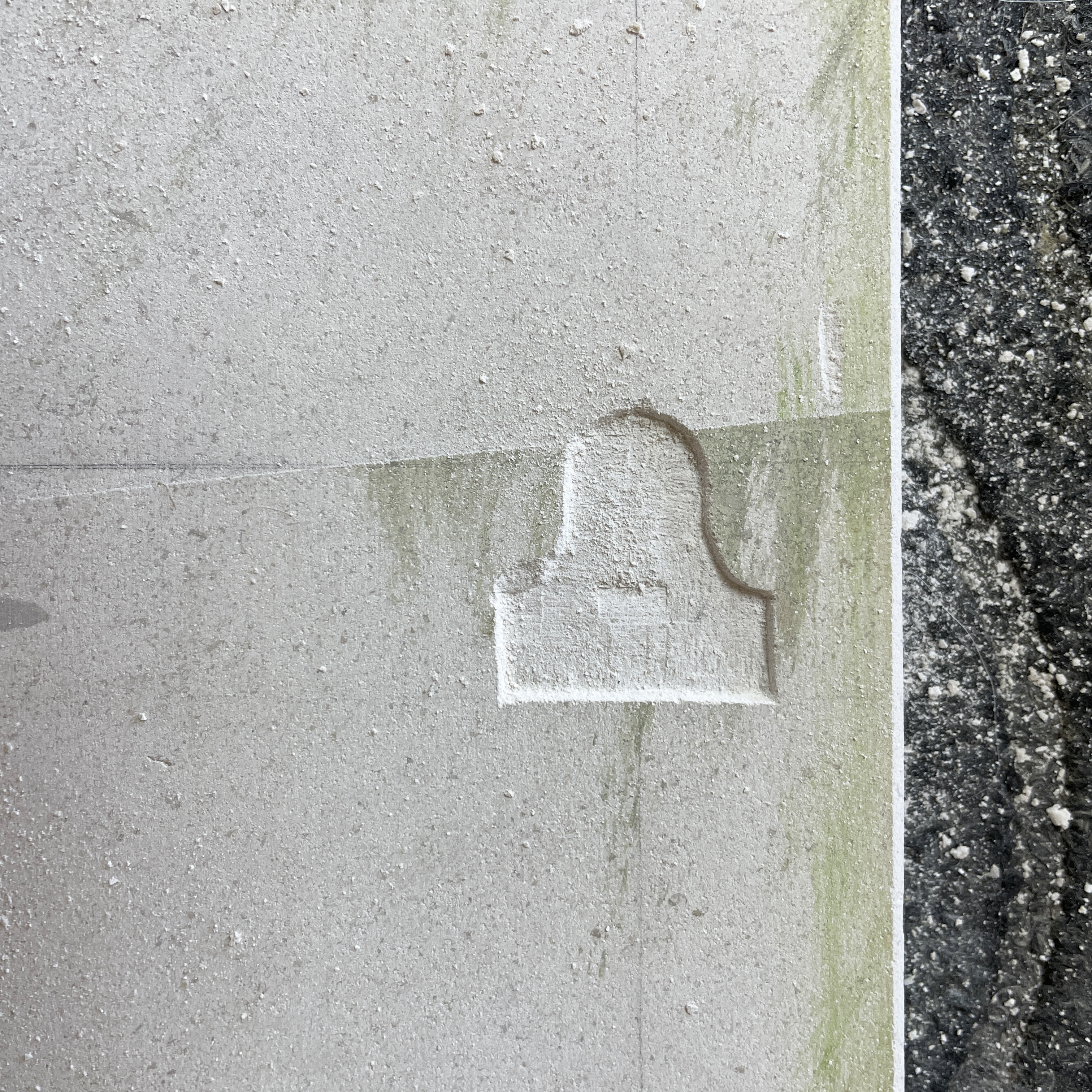
Once I had carved my alphabet the next step was to make the piece of work able to be displayed. For this we attached mirror plates to the back of the stone. Because the stone is 600mm tall we used two plates. Fig. 12 We placed them around the carved letters to allow us the full width of the stone to carve in. I worked on a flat surface for this, which helped me to cut the straight edges that were needed to fit the plate into the gap. Fig. 13 Making sure the placement of the plates was level, specifically the point where the two screws or nails will hang was most important. The plate, including the screws, needed to sit just below the surface of the stone, so that it sits flat on the wall, Fig. 14 shows how we tested this. Once the shape of the plate was cut to the right depth, we drilled in holes for the screws and glued everything to the stone. Fig. 15 + 6 show the piece hung on the wall.
![]()
![]()
![]()
![]() To complete my Trajan Alphabet we wanted to gild the letters, to make them more legible, as the light colour of the Moleanos limestone didn’t provide enough contrast. I had done a small amount of gilding, but years ago, so the process was pretty new to me.
To complete my Trajan Alphabet we wanted to gild the letters, to make them more legible, as the light colour of the Moleanos limestone didn’t provide enough contrast. I had done a small amount of gilding, but years ago, so the process was pretty new to me.
Gilding
Fig. 1, 4, 5 Our intention was to try water gilding, however when we applied the size to the stone and let it dry, the gold leaf did not stick well. So we decided to revert back to oil gilding. Fig. 6 shows how the leaf hasn’t fully adhered to the size.
![]()
![]()
![]()
![]()
![]() We applied a 3 hour size and left it to dry. The weather was quite hot, so the size only took a short time to ‘go off’, and become tacky to the touch, a ‘dry’ tackiness rather than a ‘wet’ tackiness. As I was gilding 26 letters plus the ampersand I applied the size to the letters in stages, with about 25 minutes between application so that I had time to gild each section. Although this was essential my first time gilding I found the delicacy needed to handle the leaf, move it about and cut it, quite absorbing.
We applied a 3 hour size and left it to dry. The weather was quite hot, so the size only took a short time to ‘go off’, and become tacky to the touch, a ‘dry’ tackiness rather than a ‘wet’ tackiness. As I was gilding 26 letters plus the ampersand I applied the size to the letters in stages, with about 25 minutes between application so that I had time to gild each section. Although this was essential my first time gilding I found the delicacy needed to handle the leaf, move it about and cut it, quite absorbing.
Fig. 7 - 9 Because of the size of the piece we didn't have enough of one gold do to it in the same colour, so we used a mixture of 4 different leafs; gold, champagne gold (22.5 carat), moon gold (22 carat), and palladium. Palladium or platinum is used rather than silver, as silver tarnishes, whereas the latter two don’t. The different leafs did react slightly diffidently when handled and applied, some being lighter and others heavier. The champagne gold has a slightly warmer hue and the moon gold slight cooler, while neither have the brightness of gold, they are closer to the palladium.
The set up for gilding can be seen in Fig. 2, the suede board, knife for cutting the gold, brush for burnishing the leaf into the stone and a smaller brush for transfering the gold from the cutting area to the stone. Fig. 3 shows the leaf cut into useable size pieces.
![]()
![]()
![]()
![]()
![]()
When the leaf is applied to the stone there is excess around the edges, Fig. 7 - 9, we burnish the leaf once it’s dried when reveals the how well the gold has adheared.
Gilding the whole piece took be about two days, owning to drying time. Once I was finished we could see where there had been some cross contamination of flexs of gold on other letters, Fig. 10, so I went over and reapplied some gold to the appropriate areas. I sanded back the whole piece to remove the gold that had gone over the edges of the letters. The placement of the different coloured gold was random, but I it think contrasts with the formality of the letterforms in a playful way. I enjoyed gilding and look forward to incorporating it into future pieces. Fig. 11 - 12
Watercolour
Whilst I was carving my alphabet we decided to work more with the design, by transferring it to a smaller scale and painting it in watercolours. This is a good opportunity to think about how colour can play a part in lettering and also expand my tool skills. I had a done a little bit of watercolour during my art studies but wouldn’t say that I had great skill with a brush. This proved to be the main learning curb and resulted in me simply practising painting straight and curved lines before I attempted the final painting.
![]()
We scanned my original drawing and scaled it down to A3 heigh, which I then redrew. This was around the time that I had drawn may alphbet on the stone for the final time, which meant that I have a fuller understanding of the particularties of each letter. This was useful as working at a smaller scale, 27mm, meant that
My thoughts on how to use colour for this piece were simply to mirror my carving and paint the letters as if they were carved, with the shadows. I wanted there to be a transition of light to dark across the whole piece, as well as light and shadow in the letters, and have mixed yellow into red, red into blue to achieve a gradation. This was an unusually bight piece of work for me to make, but that seemed necessary due to the formal nature of the composition.
![]()
02 ‘torc’
03 Lowercase
04 ‘S’
05 Italics
06 Sign Writing
07 Low Relief
08 Nereids
09 Flourishes
10 ‘26 Connections’
11 Woodcarving
01 Trajan
The first piece of work an apprentice often completes is designing and carving their own alphabet. Most often in the Trajan style. ‘Trajan’ being in reference to the Roman emperor Trajan’s triumphal column in Rome, a copy of which can been seen in the Victoria & Albert Museum’s hall of casts. The Trajan alphabet is an uppercase letterform, which we now know derives from the shapes made when drawing with a brush. Fig. c - e show my efforts at this, to create the curves and corners the brush is manipulated and twisted. It is directly from the brush movements that the weights and proportions of the letters derive. Understanding this connection is very useful to keep in mind when I draw my letterforms. Fig. a - b are pages 220 - 221 from Edward M. Catish’s The Origin of the Serif showing the gestures that constitute the letters.
The Trajan letterform is the most commonly used style of lettering for a letter carver as it conveys a solemnity which is appropriate for memorials, but can be personalised in myriad ways for any other type of lettering.
As this is my first exercise I am not looking to any source material to copy a lettering style, but drawing the Trajan alphabet from what I already know. This will help internalise my understand of letterforms.
Fig. 1 - 3 I start by drawing thumbnail sketches of layouts. I gravitate towards a grid that fits all 26 letters of the alphabet plus the ampersand without any gaps. A 3 x 9 grid. To understand how the letter forms of the Trajan alphabet proportionately relate to each other, I draw out the alphabet in a skeleton form. Understanding the relative widths of the letters is an important starting point for achieving a harmonious design.
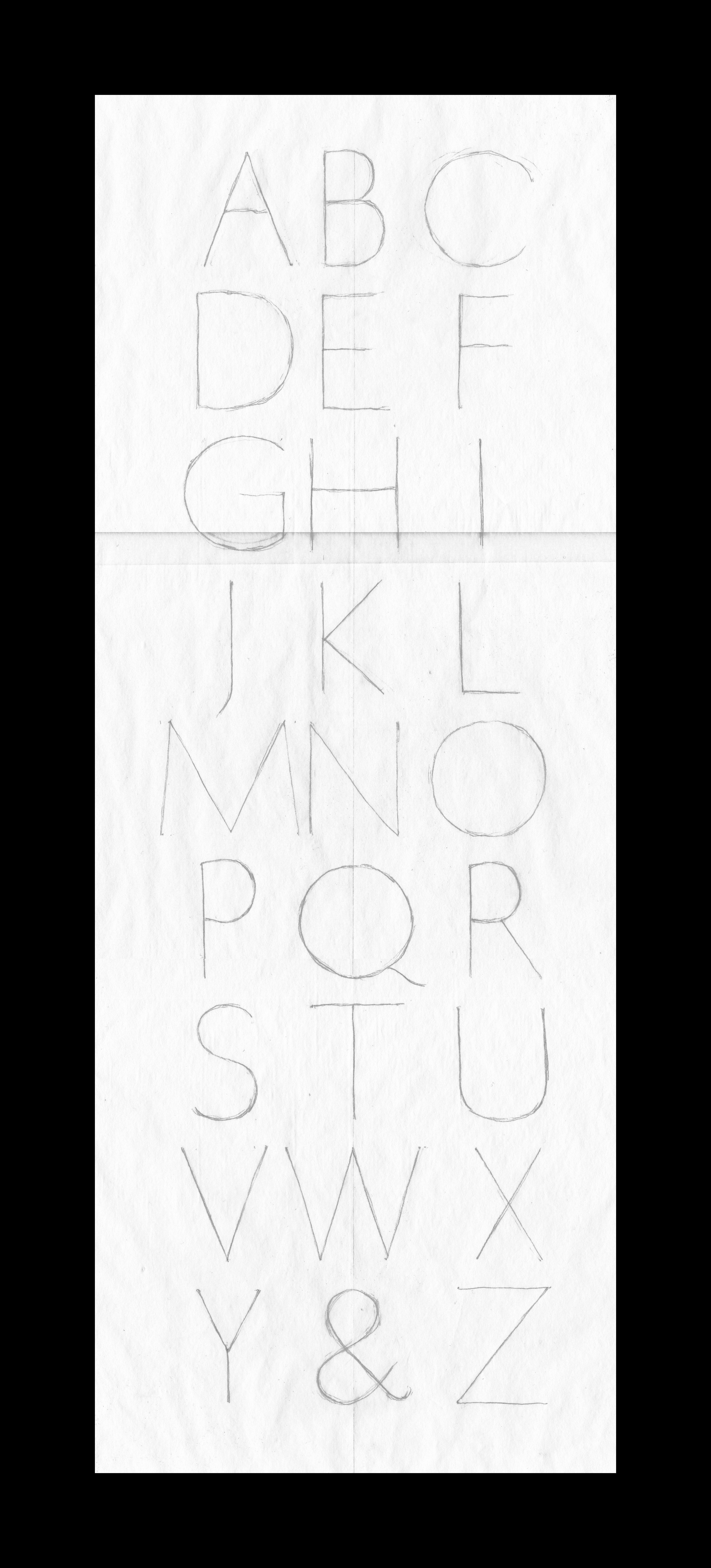
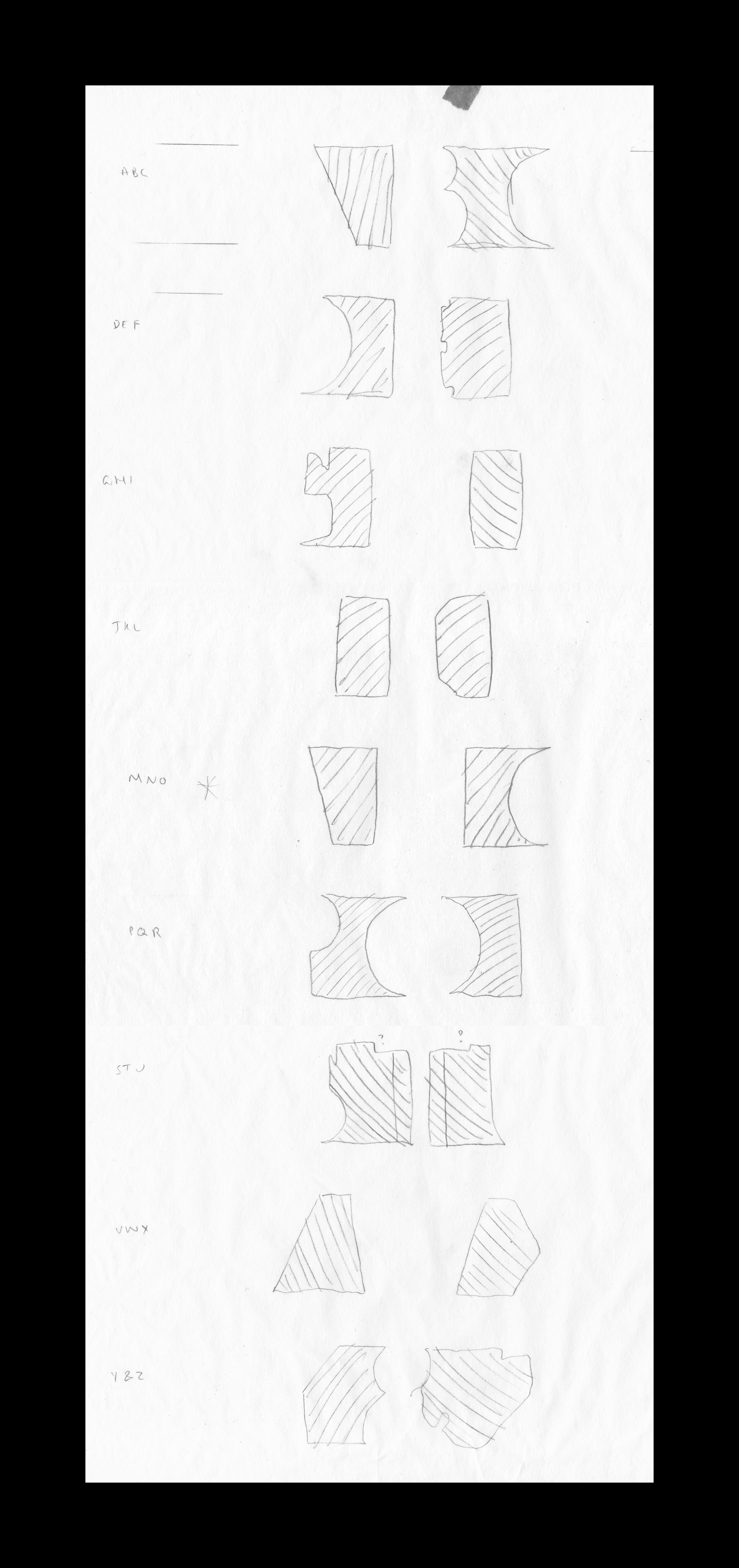
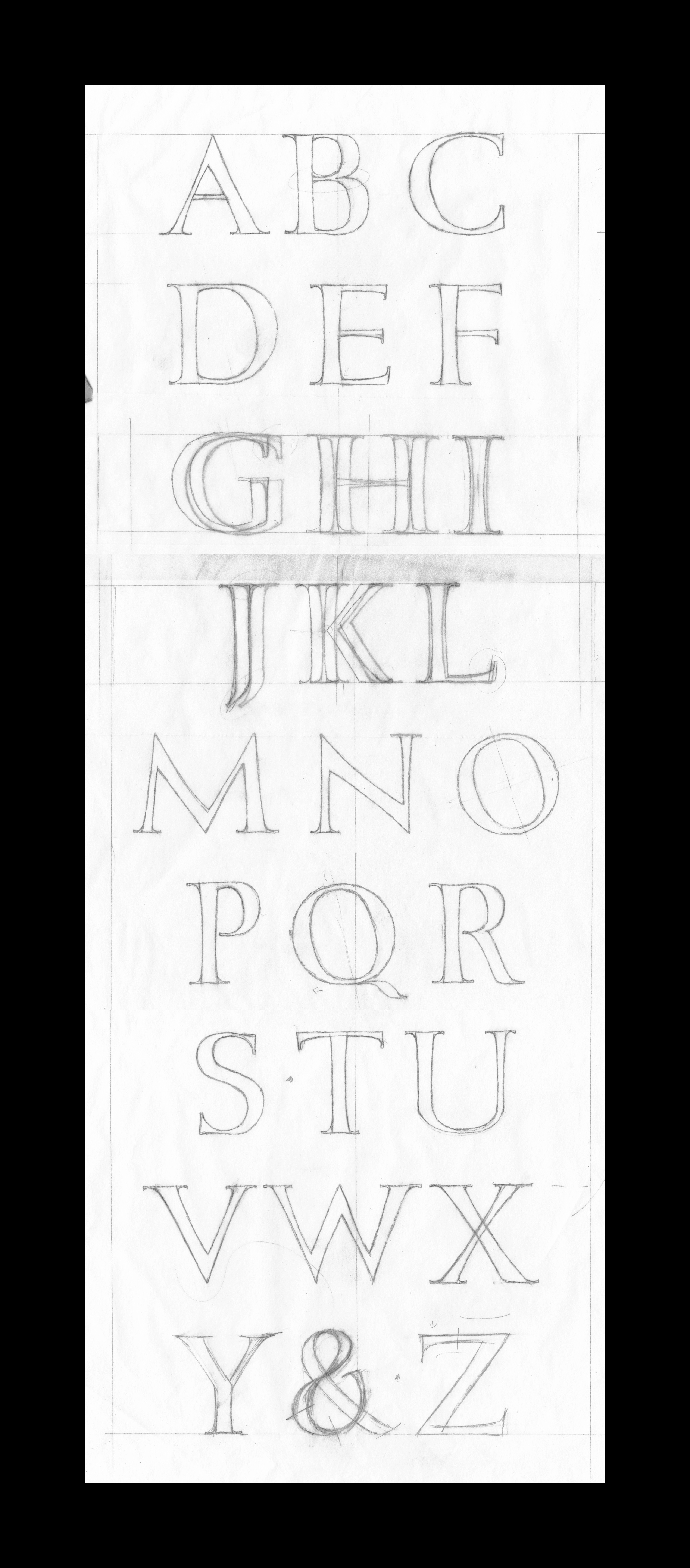
Fig. 4 - 7 I now start drawing my design at full size. We decide to work with the letters at 40mm high, not too big or too small for when I start carving. I first draw the skeleton letters and then start to thicken them up to my current understanding of the Trajan style. Whilst drawing I am measuring the letters against one another, to make sure I am getting the proportions correct. When the letters are closer to how they will look in a finished state I can start adjusting the spacing. I’m checking that each line is centred whilst taking into account the optical edge of each letter and the negative space between them, so that the composition looks balanced. I re-draw, trace, cut up and arrange lines, until I’m happy with the layout.
Once I have decided upon the spacing and I’ve made any changes that Charlotte suggested, we go through each letter’s shape and specific characteristics. Throughout this project I am redrawing the letters and gaining a better understand of how they should look. As well as the technical language used to describe a letter.
When I’ve redrawn the ‘final’ alphabet, we start preparing the stone.
Preparing the Stone
I am using a piece of Moleanos limestone for my first piece, rather than something like slate, as it will be more forgiving to cut. Moleanos is a creamy off-white stone with flecks of shells and fossils.
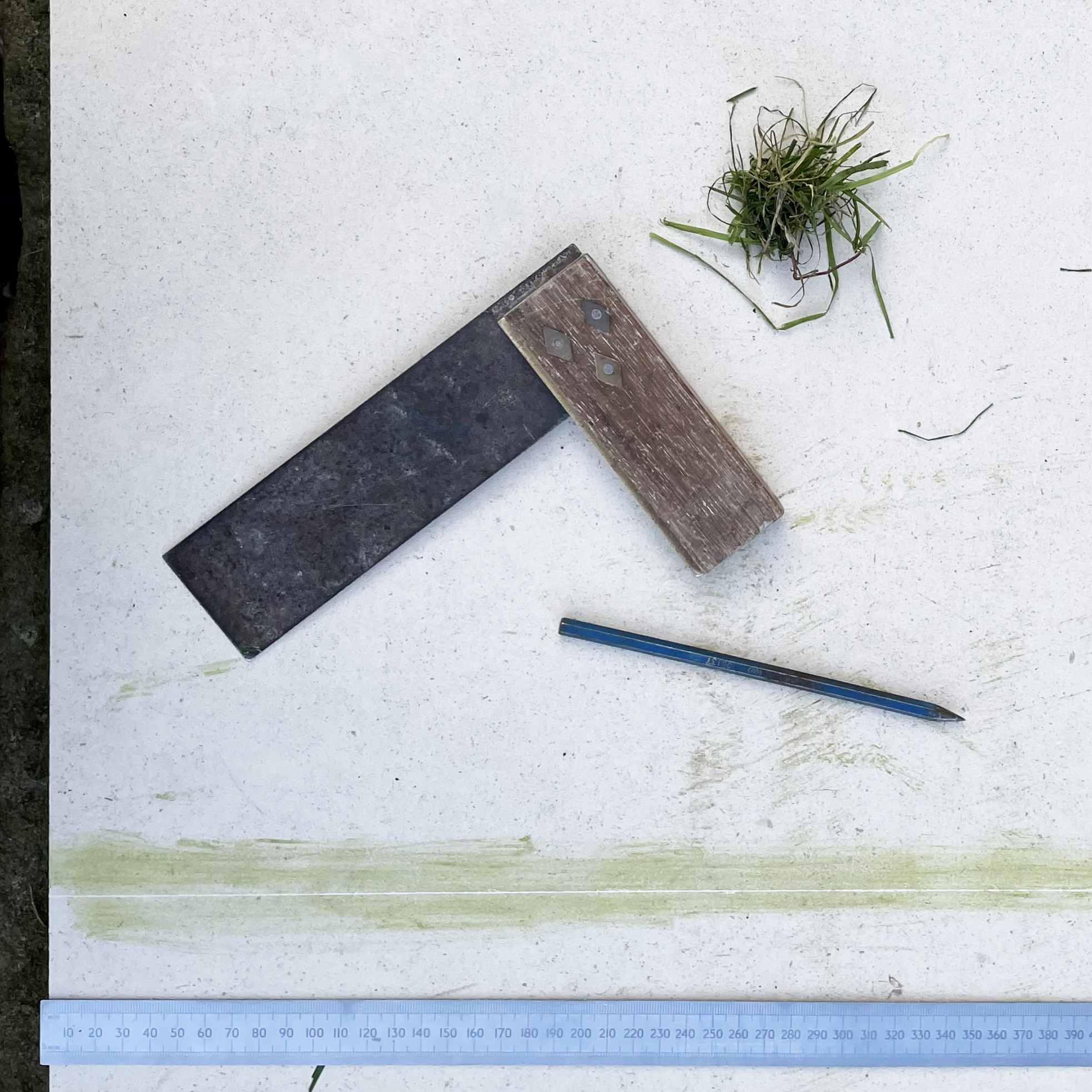
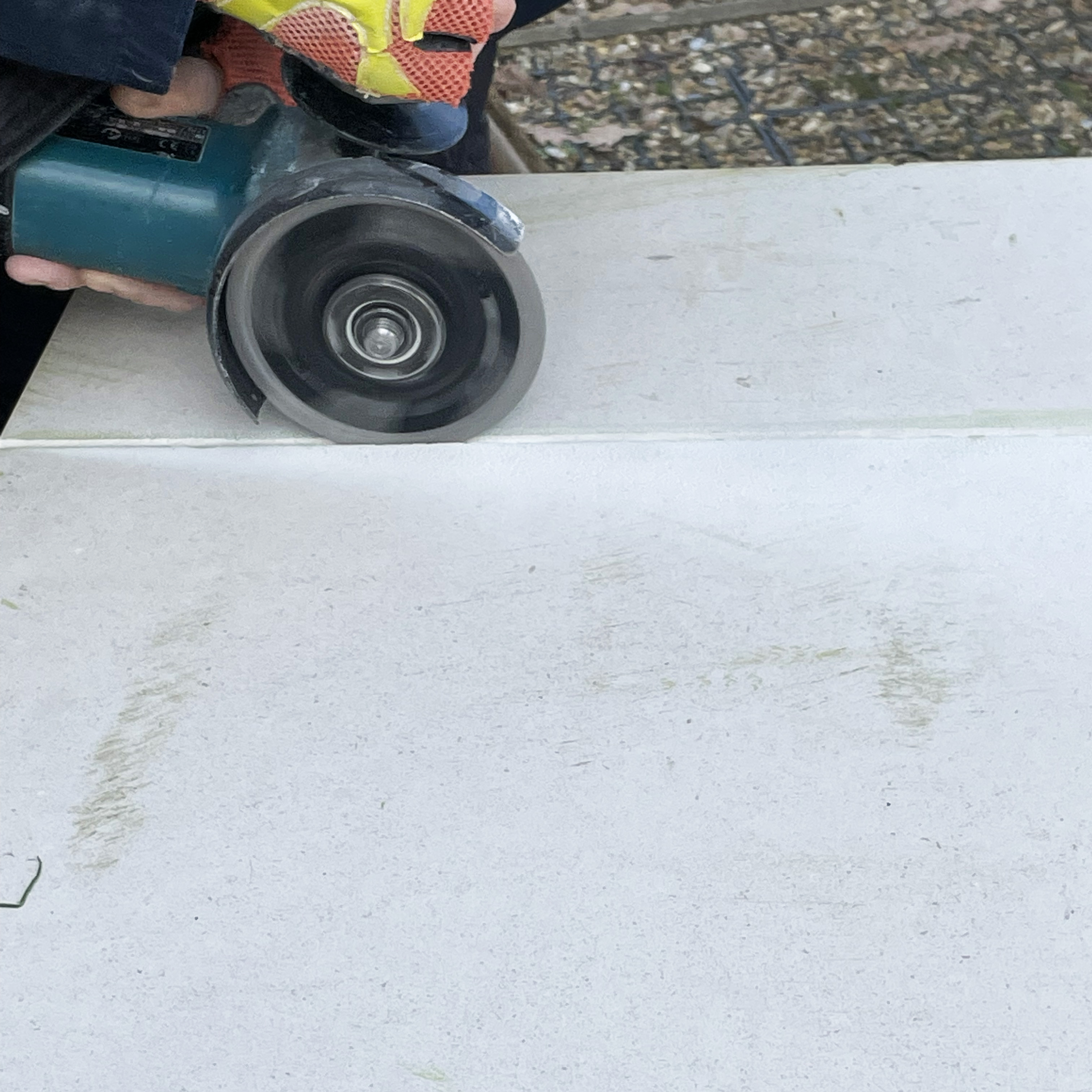
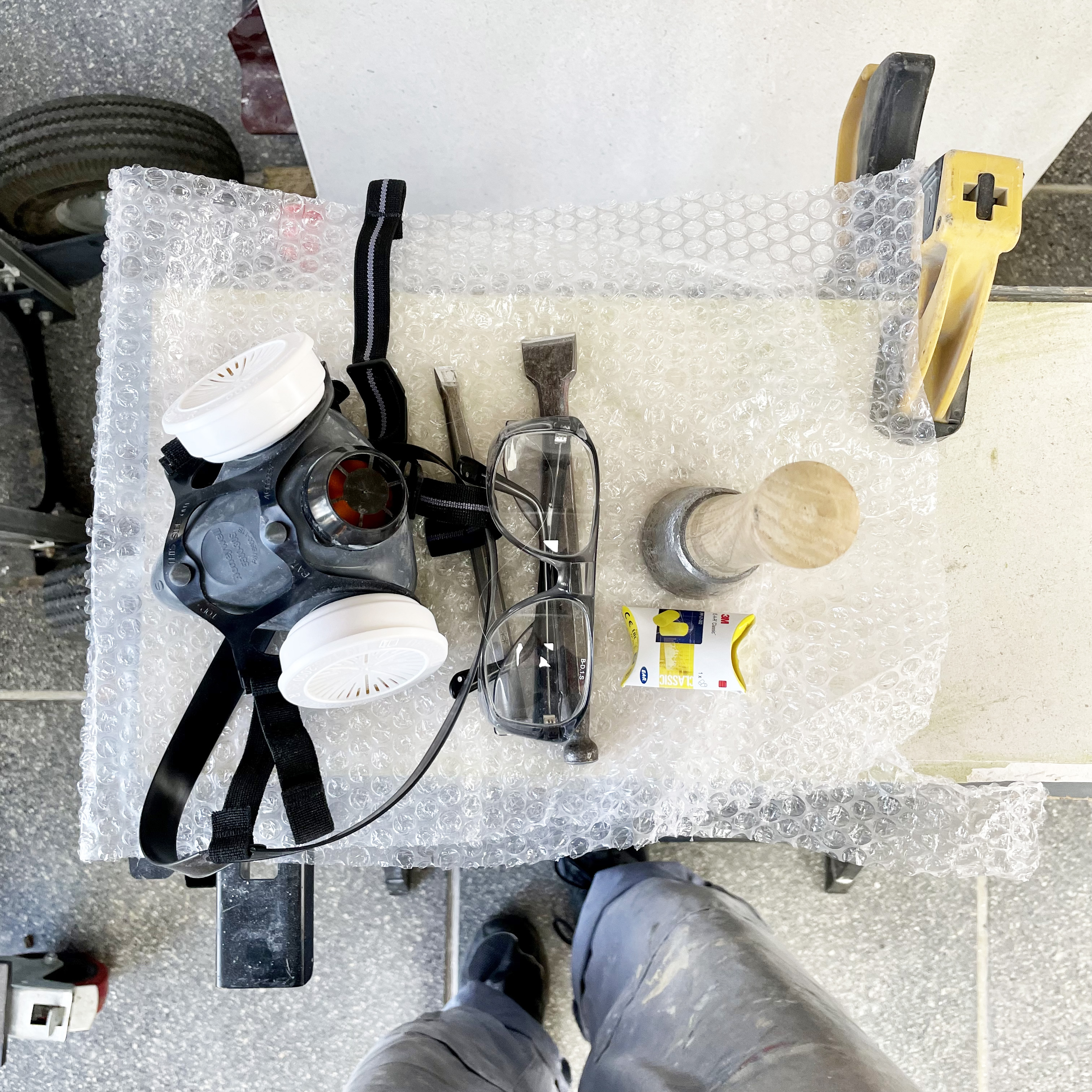
Fig. 1 - 2 First we need to cut the stone from the larger piece to the right width. We score the cutting line onto the stone with a pointed chisel and check with a set square that the line is square at either end. The line needs to be scored on both sides of the stone and on the edges. As I’ve never used an angel grinder before Charlotte cuts the stone, but I have a go at using it on a spare piece of stone, to get a feel for how it cuts. We are both in full PPE, Charlotte in a dust mask with filters, goggles, earplugs and ear defenders. Gloves, overalls and steel toe cap boots.
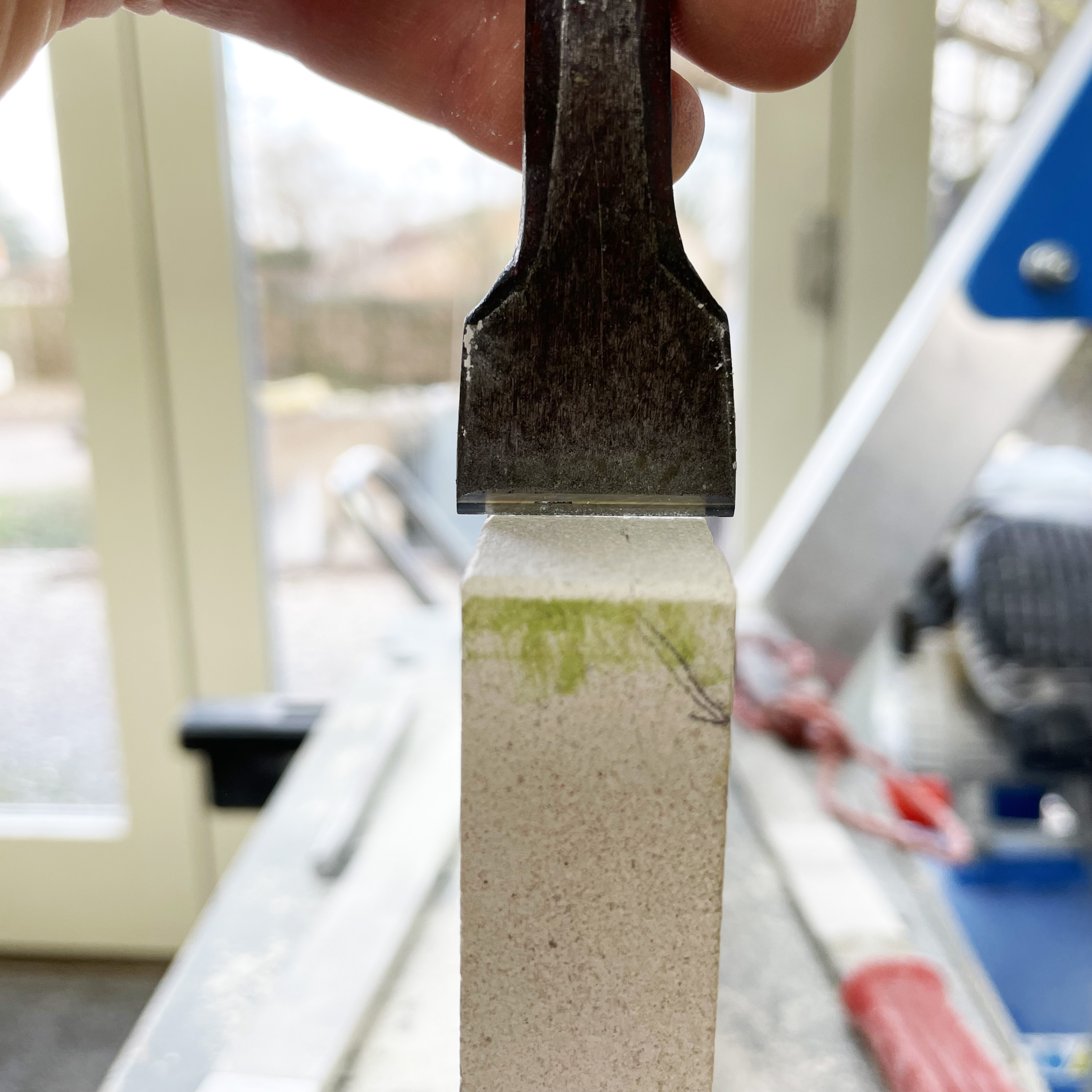

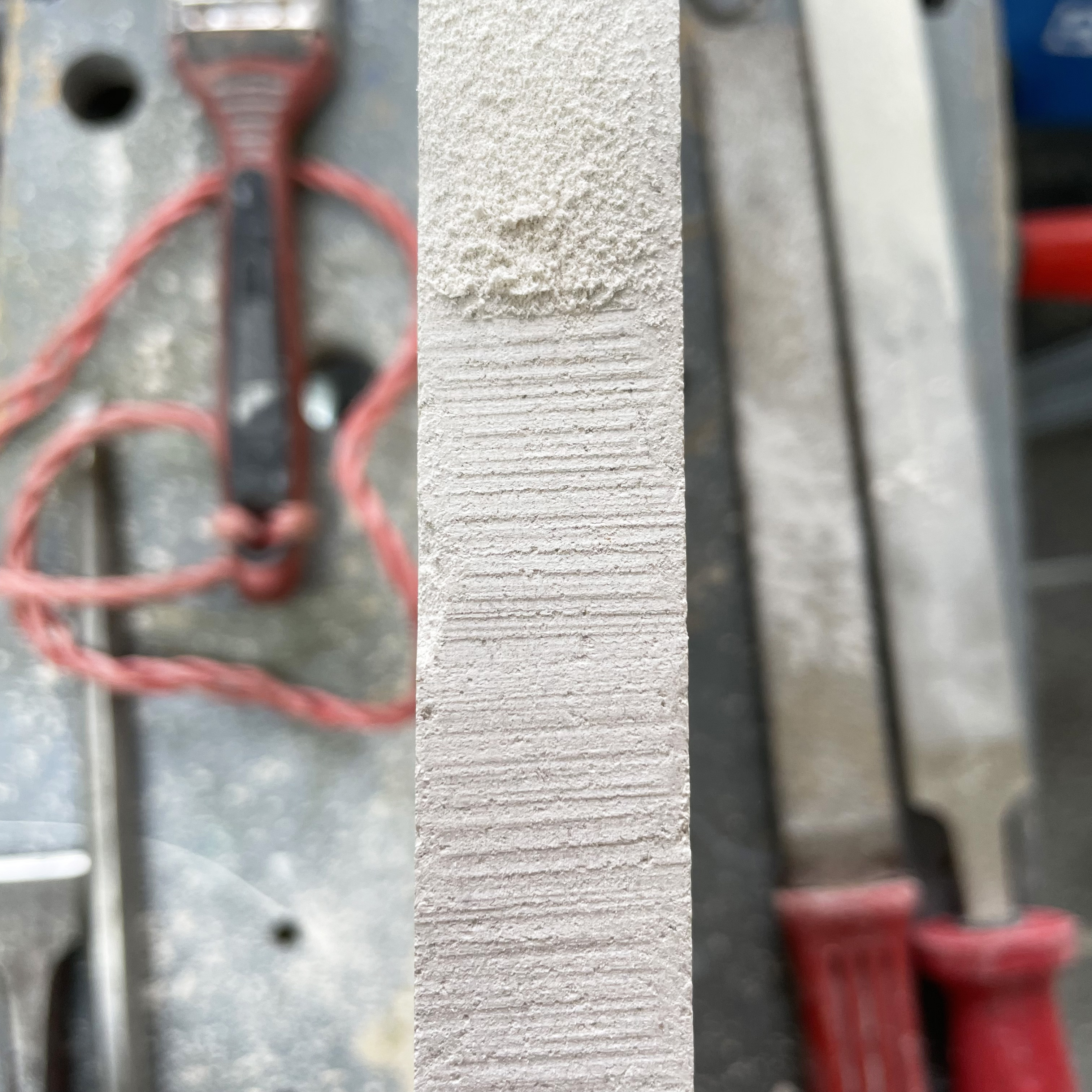
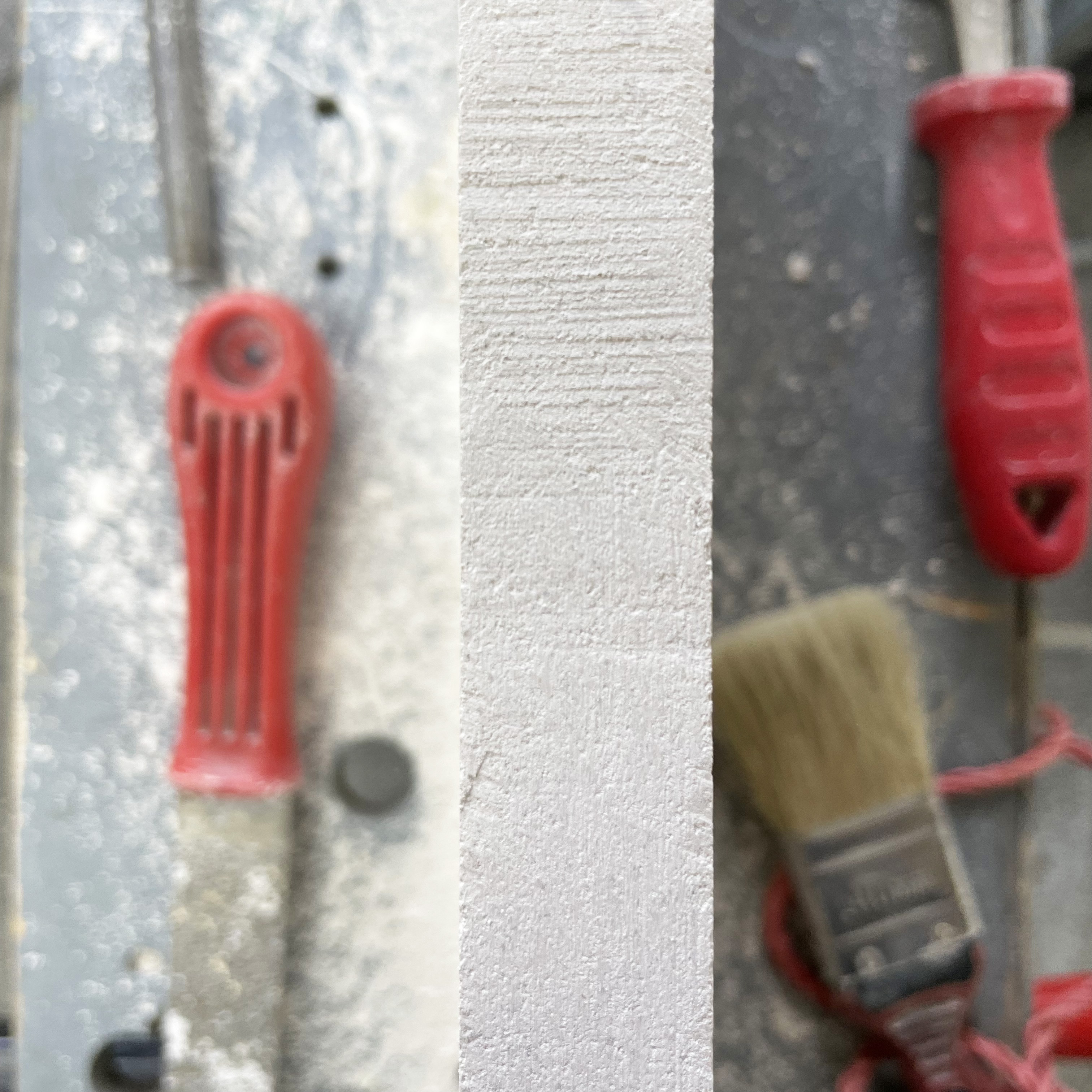
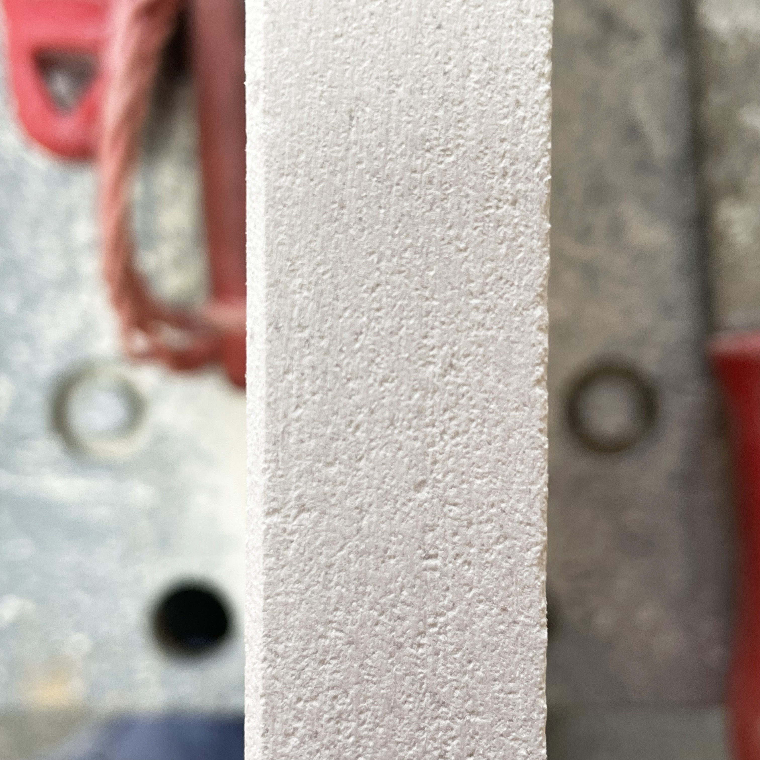
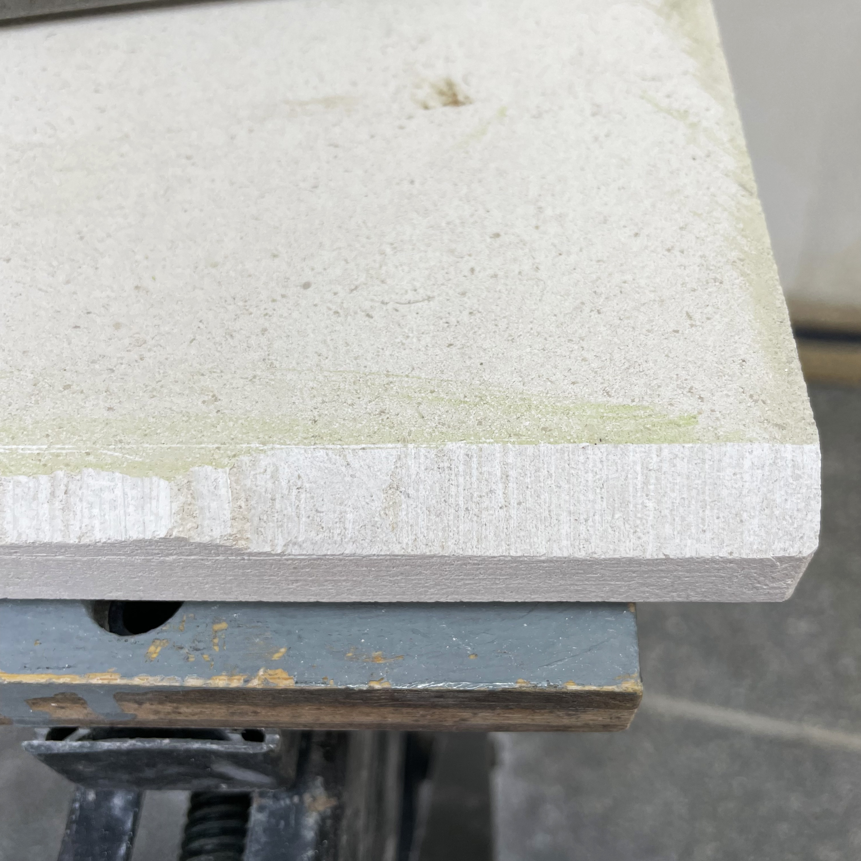
Fig. 3-4 Once the stone is cut there is a rough surface to the edge, Charlotte shows me how to neaten this to flat edge. As we are not cutting a letter but rather removing stone and preparing a surface, we use the size and shape tools that are more commonly use in stone masonry.
First we level the surface, by chopping into the centre, never out to the edge, then I chase the surface which produces the parallel lines you can see in fig. 5. I am aiming for the cutting line to reach from edge to edge, if it doesn’t that’s an indication that the surface isn’t flat. Then we go over it with a file to get a completely flat surface. I use the chisel to check that it is flat, as in fig. 7.
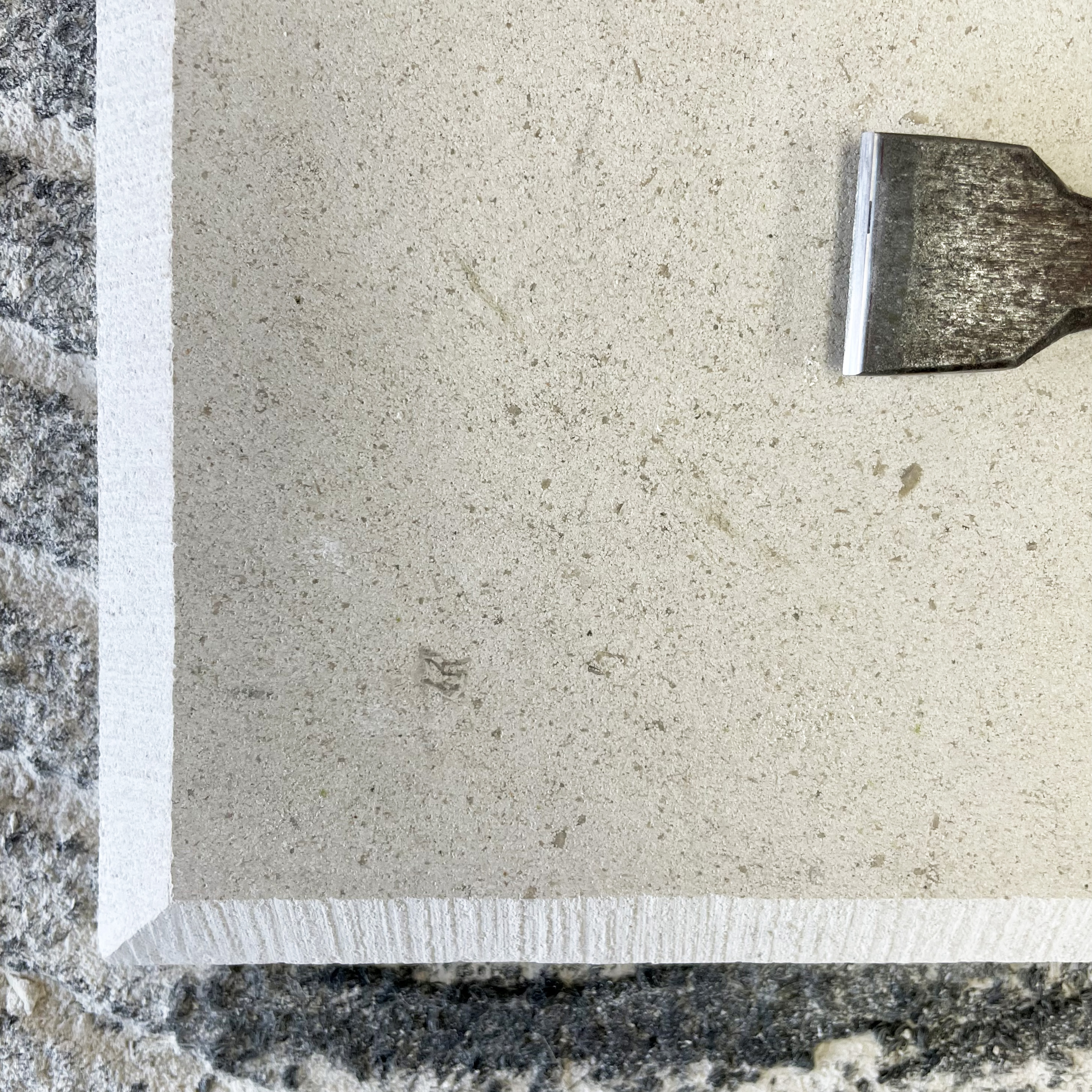
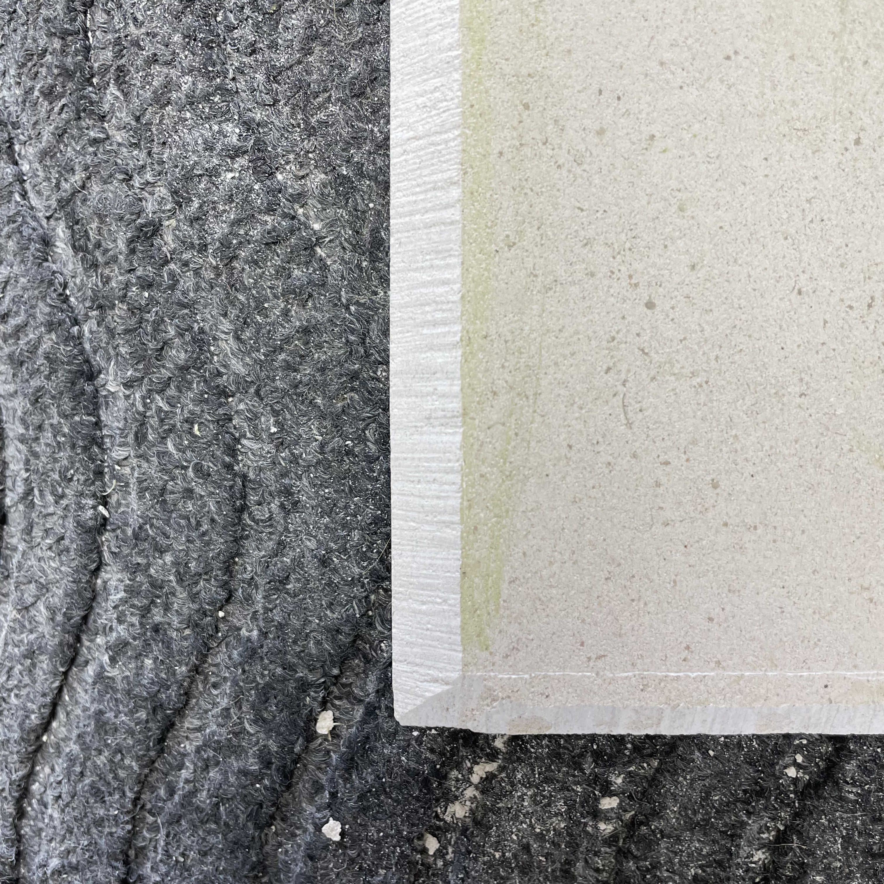
Next I cut the border. Fig. 8 I have opted for a beveled edge, with a chopped texture. Fig. 9 - 10 Although this is a fairly thin piece of stone, the bevelled edge gives the suggestion of the stone being even thinner and lighter, this is heightened by the angle of the bevel. As before we score the lines I want to cut to, and chop away the stone, then chase over it to get a flatter surface. Fig. 13 To create the chased finished texture I deliberately cut a bit deeper. Once I am happy with how the edges are looking, we can start marking up the stone to draw on the design.

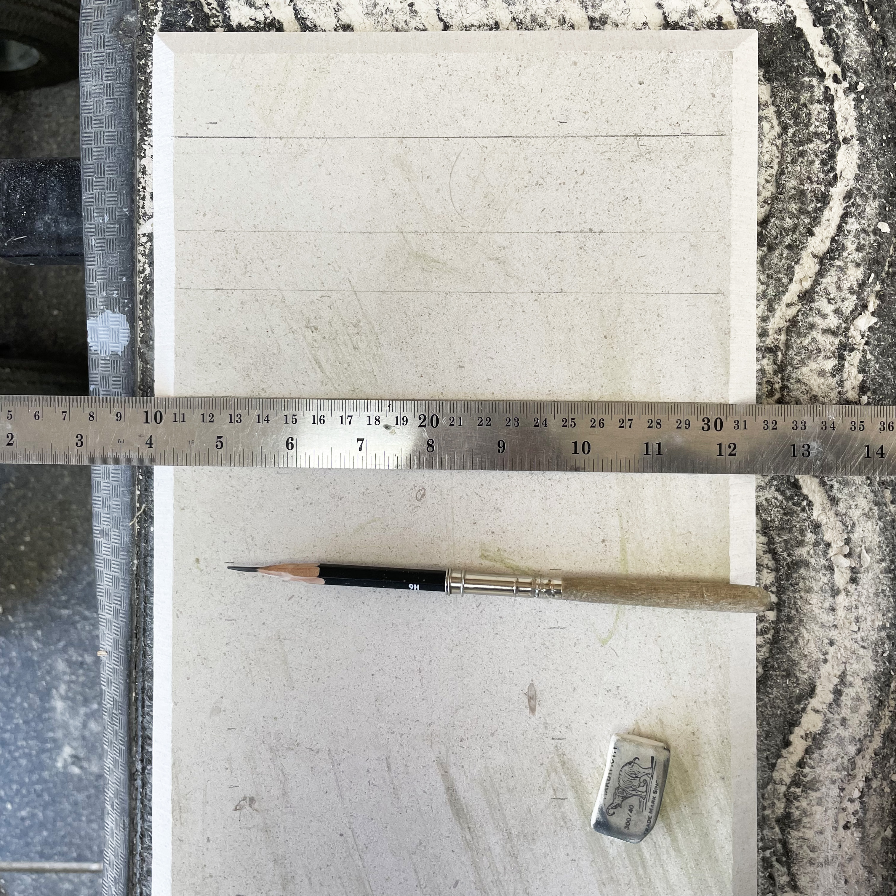

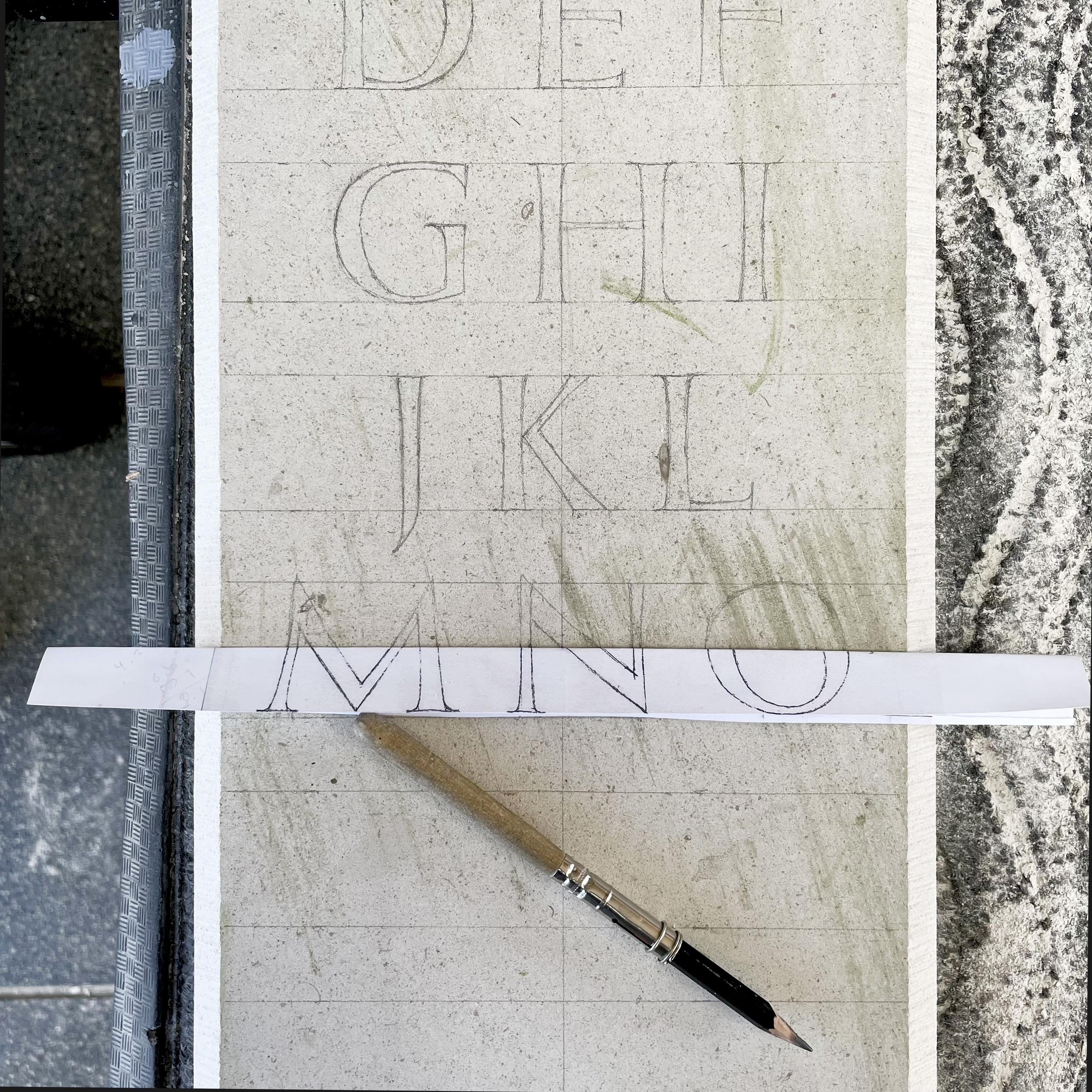
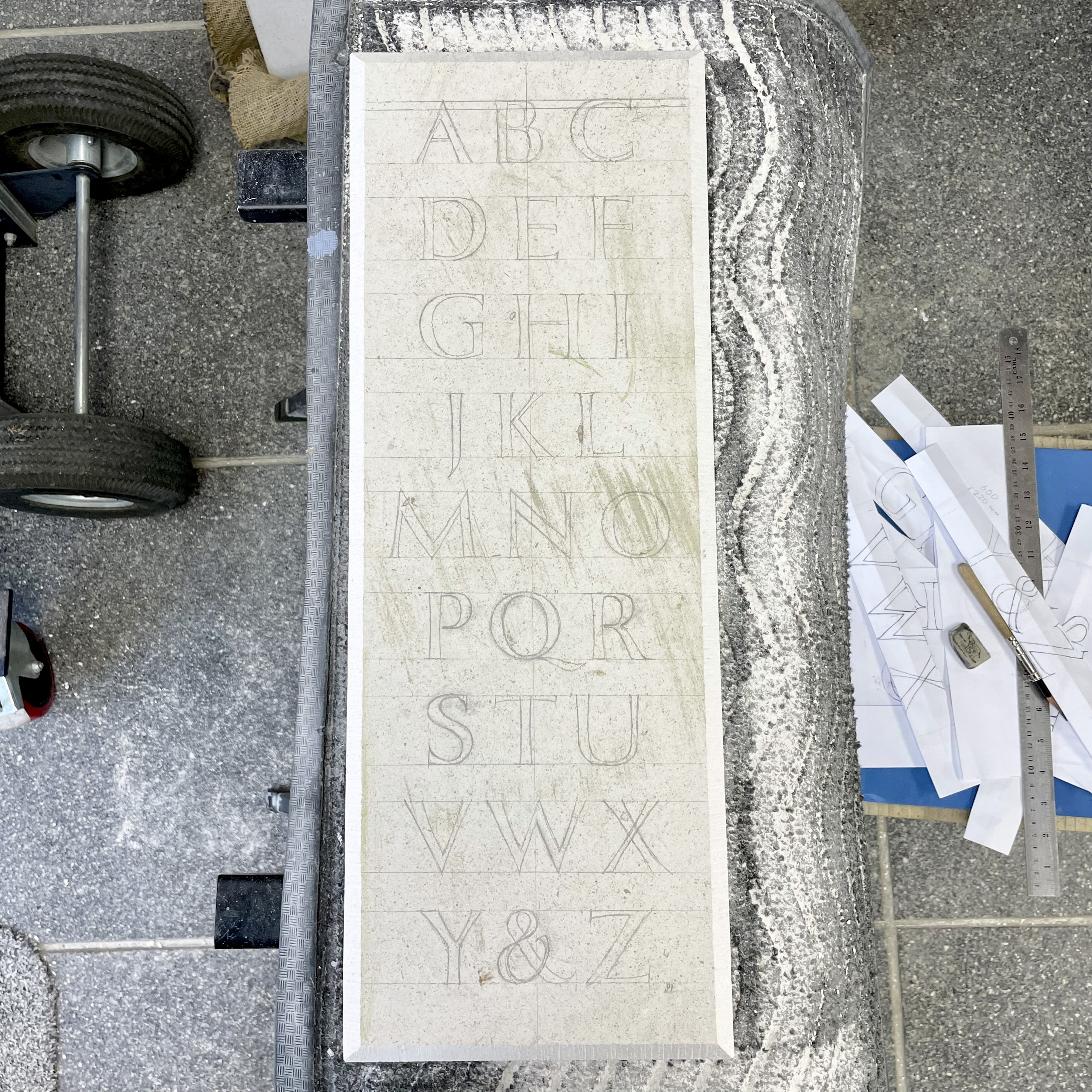
Fig. 14-17 We draw on a vertical centre line and the lines for the text, we check that everything is square and that the space at the top and bottom is how we want it. Next I transfer the design onto the stone. There are a few ways to transfer drawn letters onto the stone, but Charlotte opts for drawing them straight onto the stone, again this helps cement the letterforms in my mind. This method also takes into account that the design drawn on paper may need to change slightly when transferred to stone. I use a printed copy of my drawing to help get the spacing correct. I draw the letters fairly roughly, as we’ll go over each one before I start carving.
Carving
Fig. 1 - 5 show the letters in there final stage before carving. I’ve drawn them standing at the easel. This process was very useful as we went through all the details that are particular to each letter form.
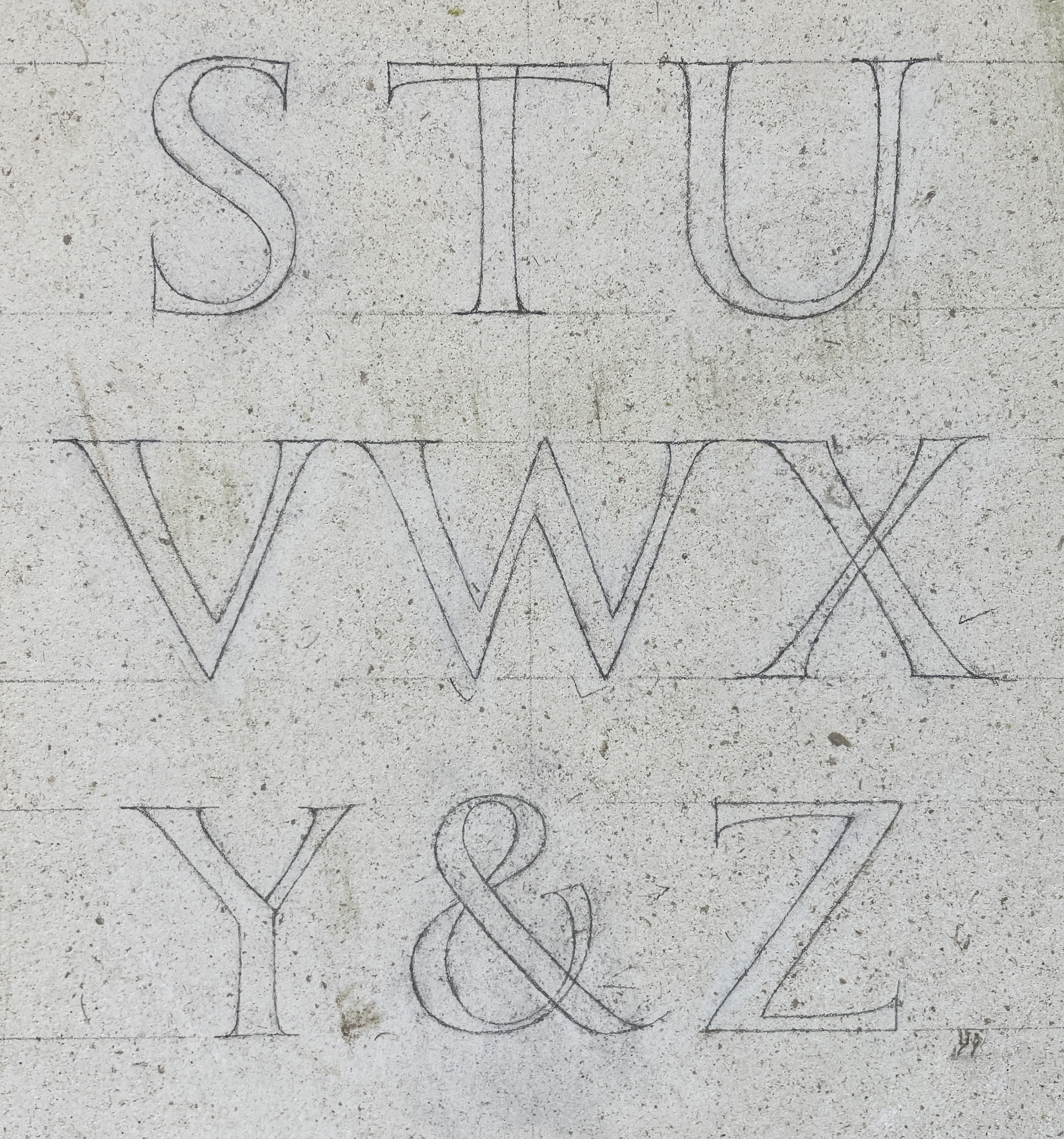
As this is the first time I’ve carved in a couple of years I am roughing out the whole design, working from bottom to top and then we’ll go over and work on finessing the cuts and the detail. To start with Charlotte shows me how to ‘chop’ out the letter and then neaten up by ‘chasing’. As mentioned in blog. 02., chopping involves cutting the stone at an angle, while chasing is generally done perpendicular to the cut surface.
The main thing that I need to learn is how to hold the chisel to get to the different parts of a letter. At first the chisel/dummy coordination feels quite awkward. As I’m right handed I hold the dummy in my right hand and chisel in the left.
Fig. 6 - 8 As a novice cutter one of the things that become apparent when I start cutting are is that the first few letters I cut are too deep. Generally this isn’t a problem in the end, as letters cut deep will weather better, but this can make them more fiddly to cut, as there is more risk of chopping out delicate edges. As I continue my letters become shallower as I get a bit more control. However, I’ll need to make them all the same depth before I finish.
The main reason that I cut the letters too deep is that I’m trying to keep the middle line of the v-cut centred and straight. This is important to the legibility of the letter as it wears over time.
Fig. a - g show the progress of one letter. Fig. c - d particularly show how the stone is ‘chopped’ out, while Fig. g shows the ‘chased’ surface of the cut.
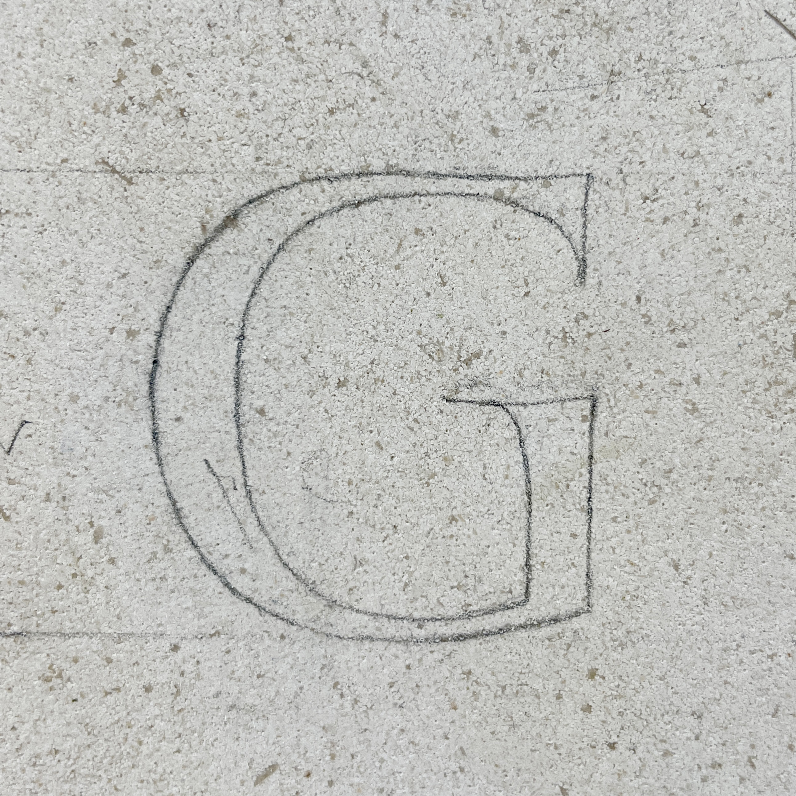
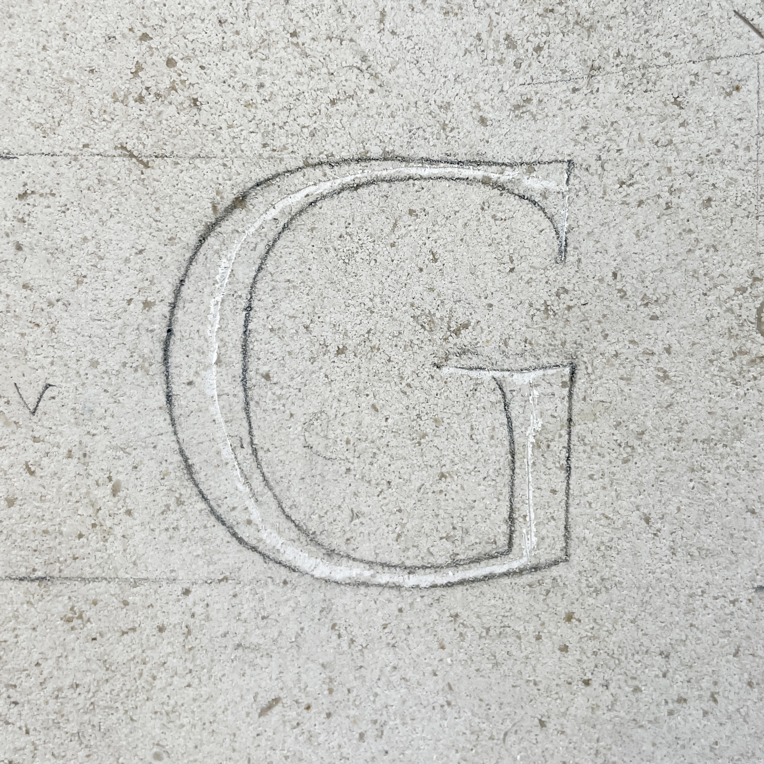
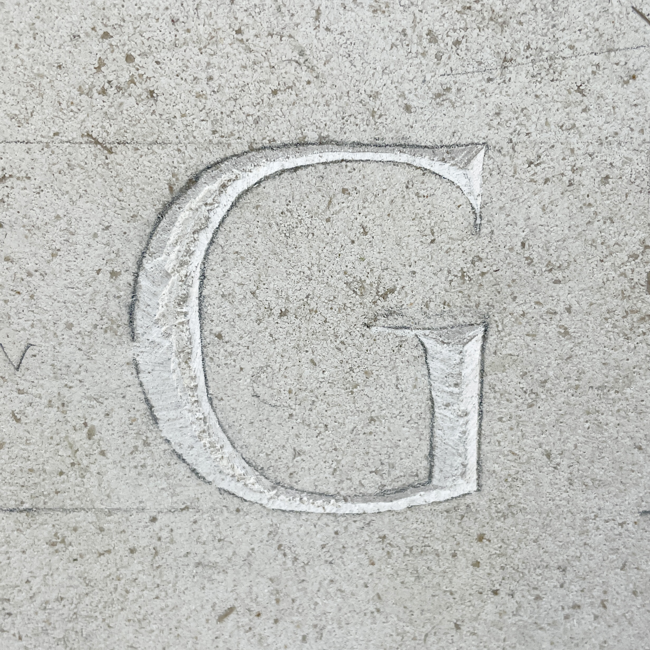
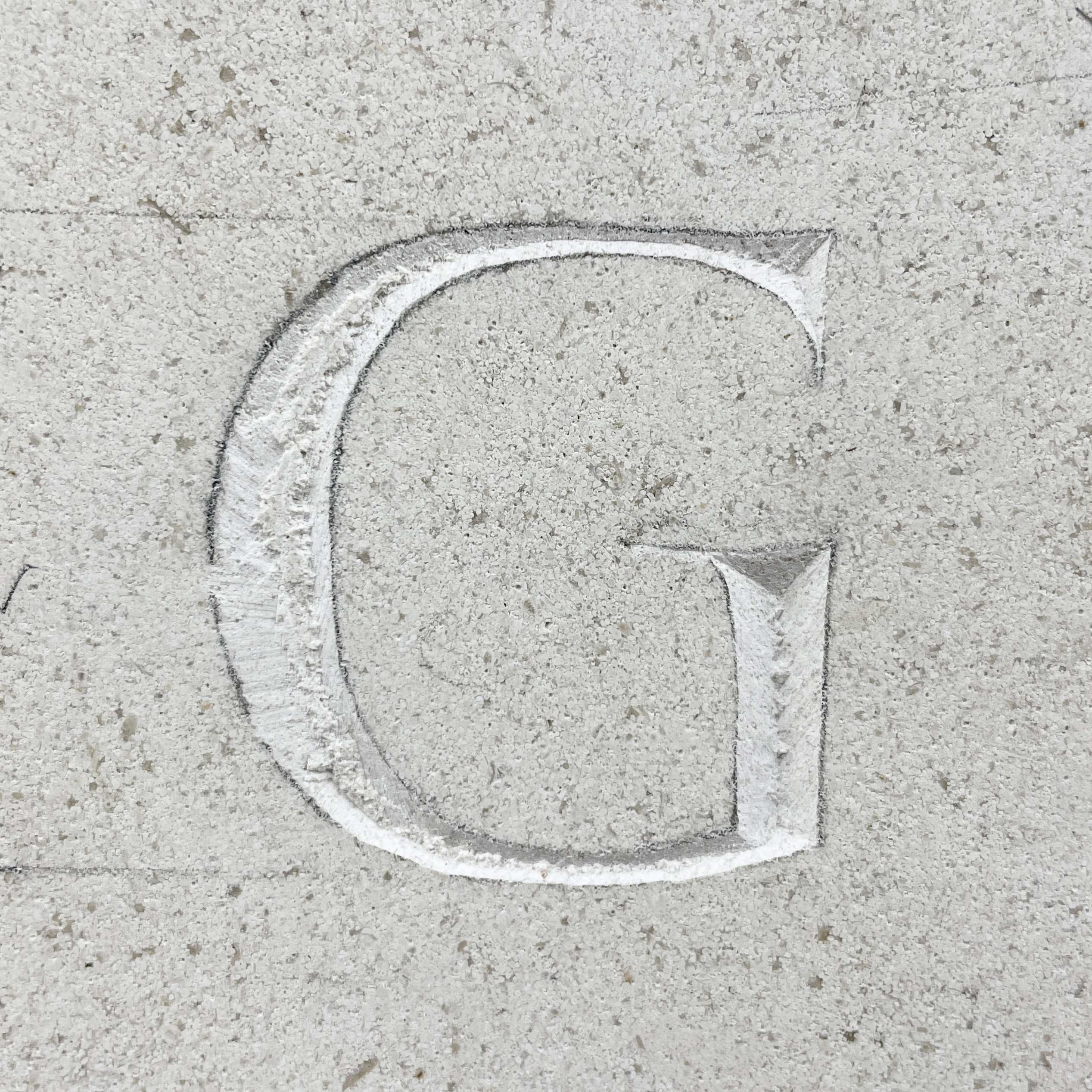
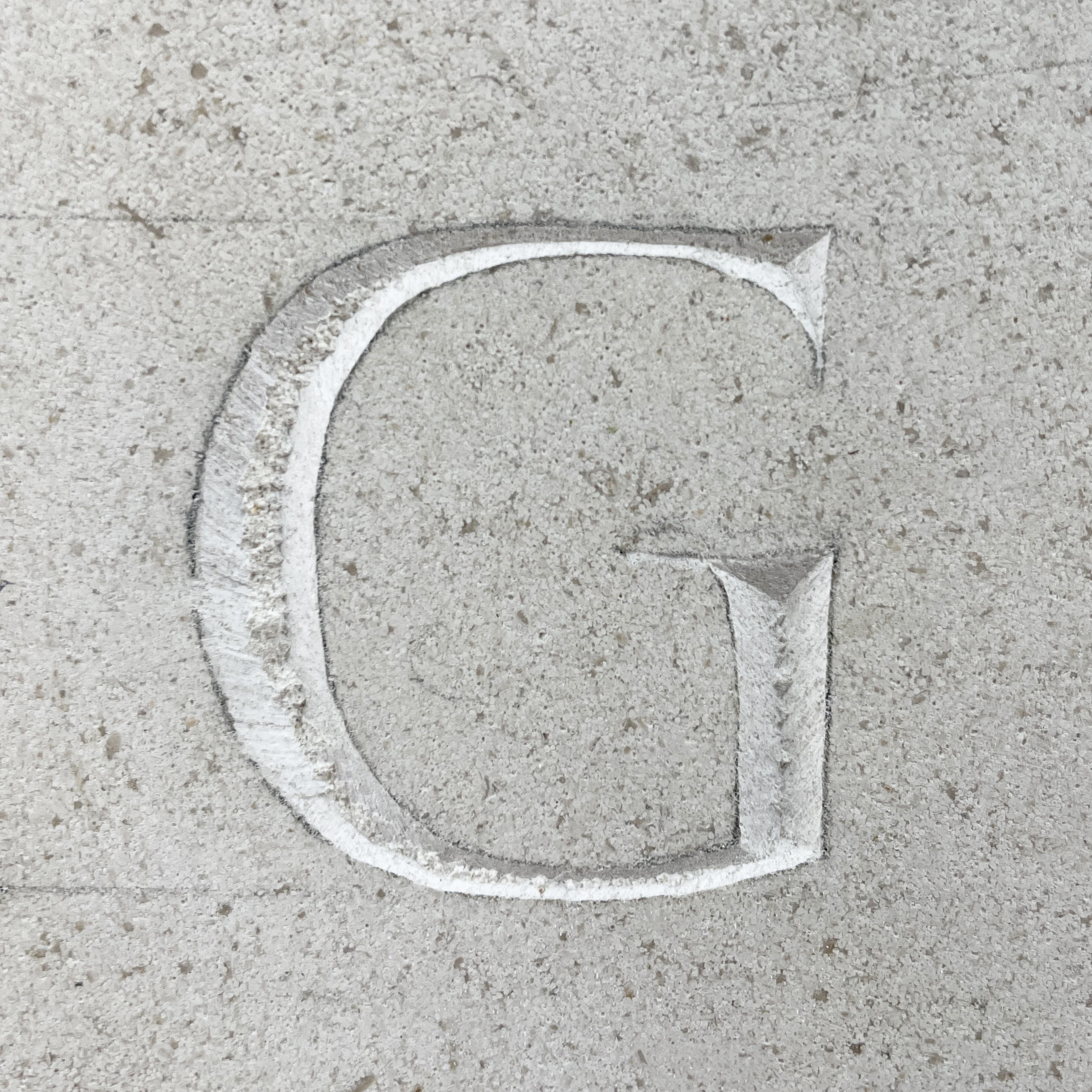
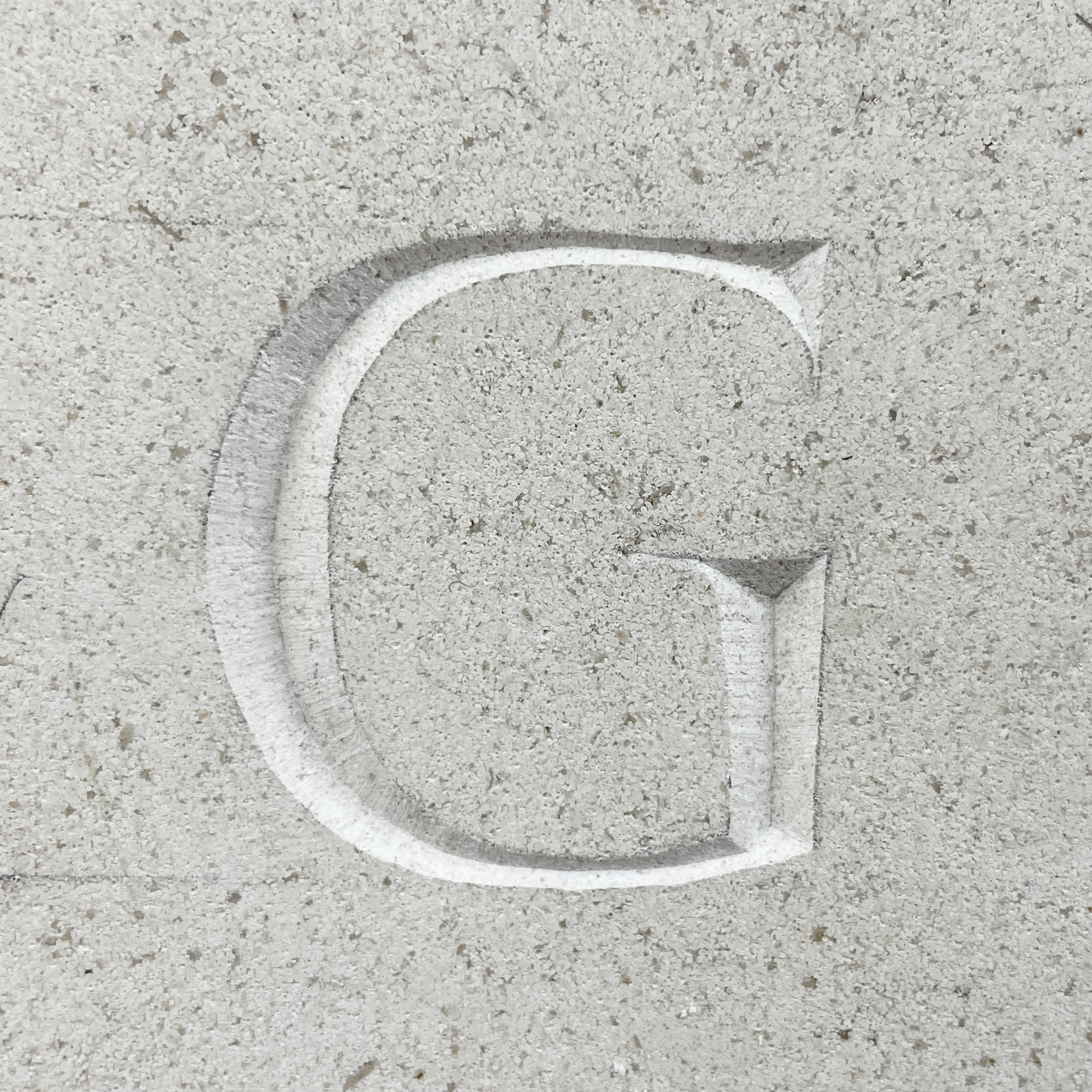
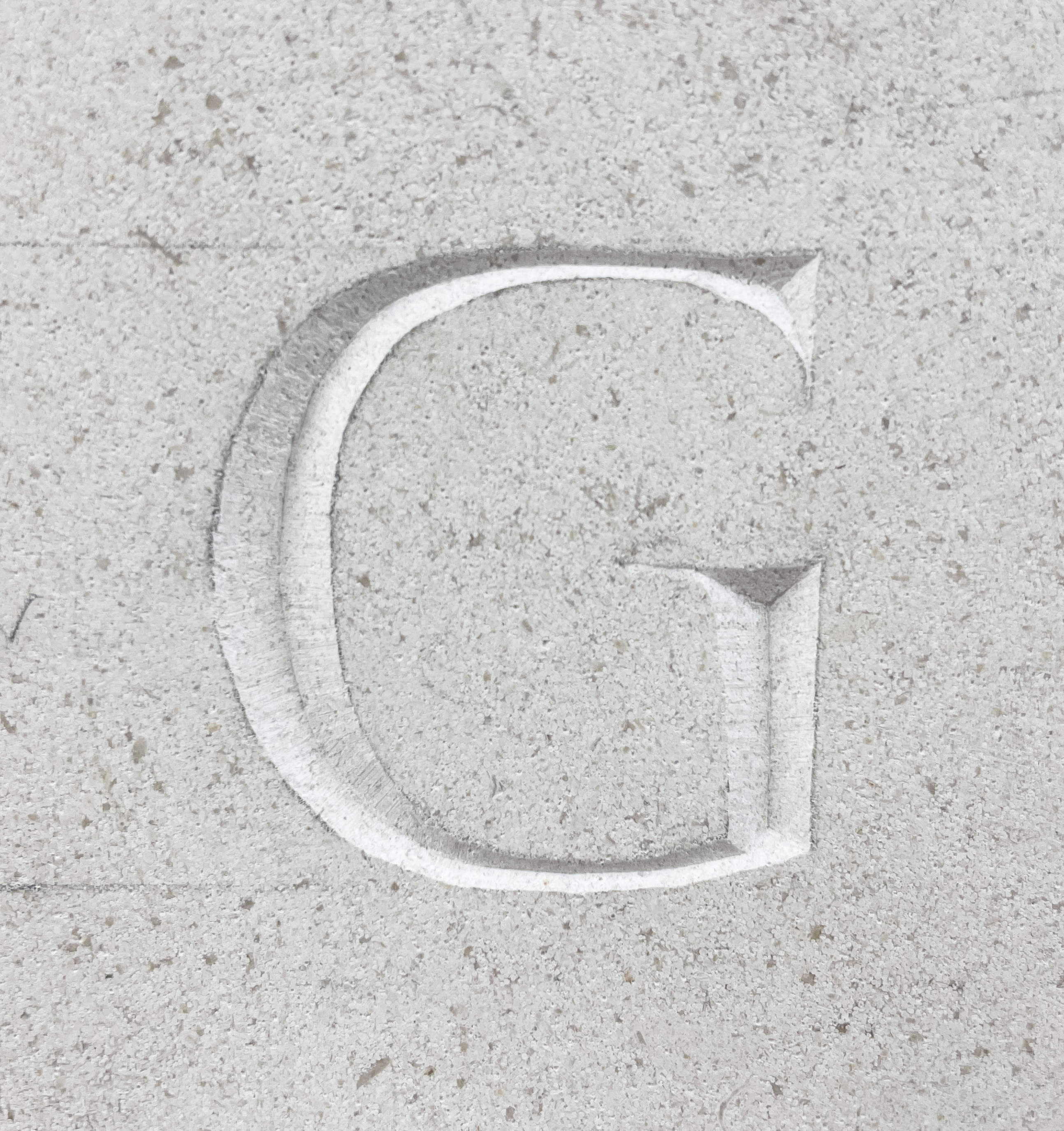
Fig. 9 - 11 After I’ve finished cutting the whole alphabet we go through each letter and make notes of what needs to be adjusted. We check that the widths of the letters are even and make the serifs more pronounced.
Once I have made all those changes we go over is one final time to make any last adjustments. I then take the stone off the easel and sand down the surface to remove any pencil marks. I also make a rubbing from the stone as a way to record the finished piece.
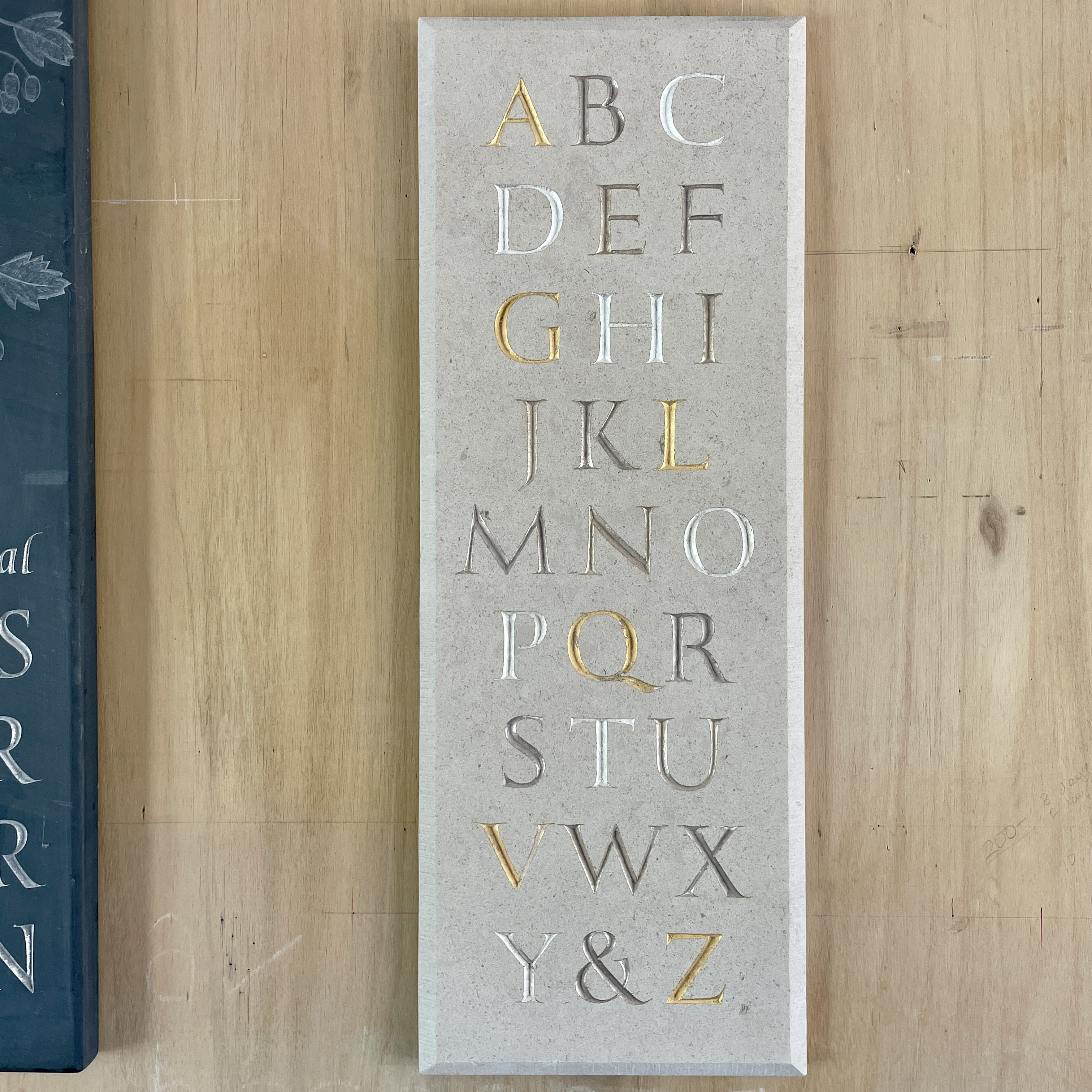
Once I had carved my alphabet the next step was to make the piece of work able to be displayed. For this we attached mirror plates to the back of the stone. Because the stone is 600mm tall we used two plates. Fig. 12 We placed them around the carved letters to allow us the full width of the stone to carve in. I worked on a flat surface for this, which helped me to cut the straight edges that were needed to fit the plate into the gap. Fig. 13 Making sure the placement of the plates was level, specifically the point where the two screws or nails will hang was most important. The plate, including the screws, needed to sit just below the surface of the stone, so that it sits flat on the wall, Fig. 14 shows how we tested this. Once the shape of the plate was cut to the right depth, we drilled in holes for the screws and glued everything to the stone. Fig. 15 + 6 show the piece hung on the wall.
Gilding
Fig. 1, 4, 5 Our intention was to try water gilding, however when we applied the size to the stone and let it dry, the gold leaf did not stick well. So we decided to revert back to oil gilding. Fig. 6 shows how the leaf hasn’t fully adhered to the size.

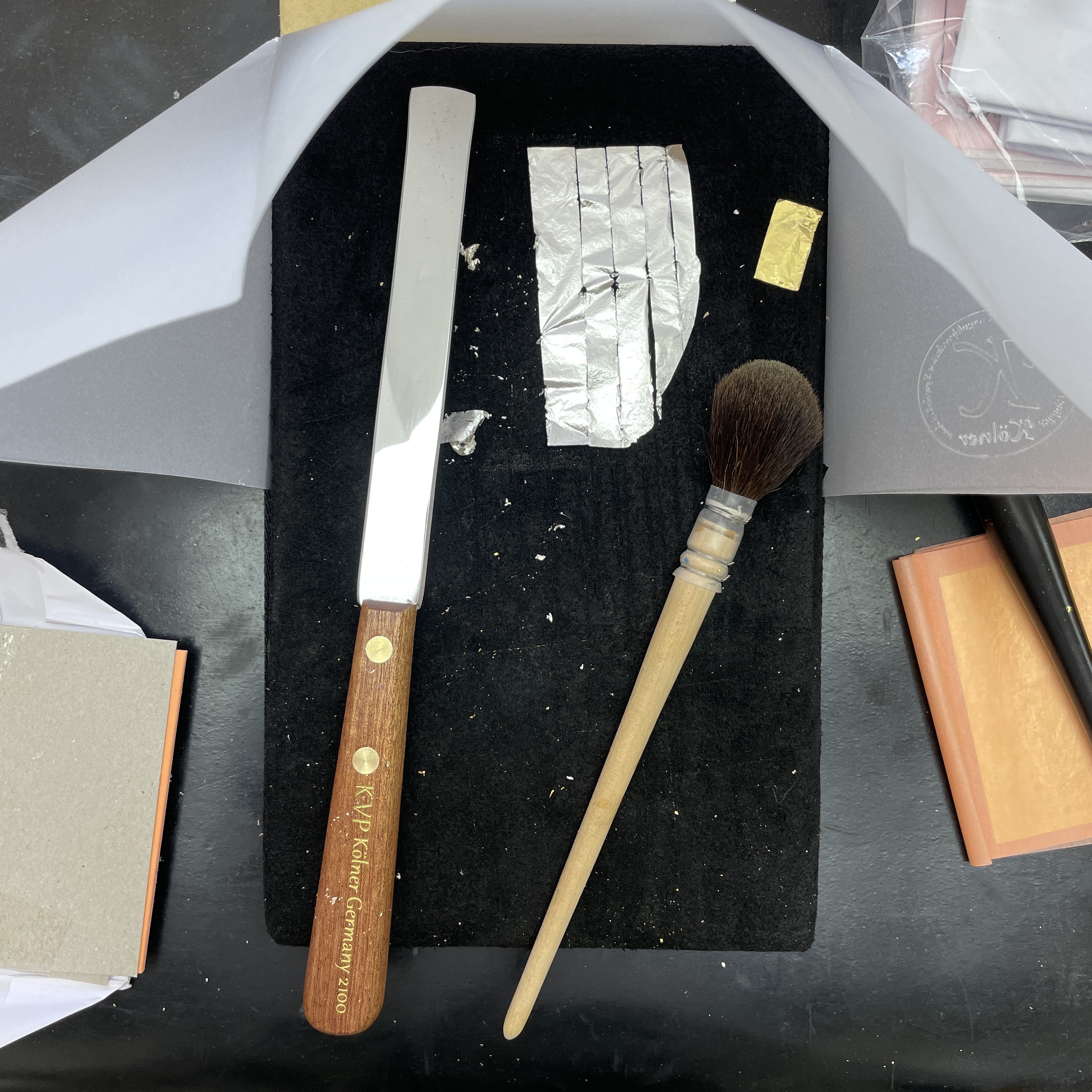

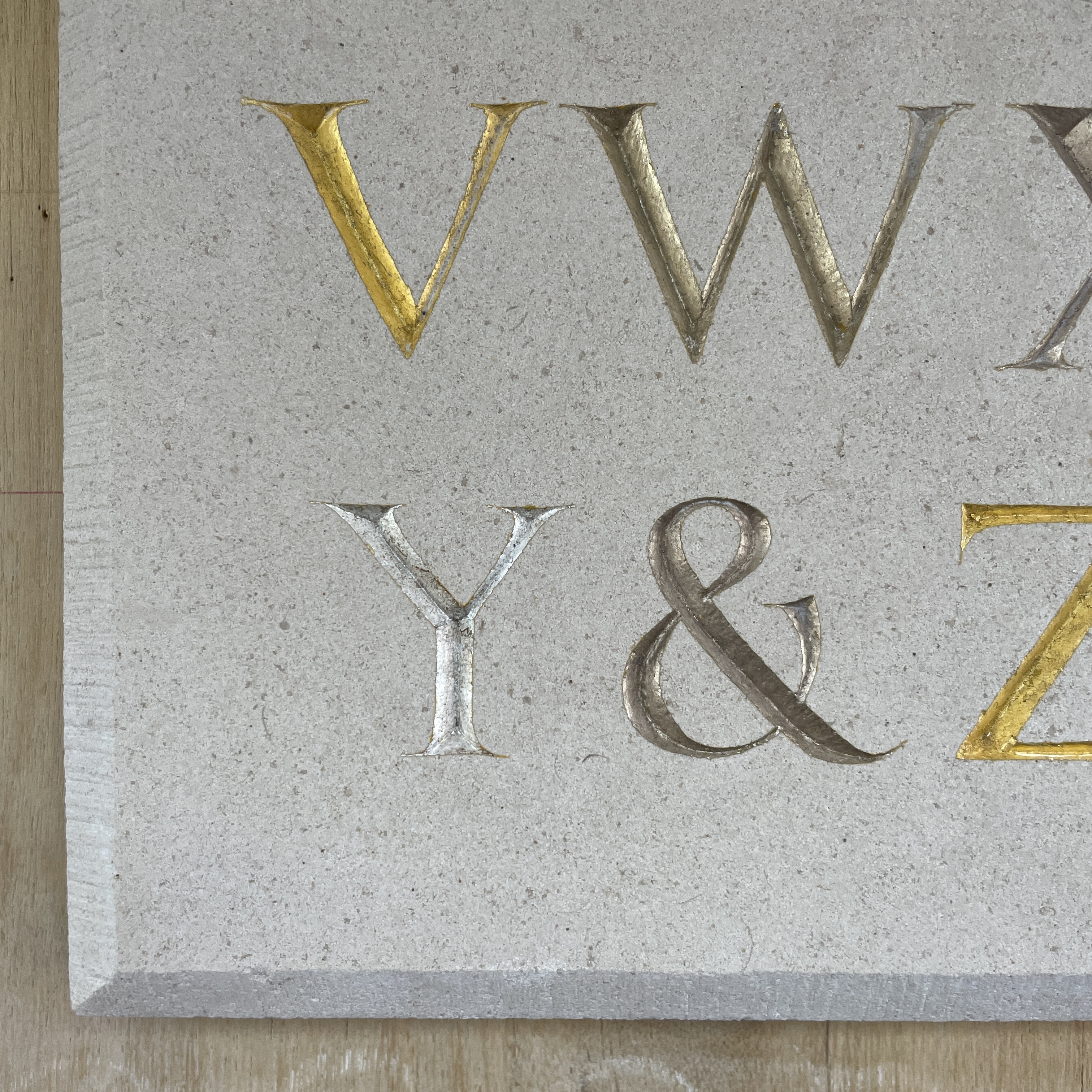
Fig. 7 - 9 Because of the size of the piece we didn't have enough of one gold do to it in the same colour, so we used a mixture of 4 different leafs; gold, champagne gold (22.5 carat), moon gold (22 carat), and palladium. Palladium or platinum is used rather than silver, as silver tarnishes, whereas the latter two don’t. The different leafs did react slightly diffidently when handled and applied, some being lighter and others heavier. The champagne gold has a slightly warmer hue and the moon gold slight cooler, while neither have the brightness of gold, they are closer to the palladium.
The set up for gilding can be seen in Fig. 2, the suede board, knife for cutting the gold, brush for burnishing the leaf into the stone and a smaller brush for transfering the gold from the cutting area to the stone. Fig. 3 shows the leaf cut into useable size pieces.
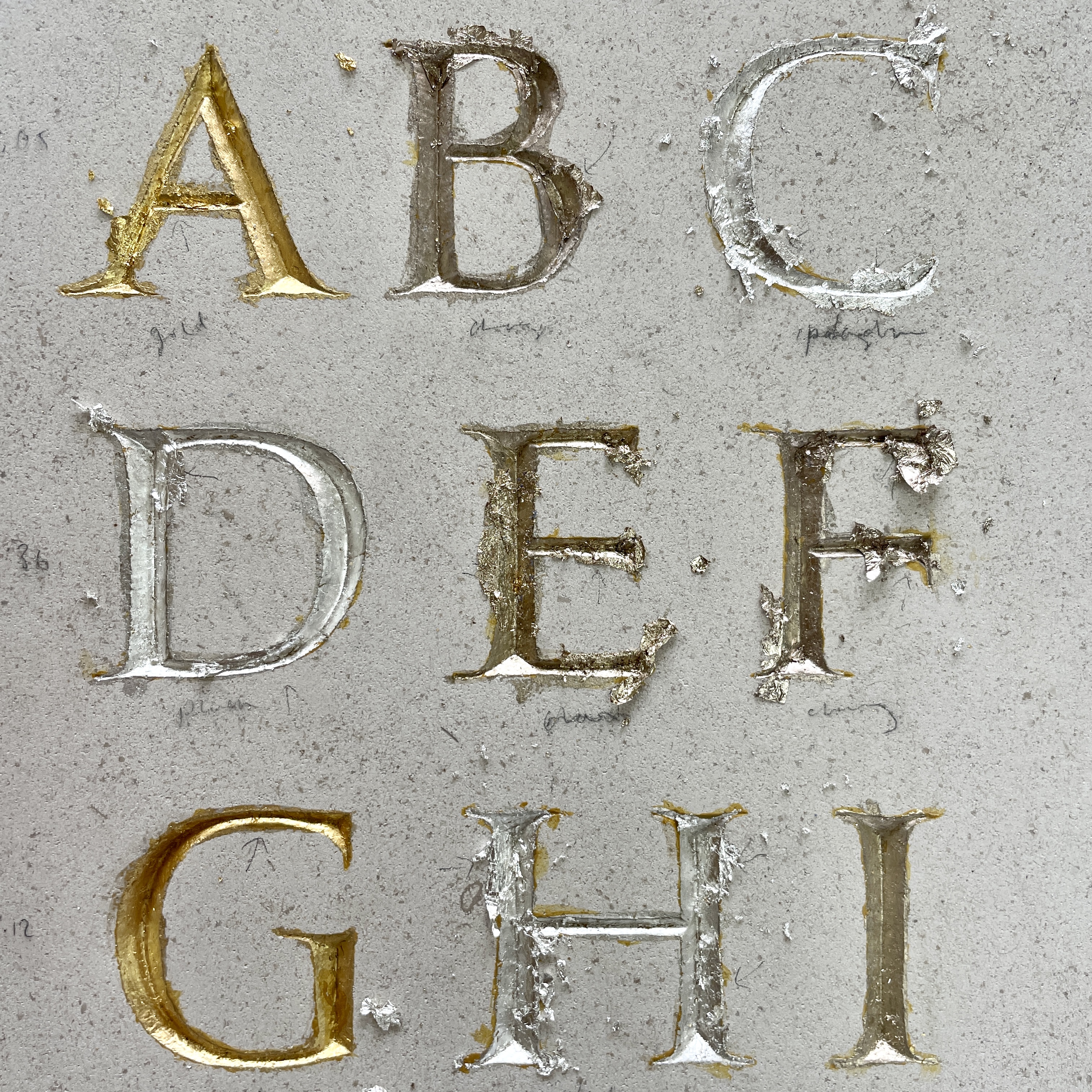
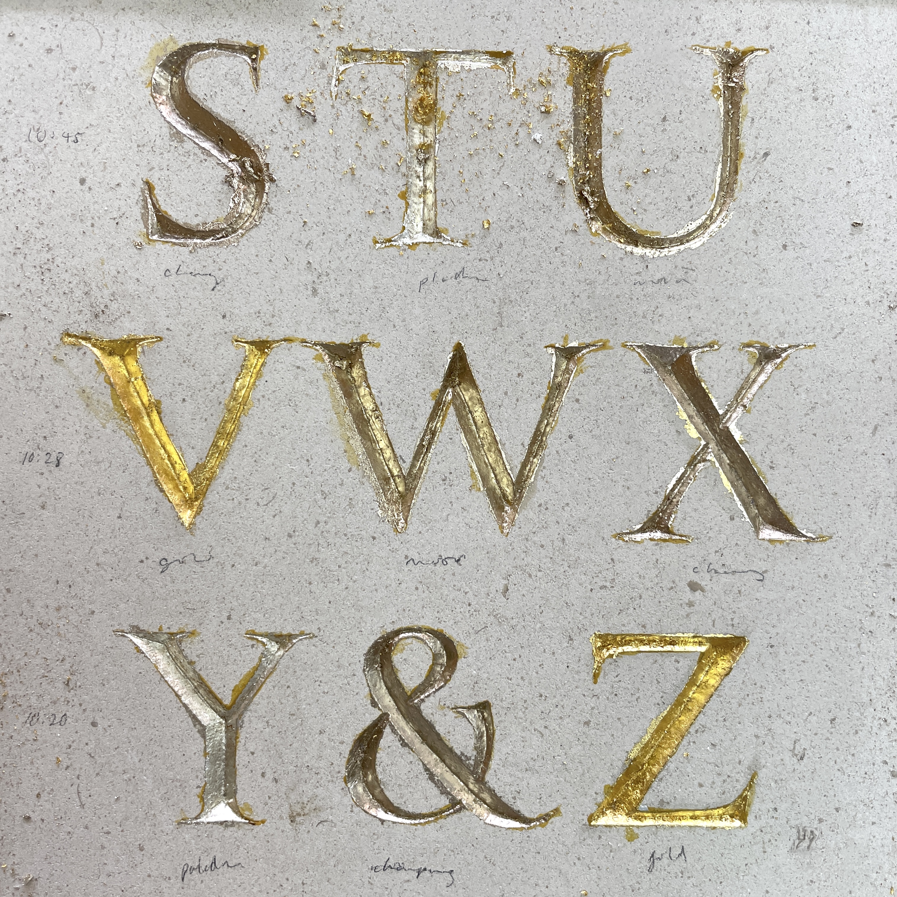
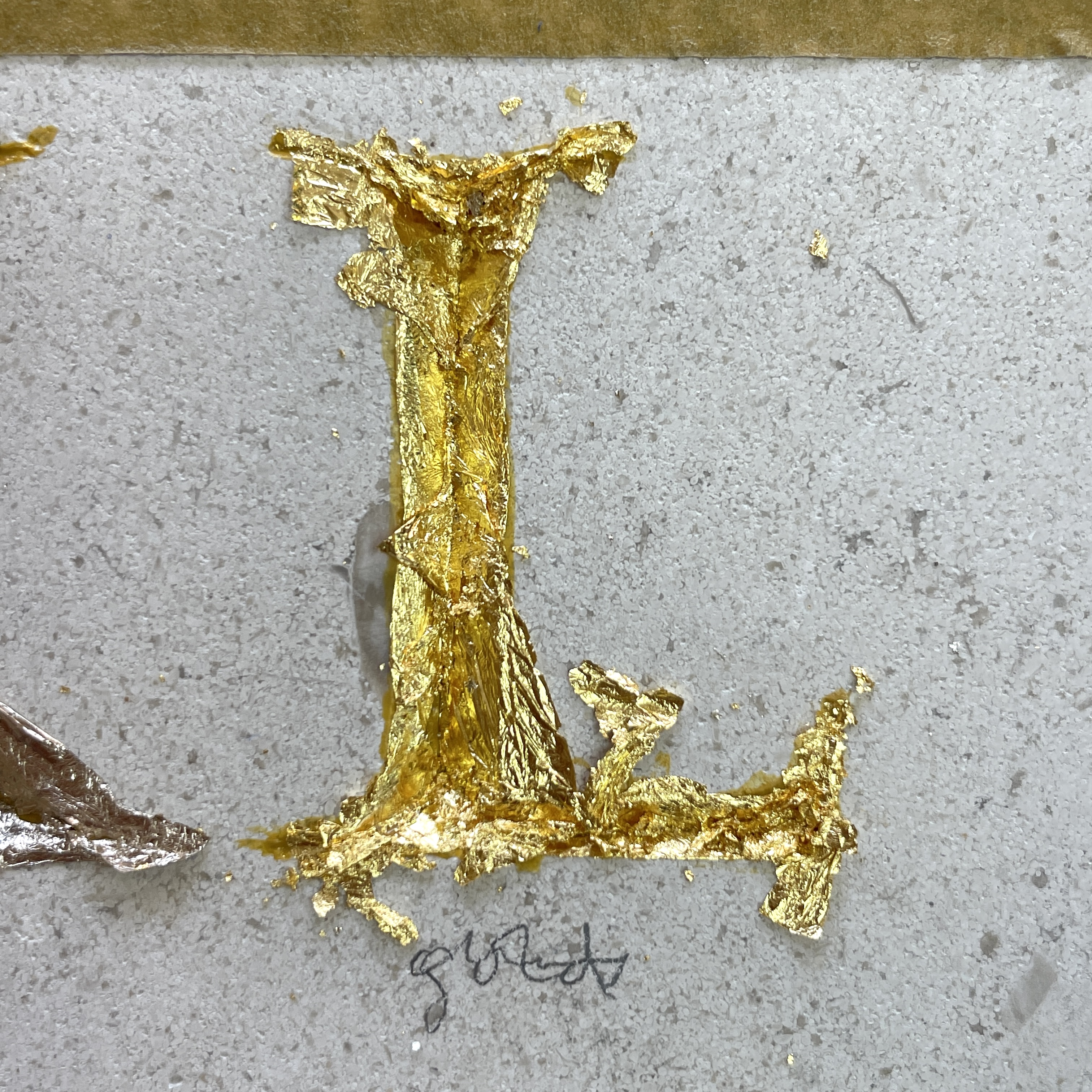
When the leaf is applied to the stone there is excess around the edges, Fig. 7 - 9, we burnish the leaf once it’s dried when reveals the how well the gold has adheared.
Gilding the whole piece took be about two days, owning to drying time. Once I was finished we could see where there had been some cross contamination of flexs of gold on other letters, Fig. 10, so I went over and reapplied some gold to the appropriate areas. I sanded back the whole piece to remove the gold that had gone over the edges of the letters. The placement of the different coloured gold was random, but I it think contrasts with the formality of the letterforms in a playful way. I enjoyed gilding and look forward to incorporating it into future pieces. Fig. 11 - 12
Watercolour
Whilst I was carving my alphabet we decided to work more with the design, by transferring it to a smaller scale and painting it in watercolours. This is a good opportunity to think about how colour can play a part in lettering and also expand my tool skills. I had a done a little bit of watercolour during my art studies but wouldn’t say that I had great skill with a brush. This proved to be the main learning curb and resulted in me simply practising painting straight and curved lines before I attempted the final painting.

We scanned my original drawing and scaled it down to A3 heigh, which I then redrew. This was around the time that I had drawn may alphbet on the stone for the final time, which meant that I have a fuller understanding of the particularties of each letter. This was useful as working at a smaller scale, 27mm, meant that
My thoughts on how to use colour for this piece were simply to mirror my carving and paint the letters as if they were carved, with the shadows. I wanted there to be a transition of light to dark across the whole piece, as well as light and shadow in the letters, and have mixed yellow into red, red into blue to achieve a gradation. This was an unusually bight piece of work for me to make, but that seemed necessary due to the formal nature of the composition.
